|
| Group |
Round |
C/R |
Comment |
Date |
Image |
| 16 |
Aug 20 |
Comment |
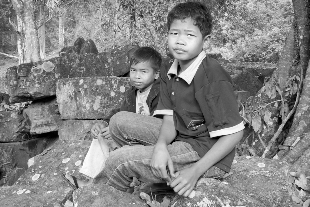
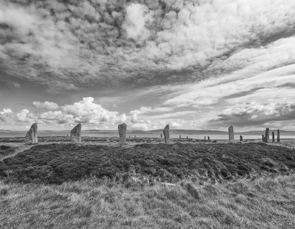
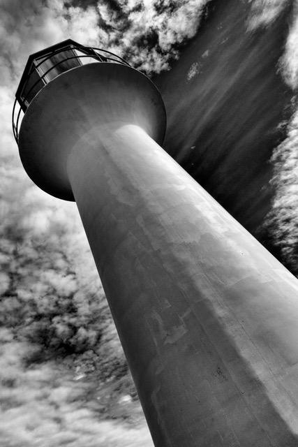
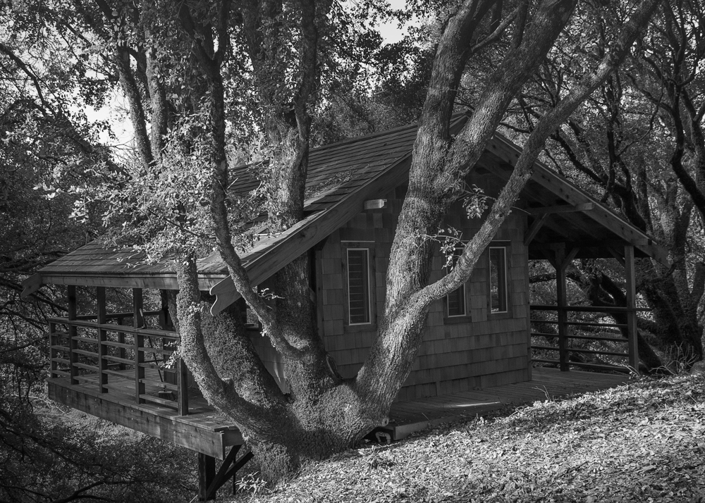
Joan, There is something about this scene that draws me in. It is a very interesting structure. It took me awhile to notice the drawings on the stilts. They're great. I like how you brought out the colors. I think this is an image that could take a lot of different treatments. I usually don't reprocess other people images, but I tried a few things--left in more of the sky, cropped out one of the posts. used a white vignette and applied a look from Topaz studio. I'm not saying it's better, as I like what you did. It's just different. |
Aug 7th |
 |
| 16 |
Aug 20 |
Reply |
Then the stick stays! I do think your image has potential as a pictorial image. So if you decide to switch categories one day, you can make sure the little bird doesn't poke out its eye! |
Aug 7th |
| 16 |
Aug 20 |
Reply |
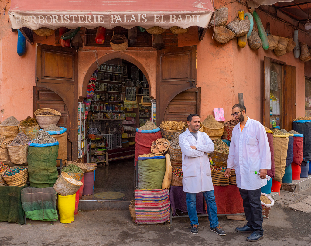
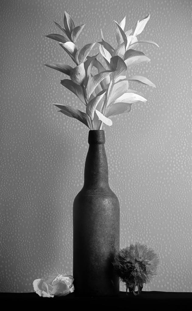
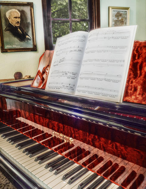
Terry, Thanks for the suggestion. I considered a vignette but I didn't want to darken the spices and their colorful containers which, to me, is also of interest. |
Aug 7th |
| 16 |
Aug 20 |
Comment |
Terry, I enjoyed the Wabi Sabi seminar. It was inspiring and it obviously inspired you to create this wonderful image. I am struggling to see what shadow you want to remove. To my eye, whatever is there seems fine to me. Great job! |
Aug 7th |
| 16 |
Aug 20 |
Comment |
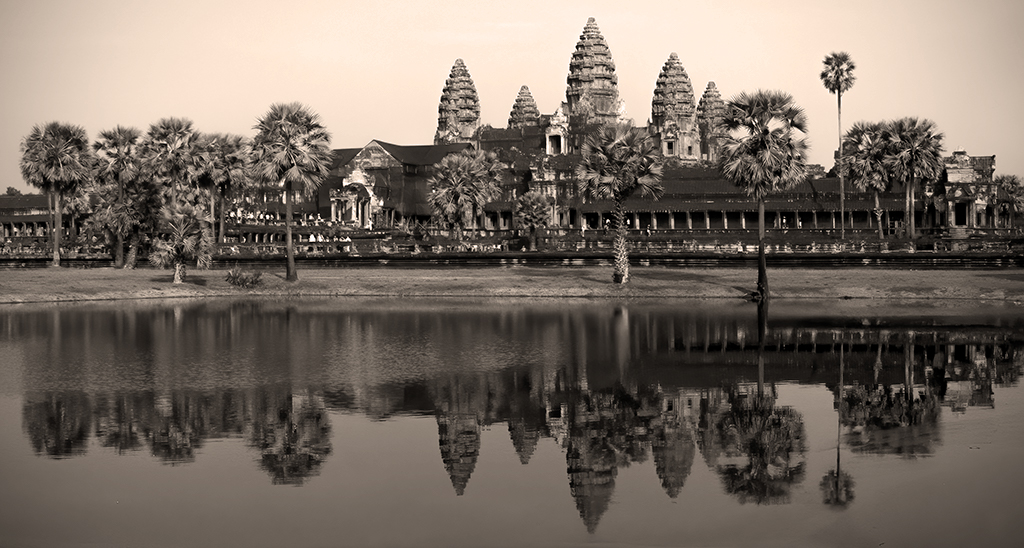
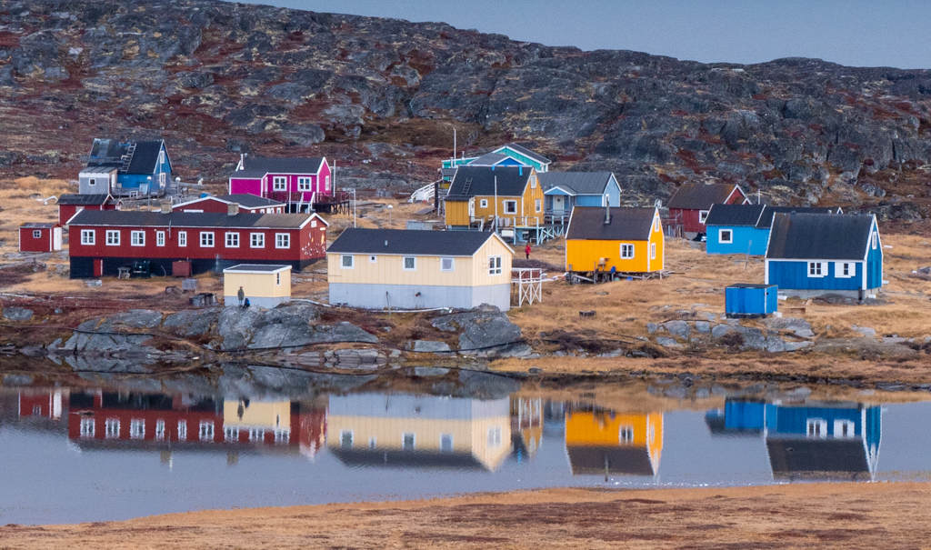
Bogdan, you are fortunate to have been there at the perfect time. I think you can use this as a travel poster to get people to visit Slovenia! Very nice. |
Aug 7th |
| 16 |
Aug 20 |
Comment |
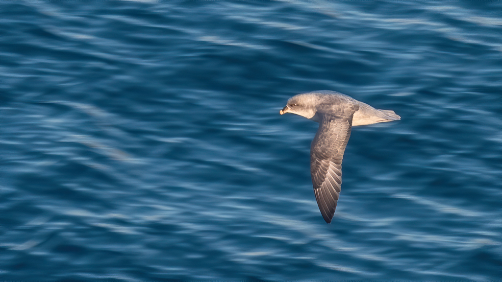
Walter, I am enjoying the painterly effect you achieved. My only suggestion is to consider removing the twig that is close to the eye of the chick on the bottom. |
Aug 7th |
| 16 |
Aug 20 |
Comment |
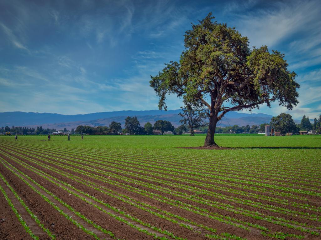
This is a wonderful, peaceful image. The oblique line of the grass provides a good contrast to the straight horizon. I am enjoying the three "zones"--the blue sky, the white sand and the ground cover. The seedling balancing the image nicely. To my eye, the crop you chose works well. |
Aug 7th |
5 comments - 2 replies for Group 16
|
| 77 |
Aug 20 |
Reply |
Lisa's webinars are great. I made several "rotational" images.
Just this week I learned to use the twirl effect and than apply a blend mode. Fun stuff! It does help to pass the time. |
Aug 15th |
| 77 |
Aug 20 |
Reply |
Cecilia, That's what I did originally, but then I remembered all the advice I've gotten in the past about centered and straight up and down being less desirable.
It really didn't occur to me that people would anthropomorphize the shape. However now I think I might have the beginnings of a series! What people see in a photo reveals something about how they think, and I like that. |
Aug 9th |
| 77 |
Aug 20 |
Reply |
I like what you've done! |
Aug 8th |
| 77 |
Aug 20 |
Comment |
Connie, This is a great story. I like the texture you applied. To my eye, the bookshelves are distracting. Have you thought about isolating the basket or perhaps combining with the image of the house? I think you are on to something and I'd love to see what else you can do. Here is a very primitive attempt that I did just to convey what I am suggesting. |
Aug 8th |
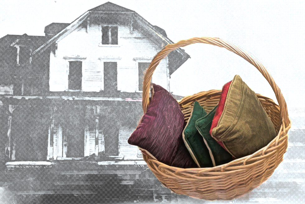 |
| 77 |
Aug 20 |
Reply |
It's on Jimmy McIntyre's You Tube channel:
https://www.youtube.com/c/JimmyMcIntyre/videos
This video is how to use a luminosity mask on a single exposure:
https://www.youtube.com/watch?v=tiNCB3s6gt0 |
Aug 7th |
| 77 |
Aug 20 |
Reply |
LOL! I'll ask my husband whether pointing down is more manly than pointing up! |
Aug 7th |
| 77 |
Aug 20 |
Comment |
Cecilia, what a great image! I am enjoying how the smoke creates a vignette, allowing me to focus on the intense expression. Your adjustments work well to bring out detail. As others have pointed out, you might consider toning down the wall. To my eye, the original wood color might be more effective. I do like the crop as having the wall serves to give the image a sense of place. |
Aug 7th |
| 77 |
Aug 20 |
Comment |
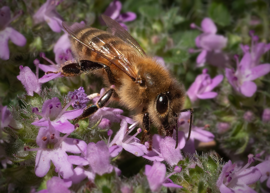
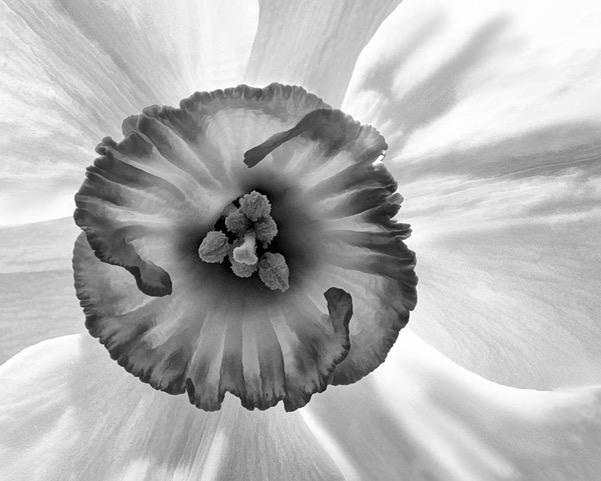
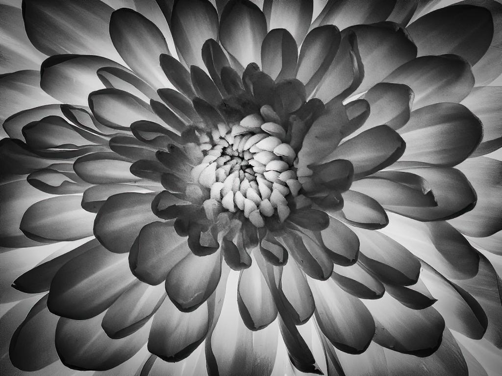
Denise, great job isolating this flower. Orchids have such a "personality" that's it is easy to imagine them dancing.
I would prefer to see the entire flower in focus as the frilly pattern of the petals is quite interesting and would be enhanced by your monochrome treatment. I know this is not possible without a tripod. |
Aug 7th |
| 77 |
Aug 20 |
Comment |
Mary, great choice to make this monochrome. It helps me focus on the emotion in the image. The diagonal line adds a lot of interest. I agree with Witta regarding adding a bit more of the hand.
The crop is good as it leaves me to imagine where she is. It certainly doesn't look like a truck. To me, it seems she is trapped indoors. |
Aug 7th |
| 77 |
Aug 20 |
Comment |
Witta, Great street capture. I am enjoying the expression you captured, the stray hairs, and the fact she appears to be in the middle of writing something. It makes me wonder if her intense expression is her imagining what to write.
I love the image as a triptych. Have you considered that? Shades of a pensive girl! If you are going to make me chose, the middle one, to my eye, would work well as a single image. |
Aug 7th |
| 77 |
Aug 20 |
Comment |
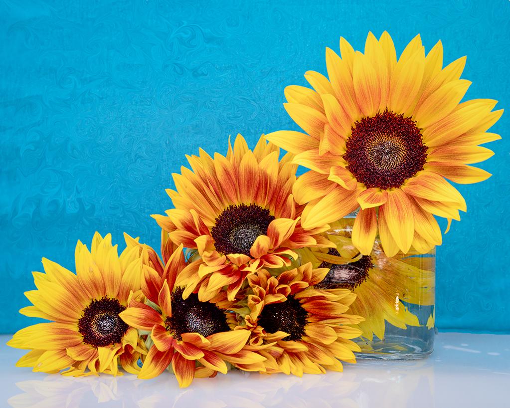
Gerogianne, Beautiful image. I am enjoying the background treatment. My only comment it so remove the dead petal,as others suggested.
I often end up with a dead petal or stray grass, so now I carry around a scissors and do a little trimming prior to taking the photo to avoid removing something later! |
Aug 7th |
| 77 |
Aug 20 |
Reply |
Witta, I think you have just introduced a topic that perhaps we can discuss on the discussion list! Do photos have a gender? If so, what constitutes a "manly" image! :-)
|
Aug 7th |
6 comments - 6 replies for Group 77
|
11 comments - 8 replies Total
|