|
| Group |
Round |
C/R |
Comment |
Date |
Image |
| 16 |
Jul 20 |
Comment |
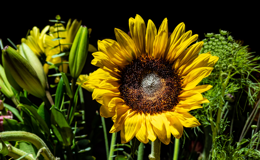
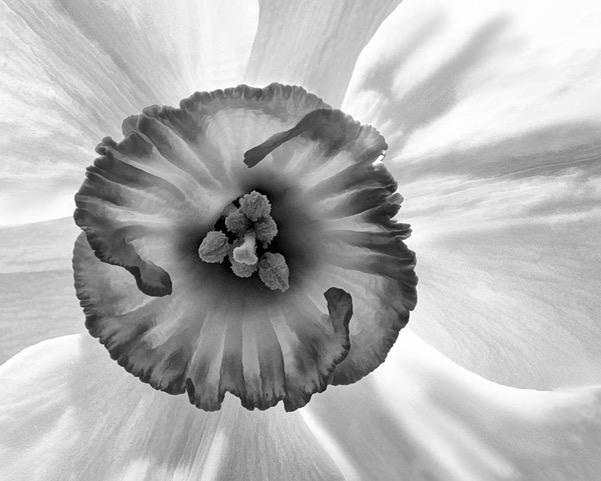
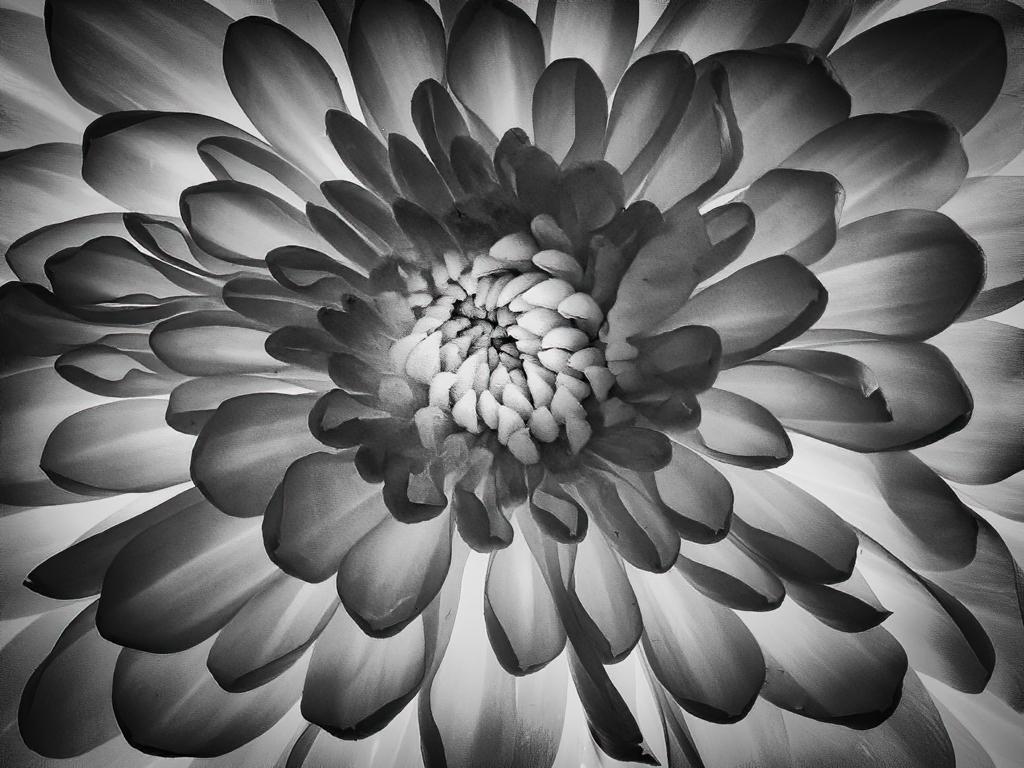
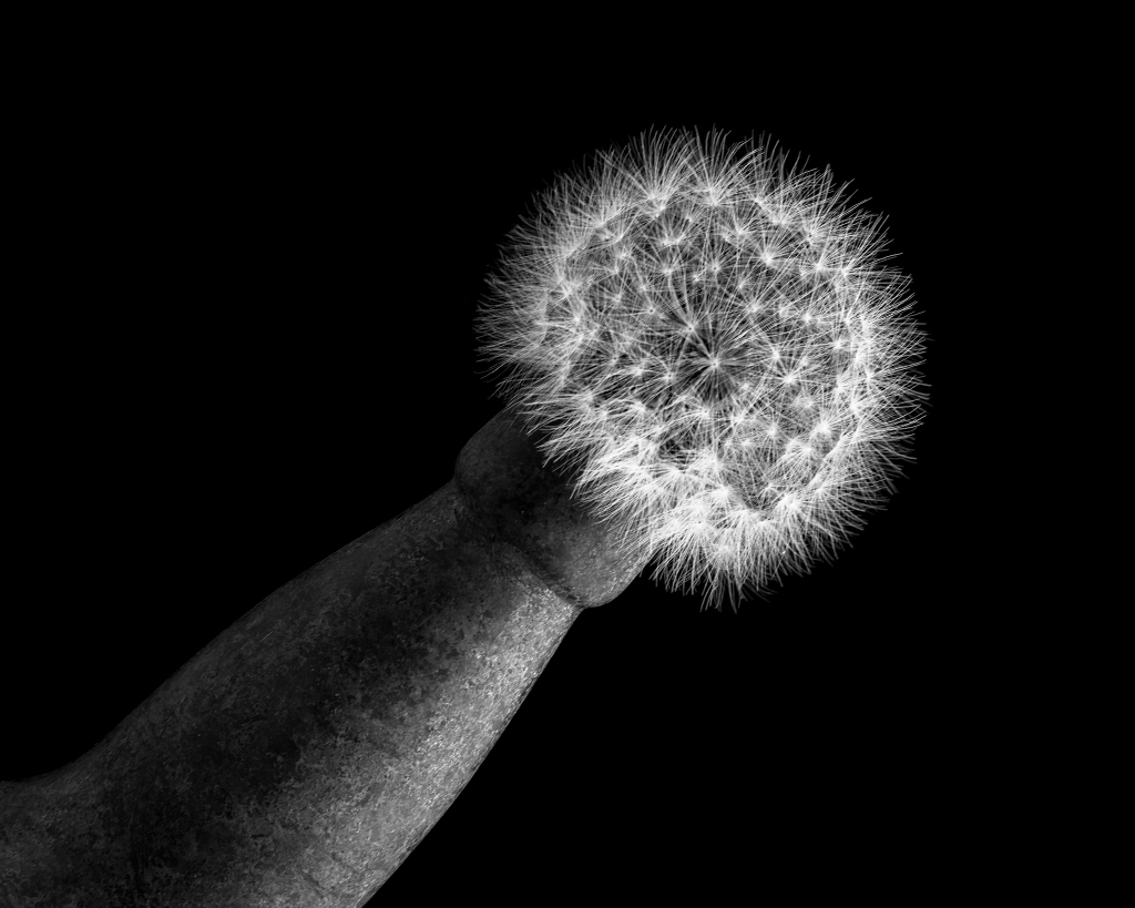
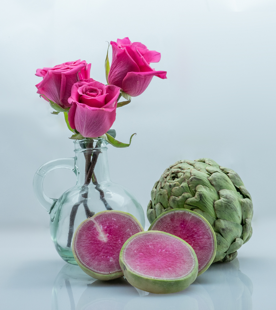
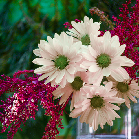
Bogdan,I love the pose you captured of the flower and how you isolated it through DOF. You might consider isolating it further by making the background less white so the flower pops. Terry suggested one way by using blur. Another way might be to use a mask or dodging to decrease the backgound highlights. |
Jul 10th |
 |
| 16 |
Jul 20 |
Comment |
Mohanan, I love the curve of the beach and the line of vegetation from the lighthouse to the sea. The red of the lighthouse complements the greenery quite well. The spots of color in the photo bring it to life. To my eye, the partial red lounge chair is a bit of a distraction. I think the image would still work well if just this bit was cropped. I'd like to hear what others think.
This is probably a great 3D image too! |
Jul 2nd |
| 16 |
Jul 20 |
Comment |
Terry, What a handsome pair of ducks. Very nice job eliminating the distractions so that I can focus on their special bond. To me, the crop looks great. The vignette works. The area on the right seems to me to be a tad dark from the "bird elimination work."
Regarding Vignette, I saw a demo of someone using a neutral gray layer and then adding a gradient with the Gradient tool (Photoshop). They were able to create a custom vignette that was suited to the image (not necessarily symmetrical). I can't find that exact link, but this website shows something like that plus three other methods. Others might have additional suggestions. https://www.ephotozine.com/article/four-easy-ways-on-how-to-create-a-vignette-in-adobe-photoshop-18261 |
Jul 2nd |
| 16 |
Jul 20 |
Comment |
Joan, Nice capture. The colorful forest contrasts nicely with the more monochrome hue of the background. I like the way you made the clouds more dramatic. |
Jul 2nd |
| 16 |
Jul 20 |
Comment |
Walter, I like the tree. Nice composition. I'm impressed at your cloning work. The shapes look good. To my eye, the color doesn't quite match.
It looks as if you made quite a number of color adjustments overall, including adding some sort of effect on the sides to give them a little more yellow tint. It's intriguing. |
Jul 2nd |
5 comments - 0 replies for Group 16
|
| 77 |
Jul 20 |
Comment |
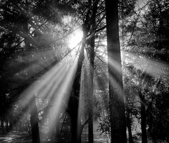
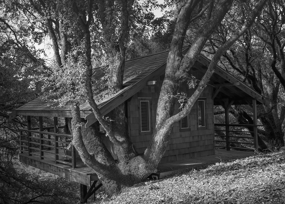
Witta, I like what you've done with the image, especially the selective clarity and the monochrome treatment. I agree with Connie about the eye of the beholder. From my perspective, this looks like prime property looking for the right owner. Perhaps a new title "Looking for the Right Owner." Regardless of what you call the image, it is wonderful. |
Jul 25th |
| 77 |
Jul 20 |
Reply |
You could make the sun rays even stronger and title the image "Sun so strong that it knocked down Tall Tony!" |
Jul 5th |
| 77 |
Jul 20 |
Reply |
As I said, that was minor. I learned in graduate school that if you give someone a perfect work (like the teacher) with the expectation to get a critique, then they will find something to say! I must admit that I struggled with something to say as your image is marvelous. |
Jul 2nd |
| 77 |
Jul 20 |
Reply |
Witta, The class is really individual sessions. PSA offers the Still Life through their website. I am working with Theresa Hood (https://www.thoodphotography.org/galeries) who is a wonderful photographer and has been very helpful to me. There are only 5 lessons, each with a photographic assignment. It's a great course, and so is the PSA History of Photography, which I finished not too long ago. |
Jul 2nd |
| 77 |
Jul 20 |
Reply |
Larry, You may suggest a rotation and I will fix it. LOL! I am usually the person catching things that are off by a small amount. |
Jul 2nd |
| 77 |
Jul 20 |
Reply |
Texture, to me, is an aesthetic choice. I enjoy seeing images use it, but I am not drawn to using textures. I worked at Apple for 20 years, and I think the super simple, clean background of white or black has become ingrained in me. That being said, I have spent a lot of time recently creating textures and increasing my skill at using them. I think it is important to know how to use a technique even if one chooses not to use it. I am drawn to using backgrounds that can contribute to a story. Old barn wood, for example, complements the story of old tools. I am exploring ways to create textures that contribute meaning. Otherwise, to my eye, a texture can look like grit, i.e. a mistake. Georgianne, you seem to do a great job at integrating them into your work, as you did with this month's image. |
Jul 2nd |
| 77 |
Jul 20 |
Comment |
Mary, I love that you created a "lock-down series." You did a good job capturing the sparks and the reflection in the mask and on the rim. I think the contrast in the image works well. For me, the burned out section communicates the heat, so I like it. |
Jul 2nd |
| 77 |
Jul 20 |
Comment |
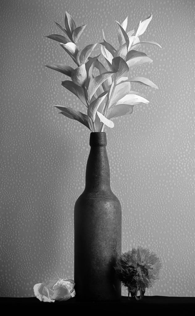
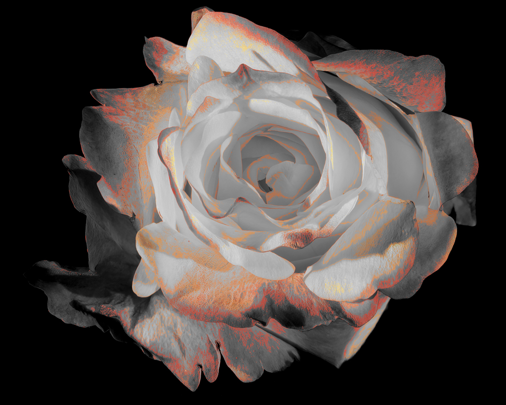
Georgianne, What a wonderful image! I love it. You put a lot of work into this image, and for a great result. My only suggestion would be to clean up the stem. Even that is minor. |
Jul 2nd |
| 77 |
Jul 20 |
Comment |
Cecilia, I love your processing. The dramatic clouds and setting sun, for me, make the photo. I think it would be a good image without the legs. Like Larry, I want to twist those legs around and align them with the sun.
It is fun to find roadside art. Great Basin is spectacular. If you get to Death Valley, there is an outstanding outdoor art collection in the ghost town of Rhyolite. |
Jul 2nd |
| 77 |
Jul 20 |
Comment |
Connie, I love this image! You were lucky to come upon such a great collection of aged items. I don't think I can add any additional novel suggestions. The minor crops in the corner that Larry suggests remind me of a judge we recently had at our camera club. He calls this sort of clean up "border control." It's something I realize I have to do in my own images, as I get fixated on the central subject!
I encourage you do try what Witta suggests-putting your current post processing tools and skills to work on a copy of this image and see what happens. |
Jul 2nd |
| 77 |
Jul 20 |
Comment |
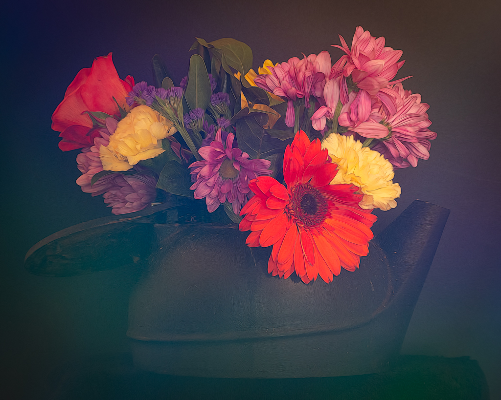
Hi Denise, I've run into the border problem in the past! I think the first photo I ever posted for DD (not this group) was a black background.
The flower is quite lovely. Very nice image. The crop does bring up a question of to crop or not to crop. To me, the centered image seems perfectly fine and I think I like it better. I'm curious to hear what others think, as I struggle with what to do with a symmetric image--center or off center. Did you consider a really tight crop as well?
No matter what the crop, the image is terrific! |
Jul 1st |
 |
6 comments - 5 replies for Group 77
|
11 comments - 5 replies Total
|