|
| Group |
Round |
C/R |
Comment |
Date |
Image |
| 16 |
Jun 20 |
Reply |
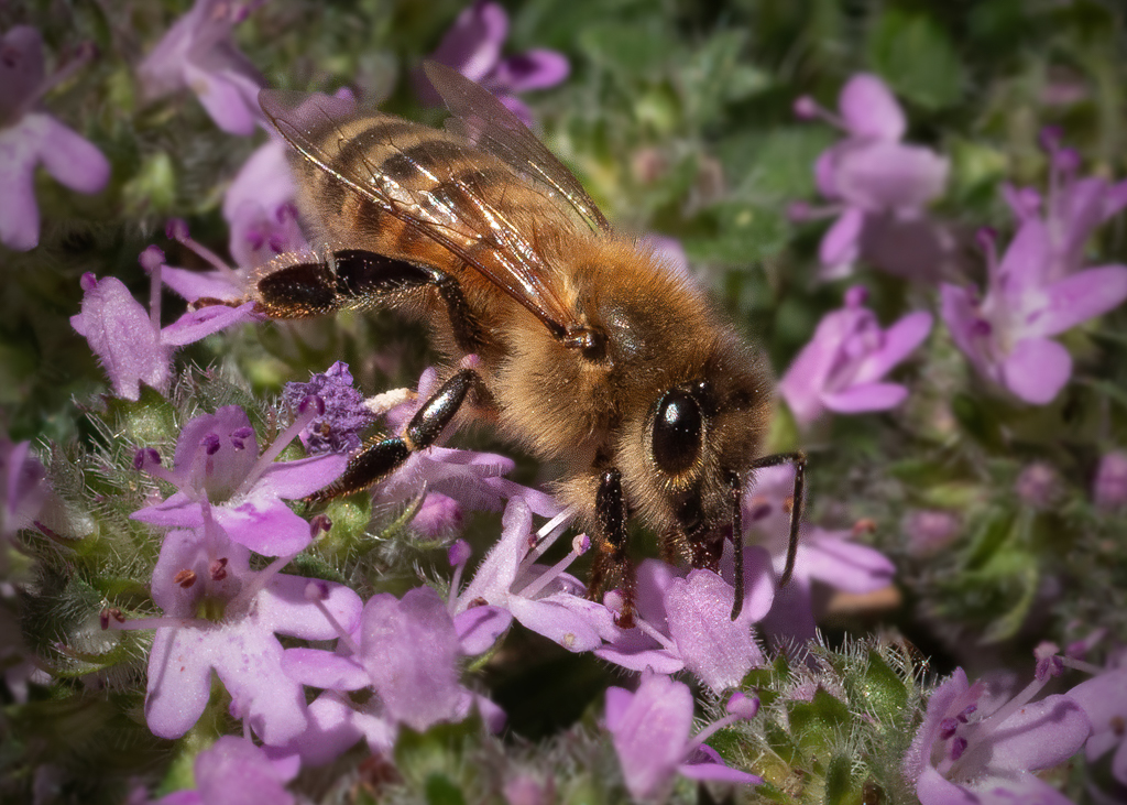
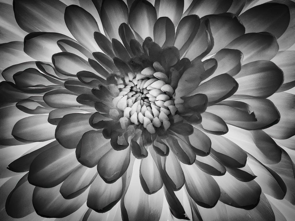
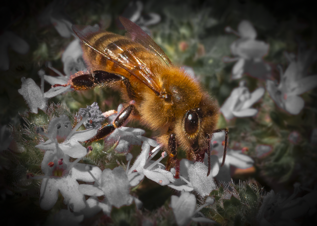
Thanks for your comments Bogdan. I wasn't considering this for nature division. Bees never look as if they are "doing" anything exciting enough by themselves. |
Jun 25th |
| 16 |
Jun 20 |
Comment |
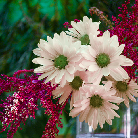
Kathleen. I like the berries. Did you use flash on this? |
Jun 20th |
| 16 |
Jun 20 |
Comment |
I like the crop that Stuart suggested. It helps me to focus on the vibrant colors. For me the image is much more peaceful without the cruise ship. |
Jun 20th |
| 16 |
Jun 20 |
Reply |
HI Terry, I agree that the flowers and bee compete for one's attention. Having the bee sharp doesn't seem to make a difference. If I desaturate or add texture this is no longer a nature image. If I crop too closely, the behavior isn't obvious. Frankly, I don't think the bee makes for a great color pictorial. I did a quick desaturation and I think the flowers are too busy no matter what. I think my lesson learned here is that I am capable of taking a close up of an insect with my macro lens but that I should choose subjects that have cleaner backgrounds. What do you think? |
Jun 12th |
 |
| 16 |
Jun 20 |
Reply |
HI Terry, I use Photoshop healing tool for any clean up I do. I use the Post Crop Vignetting feature in Lightroom for symmetrical vignetting. (There is a way in Photoshop to create asymmetrical vignetting using layers, but I did not do that in this case.)
The open lily looks good to me. If you can make it sharper, then you might give that a try. Do you know about using the high-pass filter in Photoshop for sharpening? That works well for me. I should end up sharpening only the things that are not blurry. You can see a preview before you commit. |
Jun 12th |
| 16 |
Jun 20 |
Comment |
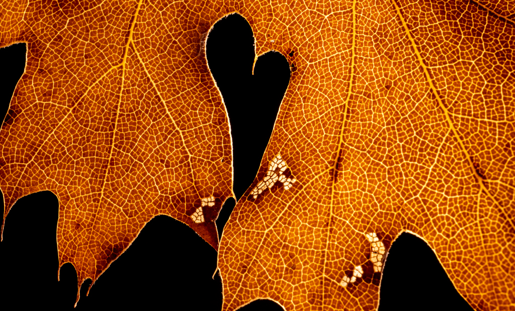
Ice covered branches are special. You captured a lovely one with a good backdrop. To my eye, I would like to see the branch fill up more of the image and a bit less of the milky water. I like the way you captured the water running over the brown vegetation. This might might a good abstract. Have you considered coping a bit more? |
Jun 4th |
 |
| 16 |
Jun 20 |
Comment |
Hi Joan, I love the concept of shooting through, or between, things to something else that's scenic. With a scene like Yellowstone Falls, it's really the only way to get an image that stands out from the thousands of others taken at that spot. I wish the tourists were standing a bit more apart so that I could clearly see the bottom of the falls and the lovely spray that I know is there. Very often the falls have a rainbow in that spray. That would have been something to capture.
I find that women's clothing a bit distracting as the clash of colors and patterns overpower, to my eye, the lovely nature aspects of the scene. |
Jun 2nd |
| 16 |
Jun 20 |
Comment |
Hi Terry, Nice image! I love water Lillies. My preference is to have the lily on the right. So to me, the flip is terrific. The crop works too. I am not distracted by the bud. You might consider cleaning up some of the out-of-focus items on the lower left, maybe even crop just a bit on the left. I think a stronger vignette might also work.
Here is a quick edit, not perfect as you can still see artifacts of healing, but you can get the idea. |
Jun 2nd |
 |
5 comments - 3 replies for Group 16
|
| 77 |
Jun 20 |
Reply |
Thanks for you comments Connie. |
Jun 28th |
| 77 |
Jun 20 |
Comment |
Great action shot! I really can't add anything that hasn't already been said. You might consider some of those suggestions, but I think you have a solid image. Nice job. |
Jun 20th |
| 77 |
Jun 20 |
Reply |
I love the related photo! What a great spot to photograph. |
Jun 19th |
| 77 |
Jun 20 |
Reply |
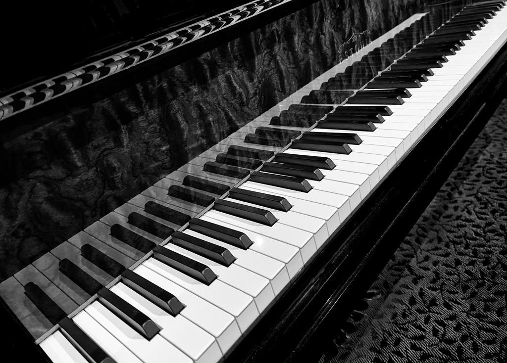
Hi Cecilia, Thanks for your suggestion. I think the best thing to do in this case is simply start over. Because it is my home, I can do that more-or-less easily. Whereas when a shot is opportunistic (such as some amazing once-only event you might happen upon) it is not as easy to go back and take it again. Due to the tight space in the room and the fact there is a door right next to the photo of the conductor, there are some challenges getting the shot set up, but not impossible. I just need some careful planning. I admit that I did not plan this image in the same way that I've planned others. Lesson learned! |
Jun 12th |
| 77 |
Jun 20 |
Reply |
That's a great idea! I use a computer to compose as my handwriting is horrible and creating parts from a score is tedious, so I don't think many people compose manually. However, it could be set up. |
Jun 5th |
| 77 |
Jun 20 |
Reply |
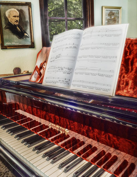
Stephen, Thanks for your comments. I can see stepping back a bit and starting with a larger image. I'll try that. I deliberately did not want to make the image about a particular piece of music, which is why I avoided a title page. I love new music, so perhaps I can find an obscure piece of music written by someone who does not evoke a particular type of music. I wanted the image to be about the piano , not about a particular piece. I am a composer, so perhaps I'll just put up something of my own, which surely no one will recognize :-) |
Jun 5th |
| 77 |
Jun 20 |
Reply |
My intention was to give a glimpse into my home. The photograph of Maestro Arturo Toscanini on the wall (the left) shows someone that both my husband and I admire. (My husband is known for restoring audio recordings of the Maestro, so to eliminate this from the image would, to me, eliminate the soul of the image.) The partial image on the wall on the right is supposed to be me, as interpreted by an artist friend. The items below Toscanini are a carved shell from Mexico and a turkey call. Is it important for a viewer to know all these details, or simply to wonder about them? Does everything in an image need to be immediately obvious to a viewer, or can one simply wonder and use her imagination?
I deliberately chose not to have everything perfectly parallel, so I could give a skewed look. Where should you eye go? Wher ever it wants. I would expect anyone looking at a photo or at art to look at every item and try to make sense of them...to see a glimpse into a world not their own. I deliberately gave the music a treatment that would obscure the piece, as I wanted the viewer to get the feeling of the piano and the space in which it exists.
Both Georgianne and Witta bring up great points. Must a piece of art have one center of focus? Must everything in the work be obvious to the viewer? When I went to MOMA in NYC last year, I enjoyed many pieces that left me scratching my head wondering what the artist was trying to say, but ultimately concluded that if the piece had a sense of aesthetic to it that appealed to me, then that is good. That is probably why I enjoy contemporary art. |
Jun 4th |
| 77 |
Jun 20 |
Comment |
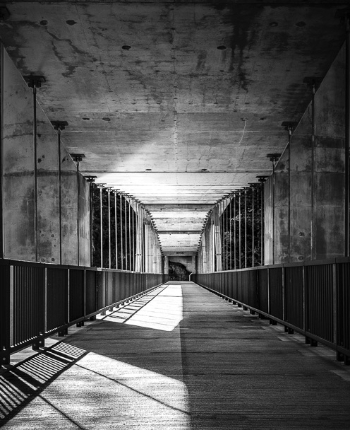
Hi Witta, Julia Anna Gospodarou is indeed amazing. I've been looking at her long exposure architectural photography for some time. One day I want to buy an ND filter so I can try out some of her techniques.
To my eye, your bridge image is really suited to black and white. I like the way there is a symmetry to it, yet the shadows are not symmetrical. For me, there is a little too much black in the foreground so I might use a different crop. |
Jun 4th |
 |
| 77 |
Jun 20 |
Comment |
Hi Celia, Nice work! Beautiful image. I love all the colors. I think the one face looking back really sets off the rest of the image nicely. Great leading line. |
Jun 2nd |
| 77 |
Jun 20 |
Comment |
Hi Georgianne, You certainly took two very unremarkable images and made them into something wonderful. I like the texture everywhere except on the child, as I find it distracting. I want to see him clearly. His right hand, to my eye, has an unusual orientation in the final image. It looks as if he is stretching his fingers around something. He was in the original, but in the final his hands are almost, but not quite in a position to make me believe he is touching the wheel.
One small nit, in both the original and the final he has something on his index finger that is a bit distracting, I thought it was something from the texture, but I see it is in the original. You might consider cloning that out.
All in all, your ability to combine things is amazing! |
Jun 2nd |
| 77 |
Jun 20 |
Comment |
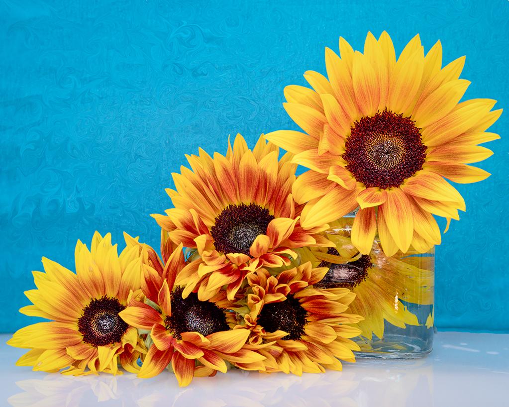
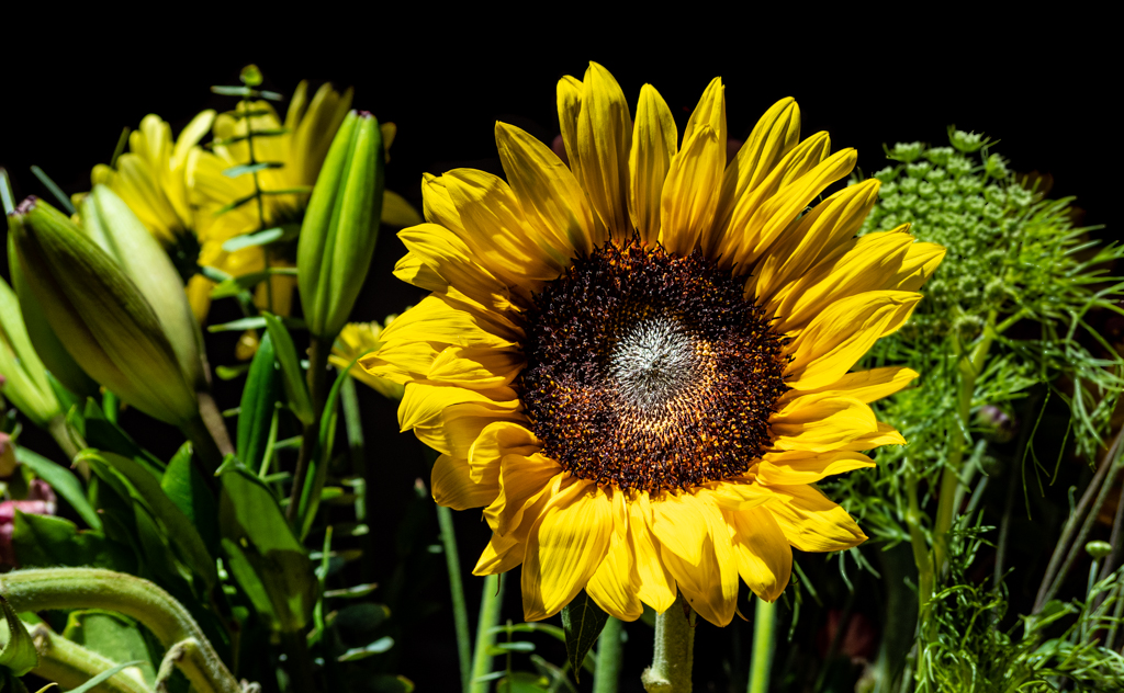
HI Connie, The tulips are lovely. I think putting them in front of a different background highlights their beauty. To me, the sunflower is so subtle that at first I thought is was a shadow or some other artifact. You might consider using a solid background and then if you want a shadow, use the tulips themselves to create one.
The sunflower might make for a different image altogether, perhaps with a background that makes it pop or a very tight crop. |
Jun 2nd |
5 comments - 6 replies for Group 77
|
10 comments - 9 replies Total
|