|
| Group |
Round |
C/R |
Comment |
Date |
Image |
| 16 |
May 20 |
Reply |
What a kind offer. Hiking the Slovenian Alps is on my bucket list. But with the pandemic, I am not sure when I will travel again. |
May 21st |
| 16 |
May 20 |
Comment |
Bogdan, with a different crop, I would hang your photo on my wall. And not in a calendar, as I do not use printed calendars any more. I love photos that have autumn colors against dramatic grey skies. You are lucky to be in a part of the world where you can capture such beauty. |
May 20th |
| 16 |
May 20 |
Reply |
Neither did I! We Californians will be able to unsheltered at the end of the month, so there will be other opportunities for photos. Perhaps you'll get a great bird image Walter. |
May 20th |
| 16 |
May 20 |
Reply |
No problem Terry. I answer to anything! My grandmother trained me when I was young as she used to run through all her grandkids names before figuring out the correct one!
|
May 19th |
| 16 |
May 20 |
Reply |
Thanks Bogdan. |
May 19th |
| 16 |
May 20 |
Comment |
Walter, Confinement makes taking photos challenging! I think you did the best with the image you captured. I am wondering what the view of the flowers would have been had you walked around them. Was there any way to avoid the street scene, such as by having your back towards the car? |
May 18th |
| 16 |
May 20 |
Comment |
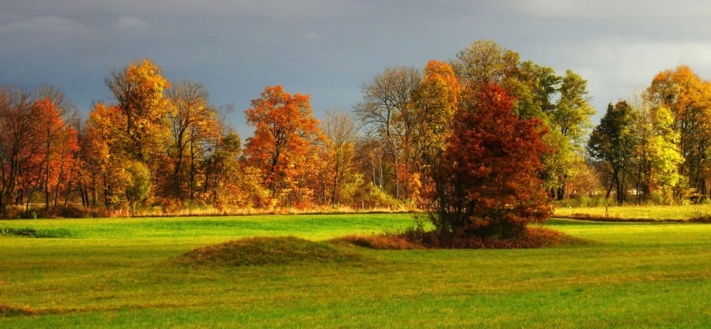
Bogdan, I love the colors of the trees and how they contrast with the gray sky. As is, it is a very beautiful image. Have you considered a crop that emphasizes the trees more? |
May 18th |
 |
| 16 |
May 20 |
Comment |
Kathleen, The pose you captured is good. The image appears to me to be very pixellated. Did something happen in the resizing? |
May 18th |
| 16 |
May 20 |
Reply |
Terry, I like the image a lot. The blur on the border is much more attractive to my eye. |
May 8th |
| 16 |
May 20 |
Comment |
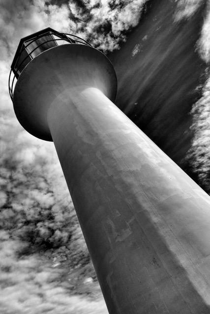
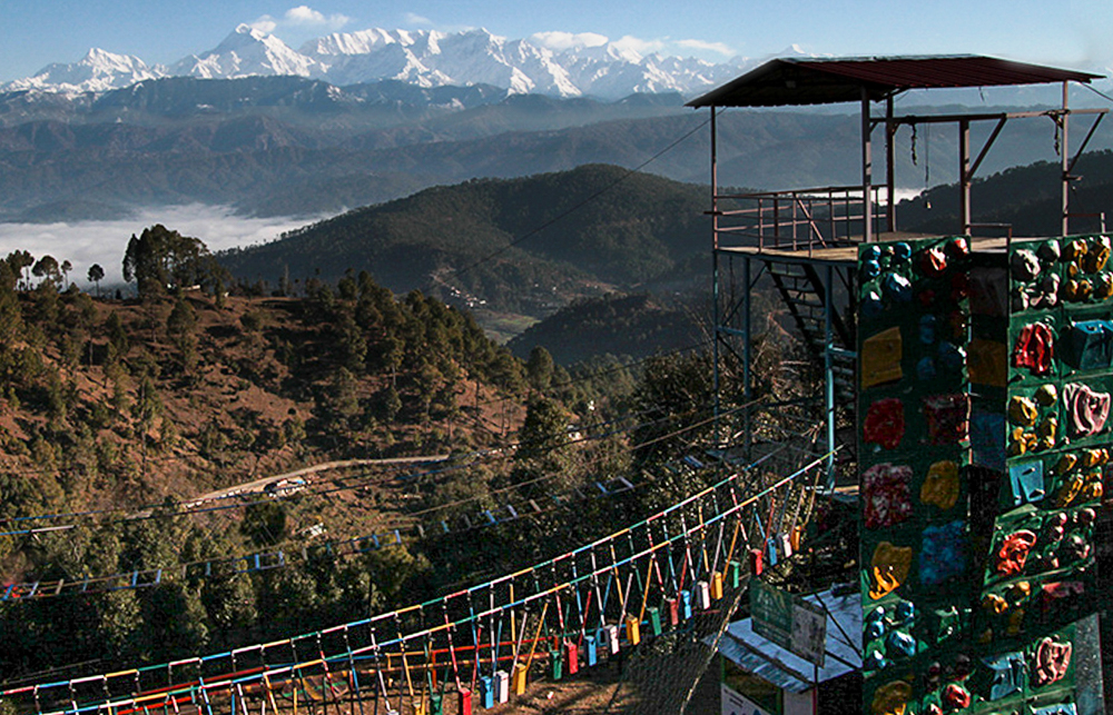
Mohanan, I enjoy seeing different countries' approaches to adventure parks and playgrounds. This one is colorful and has a spectacular view of the Himalaya.
To my eye, the mountains in the original look more natural to me because of the haze in the air. Haze gives a lack of detail that, for me, creates a feeling of depth. I think the adventure tower looks a bit crooked. Yet the horizon looks straight.
You might consider using layers to separate the background from the foreground and then making selective adjustment to the foreground. Here is something that I did very, very quickly just to illustrate what I mean. |
May 8th |
 |
| 16 |
May 20 |
Comment |
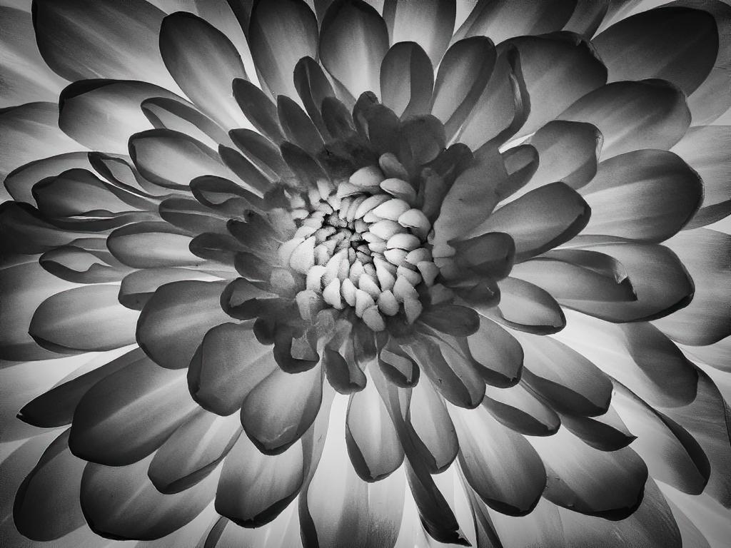
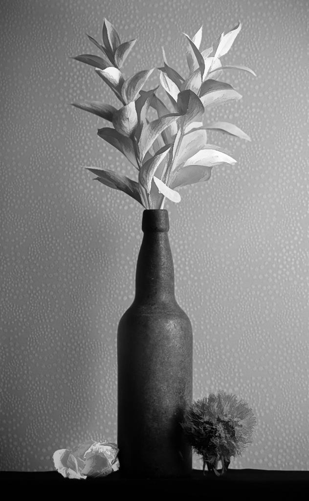
Terry, What a wonderful image! To me, the crop looks good. Cloning out the branch helps me to focus on the flower. The other adjustments make the color of the flower more warm, which is quite attractive. I find that the way you blurred the background has edges that, to my eye, doesn't seen natural.
You might try making a duplicate layer in Photoshop and blurring that entire layer. Then in the layer above, use Select Subject to isolate only the flower so you can delete all the greenery. As an alternative, you could use the erase brush to remove the greenery from the top layer, thereby exposing only the blurred leaves. (For my image this month, I ended up using a combination of the two approaches to get the subject clearly separated from the blurred background.) Other people might know of a more efficient technique. |
May 2nd |
| 16 |
May 20 |
Comment |
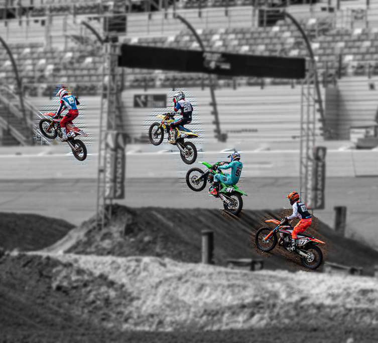
Joan, I love how you captured the arc of movement of these racers. I can feel the energy and hear the engines. The adjustments you made were done well. I'm wondering if there might be a way to bring the racers more to the foreground and deemphasize the empty stands and the chain link fence. I did a very, very quick attempt that makes the background B&W and blurry. I also remove the man at the bottom right and that other object (a dinosaur?) and cropped it. I'm not sure that the approaching rider adds to the story. As you can see, my quickness resulted in a poorly done mask, but I think you can get an idea of what I'm suggesting. |
May 1st |
 |
7 comments - 5 replies for Group 16
|
| 77 |
May 20 |
Reply |
It looks terrific! |
May 20th |
| 77 |
May 20 |
Comment |
Denise, What a great image. I like the composition and the colors you chose. Other people have given you many suggestions to think about. I do like the image as you've presented it, but let me just throw out an idea. Have you considered a diagonal crop? |
May 8th |
 |
| 77 |
May 20 |
Reply |
The Photoshop High-Pass filter is what I use when I want selective sharpening. It works really well. I never apply overall sharpening. In fact, I used the high-pass technique (with Overlay blend) for this photo, but very conservatively. I have also used selective sharpening for other images by just selecting a part of a photo. But like anything, it is all in the application of the technique, which parts the maker choses, and the extent of the sharpening. |
May 7th |
| 77 |
May 20 |
Reply |
Connie, I like what you've done. I've used the precision contrast on other images, but I am no expert at it. Now I am motivated to explore it in depth.
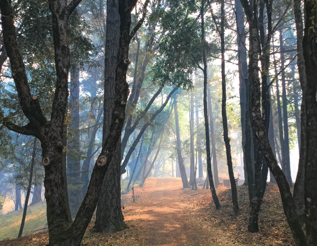
I like that your foreground did not sharpen the leaves and grass. I am not a big fan of overlay sharpened throughout, although I think turning up sharpening (and clarity) seems to be in vogue. Your treatment has lightened things, but not in a way that is too inconsistent with reality. This is a wooded area and I want to preserve some of the dark feeling one gets being there in person. What you did works well. Thanks! |
May 7th |
| 77 |
May 20 |
Reply |
Thanks for the suggestions Cecilia. The angle of the light is largely dictated by the time of year and the GPS coordinates. It's a very shady location, so getting the sun to stream down is a bit challenging. However, I might be able to use the app The Photographers Ephemeris to figure out when the most optimal time of the year would be for the sun through the trees. Have you used that app? |
May 5th |
| 77 |
May 20 |
Reply |
Thanks so much for the suggestion With. I agree that the foreground could be darkened. |
May 5th |
| 77 |
May 20 |
Reply |
What you have results in a wonderful image. So I'm just wondering. Given that you already tried it and discarded the idea, I trust the maker's intuition! |
May 1st |
| 77 |
May 20 |
Comment |
Georgianne, I am always amazed at the creative approaches that makers use for a still life. This is indeed a creative choice of items. I have those three items (more or less-not that book title!), yet it would never occur to me to put them together. When I finish the PSA History of Photography course, I am considering taking the Still Life course. You obviously have a knack for it!
The choice of clouds as a texture is brilliant. In your final image, I didn't realize they were clouds, just an interesting and complementary texture. The red and gray go well together. The image is evocative. Why are these items together? Who was reading the book?
On one hand, I like the fading of the bottom edge of the candle and the bell, but something in me also wants to see just a hint more of the edge of that bell, and perhaps just a tad more space at the bottom. Did you consider that? |
May 1st |
| 77 |
May 20 |
Reply |
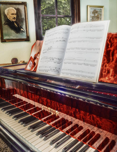
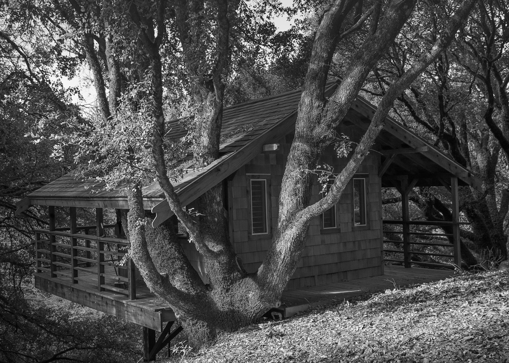
I am so fortunate. With another 31 days added to shelter-in-place (California) I feel even more fortunate. This building (190 square feet) used to be a hippie-hot-tub-party building back in the 1960's. When we got the property 12 years ago, this building was full of mice, a complete wreck, with open sides. It was a labor of love to restore it, make it mouse proof, and enclose it. At that time we extended the deck to wrap around and extended the roof to encompass the trees. We also got rid of the hot tub and repurposed the building for our friends and family when they visit. These days, my husband and I have renamed it "Treehouse Tavern" and go there once a week to listen to music and sip a cocktail. |
May 1st |
| 77 |
May 20 |
Comment |
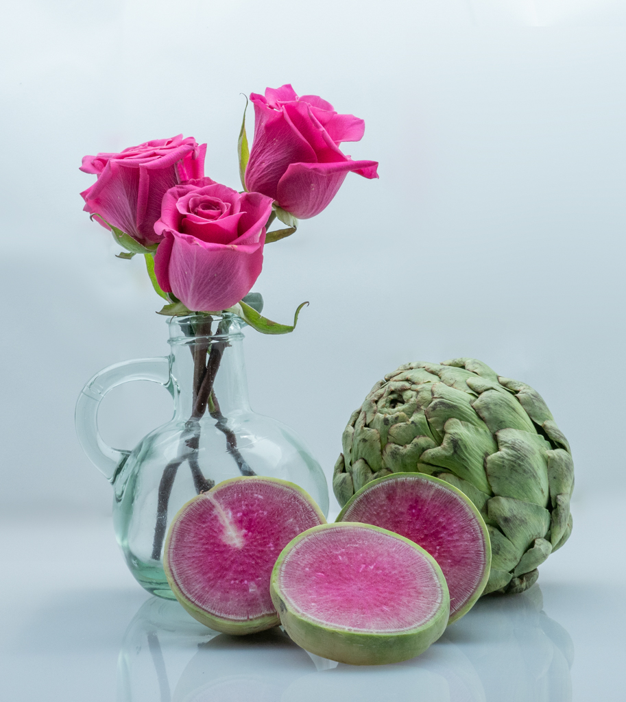
Connie, I like the composition. What a great idea to pose these items. I almost looks as if the bird is trying to get nectar from the rose. The texture you chose complements the treasures nicely. To my eye, I would prefer the front wing to be more in focus. Right now, the back is more focused.
About positioning the bird: I, too, have the "items falling over" problem when I'm setting up a still life. I use small pieces of Play-Doh, carefully placed and out of the eye of the camera, to prop up items. |
May 1st |
| 77 |
May 20 |
Comment |
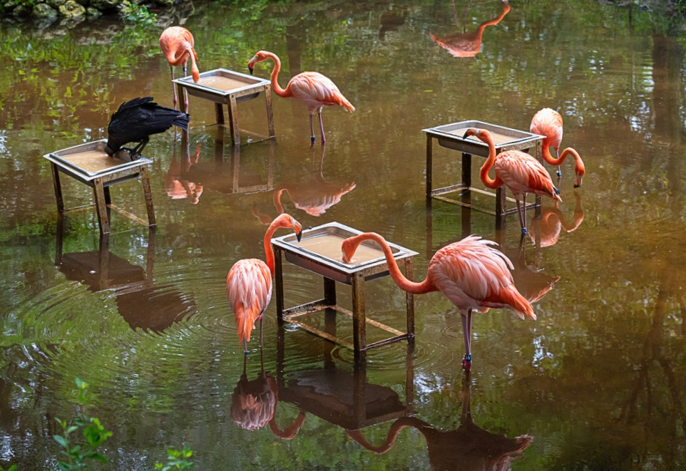
Cecilia, I love the contrast between the vulture and the flamingos. The "Day at the Beach" look works well. My suggestion is along the lines of Georgianne's. I find the partial bird legs and beak at the top distracting, although I do like the reflection. To my eye, the image looks as if it could be straightened just a tad. You'll see that my result cuts off the lovely image at the bottom. Georgianne's content-aware fill idea would work better. |
May 1st |
 |
| 77 |
May 20 |
Comment |
Witta, I love this image! I find that creating abstracts like this can be very relaxing and meditative. What a great indoor activity. For me, the symmetry works well as does the color scheme you chose. The lighter area and the circular swirls draw me in. These days I don't want to think about lungs, but I find that the Open your Mind part of the title seems fitting. Nice job. |
May 1st |
| 77 |
May 20 |
Reply |
Thanks for the suggestions Georgianne. This particular location on my property is always in dappled light, which is a challenge. It is in a dark area with lots of big oaks, but a few times during the day (morning and evening) light streams through. I will certainly try some of your ideas.
BTW, I was inspired to submit this because of your building image. I thought I give it a try to try to make something interesting looking out of a scene like this. |
May 1st |
| 77 |
May 20 |
Comment |
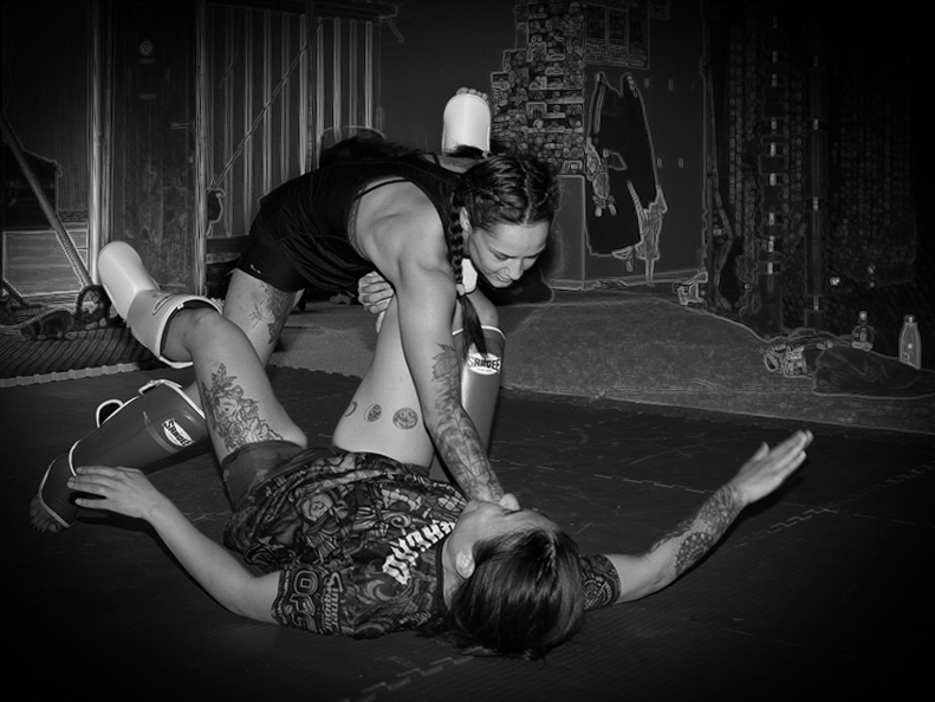
Mary. You are so fortunate to have athletes to photograph! I love the dynamic pose you captured-the moment of victory! Using B&W works well. I'm a big fan of fog-like veils over photos. For me, they work well for a still life. To my eye, this light on the athletes obscures them. I want to see more details of them.
Here is something completely different that I tried. You said you wanted some details to give a sense of place-i.e., the gym, But you wanted to highlight the athletes. With that in mind, I made a layer in Topaz Studio using a color sketch filter. Then I layered that with a B&W version in Photoshop. combined the layers. Did a bit of cropping, healing, and a vignette. This might not be the direction you want to go in, but I think you have a very good basis here. I can't want to see your final result! |
May 1st |
 |
6 comments - 8 replies for Group 77
|
13 comments - 13 replies Total
|