|
| Group |
Round |
C/R |
Comment |
Date |
Image |
| 16 |
Apr 20 |
Reply |
Thanks Bogdan. Yes, I think everyone has point out that straight up and down is not good. I created an off-axis version since I've gotten the comments. |
Apr 24th |
| 16 |
Apr 20 |
Reply |
I don't own a cell phone, but my husband sometimes uses his for landscape photos. He uses a third-party app so he can capture and edit RAW images. I know Halide is one camera app, but there are others. (I know you can't use Apple's Camera program to capture RAW.) |
Apr 19th |
| 16 |
Apr 20 |
Comment |
Getting to photograph a mom with an infant is special! Did you capture this in RAW?
The adjustments give the image a feeling of a charcoal sketch in which the image is softened. Was that your intention? Topaz is awesome at adding sharpness back in a smart way. Your original looked sharp to me, so you might consider trying the various B&W profiles available in Lightroom. LR also lets you adjust individual color components for a B&W which can bring out, or lessen, various features in the photo. I think that approach would allow you to preserve the detail in the monochrome version.
I agree with Mohanan that eye highlights would benefit the image. Terry mentioned cloning out the tree trunk. Doing that would help me to focus on the main subject.
|
Apr 19th |
| 16 |
Apr 20 |
Reply |
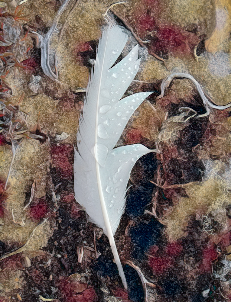
Thanks Kathleen. No, I did not add the water droplets. They were there! I think that's what caught my eye. |
Apr 19th |
| 16 |
Apr 20 |
Reply |
I like your clone work! |
Apr 9th |
| 16 |
Apr 20 |
Comment |
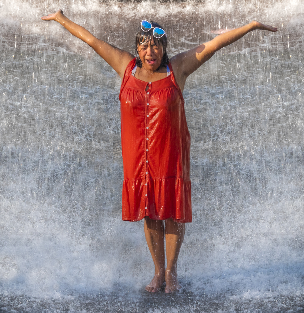
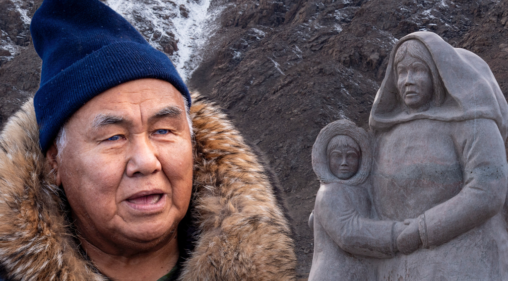
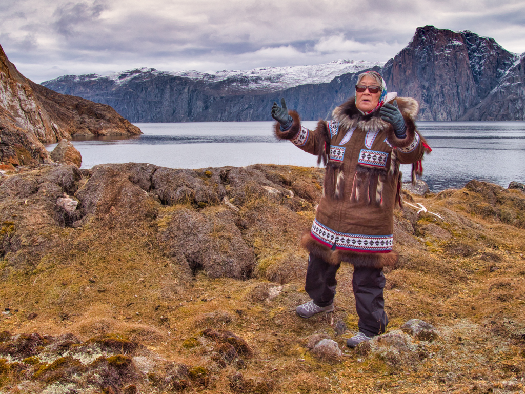
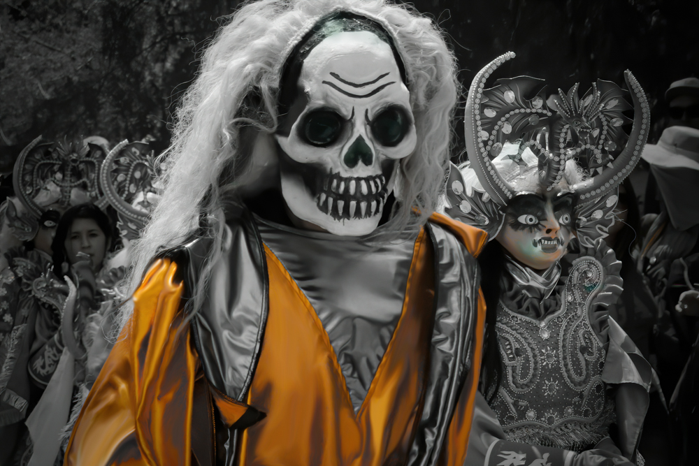
Bogdan, I like the colors in this image and the expression on the woman's face. This was have been a wonderful event to attend in person.
To me, there are several distracting elements-the printing and the people in the background. I think it is possible to reduce these distractions through a combination of tighter cropping and using a blur filter on the background. Is it also possible to lighten the woman's eyes anymore? I would love to see the eyes pop.
|
Apr 9th |
| 16 |
Apr 20 |
Comment |
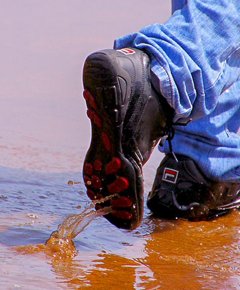
Mohanan, The contrast between the blue jeans and the orange tinged water is wonderful. I like the way the image is skewed, as I think it communicates the feeling of a rainy day, but also how we all feel a bit off-kilter during this COVID time. You did a great job capturing the splash from the right boot.
I do like the image as it is. I also see that it could have other possibilities if you wanted to make it more about the splash. I'm not sure what I've uploaded is an improvement, just different. |
Apr 9th |
 |
| 16 |
Apr 20 |
Comment |
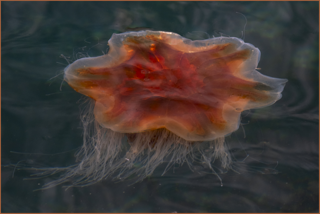
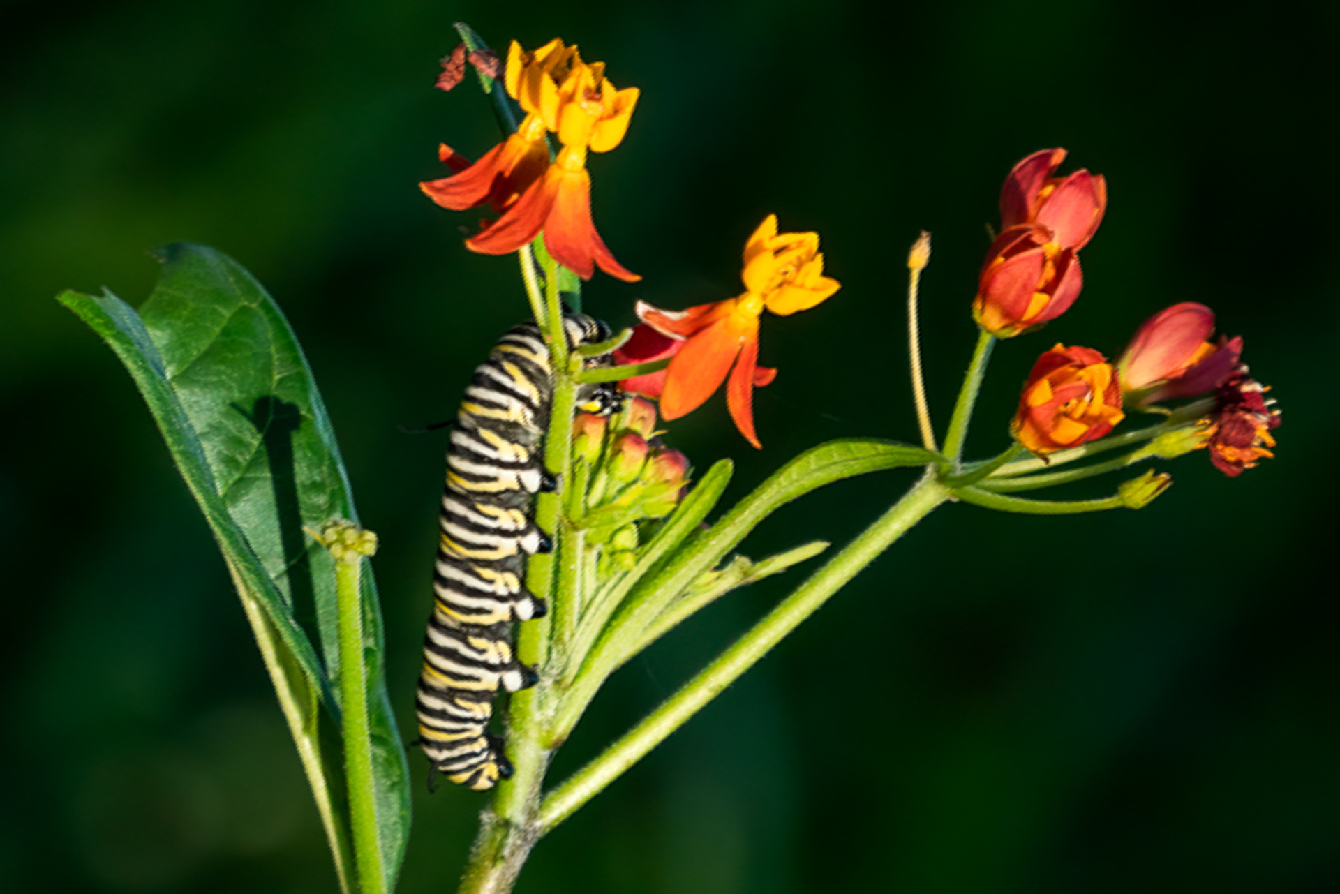
Joan, I love the catepillars and how you were able to isolate them from the background. The lighting is good, so the golden hour paid off.
Because I am a human, I am a little disturbed at their position, with backs to the ground. I know they won't fall because their feet are better than mine. But I am wondering what it would look like if the plant was rotated the other direction. In the most extreme, one caterpillar might work. Just a thought. |
Apr 9th |
 |
| 16 |
Apr 20 |
Comment |
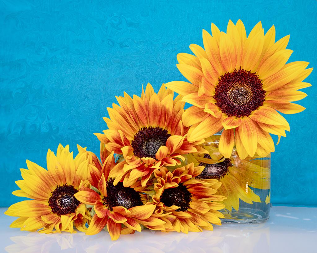
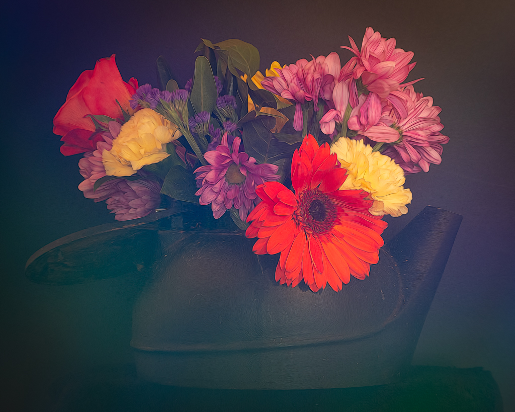
Walter, I like the crop you chose. It gives a pleasing diagonal line to the image. Getting the droplets on the flowers adds to the depth of the image. You did a great job with the adjustments to bring out the color in flowers and keep my focus there. |
Apr 9th |
| 16 |
Apr 20 |
Comment |
Terry, What a great image. Your removal of background distractions and making the non-essential items black and white really focuses my eye on the center of the action. You caught the jump at the peak moment. I can see the concentration in the face of the horse. |
Apr 9th |
| 16 |
Apr 20 |
Reply |
Thanks Terry, That's a great suggestion! I like it. |
Apr 8th |
6 comments - 5 replies for Group 16
|
| 77 |
Apr 20 |
Reply |
Thanks for the tips Witta. I appreciate your feedback. |
Apr 9th |
| 77 |
Apr 20 |
Reply |
Thanks for the suggestions Cecilia. I'll try the edge burn.
We just had our monthly competition at my local camera club. The judge kept using the term "Border Patrol" meaning that photographers need to be mindful of what's on the edges and take care of those things that are distracting. That's going to be my new mantra! |
Apr 9th |
| 77 |
Apr 20 |
Reply |
Thanks for the tips Georgianne. I'll try out the content-aware fill, which is something I've not used before. |
Apr 9th |
| 77 |
Apr 20 |
Reply |
Good eye. The green tinge is there. Thanks for the comment. |
Apr 9th |
| 77 |
Apr 20 |
Comment |
Witta, What a great abstract! I've been taking the Stuck at Home Photo Challenge, which is exclusively of abstracts. Now I am inspired to do more! The texture created by combing the images is very interesting to me. The colors are terrific, especially in your revised version.
I don't know if I'd saddle such a wonderful image with a virus title. (It also doesn't look like the corona virus.) Why not something more fun? To me, it is a splash of color, or maybe one's inner self trying to break out in this stay-at-home time. Perhaps you can have a naming contest!!! |
Apr 9th |
| 77 |
Apr 20 |
Comment |
Cecilia, I love this image. To me, it seems perfect for black and white because it helps me focus on the structure of the tree. The landscape orientation allows for me to appreciate the long branch of this tree. I think the contrast between the thick branches and the tiny leaves really makes the image pop. Nice job!
A side note: Like Mary I export to JPG, not Save As. Then I can go back in the future and try out different things on my RAW file (I assume everyone shoots in RAW). |
Apr 9th |
| 77 |
Apr 20 |
Comment |
Georgianne, What a wonderful image! Old wood buildings are terrific subjects. I love the composition, where you placed the building, and the surrounding wild garden and tree that you captured. The fence post doesn't bother me at all. I like the way it creates a diagonal line with the two other wood objects in the background. A slightly more vibrant door might make the house look more inviting. Like Cecilia, I am not a fan of over sharpening. I would hang this one on my wall! |
Apr 9th |
| 77 |
Apr 20 |
Comment |
Connie, I love chandeliers because the best one go beyond the light itself and merge into the ceiling to create a work of art. That is to say, the medallion and the lines emanating from the chandelier are, to me, part of the entire work. You did a great job bringing out the details in the crystals and the ceiling. I like the diagonal lines and the warmth of the colors. Although I wouldn't hang this image on my wall, it is a good capture of an architectural detail. I agree about the burnt out light. The rays are so lovely I would enjoy seeing rays on the two on the right. |
Apr 8th |
| 77 |
Apr 20 |
Comment |
Mary, I love this image because it is so evocative.Your choices for moving the woman and getting rid of the item above the sign really help focus me on her. I do like the subtle swirl effect you have in the background. I don't see this as conveying indecision, just the opposite. "Taking my space and finding my place." I imagine the woman just took a positive step towards making a change in her life. Now she is on the phone researching her next move. I would love to see more of her eyes. Perhaps there is a way to lighten them a bit? You could experiment with changing the color of her clothing or making her more vibrant. One thought is to monochrome everything except her. In any case, I really like the image. |
Apr 8th |
5 comments - 4 replies for Group 77
|
11 comments - 9 replies Total
|