|
| Group |
Round |
C/R |
Comment |
Date |
Image |
| 16 |
Jan 20 |
Reply |
The compact camera has done quite well for me when I've be on week-long treks in the mountains carrying a pack. I am not strong enough to cart around the full frame cameras! Now I use a micro four thirds. |
Jan 24th |
| 16 |
Jan 20 |
Reply |
Thanks Terry. I've been out of town for a few weeks but I do plan on trying your suggestion. |
Jan 24th |
| 16 |
Jan 20 |
Comment |
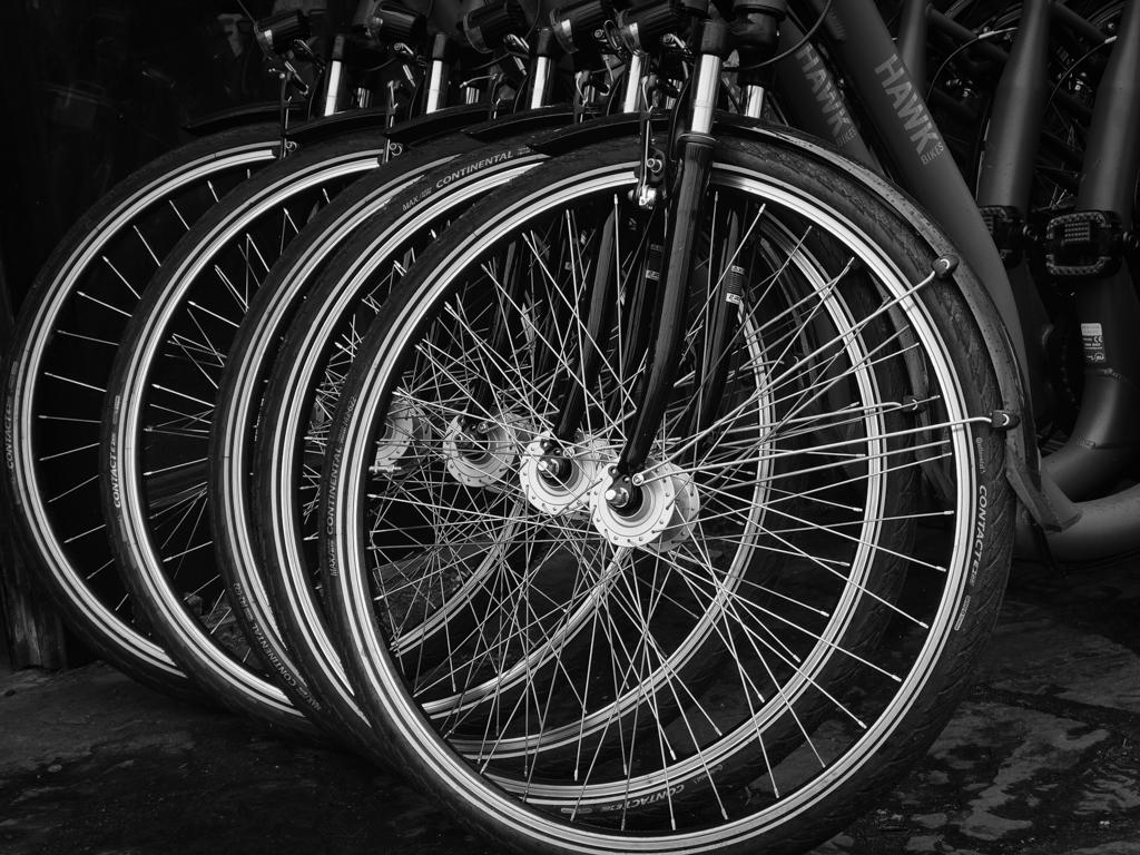
I like the crop but I want to move the scene to the left so that I can seen the bicycles, which seem to be part of the story. The tonal quality of the image is quite pleasing to me, as it puts my focus on the darkly clad bicyclers and what I see of the bicycles.
I understand why you didn't show the all of the bicycles. Would it have been possible to ask that person to move away for a moment? |
Jan 24th |
| 16 |
Jan 20 |
Comment |
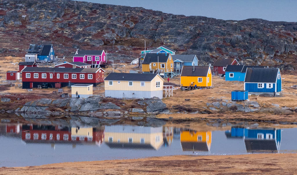
I love the symmetry of this image and how the red-orange roofs complement the blue sky and lake. Great reflection in the lake. You might consider a 16:9 crop, which would give the image a more cinematic quality and put the viewer's focus more on the mountains and buildings. |
Jan 24th |
| 16 |
Jan 20 |
Comment |
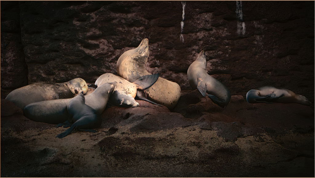
It's wonderful that you captured the griaffe looking at you. I love the pose and that you removed the fence and the branches. The giraffe is not as sharp as I'd like. Why did you choose a solid purple background rather than keeping the original blue with the slight cloud texture? Just curious. |
Jan 24th |
| 16 |
Jan 20 |
Reply |
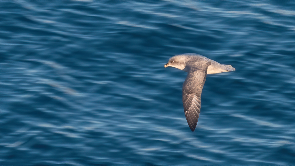
I agree. If the reeds are too sharp or too green, then the image becomes more about them than the bird. Still, you might consider dehazing just the bird just a bit, similar to what Mohanan proposed.
What's your workflow for defocusing the background? I'm looking for tips. |
Jan 24th |
| 16 |
Jan 20 |
Comment |
I like the capture and the crop. The white of the bird against the green reeds is very pleasing. |
Jan 24th |
| 16 |
Jan 20 |
Comment |
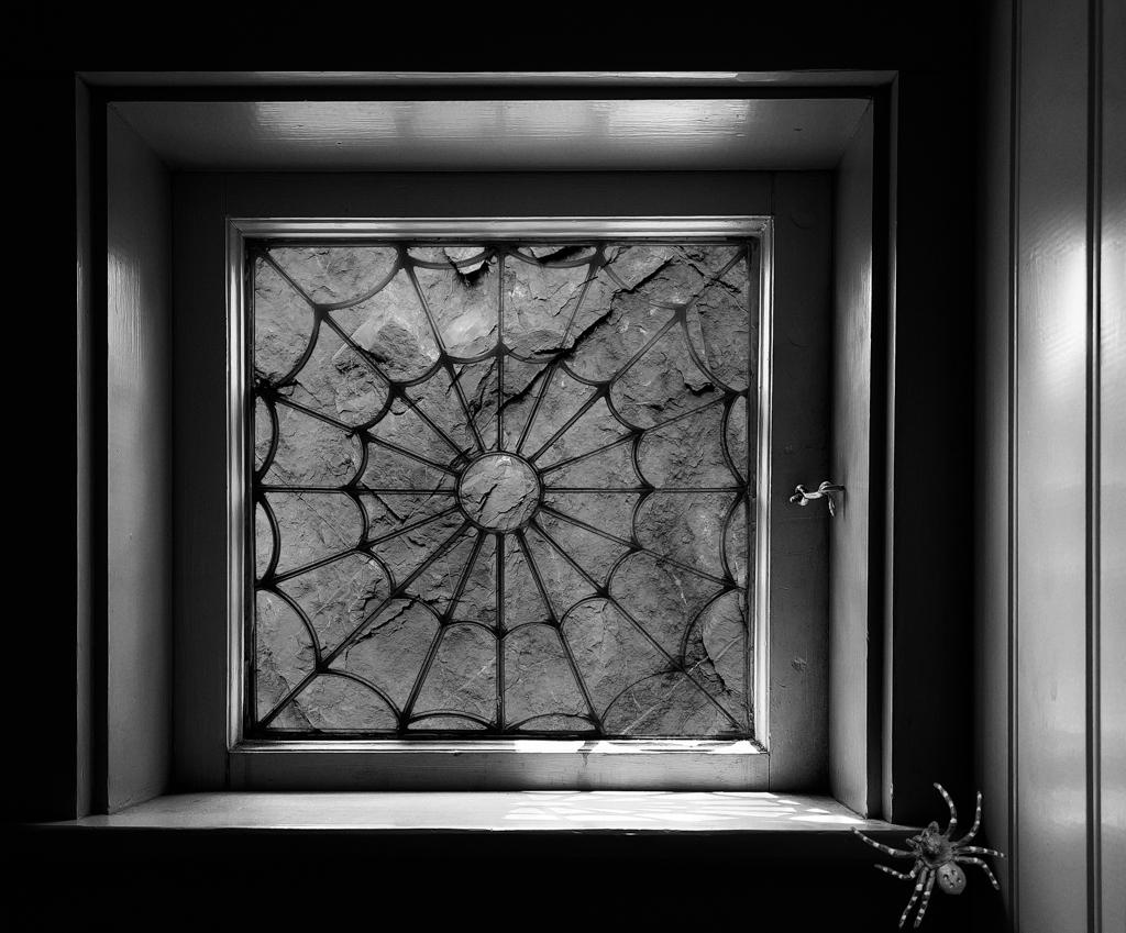
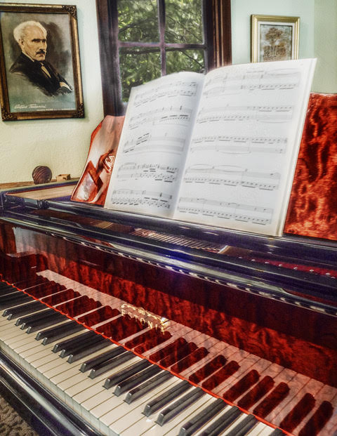
I love ceiling shots like this. It is a gorgeous dome. The noise reduction worked well. You did a great job framing the shot. Nicely done! |
Jan 24th |
| 16 |
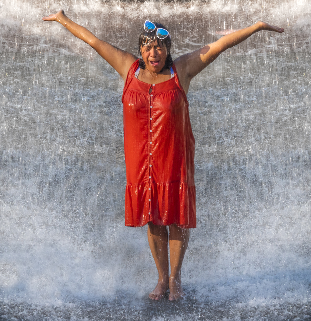
Jan 20 |
Comment |
I like what you did with the image. I was in Spokane for PSA, and your processing makes the scene look brighter and warmer than it was! Nice job. I agree about the falls being overexposed. |
Jan 24th |
| 16 |
Jan 20 |
Reply |
Hi Joan, I agree about the whites. I'm out of town now and away from my photo workstation. When I return, I have a few ideas on how to expand the tonal range using curves. If that doesn't get me what I want, I will try using layers and "bleeding" some white through. I'll post the results and see what you think. |
Jan 9th |
6 comments - 4 replies for Group 16
|
| 77 |
Jan 20 |
Comment |
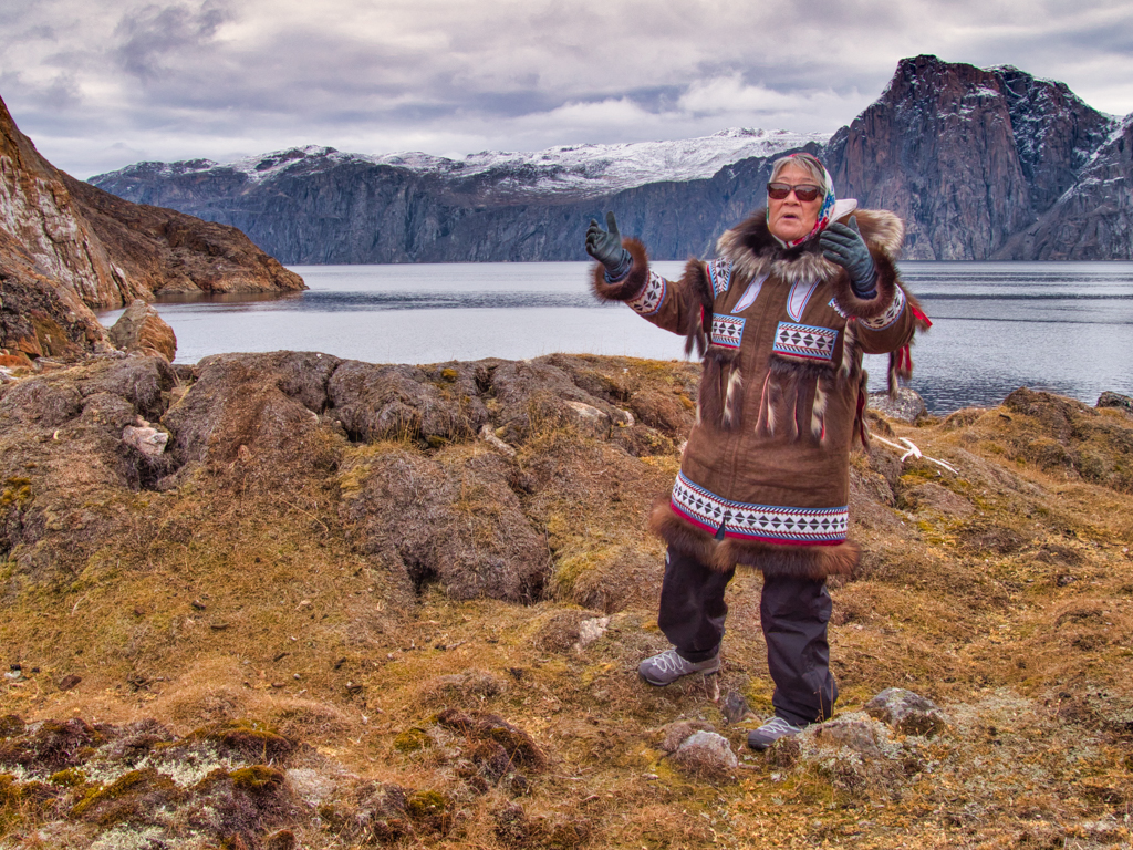
This is a special image that, to me, conveys the patience of waiting. What is she waiting for? What is she thinking? Images like this make me want to invent a story, which is why I like this image so much.
The lighting is great as the tones you chose for the image. Great job! |
Jan 24th |
| 77 |
Jan 20 |
Reply |
Hi Karen, That's the "shabby chic" look that is so popular in California. I love it! |
Jan 24th |
| 77 |
Jan 20 |
Reply |
Thanks Georgianne. I enjoy hearing other people's perspectives. Perhaps I'll go back and reconsider the original. |
Jan 24th |
| 77 |
Jan 20 |
Comment |
What a great idea to use flour to get this effect. I love it! The projection of the face on the wall adds to the interest and mood of the image. Is there a spirit coming out of the book? There is a mystery there that makes me want to conjure up a story! Nicely done. I wouldn't change anything. |
Jan 24th |
| 77 |
Jan 20 |
Comment |
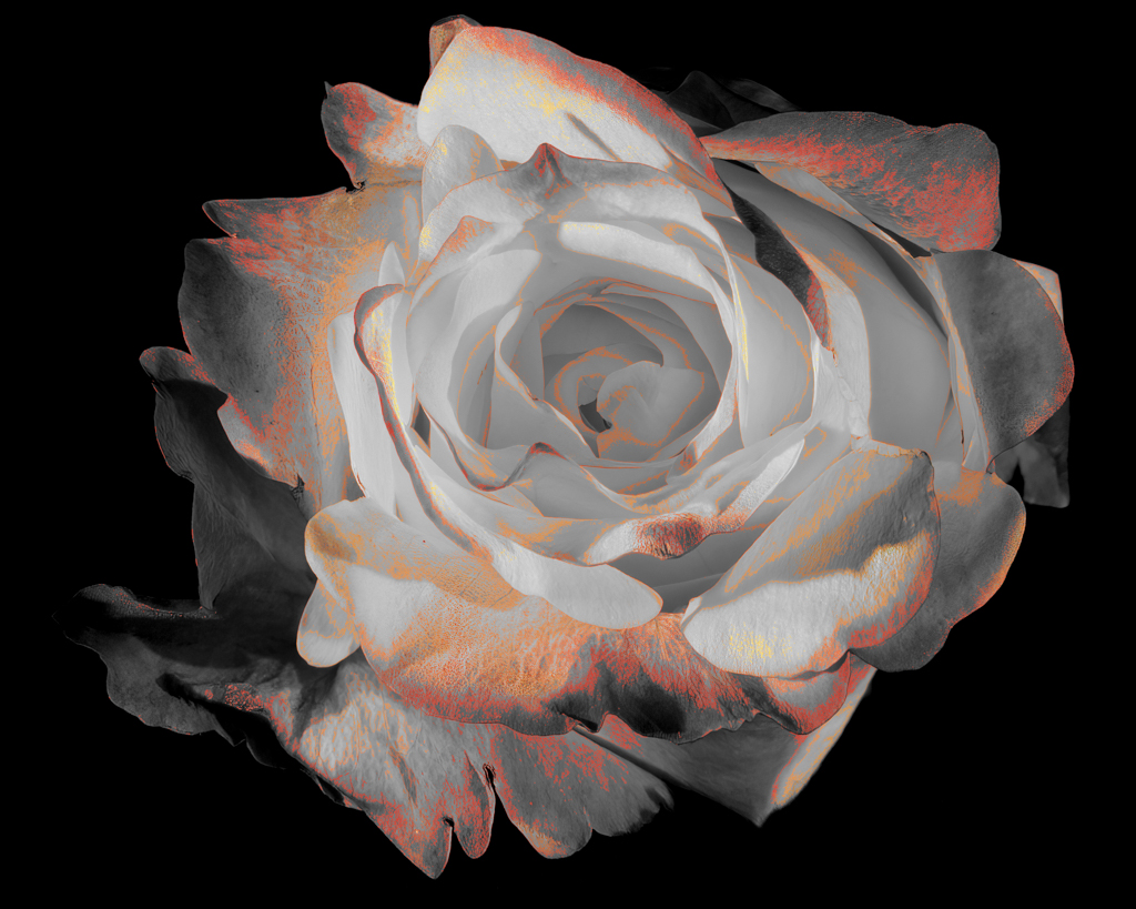
The monochrome treatment works well on this image. The walkway and the distant trees in the original image add interest. For me, the distant trees make the foreground tree look larger and more lonely. The oil painting filter makes the tree look feathered rather than finely branched. I prefer the original branch look.
Regarding what makes something "painterly" and "fine art" is interesting. Perhaps we need to start up our discussion group again. To me, painterly is not necessarily applying a paint effect. Many people make "painterly" images in camera. For example, see:
Impressionistic Photograpy: A Field Guide to Using Your Camera as a Paintbrush by Charles Needles
http://impressionisticphotographybook.com
|
Jan 24th |
| 77 |
Jan 20 |
Comment |
What an idyllic scene! I like the how the line of the trees complements the line of the fallen leaves. Your adjustments to color and the added sky make the image pop. Nice job!
I could imagine hanging this on my wall. |
Jan 24th |
| 77 |
Jan 20 |
Reply |
Hi Witta, I used the oil paint filter on two images in the past, but for me, it's a very specific filter that I rarely use. In this case, I did not want an oil paint effect.
I have been taking a Photoshop course on the web. One of the lessons was on blend modes. The teacher encouraged us to explore what they do. My aim with this photo was to bring out something in the rose that wasn't immediately evident. In this case, the whiteness, or the Inner Light.
I am pleased with the effect. However, I always enjoy hearing what other people perceive. I appreciate hearing your reaction and suggestion. Thank you!
I plan to make of large print of this and am enjoying testing various papers to see which ones give the best tonal range and maintain the crisp edges of the rose. Do you have any favorite papers? When I return home, I should have test images for Fuji Pearl and a metallic paper. But I am always looking for suggestions.
PS I am on a trip right now, which is why I have been slow to respond. In a few days, I'll be out of Internet contact for a week or so. |
Jan 9th |
4 comments - 3 replies for Group 77
|
10 comments - 7 replies Total
|