|
| Group |
Round |
C/R |
Comment |
Date |
Image |
| 16 |
Oct 19 |
Comment |
Nice composition. I love the lines in this image-the horizontal bridges, the vertical tower, and the diagonal steps all add interest for me. In my opinion, the vibrancy of the colors, especially the complementary orange and blue, are quite pleasing. This image has a wonderful warmth to it that I did not feel when I was in Spokane. The two evenings I went outside the convention were cold and rainy! |
Oct 20th |
| 16 |
Oct 19 |
Comment |
When looking at this image, I realize that is it comforting for me to see fighter jets flying slightly upwards. I appreciate that you made this change from the original. Removing the cloud helps me to focus on the main subject and their contrails. Nice job lighting the jets. Overall, a very pleasing image to my eye. |
Oct 20th |
| 16 |
Oct 19 |
Comment |
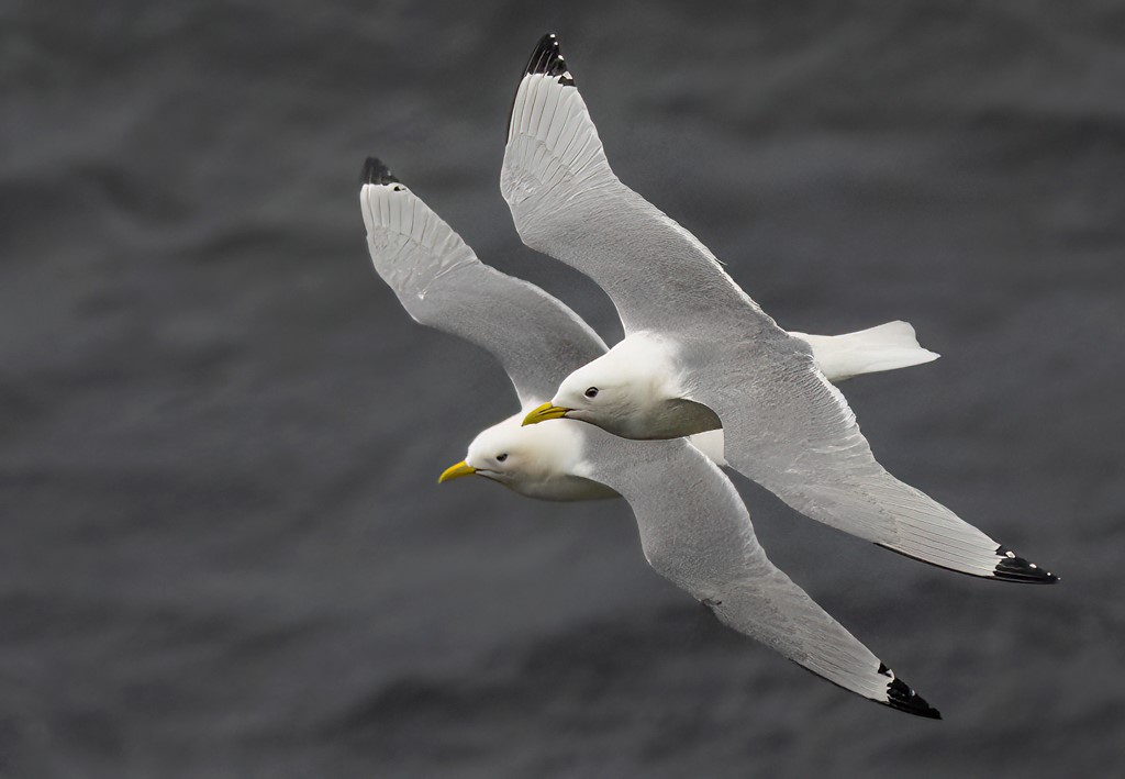
When I look at this image, I get a sense of motion, speed, and intense concentration. To my eye, the line on the water is interesting in the way it demarcates the bird from its reflection. The post processing brought out detail in the head, wings, and reflection that I would not otherwise have appreciated. Good choice on the crop and straightening the horizon. Nicely done! |
Oct 19th |
| 16 |
Oct 19 |
Comment |
That look likes a lupine, although in my area it would be unusual to see a single one stand out like this. There are typically fields of them.
To my eye, the color in the orignal flower is better. That might be because I've seen so many lupines that the purple in the modifed file seems, to me, too artificial. I really like that you worked to defocus the grass. Grass is such a busy background. In my opinion, the grass is still a bit distacting, but perhaps of the vibrant green. You might try desaturating it a bit. |
Oct 19th |
| 16 |
Oct 19 |
Comment |
What a great job capturing the swan family and "friend. "In my opinion, the right and left spaces are just right. You might consider a widescreen crop to eliminate a bit of the top and bottom space. (I do a lot of work in video, so 16:9 always looks good to me.) To my eye, thet swans are just a bit too green and their heads a bit too shadowed. |
Oct 19th |
| 16 |
Oct 19 |
Comment |
I love this image! The adjustments you made to the background help the iguana to stand out. The detail in the eye and skin is stunning. Really nice job. |
Oct 19th |
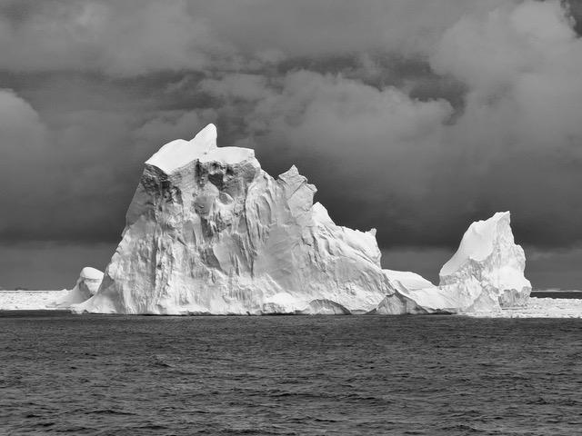
| 16 |
Oct 19 |
Reply |
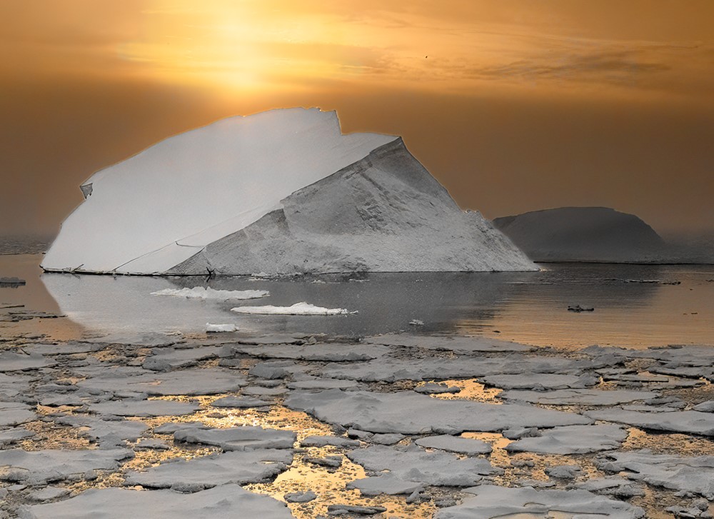
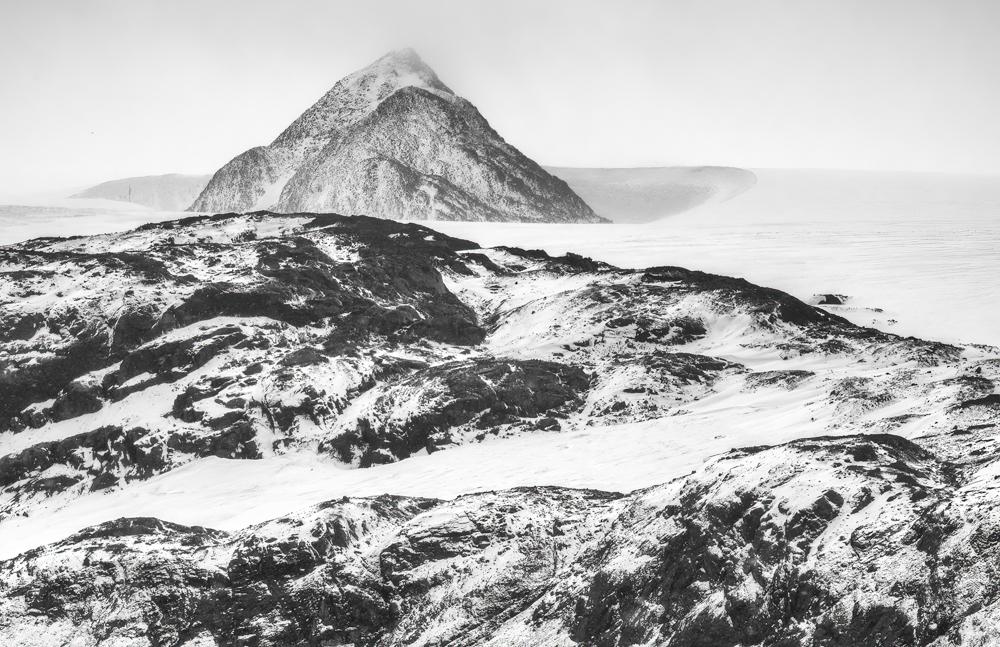
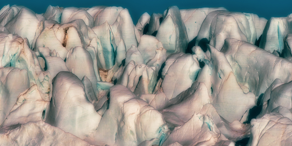
I had considered keeping the original aspect, but thought I'd experiment with highlighting the reflections. I am happy to go back to the original but I would keep the ice berg, as ice bergs are defining features of Greenland. That would also allow me to consider this a travel photo, which it is. |
Oct 12th |
6 comments - 1 reply for Group 16
|
| 77 |
Oct 19 |
Comment |
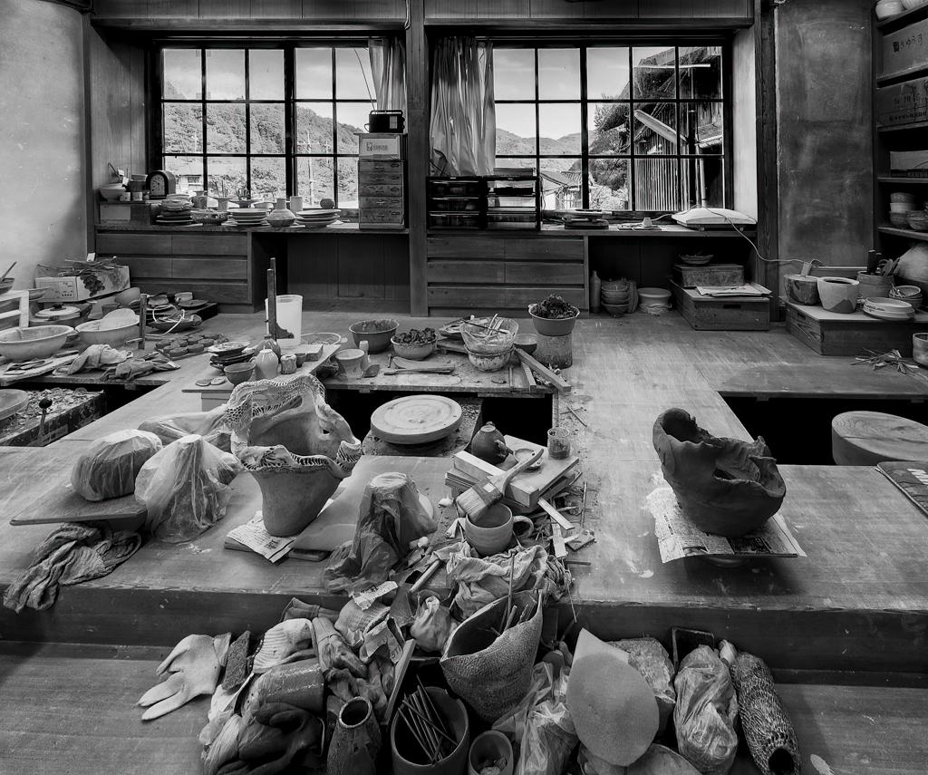
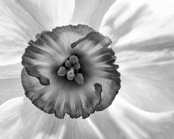
When I look at this image, I can definitely see the "nestlings"-so many mouths to feed! I like how you used the soft parts of the original flower image to your advantage. My eyes can't help but to be drawn to the sharp nestlings in the center. The texture you applied not only helps the flower to pop, but adds a great deal of interest and artistry.
For me, I would appreciate just a bit more texture in the upper right, or perhaps crop the right just a bit to reduce the large blaxk area.
Thank you for explaining exactly what you did. I don't use Photoshop, but now you've got me interested! |
Oct 20th |
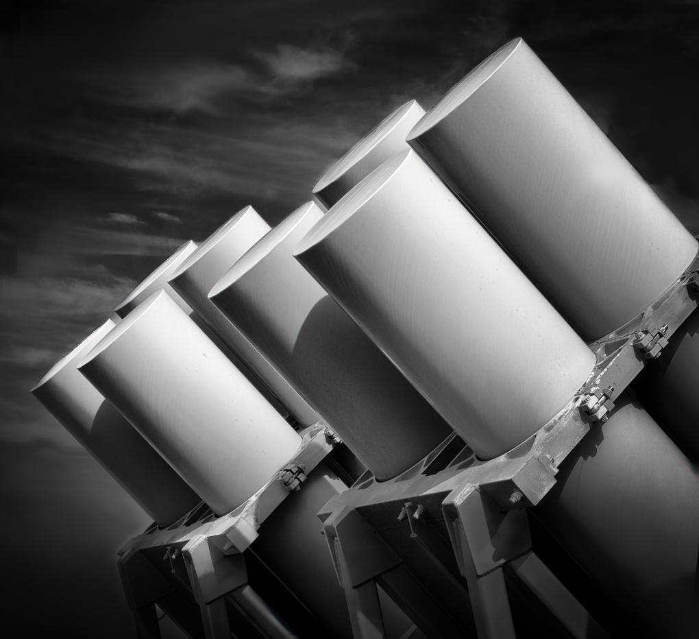
| 77 |
Oct 19 |
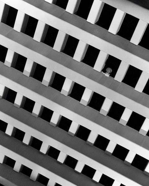
Comment |
I am impressed that you captured an image of something that most people (me included) would have walked by. To me, the bold lines aroud the lamp shades bring out the geometry and is what draws my interest. I also enjoy the soft background, which I think serves as a good back drop.
To my eye, the lampshade in the center of the photo is a bit skewed and might support the geometry of the image if it were straight. |
Oct 20th |
| 77 |
Oct 19 |
Comment |
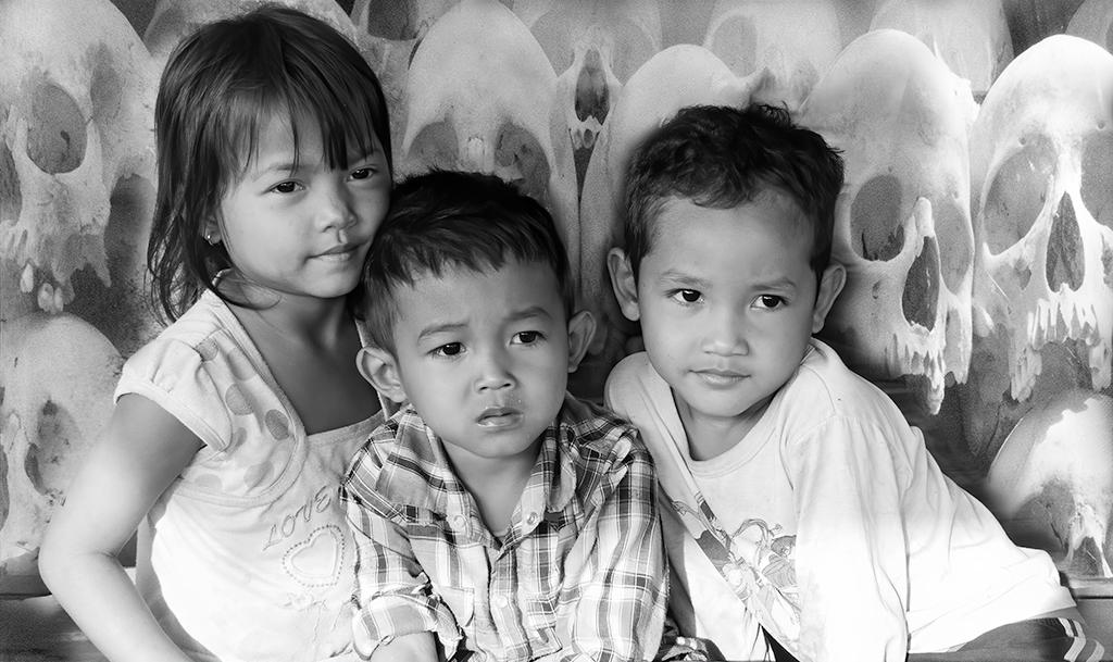
When I first look at this image, I start to image the story behind "Beware��" The light pattern on the left suggests to me that they might be caught in a basement! What lurks there?
This image, for me, works well as a monochrome. There is a good tonal range with most of the brighter areas on the girls, which draws my attention to them. It's almost as if there is a spotlight on them.
I think it's good that they did not look up at you. This pose makes a far better story as there are all sorts of scenarios I can imagine! I really like the way you stretched them as well as brought out the silky sheen of their hair. Nice job! |
Oct 20th |
| 77 |
Oct 19 |
Comment |
When I first look at the image, I am drawn to the eyes. I'm glad to see you left the "skin imperfections" in, as being of Irish ancestry, I consider freckles to be part of a person's personality, and thus, part of the story. For me, the vignetting and purple background support the secrets and lies theme. I really had to look for the stray hairs. They are not distracting to me. I agree they go with the theme.
I wondered whether including the tatoo would contribute to the theme, so thank you for letting us know that you considered it. Perhaps something that includes tatoos on the next image session would be interesting?
Overall, very nice image. |
Oct 20th |
| 77 |
Oct 19 |
Comment |
I really like the way you captured the light in the image. The thing that impresses me about this image are the lines-the diagonal light and the horizontal patterns in the background. For me, these lines are quite pleasing. To my eye, the model's head could be more evenly illluminated. I would prefer to see some detail in her hair, as it gets lost in the shadows. I do like the pose and I applaud you for asking a stranger to stop for the picture. |
Oct 20th |
| 77 |
Oct 19 |
Comment |
When I look at this image, I see a girl who refuses to practice-Not One More Note! To my eye, your choice of monochrome puts the focus on Hayden. I'm not sure if you intentionally had her wear those pants, but that pattern works quite well in monocrhome and gives interesting texture to the image. For me, that pattern balances with her hair and works nicely. Her expression is wonderful. Great job! |
Oct 20th |
6 comments - 0 replies for Group 77
|
12 comments - 1 reply Total
|