|
| Group |
Round |
C/R |
Comment |
Date |
Image |
| 16 |
Aug 19 |
Comment |
I love Mohan's suggestion. It really makes that beautiful pose look terrific. |
Aug 17th |
| 16 |
Aug 19 |
Comment |
When I look at this image, I get a sense of heart-pounding action! I agree with Terry regarding the longer, narrower crop. The kayaker looks as if he is moving very fast and for me, I would like to see more space to the right for him to move into. To my eye, the skin tone looks a bit artificial. I am wondering if you can change that and lighten up his face so we can see his expression. |
Aug 14th |
| 16 |
Aug 19 |
Comment |
You captured a great pose. The soft focus of the birds has a painting-like quality that I actually find refreshing given that many photographers have a tendency to over sharpen. To my eye, the vegetation is very distracting. |
Aug 14th |
| 16 |
Aug 19 |
Comment |
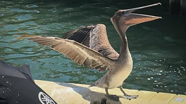
Kathleen, The pelican is such a beautiful bird. You managed to capture a great pose. To my eye, the removal of the clutter isn't effective because I can see artifacts from the cloning and removal processes. I think I would prefer to see the black bag on the dock over the removal artifacts. I don't use Photoshop, but some of our other experts might have some tips for making the removal look more natural.
You might consider using a 16:9 crop, which, with a little vignetting, would take care of the back dock. |
Aug 10th |
 |
| 16 |
Aug 19 |
Reply |
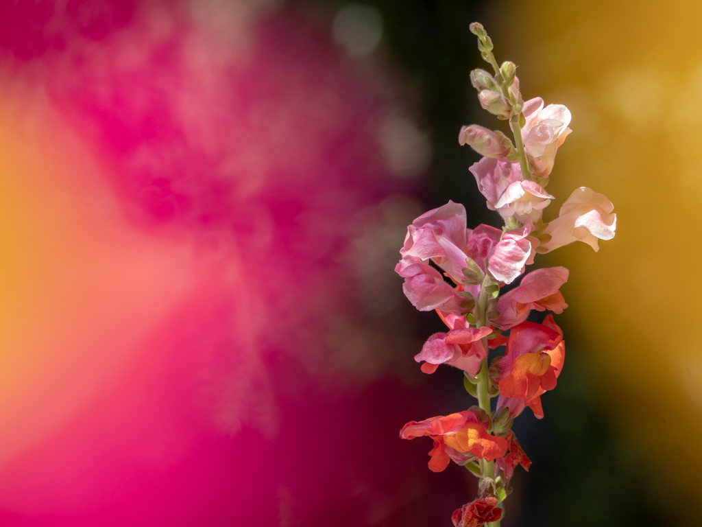
Bogdan, It was a good seminar. The background is dark green. The snapdragon was sitting several feet in front of a pine tree. I chose that because I thought it helped the snapdragon to "pop." But yes, it is possible to choose a different background. I have yet to experiment, but I do plan on it. |
Aug 6th |
| 16 |
Aug 19 |
Comment |
To me, this image says "No one will notice that I'm stepping out." And it is humorous! I thnk your cropping was successful in putting the attention on the dancing chicken while still showing the onlooker. Good composition that, I think, succeeds in telling a story. To my eye, the background seems good as it is.
I like your selective use of color. I am wondering if you can bring out the chicken's eyes any more? They are quite small, so I'm not sure if that's possible. |
Aug 1st |
| 16 |
Aug 19 |
Comment |
You certainly turned what, to me, was a rather dull image into an interesting one. I like the way the reeds curve to draw my eye to the kayaker. To my eye, cropping the image and increasing the vibrance makes the kayaker "pop" and become the main focus of the scene. I also think having the tree on the right helps to balance the image. Overall, it communicates to me a tranquil day on the water.
My only suggestion would be to consider a 16:9 aspect ratio. For me, that would help further to focus my attention on the kayaking activity. |
Aug 1st |
| 16 |
Aug 19 |
Comment |
When I look at this image, I immediately get a sense of drama-science fiction, eerie events, and of course, an invisible man. The ghostly appearance of the man makes me unsure of his intentions. To me, this image seems a good choice for a drama cover.
I like the way you distorted the original image (a bridge?) and your use of complementary colors. The layering is very effective as is your choice of font. The images you chose to create the invisible man seem, to me, to communicate the layered nature of this character. Although I can't discern those individual images, I certainly get a sense of there being more than meets the eye about this character.
Nicely done! |
Aug 1st |
7 comments - 1 reply for Group 16
|
7 comments - 1 reply Total
|