|
| Group |
Round |
C/R |
Comment |
Date |
Image |
| 5 |
Apr 19 |
Reply |
Thank you Richard... I will look at that detail extractor in the Nik collection and i guess, like you, I need a collection of skies/clouds... thanks you for the idea |
Apr 17th |
| 5 |
Apr 19 |
Reply |
Hi Guy Thank you for taking the time to comment, I really appreciate that. I realise that my image may not be the most exciting but I guess it depicts natural history and they are only exciting when they are killing/eating something else :) |
Apr 17th |
| 5 |
Apr 19 |
Comment |
Hi Nick
On my screen the image is very noisy, have you tried reducing the noise in LR or other similar software?
I like the way the swallowtails wings point to the corners of the frame and the detail on the wings is lovely. I find the b/g distracting you could just reduce the contrast in the b/g i think that will help it greatly
The colours of the flower is very vibrant which is offset by the muted tones of the butterfly |
Apr 10th |
| 5 |
Apr 19 |
Reply |
Thank you Mike for taking the time to comment. Personally I have never been a fan of rules, and i am not sure which rules this may/may not have broken... not that it matters in any way...I am just glad you like it :) |
Apr 8th |
| 5 |
Apr 19 |
Reply |
I am a very much an edit in LR kind of girl... I do dabble in PS a little, but only for major cloning work... I am still trying to get my head around layers and masks |
Apr 6th |
| 5 |
Apr 19 |
Reply |
Thank you :) I wish my PP skills were up to adding a different sky or clouds |
Apr 6th |
| 5 |
Apr 19 |
Reply |
Thank you....I will look at that line that you mentioned in the RAW file, it may have something to do with the editing, I am not sure |
Apr 6th |
| 5 |
Apr 19 |
Comment |
I love the portrait and I am sure that the sitter/model would also enjoy this image of themselves. I like the way her hair blows out behind her
One very minor issue for me are the highlights on her forehead, nose and cheek nearest us, I find them a tad distracting and may be tempted to tone those down.
As they are small areas a quick touch up with the heal/clone tool should work very nicely.
I |
Apr 3rd |
| 5 |
Apr 19 |
Comment |
A lovely moment in time that tells the story well.
For me, the image is in the expression of concentration on the tattooist face and the other man looking away. I wonder if even a tighter crop might work to really draw us into the faces of the two men.
I might be tempted to crop off all that is below the armpit of the man being tattooed
The mans bare chest is a large part of the image and is also the brightest part of the image. I find my eye is drawn to the tattoo on his chest rather than the tattoo artist at work
|
Apr 3rd |
| 5 |
Apr 19 |
Comment |
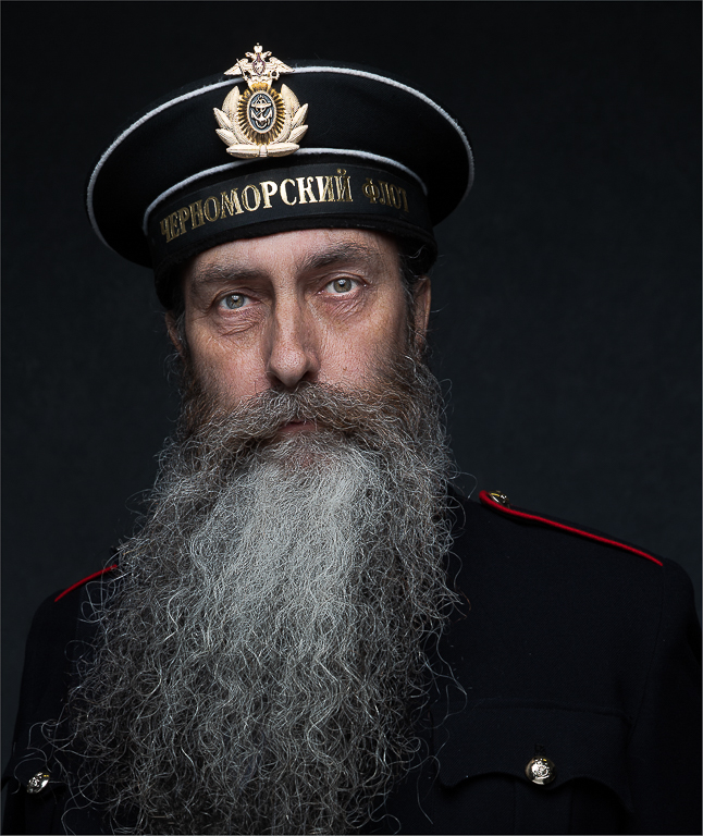
I rally enjoy the tight crop of this image. I feel I am are really being drawn into the frame and his eyes (window to the soul)
The colour tones work really well and compliment the image. His skin tone and detail has been well handled but I do find the beard is the dominate part of the image. If this could be toned down slightly (maybe even made a little darker) I would look at his face for longer and beard would be less noticeable and have a supporting rather than the star :)
|
Apr 3rd |
| 5 |
Apr 19 |
Comment |
This image has a very strong pull and feel about it. I am totally drawn into the mans face and eye and left wondering about his "story"
I do find the darkening tinge a little distracting. I wonder if a dark grey or black would work/fit better
I also would be tempted to crop the image at the window frame to the right of the visible eye. The area beyond the frame is quite light and is distracting. We know what it is because we can see the original image (Jacket?) but I wonder if a tighter crop would draw you in even further |
Apr 3rd |
5 comments - 6 replies for Group 5
|
5 comments - 6 replies Total
|