|
| Group |
Round |
C/R |
Comment |
Date |
Image |
| 47 |
Oct 20 |
Comment |
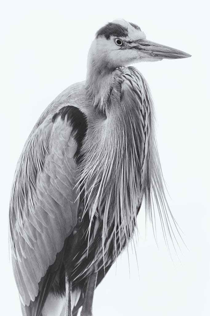
Jen, Very nice portrait of this intense owl and I can appreciate all the detail that you were able to show. I like the composition that places the eyes off center and how the body gives a triangular structure to the image. Toning, vignette and framing work very well together to create a very pleasing image of this wise owl. Wonderful job in my opinion, thanks for sharing. |
Oct 12th |
| 47 |
Oct 20 |
Comment |
Albert, I recognized this instantly even though I was in Berlin over a decade ago which attests to the emotional power of this site. I see what you were after regards the repeating patterns. For me, having a person in the image would give some emotional impact which is absent in your image except for the title. |
Oct 12th |
| 47 |
Oct 20 |
Comment |
Don, Nice portrait of this bear and I sense the bear is thinking about the safety of her cubs. The bear is nice and crisp and I can see good detail in the fur and can see the catch lights in its eyes. I would have preferred a wider aperture to throw more of the background branches out of focus thereby isolating the bear more but this still works as it shows the bear in it's environment. Good job, thanks for sharing. |
Oct 12th |
| 47 |
Oct 20 |
Comment |
Adrian, This works very well as street photography and I love that you captured this moment with each child in a moment by his or herself i.e. three individual moments. This is not easy and your patience paid off handsomely. Nice detail, good tonal range with shadows and highlights well exposed, clean background. As a bonus I think your color image works well too as the color palette is simple and complementary. Congratulations on a great shot! |
Oct 12th |
| 47 |
Oct 20 |
Comment |
Ed, Great composition with the surfer positioned slightly off center and with room for him to surf towards the lower left. I think the bright, white vignette works perfectly for this ocean view as it adds for me a feel of ocean mist. Good job bringing out the detail in the surfer's face as this adds additional interest to see his expression. Great job, thanks for sharing this surfing image. |
Oct 12th |
| 47 |
Oct 20 |
Comment |
Jack,
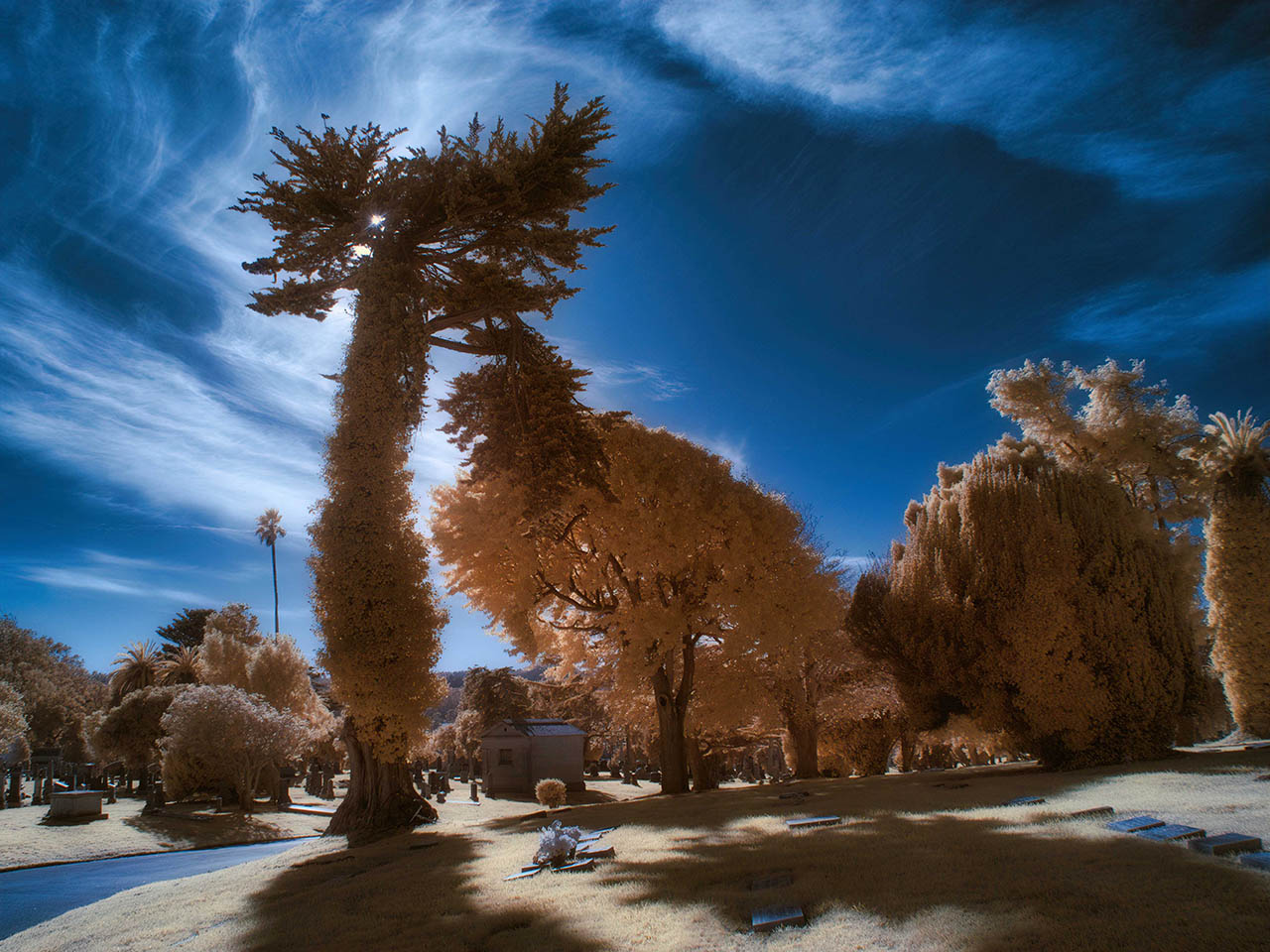
I agree that adding the moon provides a point of focus which helps this image greatly. Without it one is left only with the patterns in the rocks but I think there is not sufficient detail to appreciate the textures. For me your image creates an other planetary experience. Thanks for sharing.
|
Oct 12th |
6 comments - 0 replies for Group 47
|
| 66 |
Oct 20 |
Comment |
Yes, Gary, I think this is much better! |
Oct 6th |
| 66 |
Oct 20 |
Reply |
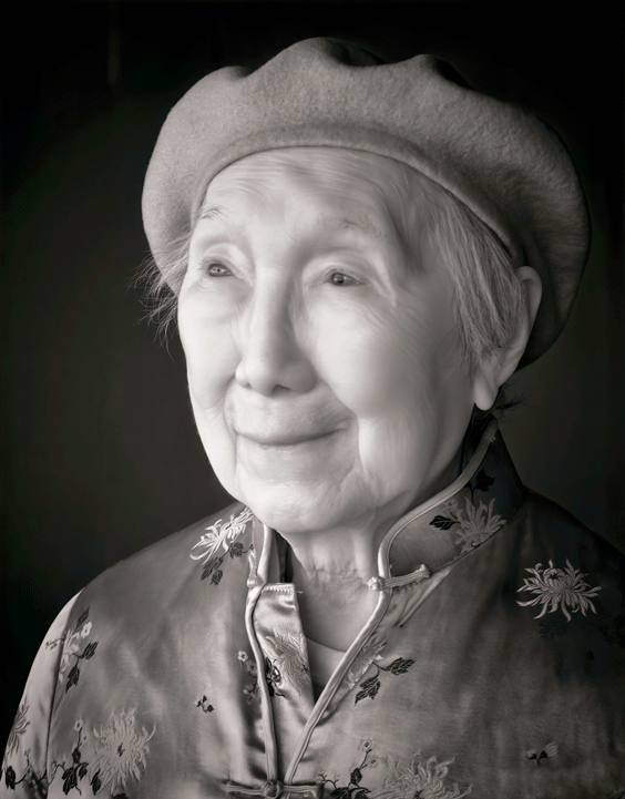
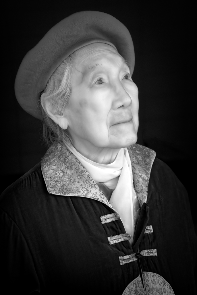
Thank-you Gary for your comments and it is interesting to see your reprocessed image (as you suggest, I will load a jpeg image next month). In your image, the scarf is the brightest area which I feel draws attention away from the face and darkening it to add more "grit" could work for a male subject, but I feel the brighter and smoother appearance is better for this older woman. |
Oct 5th |
| 66 |
Oct 20 |
Comment |
Melanie,
There is a lot of detail in the image and everything is acceptably sharp. I find the center of interest is where the man is standing but for me, this area is too small and too congested and I find my eye squinting as it I am in the sun. I wonder how this scene would feel if you were three tables closer to the action? Thanks for sharing this image.
|
Oct 5th |
| 66 |
Oct 20 |
Comment |
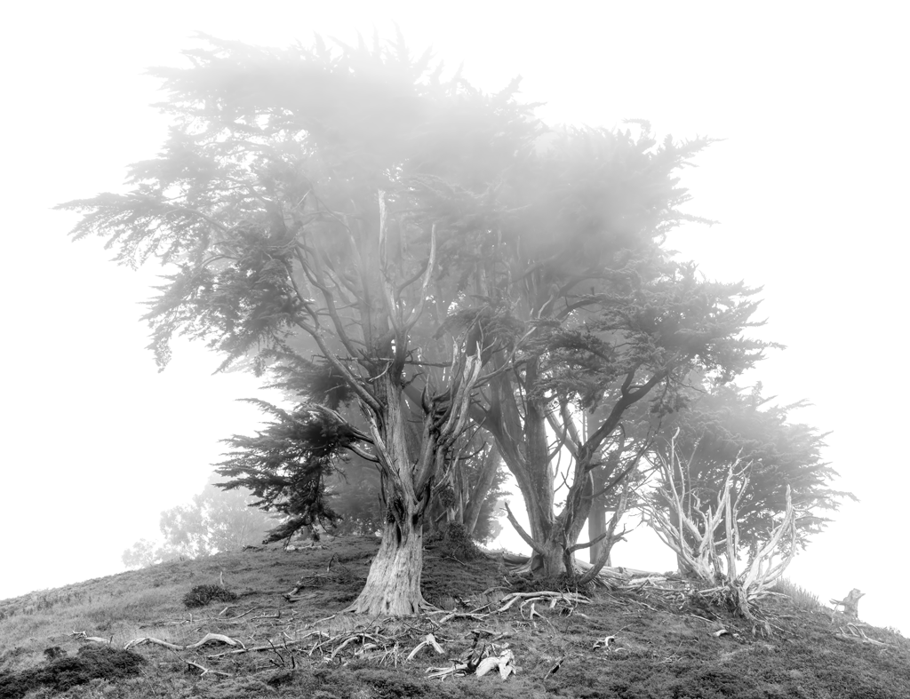
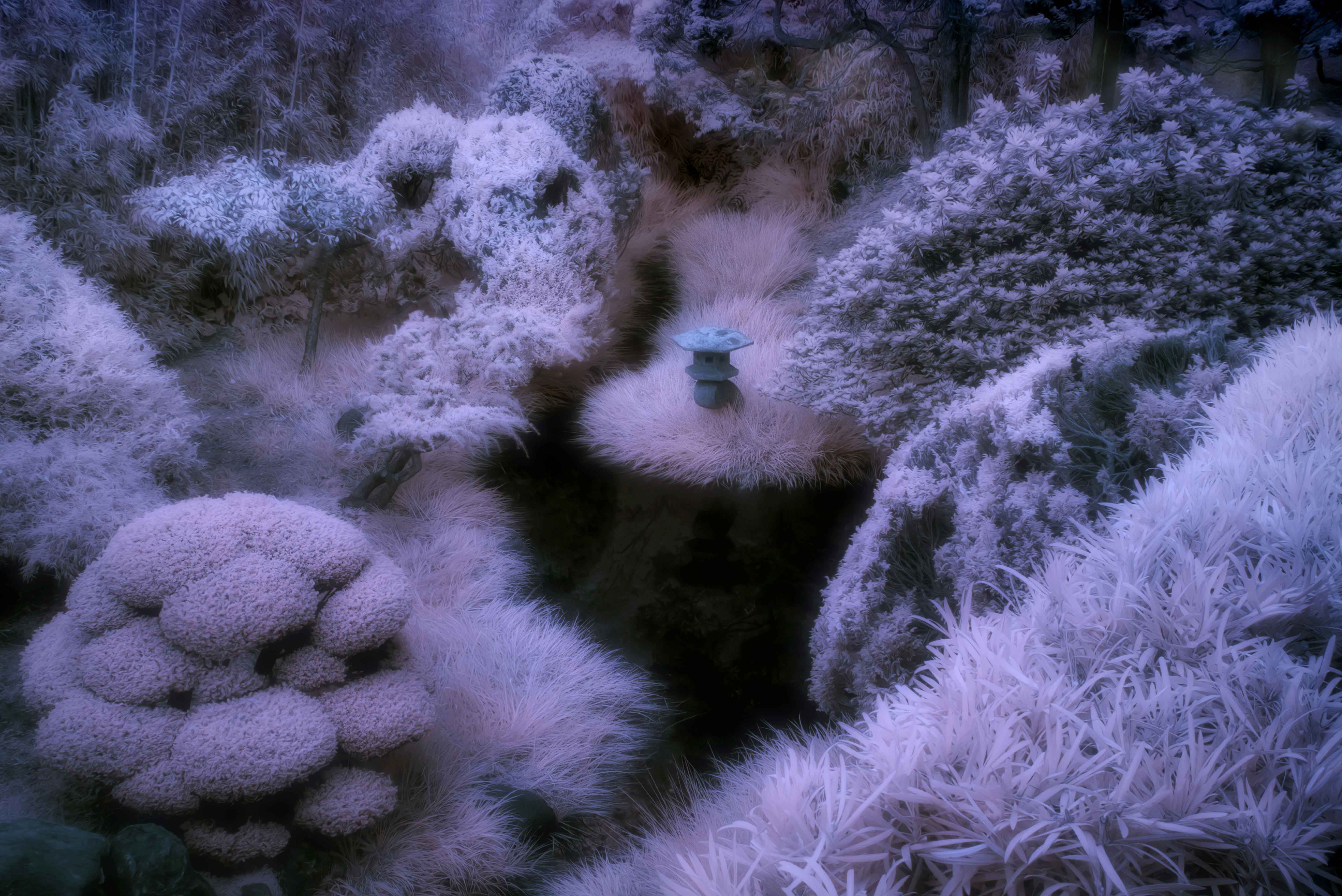
Jack, I like the dreamy feel this image gives me and the composition provided with the tree and limbs leads my eye around the image. The sepia toning works well in my opinion. Only critical comment is that I wish there was more room at the base of the tree to give it a stronger foundation rather than to have it be so close to the edge. |
Oct 5th |
| 66 |
Oct 20 |
Comment |
Charles,
I enjoy this tight crop and composition that uses both lines and colors to guide my eyes around the image. Your creative use of colors is what I most enjoy and thank-you for describing how you did it. Your image at first made me think of Georgia O'Keeffe although I can see how you were inspired by Edward Weston as well.
|
Oct 5th |
| 66 |
Oct 20 |
Comment |
Gary, Nice use of framing to emphasize the corn field and the sepia toning is a good choice for this subject that contains a lot of wood. The image is sharp and a lot of interest in the image. For me the overall image is a little dark and it is hard to see what is in the shadows, namely, the inside of the barn, and I would also like to suggest increasing the brightness of the corn field outside. Thanks for this interesting image. |
Oct 5th |
| 66 |
Oct 20 |
Comment |
Emil,
This intentional camera motion technique that you used was successful for me in that it turned an ordinary scene into something unique. For me what makes this work is that there is sufficient detail in the bark of the tree on the left so my eye has a spot to rest. Thanks for sharing this one.
|
Oct 5th |
| 66 |
Oct 20 |
Comment |
Palli,
I prefer your "V2" as the added brightness in the center adds some additional drama to this scene. I second Emil's recommendation for Topaz Denoise AI. It can work wonders for images that have noise in the sky yet not overly smooth the subject.
|
Oct 5th |
7 comments - 1 reply for Group 66
|
13 comments - 1 reply Total
|