|
| Group |
Round |
C/R |
Comment |
Date |
Image |
| 47 |
Sep 20 |
Comment |
Ed, I assumed the surfer was watching the pelican but I can agree that he may not have even noticed. Your use of the telephoto lens to put the subjects in close juxtaposition allows one to create a story as you suggested. I think this works well as it is very simple with only the three elements. My only suggestion would be to clone out the many highlights in the water as well as the writing on the surfer's back to remove these potential viewer distractions. Thanks for sharing. |
Sep 5th |
| 47 |
Sep 20 |
Comment |
Jen,
The panoramic format is a good choice and for me emphasizes the grandeur of this scene. The mountain tops partially obscured by the clouds also works well as it adds mood and a sense of scale. You mentioned the bush in the foreground: initially I did not notice it but now I think that because it is the darkest point and also there is more detail in the foreground it competes with the mountains. My suggestion would be, if possible, to increase the contrast and details in the mountain range. Thanks for sharing this image.
|
Sep 5th |
| 47 |
Sep 20 |
Comment |
Albert,
Its nice to see a 1812 privateer under full sail on the open ocean! For me there is too much brightness and detail in the waves and not enough detail in the boat. The lighting conditions appear to be challenging but I commend your attempt.
|
Sep 5th |
| 47 |
Sep 20 |
Comment |
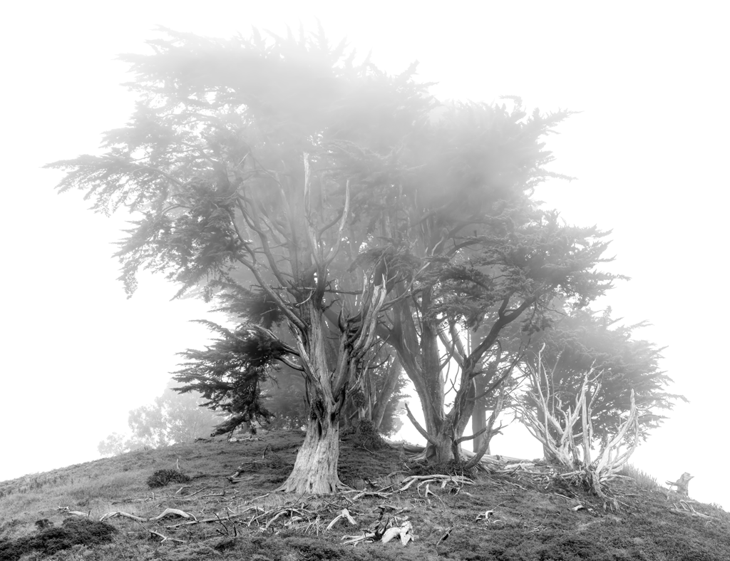
Don, For me the shape of the mountain reminds me of the Matterhorn and the clouds lend to a sense of majesty. On account of the reflections being so clear, it adds to my feeling that the water must have been very still. I think the frame works well. My only thought is whether it is better to have the snow-capped mountain reflections on the bottom of the image cropped or not? It is something that you might consider. Thanks for sharing this. |
Sep 5th |
| 47 |
Sep 20 |
Comment |
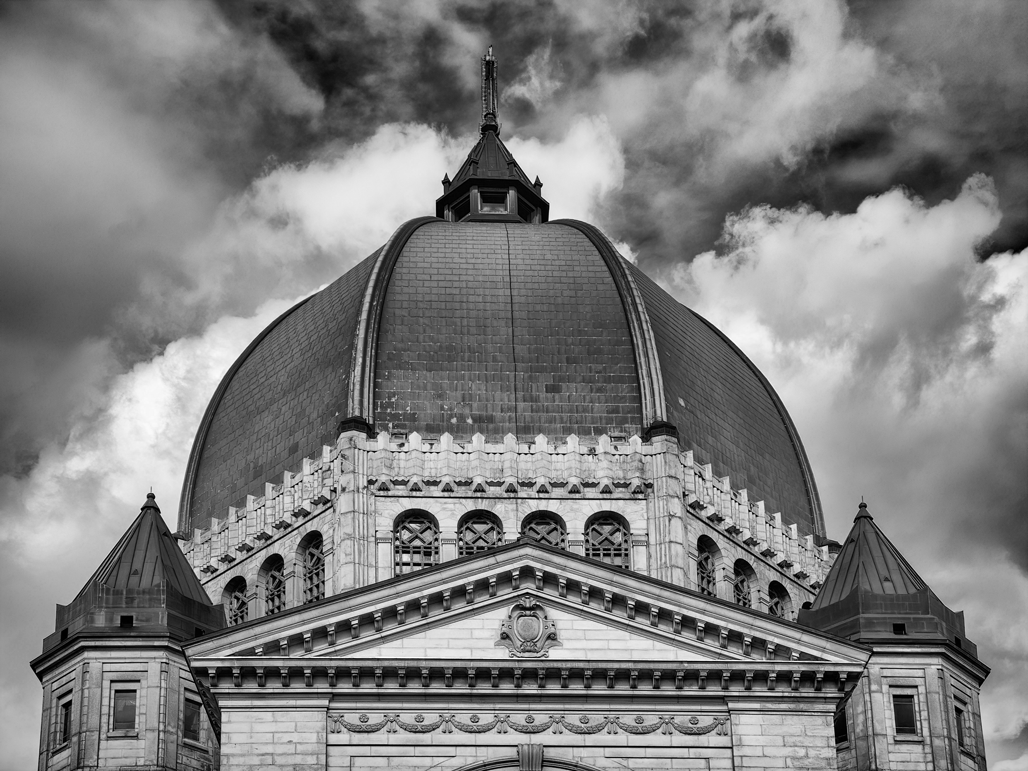
Adrian,
A very impactful image on account of the symmetry that you were able to capture. This works very well as a monochrome as it, for me, emphasizes the architecture. The detail is well brought out and the reflection in the font adds interest. I am impressed with your use of HDR and this has worked wonderfully in this image. Congratulations on taking advantage of the current situation to capture the grandeur of this cathedral without the distraction of tourists. Thank you for sharing how you created this image.
|
Sep 5th |
| 47 |
Sep 20 |
Comment |
Jack, For me this is too close for comfort: I have been having trouble breathing here in South City and can see why. The composition is good with the hill creating a strong diagonal. My suggestion would be, if possible, to increase the detail and contrast in the billowing smoke to make it more dramatic. Thanks for sharing and stay safe. |
Sep 5th |
6 comments - 0 replies for Group 47
|
| 66 |
Sep 20 |
Reply |
Thanks Gary for your suggestion and I think your crop works well too. |
Sep 7th |
| 66 |
Sep 20 |
Comment |
Melanie,
I think this is a very creative attempt to add a different mood to this image and for me it is successful. I often introduce selective colors like this too and the red house is a perfect subject. For me I would like to see a little more room to the left of the colored structures to provide a better balance: since the colors give the structures more visual weight, I feel that my eye is drawn more to the left side. If it was possible to make the foreground fir tree to stand out more that could help provide balance. Thanks for sharing this creative photo.
|
Sep 6th |
| 66 |
Sep 20 |
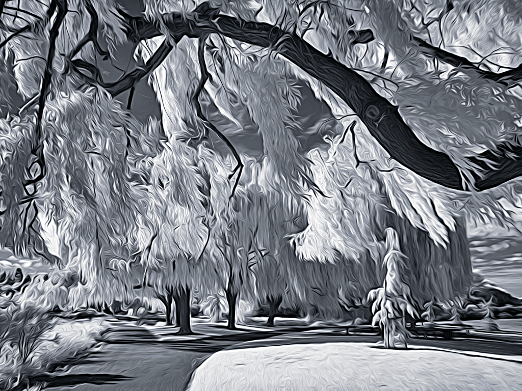
Comment |
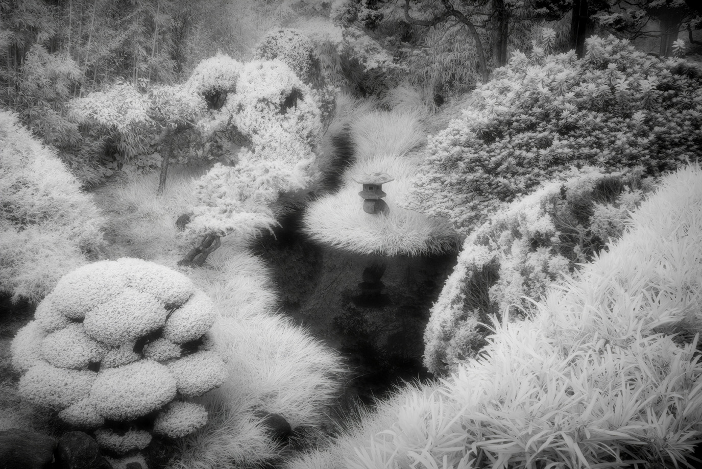
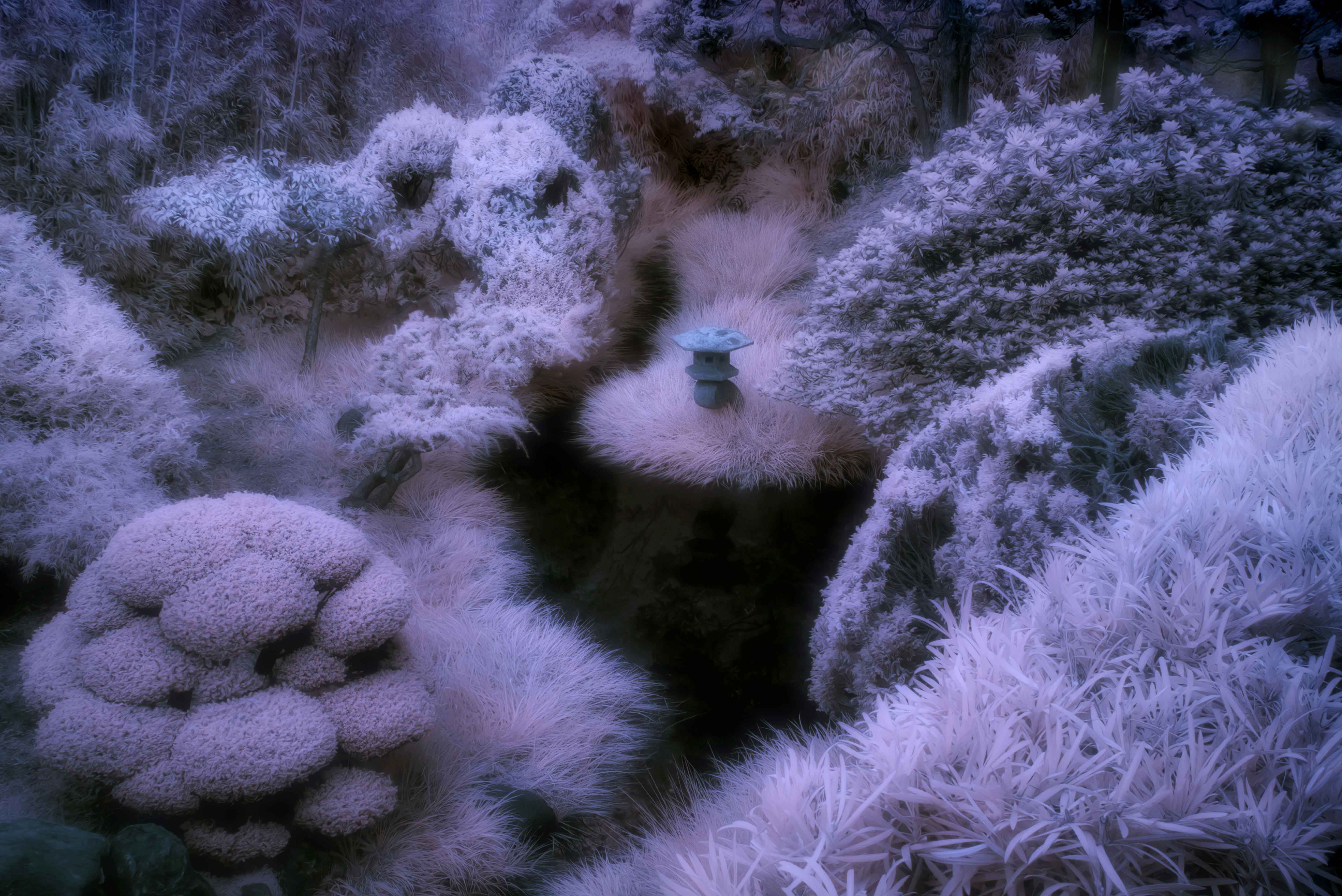
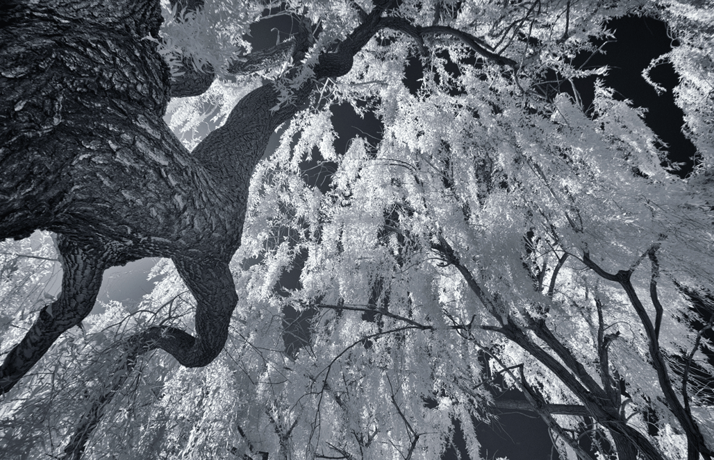
Jack, I can see a nice IR effect here due to the sense of glowing of the foliage. I like the detail in the path leading to the tree which also makes for a good composition and a clear focus on the tree. Your choice of cropping is a good choice as it isolates the main Oak tree. Everything works well in my opinion including the toning that you applied. Thanks for sharing this one. |
Sep 6th |
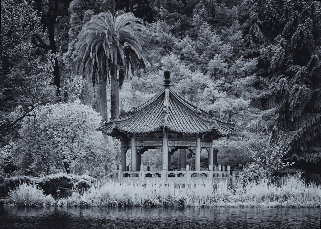
| 66 |
Sep 20 |
Comment |
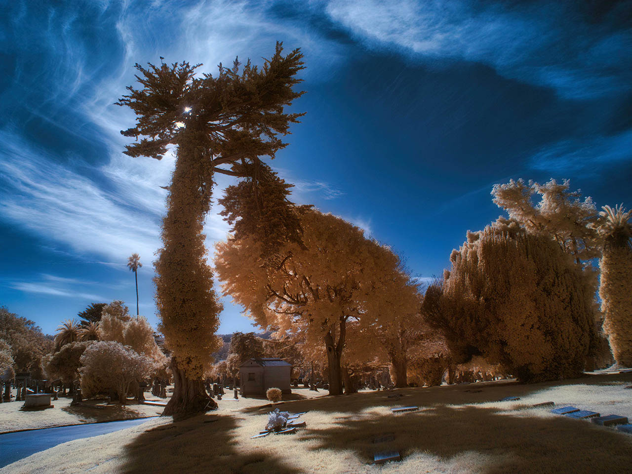
Charles, I do recognize this as a IR image based on similar images with this color scheme. Was it taken with a 635 nm filter? For me the most interesting aspect is the reflections of the clouds in the lake and to me this came across quite well. I notice that the horizon seems to drop off on the left which you may want to correct. Other than that, I feel this captures a pleasing scene. Thanks for sharing. |
Sep 6th |
| 66 |
Sep 20 |
Comment |
Gary, For me this is a good choice for an IR image and the toning works well for the rural scene. The detail is brought out well and the depth of field helps me to see the IR effect of the distant trees. You did a good job of cloning out the traffic. Thank you for describing how you created the stream which I did not think of as a stream when I first saw the image but imagined it was a plowed field. The only critical comment is that, except for the foreground buggy, the distant ones are overlapping. I image the angle was a challenge to separate them and retain the horse. Thanks for sharing this image. |
Sep 6th |
| 66 |
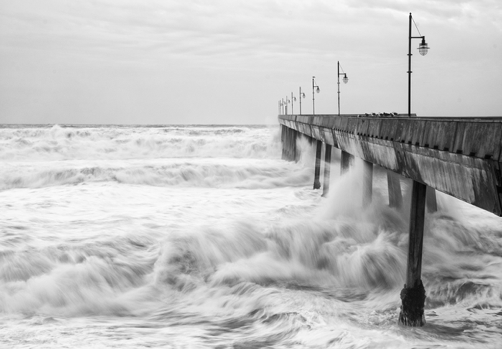
Sep 20 |
Comment |
Emil, The sky is an ideal subject for a long exposure but I have not tried it myself. You image will motivate me to try it soon. For me, the image seems to lack sufficient focus in the bridge and that is what I notice first. I think if the bridge was sharper, I would be able to appreciate better the long exposure of the moving clouds. Thanks for sharing. |
Sep 6th |
| 66 |
Sep 20 |
Comment |
Palli, for me this artistic filter works very well and is very effective especially adding interest to the foliage. The composition has the lizard coming out on a diagonal at the viewer and adds to my feel that the claw will grab me. The eye is well positioned in a power-point. The sepia tone works well too. Thanks for sharing it. |
Sep 3rd |
6 comments - 1 reply for Group 66
|
12 comments - 1 reply Total
|