|
| Group |
Round |
C/R |
Comment |
Date |
Image |
| 47 |
Aug 19 |
Reply |
Thanks Ed for your comments. This picture was inspired by Hila and Bernd Becher who photographed industrial architecture around Europe and North America starting in the 1960s. I saw some of their photographs here in the SFMOMA. I think these are more documentary than story telling. |
Aug 12th |
| 47 |
Aug 19 |
Reply |
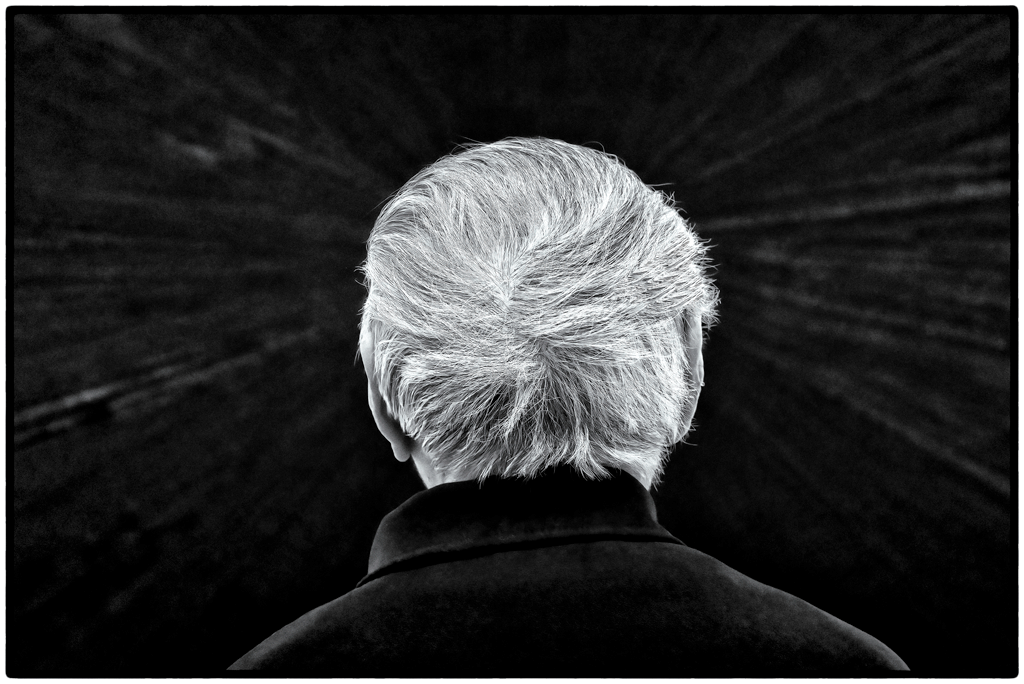
Thanks Adrian for your constructive suggestions. The only time I have used the flipping technique was for a completely abstract image. For me, in this image I don't feel this a major improvement so I would keep it as is. I also think the added tubing in the corner adds a little extra interest which is why I kept it. I find it very interesting how everyone has their opinions on cropping and flipping! |
Aug 12th |
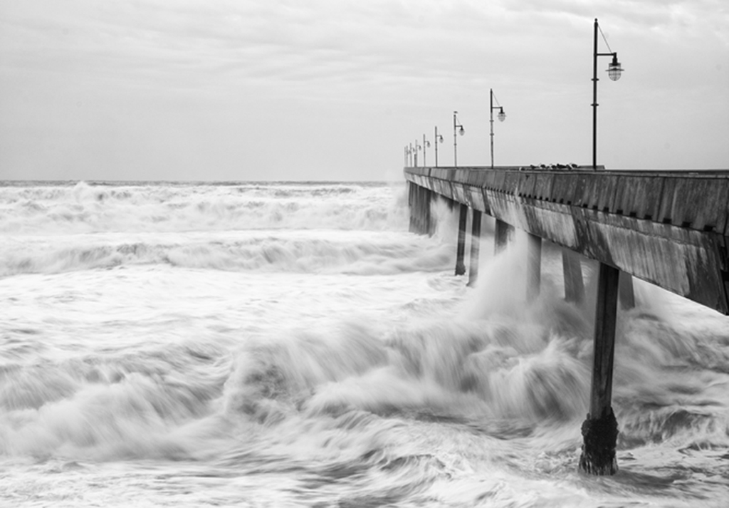
| 47 |
Aug 19 |
Comment |
Jen,
I am from Chicago so I know of this bridge but have never been so close as you got to it. It is a very interesting object and you were able to give a sense of the complexity of the weight system. There is a lot of detail which I find intriguing although it is hard for me to zero in on a particular spot as the image is equally bright. I am not sure but maybe adding a vignette would help to focus the viewer's attention more in the center of the image?
|
Aug 12th |
| 47 |
Aug 19 |
Comment |
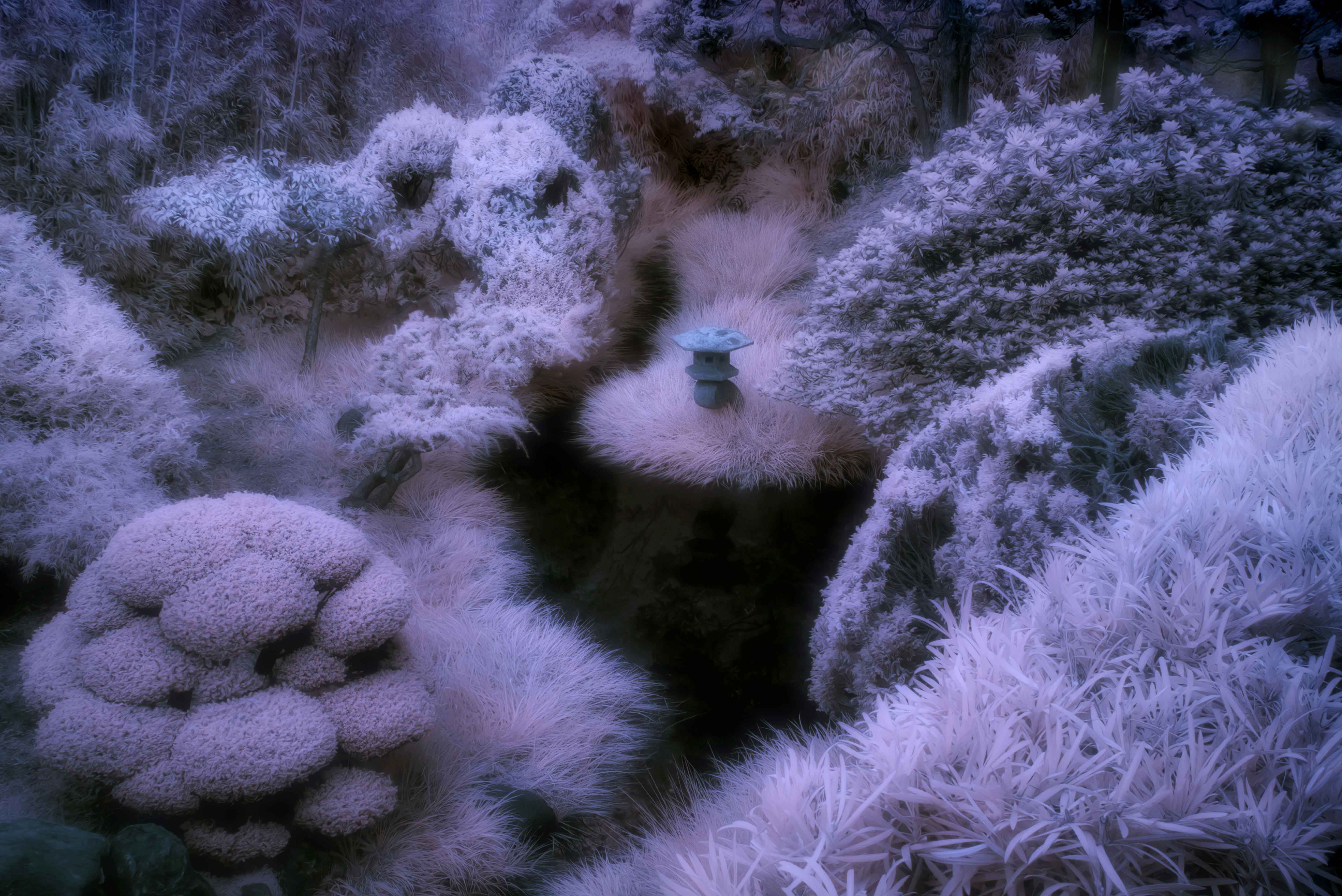
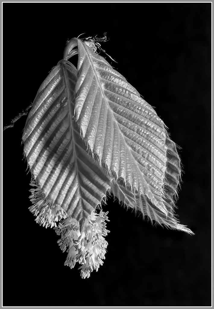
Don,
I really enjoy all the fine detail that you were able to capture in this beech bloom. I also get a feeling of depth due to the lighting that you employed. It is a very simple image but makes me appreciate all the beauty that is out there in the natural world. I think by making the background more black helps me to see the detail even better. Thanks for sharing this image.
|
Aug 12th |
 |
| 47 |
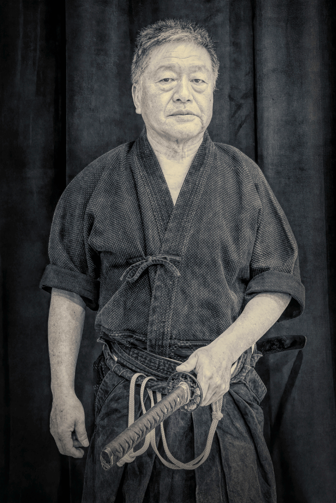
Aug 19 |
Comment |
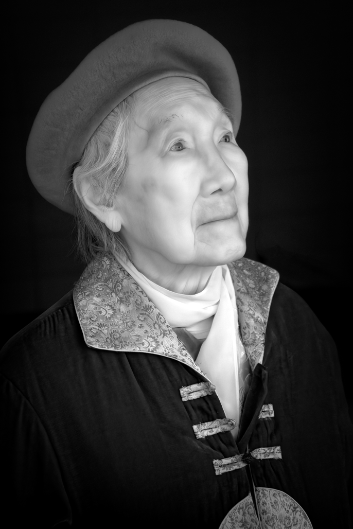
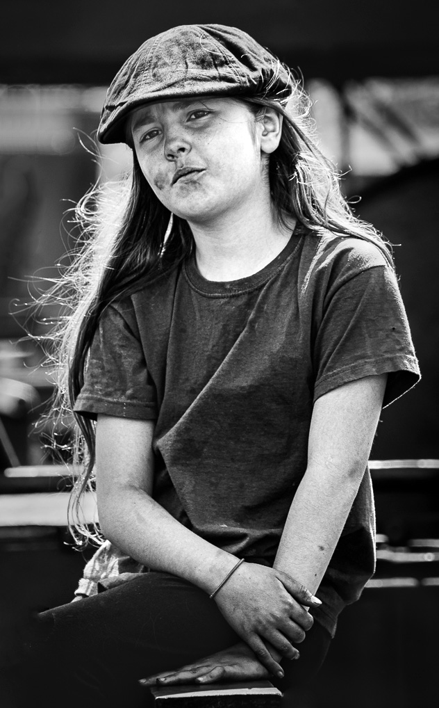
Adrian,
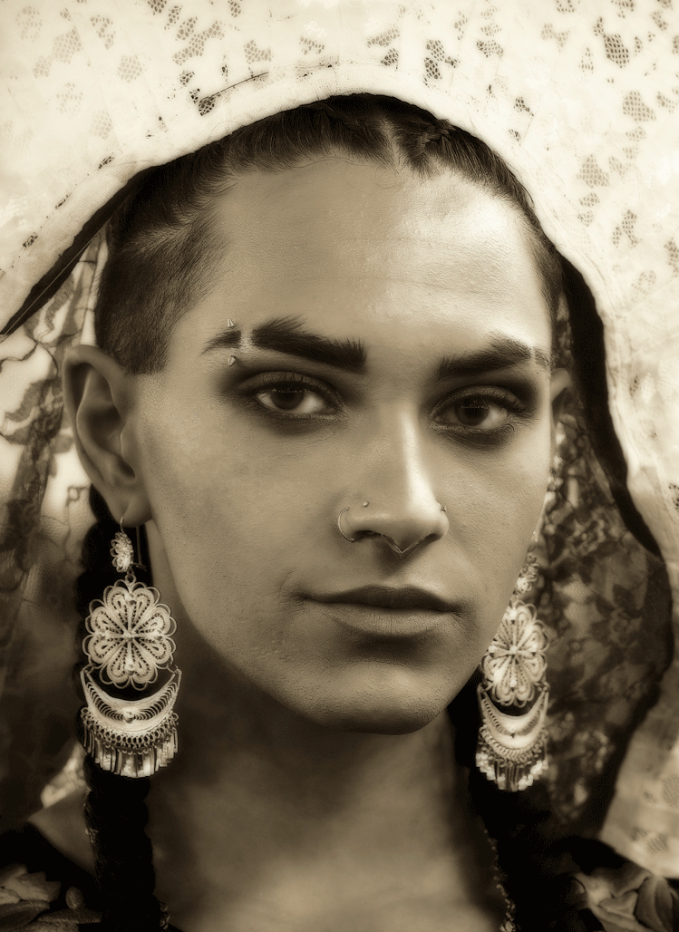
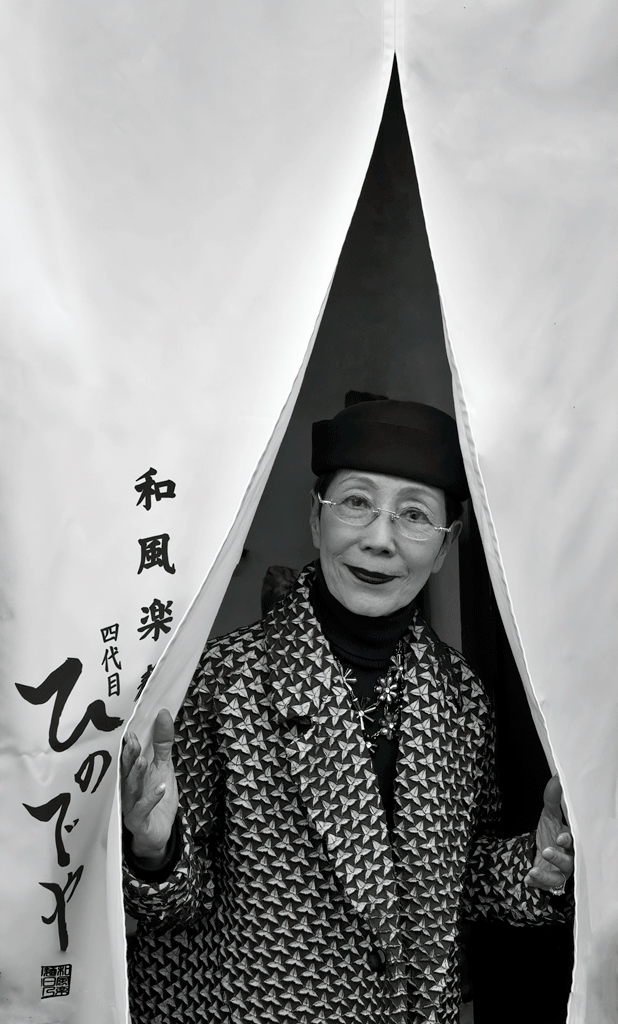
You caught an interesting moment of contemplation as I can see the trainee is wondering if this is the right career choice. I think her pose works well as her lower hand forms a base and allows my eyes to move around her in a circular fashion along her arms to her hands and back to her face. To me, some more contrast would help her stand out more and cropping on the left to remove as much distractions from the background. I would also consider removing the object by her knee. Thanks for sharing this image. And Welcome to the group!
|
Aug 12th |
 |
| 47 |
Aug 19 |
Comment |
Ed,
Definitely an impressive eagle and I think you chose a good angle to give three dimensionality to the image. I am wondering if a portrait orientation would have allowed you to include more of the pillar on which it is "perched"? For me I would have liked more contrast with a darker sky which I think would make the eagle stand out more. I have also been using Topaz denoise and find that it does an amazing job even at 3200 ISO so I am surprised that there is still noise in your image if it was taken at 400 ISO.
|
Aug 12th |
| 47 |
Aug 19 |
Comment |
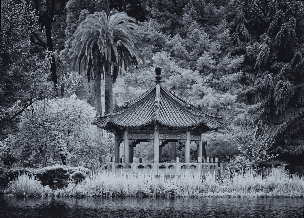
Jack,
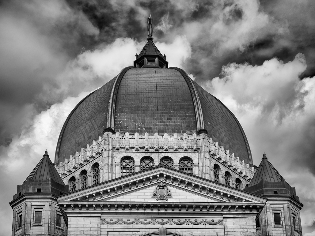
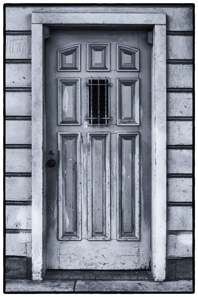
Great perspective and good choice for a monochrome as there is a wide range of tones from white to black and I also like the graphic nature of the image. I found my eye drawn very quickly to the top edge for one or all of the reasons: (1) seems to me rather bright (2) thinnest section of roof showing shingles compared to the other edges (3) not straight. In my opinion, if the top edge had more to show it would be a more balance composition and the "hodgepodge" of lines not being parallel would not be as much an issue. You may be able to simply clone more on the top edge.
|
Aug 12th |
| 47 |
Aug 19 |
Comment |
Albert,
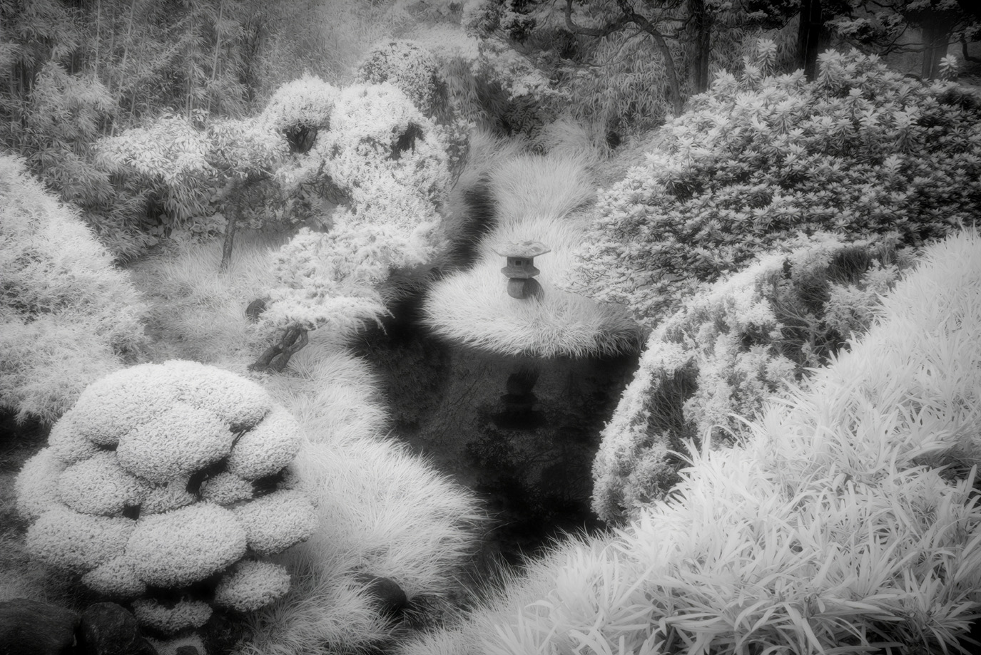
This is a good choice for a monochrome with a good range of tones from white to black. I like how the composition draws me into the large glacier and that I can see the textures of the snow and ice. I think by cropping out the left-most smaller mountain you might have a tighter composition and make the glacier more prominent. There are a few things that I see in the sky that are likely artifacts, or, reflections that could be easily removed.
|
Aug 12th |
6 comments - 2 replies for Group 47
|
6 comments - 2 replies Total
|