|
| Group |
Round |
C/R |
Comment |
Date |
Image |
| 78 |
Oct 25 |
Comment |
Technically, this is a diffucult shot and subject. If you make the foreground brighter, you are in danger of making it feel unreal, somewhat like one of the images we had one or two months ago. Instead of making the foreground brighter, what about going in the other direction and darker? I tried it, and I liked the result.
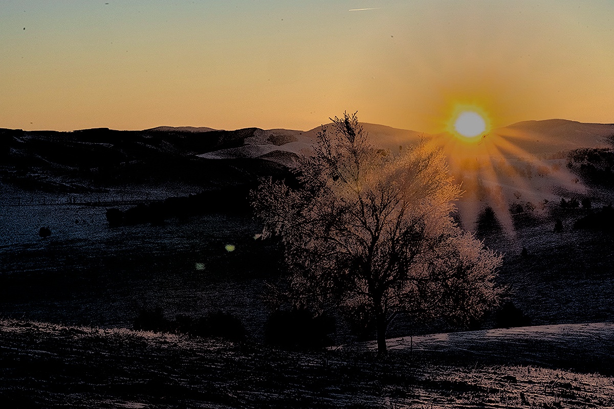
Near the center of your image are three ghost flares from internal reflections in your camera that could be removed. |
Oct 23rd |
 |
| 78 |
Oct 25 |
Reply |
I also agree with Ed and Jean, as to me, the point of most photographs (at least used to be) to capture an instant of time (and to me to represent the scene as I saw it in my mind's eye). Now with purchasing images of sky and putting them in your own images, expanding borders, and making A.I. improvements, the whole point of photography seems to be disappearing. How long until we have "images" for competition that have been generated without even the use of a camera? |
Oct 21st |
| 78 |
Oct 25 |
Reply |
Thank you. I had a hard time deciding whether to use the entire original image that includes part of the vase or exclude the vase and opt for a more simple image. I suspect that if I were including the vase, I'd reverse the image left-right. |
Oct 21st |
| 78 |
Oct 25 |
Comment |
Were the rows of shingles on the roof really inclined like that rather than parallel to the roof lines and gutters, as is normal in roofinng? |
Oct 21st |
| 78 |
Oct 25 |
Comment |
Would you at least consider making the sides of the spire have the same brightness as the corresponding sides of the main church? |
Oct 10th |
| 78 |
Oct 25 |
Reply |
Shouldn't each element of the reflection lie on a straight line from the actual element to your camera? In your construction of the reflection, you have placed the elements on lines perpendicular to the truck rather than all angled toward the camera. You could work some more on the reflection of the water out of the hose. Also, instead of letting the stream of water arc downward, can't you let it shoot straight out of the nozzle? |
Oct 7th |
| 78 |
Oct 25 |
Comment |
Here is one of the images from the focus stack. The stems were green in the raw file as well as its conversion to tif, and here, in the jpg.
I tried using a light grey background and this image displays an affect that I have occasionally seen where the physical size of the displayed image or the print affects the way it feels. In this case, with a smaller image, the near white background is good with the leaves feeling sharp and crisp. Making the background grey seems to detract from the leaves' crispness. For a larger rendition, say more than a foot across, the leaves seem to retain their crispness, and the image feels less stark than with a white background. |
Oct 6th |
 |
| 78 |
Oct 25 |
Comment |
Somehow, the stems appear more green here than they were on my computer images or prints. I tried lots of backgrounds for this shot, and I found that detail, even when significantly blurred, interfered with seeing the thistle leaves. I'll try light grey again. |
Oct 6th |
| 78 |
Oct 25 |
Comment |
I concur with the comments above. To me, the two parts of the image do not seem connected, but rather as parts of two unrelated images. |
Oct 6th |
| 78 |
Oct 25 |
Comment |
i like your cropping of the original. In your revision, the illumination of the flowers is closer to being consistent with the illumination in the rest of the scene. I'd like the image still more if the illumination of the clouds were closer to the illumination of the rest of the scene. |
Oct 6th |
| 78 |
Oct 25 |
Comment |
Very nice idea for the group. Adding the water for a reflection was a good idea, but as noticed by others, the front of the truck is not properly reflected. The arc of the water leaving the nozzle, feels like it is dribbling out of the hose. With two firefighters handling the hose as though the water is under high pressue, make the water shoot straight out of the nozzle as though it will go 100 feet instead of 15 feet. |
Oct 6th |
| 78 |
Oct 25 |
Comment |
It is an interesting image, but I'm more in the camp of take a good picture than make a good picture. |
Oct 6th |
| 78 |
Oct 25 |
Comment |
Sorry, but I don't agree with the others. To me the sky is so greatly overdone that it has become point of the picture. Also, while you effectively removed the two cars, the cross on the spire is misplaced, perhaps as you extended the size of the image. The spire itself is considerbly darker than the same side of the church itself. I'd like this more if the effects were significantly toned down. |
Oct 6th |
10 comments - 3 replies for Group 78
|
10 comments - 3 replies Total
|


