|
| Group |
Round |
C/R |
Comment |
Date |
Image |
| 78 |
Dec 23 |
Reply |
To me, sepia toning gives an image an aged appearance, as though the photograph were taken decades ago. This is, however, contradicted by the modern building in the background. An inherent contradiction like this in an image seems to reduce my liking. |
Dec 22nd |
| 78 |
Dec 23 |
Comment |
I'm never taken a photo that had so many attractive variations merely from different croppings. |
Dec 19th |
| 78 |
Dec 23 |
Reply |
Thank you, I'll do that and then, at last, make a print. |
Dec 16th |
| 78 |
Dec 23 |
Reply |
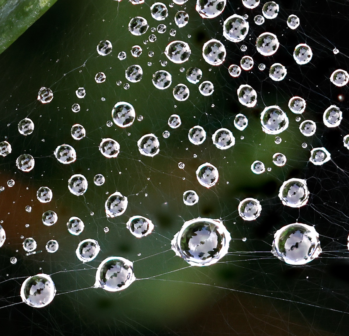
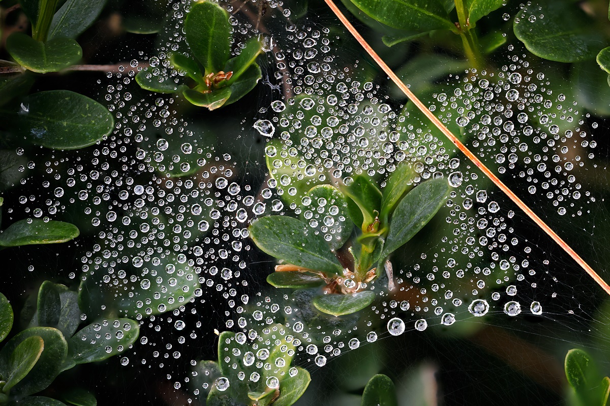
Yes, you can see something in the droplets. Here is a crop that displays the web without the distraction of the pine needle. |
Dec 14th |
 |
| 78 |
Dec 23 |
Reply |
Very interesting idea, thank you. I'll work on it and report back if I can see anything. |
Dec 13th |
| 78 |
Dec 23 |
Reply |
I am left-handed also, and I used to prefer left-directed images. However, after looking at a lot of images I've come to prefer the right-facing orientation. Although it doesn't affect image orientation, there is a very interesting psychological finding that for most people, an image of someone doing something like scratching their back or painting a wall will feel reasonably natural. However, in the mirror reflections of these images, people report that the subjects look unnatural or awkward. (It is just a "reflection" of the mostly right-handed world.) |
Dec 13th |
| 78 |
Dec 23 |
Comment |
It seems more natural to me to have the bird facing to the right. That is the way he or she would then move, and that is the direction of movement of our eyes when we read. |
Dec 12th |
| 78 |
Dec 23 |
Reply |
Alternate crop. |
Dec 9th |
 |
| 78 |
Dec 23 |
Comment |
I'll post an alternate crop with my next comment. Here is the original. The web is more visible on the much higher resolution versions, which, unfortunately, cannot be displayed on the PSA site. My alternate cropped version gives a much stronger clue that a spider web is involved. I preferred the more abstract version that I posted, but hearing more people's opinions may change my mind. The dew drops were the size of pin heads, so depth of field is not the issue. The original and alternate crop versions include a portion of a pine needle, so you can appreciate that the drops are small. The edges of the drops a blown, just as a reflection from a chrome bumper. That is the nature of a specular reflection or light focussed by a lens. |
Dec 9th |
 |
| 78 |
Dec 23 |
Comment |
This gives me a lovely feeling of depth and perspective. The vantage point seems ideally chosen, and the removal of the signs makes the image match what my brain would have "seen" had I been there. Possibly the colors or contrast could be slightly enhanced. |
Dec 2nd |
| 78 |
Dec 23 |
Comment |
I like the sharpness of the eye and comb and the blurred background. I know that some of the feathers are in sharp focus, which raises the question as to why the feathers don't feel to me like they are in focus. |
Dec 2nd |
| 78 |
Dec 23 |
Comment |
What an amazing bird. Nice that you captured it. I like your cropping and treatment of the bird's and vegetation's colors and brightness. Do the rules of the competitions that you are considering allow you to emphasize the eyes? Maybe it would be possible to brighten the eye light? |
Dec 2nd |
| 78 |
Dec 23 |
Comment |
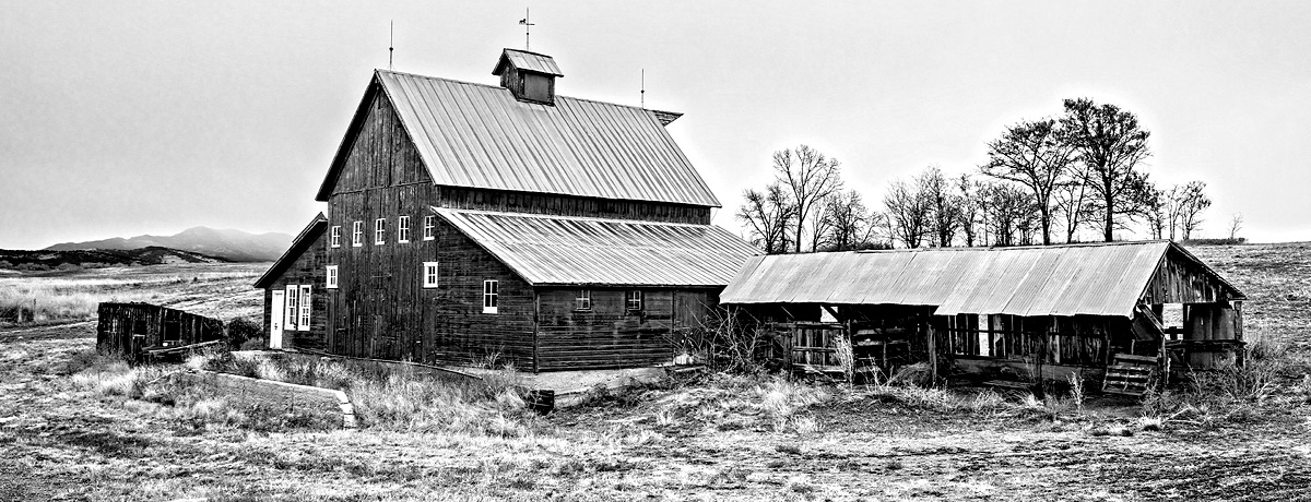
I like the choice of the barn and shed, the position from which the shot was taken, and the decision to convert to B&W. I'd like it more if it didn't look like the trees on the right are coming out of the ridge of the shed. I also like it more when still more of the white sky is cropped off as well as some of the foreground. Finally, I like B&W images to have some pure white and pure black, so I upped the contrast a bit as well in this reworking. |
Dec 2nd |
 |
| 78 |
Dec 23 |
Comment |
It is an eye catching juxtaposition of the old and the new. I like B&W to go from full black to full white. Here is something that illustrates my thinking. You cropped off the building on the left, but I find that including it feels more balanced to me. Working with higher resolution files would reduce the posterization present in my version. |
Dec 1st |
 |
8 comments - 6 replies for Group 78
|
8 comments - 6 replies Total
|


