|
| Group |
Round |
C/R |
Comment |
Date |
Image |
| 78 |
Sep 23 |
Reply |
Thank you for pointing out the unsuitability of the red border. I think I'll go with no border. I haven't been entering competitions, but only giving an occasional print to friends. The calendar idea sounds most appealing, as by now I have acquired quite a few images in this genre. |
Sep 27th |
| 78 |
Sep 23 |
Reply |
The ball could not cast green light on the side of the finger facing out, only on the inside. If you are going for versimilitude, the illuminated area near the base of the thumb could be tinted green.
You are right, calling him "Merlin" invokes in my mind King Arthur's time, and not a galactic presence.
With respect to the stars on the glove, I believe that whether they are to be reflections, or magnified images of stars behind the globe, or eminating from within, those closest to the edge need to be elongated in the direction of the nearby edge of the globe and foreshortened in the radial direction.
|
Sep 27th |
| 78 |
Sep 23 |
Comment |
I very much like the hand and the cloak. The ball, hand, and cloak fit the Merlin title, but still, to me, they do not fit the background. In order to fit the background, I'd expect the cloak to be white and without trim at the end of the sleeve. With more time, I expect that you would eliminate the ball's green from the two fingers of the hand. |
Sep 27th |
| 78 |
Sep 23 |
Comment |
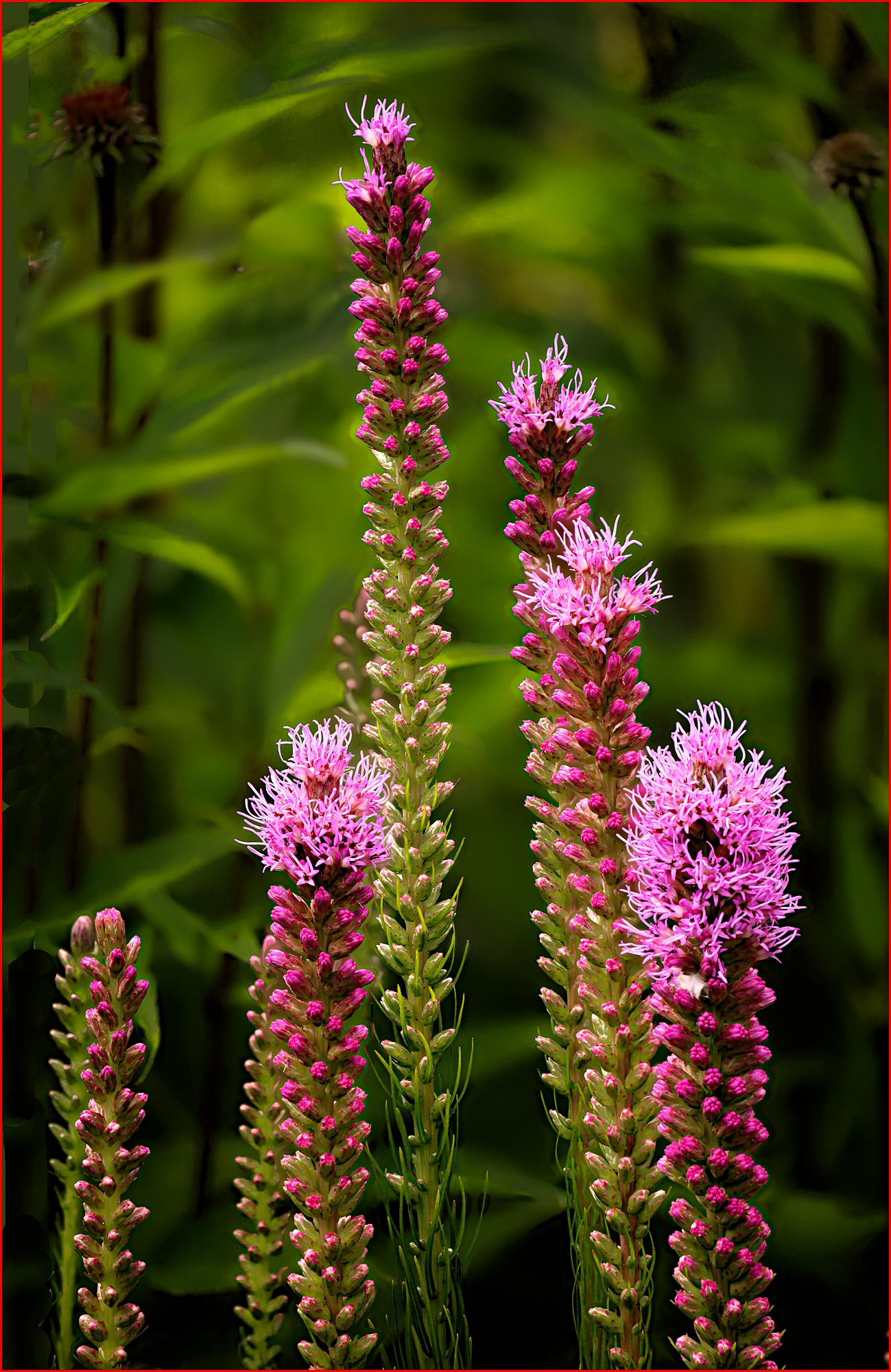
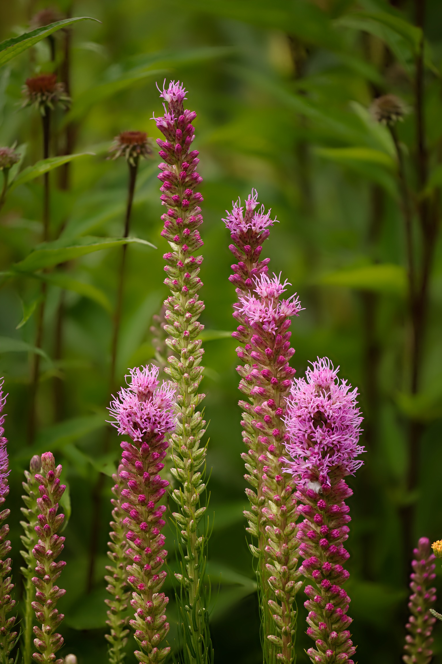
After trying out the many ideas suggested above, I've come to this version of Blazing Star. I removed the dead flower close to the tallest stalk, but not the one further to the left, mostly because of the difficulty of removing. I darkened a couple bright areas and blurred the one leaf that was nearly in focus. I like the degree of saturation of the greens on my monitor, (see my comments above on saturation) so I left it as before. To reduce the illusion that some of the flowers overlapped the boundary, I added the narrow, red border to show the edge of the image. I thank everyone for their helpful comments.
As before, the saturation of the greens in the image on the PSA web page is greater than the exact same image on my computer before uploading. Therefore, it looks to me like the PSA site is changing the saturation. |
Sep 14th |
 |
| 78 |
Sep 23 |
Reply |
In looking still more at the saturation issue, I see that my image on PSA site is more saturated than my copy of it on my computer. My copy was a tiff file in the Adobe RGB color space and the copy on the web is a jpg file in sRGB. Thus, the increase in saturation may have been generated at my end in the color space conversion or by the PSA site itself. In a conversion however, from Adobe RGB to sRGB, wouldn't saturation either remain constant or decrease, but never increase? |
Sep 12th |
| 78 |
Sep 23 |
Reply |
Thank you. Now I'm seeing the negative effect of the dead flower immediately to the left of the tallest stalk. There is a second dead flower further to the left. So far that isn't bothering me as much as the first. Should that also go? |
Sep 11th |
| 78 |
Sep 23 |
Reply |
I have finally had time to think about your comment that the background looks oversaturated. I find that decreasing luminosity does increase saturation, and thus, my step of specifically decreasing the luminosity of the greens to make the flowers stand out did increase the saturation of the background. Henceforth, I'll keep this effect in mind as I make adjustments to images. |
Sep 8th |
| 78 |
Sep 23 |
Reply |
In the processing, I did increase color saturation, but it only had a perceptable effect on the pinks. The greens in the image acquired their saturated-like appearance when I selectively reduced their luminosity.
I like the background in this image because it reminds me of the jungle that I remember in one of Runyard Kipling's children's books (80 years ago).
From the illustrations that I find from a Google search on blazing star, it looks like my flowers are Liatris spicata.
With respect to the question of the best number of flower stalks to have in the image, I agree with you, but one could say that the image contains three distinct groups of stalks. |
Sep 5th |
| 78 |
Sep 23 |
Reply |
I'll try that. Thank you. |
Sep 3rd |
| 78 |
Sep 23 |
Comment |
A very nice dog--wish I had one at present. As I looked at this and played with the image, I liked it more and more the more I cropped. When I reached this point, it seemed like Granddog was looking more directly at me. |
Sep 2nd |
 |
| 78 |
Sep 23 |
Comment |
Reallly nice processing. I love the trees in the right half and in general the locale from which the galaxy was shot. The original had lots of blue stars, but what looks like a scarcity of reddish stars, then, in the final image, all the stars are white--why no colors? If you ever have a chance to shoot the Milky Way again, a shorter expossure could eliminate the star trails that are most apparent in the left half of the image. |
Sep 2nd |
| 78 |
Sep 23 |
Comment |
The vignetting is very effective. I also like the overall illumination level as it has brought out the very nice colors. |
Sep 2nd |
| 78 |
Sep 23 |
Comment |
Very interesting and thought provoking. My first thought before reading the title is that it might be "The Hand of God." To forestall such thoughts, perhaps the background should not be the stars, but something that might have been in Merlin's immediate environment. To me, the hand looks too young and vigorous to be Merlin's. Perhaps remove most of the color from the hand so it looks like it belongs to someone very old? |
Sep 1st |
| 78 |
Sep 23 |
Comment |
It is indeed, a very tranquil scene. I like the idea of replacing the background trees on the left half of the image. I'd have liked it more if the replacement had not led to repeating the same pattern of trees four times across the image. |
Sep 1st |
| 78 |
Sep 23 |
Comment |
I like that the shape of the cloud matches rather well the shape of the branch. I also like the idea of colorizing and IR image. I'd have liked it more if the color chosen for the blossoms were more natural. I don't know what the dynamic range of such IR photos is, so I don't know whether the blossoms could have contained a greater range of brightness. |
Sep 1st |
| 78 |
Sep 23 |
Comment |
Here is the output of the focus stack which was then processed normally to produce my posted image. |
Sep 1st |
 |
9 comments - 7 replies for Group 78
|
9 comments - 7 replies Total
|


