|
| Group |
Round |
C/R |
Comment |
Date |
Image |
| 78 |
Jul 23 |
Reply |
It is interesting what removing those two leaves, cropping more tightly, and providing more headroom at the top does to the feel of the image. Now the emphasis is really on the blossoms. Thank you. |
Jul 22nd |
| 78 |
Jul 23 |
Comment |
In playing around with this month's image, I've come up with this. Typically, I like B&W to be crisp and contrasty, neither of which seem to characterize this image, and yet I think it may be OK. I am interested in hearing how others respond to it. |
Jul 13th |
 |
| 78 |
Jul 23 |
Reply |
Thank you Jim and Brenda. I, too, had reached the conclusion that the background needed darkening. I had not yet reached the point of eliminating that bottom blossome, but clearly that idea also helps the image. |
Jul 7th |
| 78 |
Jul 23 |
Reply |
I think that Ed cropped from the right to move the tree to a more attractive position, as I did on my version.
I don't know why I'm fussing about the faint red and green areas in your images as similar artifacts are also present in my image. In making my edits, I did not convert Ed's 24 bit color image to an 8 bit monochrome, and most likely, nearly insignificant differences in the RGB values of the pixels were amplified by increases in contrast and became visible as the colored fringes. If you converted Ed's original 24 bit image to 8 bits and then made your edits, the colors would have to have been introduced when your edited images were converted back to 24 bit color. |
Jul 5th |
| 78 |
Jul 23 |
Comment |
Now that I look more carefully, I do see some snowflakes in Ed's original and processed image. Ed's processed image places the tree in a position that I find more appealing than in Brenda's versions. Brenda's versions might better be converted to monochrome as both have introduced faint rainbow color abberations in the clouds and snow. |
Jul 5th |
| 78 |
Jul 23 |
Comment |
I've come to feel that the subject is too flat, and I'm playing around trying to change that. |
Jul 5th |
| 78 |
Jul 23 |
Reply |
Thank you for a fresh idea. |
Jul 4th |
| 78 |
Jul 23 |
Comment |
Ken's rotation-crop nicely eliminates that annoying little branch. It sounds like his color adjustments may not be allowed in your competition though. I like the appearance of "total concentration" by the heron as well as the overall subject of a bird tending her eggs. |
Jul 3rd |
| 78 |
Jul 23 |
Comment |
Yes, wonderful vivid colors. Brenda has a point about the title. How about "Display Art"? |
Jul 3rd |
| 78 |
Jul 23 |
Comment |
After processing, it turned out to be a most interesting picture. To me, your cropping feels natural. I'd like your image still more if the people under the umbrellas were less brightened as I feel that now they are unnaturally bright (Compare to the lady emerging from the store whose face is in full sunlight.). |
Jul 3rd |
| 78 |
Jul 23 |
Comment |
I have pretty much the same feelings as were expressed above. I'd like the image more if it were brightened a bit. The bright glove draws my eye, but it is unclear what it is clasping. |
Jul 3rd |
| 78 |
Jul 23 |
Comment |
It is a really nice image, and it was such a good decision to capture the boat in the middle of the sun't reflection. Of the three images, your original, your processed, and Brenda's, I prefer your origina because the length of the sun's reflection is unusually long, there is a tad of the sun itself in the image, there is significant difference in the brightness of the sun, its reflection, and the rest of the image, and finally because the contour of the land in the original's wider view is more interesting than in the cropped versions. |
Jul 3rd |
| 78 |
Jul 23 |
Reply |
Thank you for all the suggestions. I'll start playing with them.
It looks like your plant identification app is smarter than mine. Thank you also for identifying my flower.
Yes, there is a spider on one of the leaves on the left side of the main flower. There is also spider silk at the top of the main flower. I'll think about removing both, but I kind of like the natural feeling each add to the image.
As for the intensity of the reds: I think that your suggestion of "adding black" means to reduce the luminosity. From the appearance of the flowers on the PSA site, this change is needed. On my computer it is not. I think that the PSA site may be boosting reds a bit or maybe my monitor's brightness is set a bit too low. (The darn companies that sell calibrators keep dropping support of their devices and I resent having to buy a new calibrator every three or four years.) |
Jul 3rd |
| 78 |
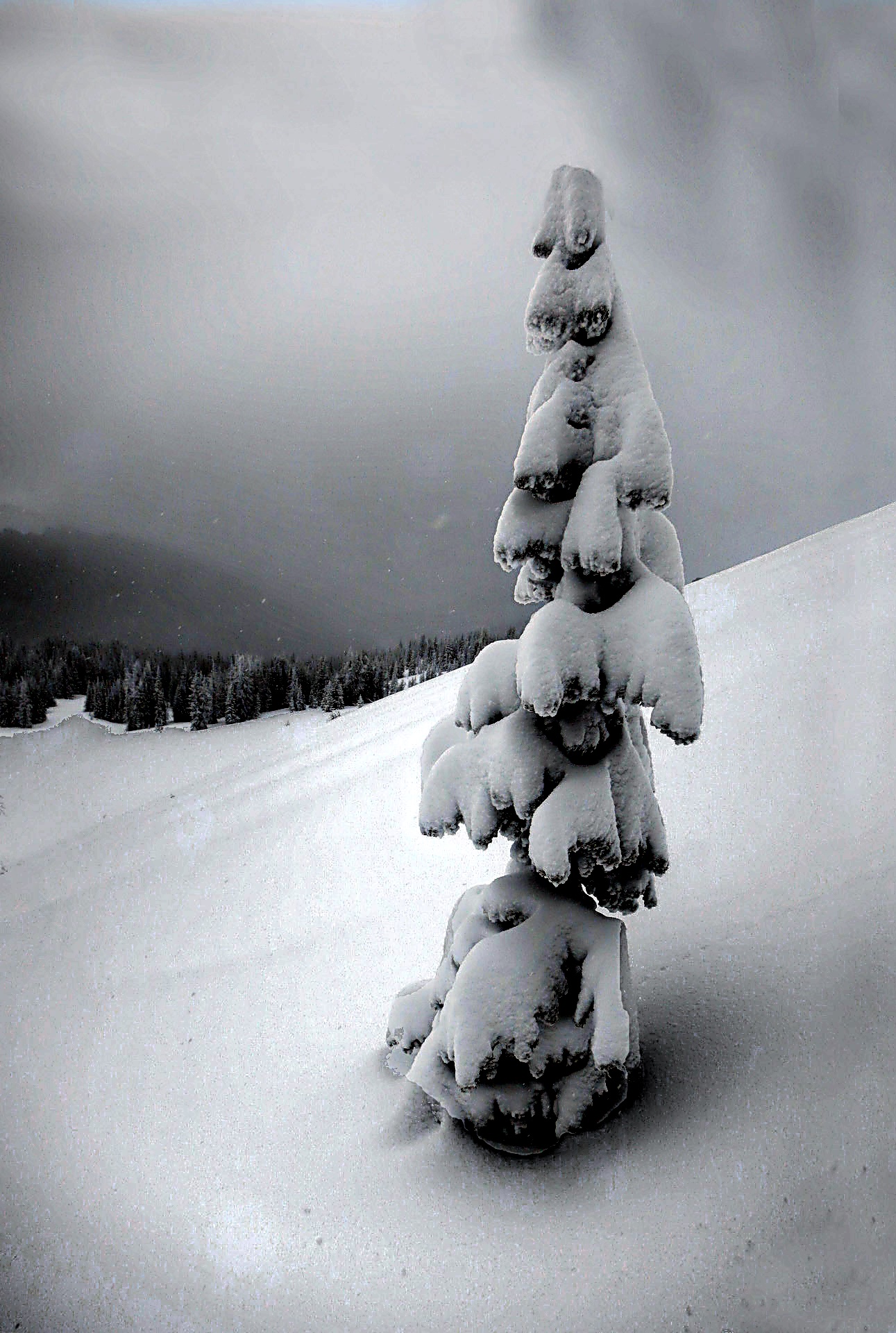
Jul 23 |
Comment |
In order that the flat lighting in a snowstorm be plausible in a shot, to me you must also have something that shows that it actually is a snowstorm--some flakes would do. In my altered version, I've increased the contrast a lot, sharpened a bit, and cropped some from the right. It doesn't look so much like it is in a snowstorm, but I like how it all came out. |
Jul 2nd |
 |
9 comments - 5 replies for Group 78
|
9 comments - 5 replies Total
|


