|
| Group |
Round |
C/R |
Comment |
Date |
Image |
| 78 |
May 23 |
Comment |
This conveys my intended feeling more than my attemps. Thank you. |
May 8th |
| 78 |
May 23 |
Comment |
Here is my first revision. I removed the yellow flowers, played with the shade of the greens, moved the seed heads closer to pure white, and reduced the size of the open space on the lower left. I think it is better, but still has plenty of room for improvement. |
May 5th |
 |
| 78 |
May 23 |
Comment |
Your original image has those spots, but your final image doesn't seem to. Do you know what was done to suppress them? I think that they are considered flare, and I think that they generally come from reflections between lens elements and also off the supporting lens barrel.
I was able to do pretty much as Brenda suggested except that I left the sky and sun alone. The result is even more stunning than your posted image. I'll let you incorporate the suggestions you choose and post that rather than me posting a rendition using Brenda's and my ideas.
If this is sunrise, you must be on the Western side of the the park and Continental Divide? If so, how did you get there, were you staying on the west side of the mountains? |
May 5th |
| 78 |
May 23 |
Reply |
I like Jim's adjustment of the sky. To me it now feels consistent with the brightness of the rest of the image. I did check, and I find the lighthouse is slightly tiipped to the right. James' distortion adjustment makes the tower a little shorter and thicker, and I prefer this shape to the more slender tower. Thus, combining Brenda, James, and Jim and making the tower plumb would make for a pretty awesome image. |
May 5th |
| 78 |
May 23 |
Reply |
Yes, please play with it and show me your ideas. Is a "busy piece" a dandilion seed head? |
May 5th |
| 78 |
May 23 |
Comment |
The lighting is nice and eerie. I'd like to see the ears more clearly. I didn't recognize the background as smoke until I read your comments on the image. |
May 3rd |
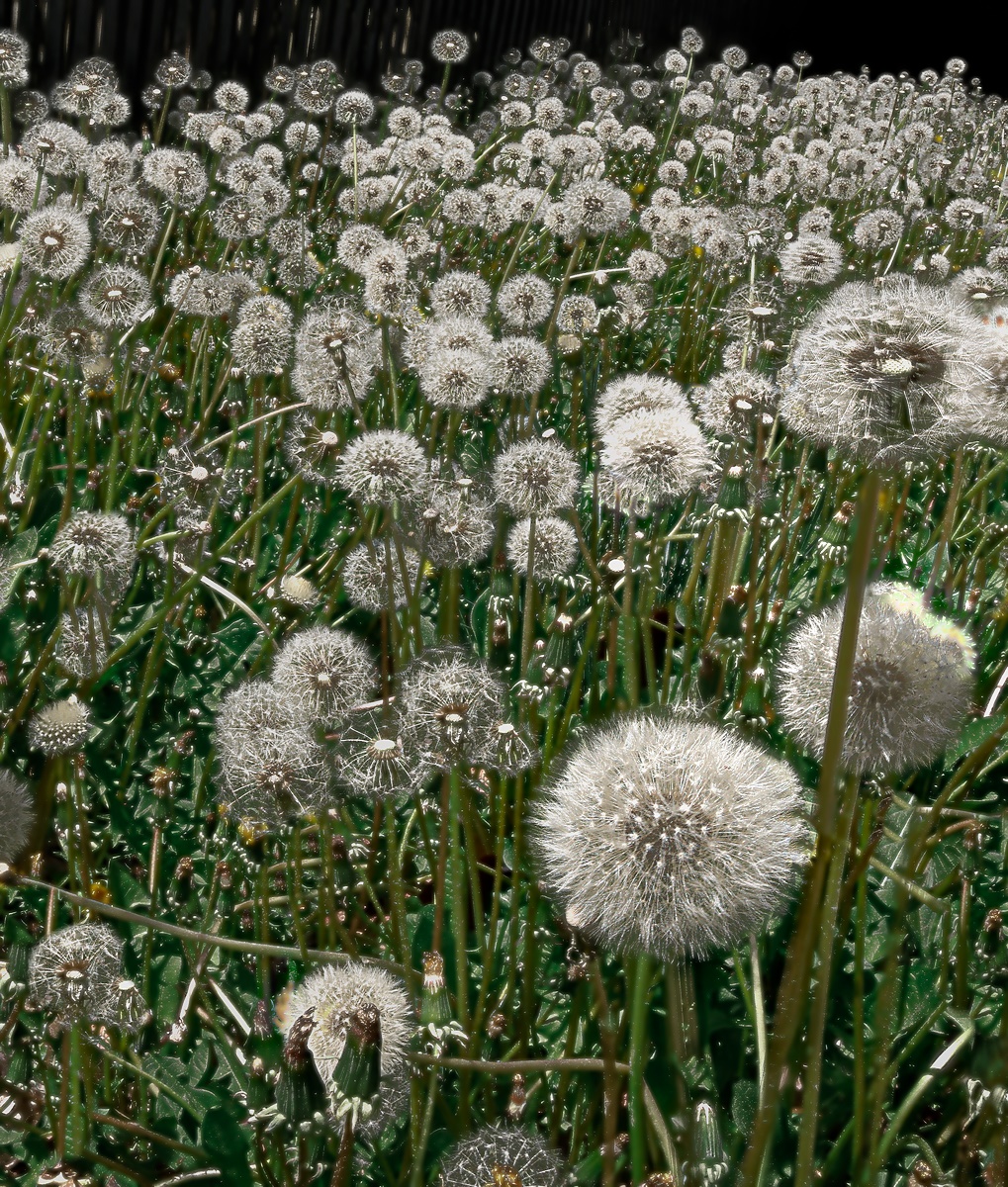
| 78 |
May 23 |
Comment |
It is a compelling subject, and I like the way it has been cropped. I also like the fact that the heads are in focus. I'd like it still more if, somehow, the front part of the ring at the bottom could also have been in focus. |
May 3rd |
| 78 |
May 23 |
Comment |
It is a most interesting subject. You expertly removed a lot of detail, but perhaps more than I would have. To me the scene would feel a little more natural if a tiny bit of clutter remained. The path to the lighthouse and the lighthouse itself are beautiful. For me, the sky feels overdone as it competes with the lighthouse and, since I've never seen rain out of clouds like these, I feel slightly uneasy. Is the lighthouse truely vertical? It feels slightly tipped, but that could be an optical illusion caused by the spiral pattern. The lighting on the brick walkway and the grass is pretty bright for being in a rainstorm, but maybe this feeling will go away if you brighten the sky and reduce the contrast enhancement of the sky. |
May 2nd |
| 78 |
May 23 |
Comment |
I like the idea and the execution. I think it was a good move to put the lady on the right on a diet. I'd like to know how you did it, as I can find no evidence of any distortions in her vicinity. I, myself, would prefer that the two chains on each side of the seat remain, as a single chain would be mechanically unstable, and thoughts of that induce a little anxiety in me. I also love the color of the leaves in early spring and I like how it shows in this image. I find the symmetry and slight deviations from it to be pleasing, but I also wonder how the scene would have looked if you had shot from five feet to the left or right of center. |
May 2nd |
| 78 |
May 23 |
Comment |
Very nice. It reminds me of paintings by Edward Hopper. I like the cropping and the colors and the fact that in much of the image, no texture is visible. While some might complain about this or the cloudless sky, I find that these properties increase my liking of the image. You might experiment with reversing left-to-right as at least I am more used to having a light source over my right shoulder. To counter criticisms that there is little texture and flat surfaces, you might consider titling the image "After Hopper". |
May 2nd |
8 comments - 2 replies for Group 78
|
8 comments - 2 replies Total
|


