|
| Group |
Round |
C/R |
Comment |
Date |
Image |
| 78 |
Mar 23 |
Comment |
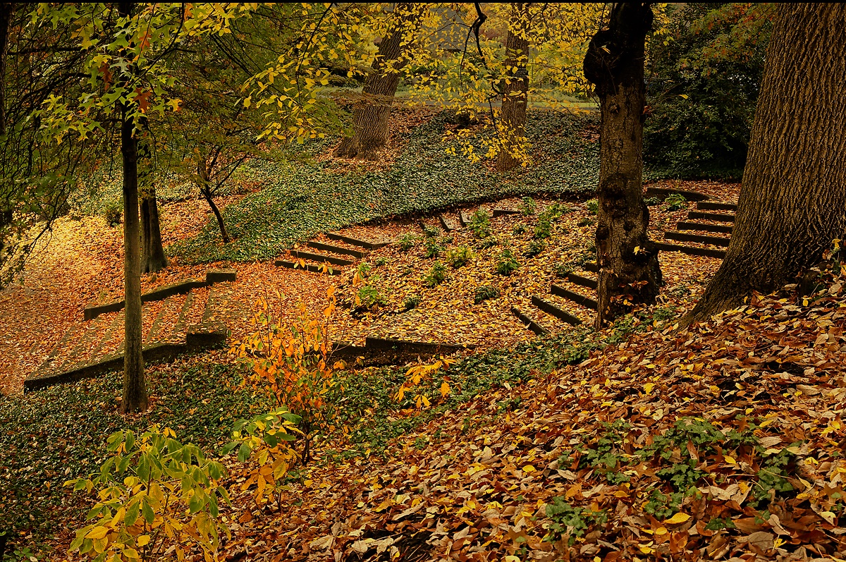
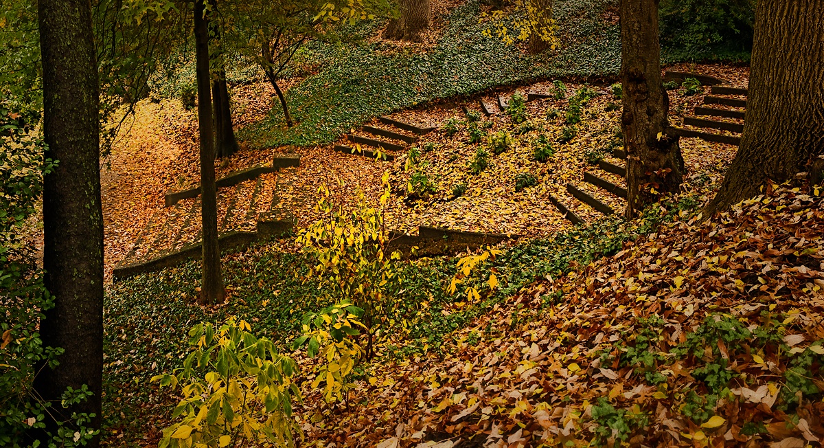
This is what I've come up with after taking note of all the suggestions and comments. Cropping to remove that dark, overbearing tree on the left then placed the nearer, bottom end of the stairs rather close to the border. It took some effort to move it a bit further away from the edge. I also cropped, darkened the house and sidewalk near the upper edge, lightened a shadow area near the center, tinted slightly for more orange color, and introduced some vignetting. Thank you all for your suggestions. |
Mar 16th |
 |
| 78 |
Mar 23 |
Reply |
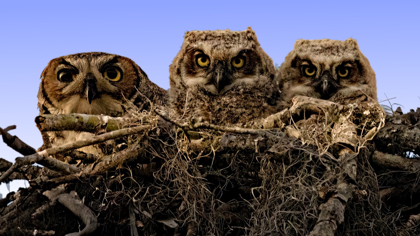
I like lighter sky more than I like your original with the darker sky. To me, it feels more natural for the color of the sky to be less intense near the horizon.
I generated my version in several steps. First I created a new blank image with the same dimensions as your image. Then I tinted it sky blue using a gradient so that the top was sky blue and 2/3 of the way down it was white, and white the rest of the way down. Then, I created a mask of just your sky, and used it to replace your sky with my gradient sky. |
Mar 10th |
| 78 |
Mar 23 |
Reply |
Thank you for your ideas. I'm seeing that there are quite a few ways of cropping my original--all of which are better than the one I chose. I don't generally enter competitions, but if I display it anywhere but my office, I'm thinking of a title somewhat like "Steps into Winter". |
Mar 8th |
| 78 |
Mar 23 |
Reply |
Thank you. I'll see what I can do with your ideas. |
Mar 4th |
| 78 |
Mar 23 |
Reply |
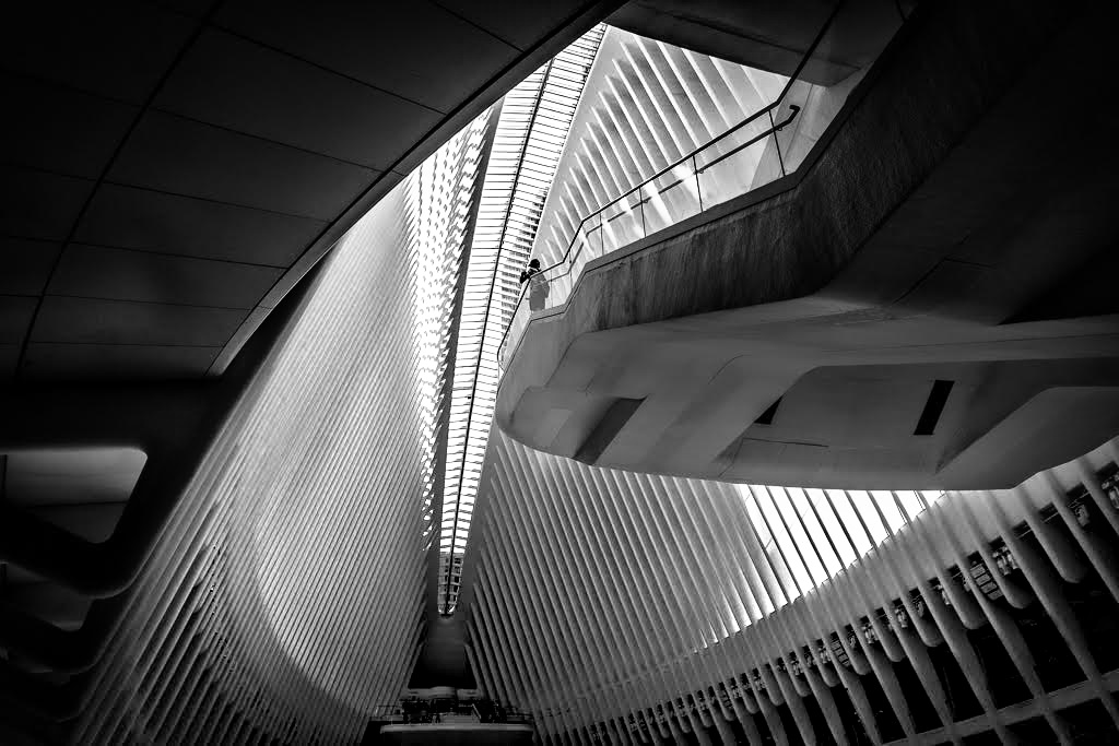
I slightly prefer this to what your first submitted. I do like B&W to be contrasty, almost harsh, so that I think you could increase the contrast of the ribs still more. |
Mar 4th |
| 78 |
Mar 23 |
Reply |
Yes, "Are You Prey" works for me. |
Mar 3rd |
| 78 |
Mar 23 |
Reply |
I like your cropping, in addition to feeling more "comfortable" to me, the image dimensions are more normal. |
Mar 3rd |
| 78 |
Mar 23 |
Comment |
I feel the colors are important. I also like the complementarity between the drawing on the wall and the shawl. Pity that the woman isn't looking a little more to her left. |
Mar 2nd |
| 78 |
Mar 23 |
Comment |
This is a nice use of your new lens. The cropping seems comfortable, and you have nicely toned down the bright background. I'd be comfortable with even more reduction in its brightness. This might feel more natural if it were reversed left to right. |
Mar 2nd |
| 78 |
Mar 23 |
Comment |
I like the subject and how it naturally goes with the background. I also like the sharpness of the subject and that the rest of the image is not sharp. The cropping and adjustments to the background are also appropriate. Possibly the strumming fingers could be slightly blurred to indicate that they are moving. |
Mar 2nd |
| 78 |
Mar 23 |
Comment |
I very much like the subject, the interesting angle, the fact that it is B&W, and the lone traveler. The shading to generate vignetting very much helps the image as it is nice to see details fade into black near the edges. I found that I like the image even more upon increasing the contrast of the ribs of the roof even more than you did. |
Mar 2nd |
 |
| 78 |
Mar 23 |
Comment |
I like seeing the owls in their semi-natural environment and the adult beside the two owlets. I increased the local contrast, changed the tint of the sky, and made the sky brighter near the horizon.
As for titles, there is the obvious "I've Got my Eye on You", but I prefer the ambiguous "Prey?" |
Mar 2nd |
 |
| 78 |
Mar 23 |
Comment |
Good idea, use sharpness to emphasize depth and the subject of the image. I've also added some vignetting to further direct attention to the steps. At the same time I've selectively adjusted brightness in areas of the image. Finally, I found that the orange leaves on the bush right in the middle of the image caused me a problem. When I first look at the image, I don't see the bush, but as I look longer, I then see the bush and I'm annoyed by the confusion between bush and leaves on the steps. I've therefore brightened the leaves on the bush and shifted them towards yellow. Now they cause me less confusion and annoyance. |
Mar 2nd |
 |
7 comments - 6 replies for Group 78
|
7 comments - 6 replies Total
|


