|
| Group |
Round |
C/R |
Comment |
Date |
Image |
| 30 |
Nov 22 |
Comment |
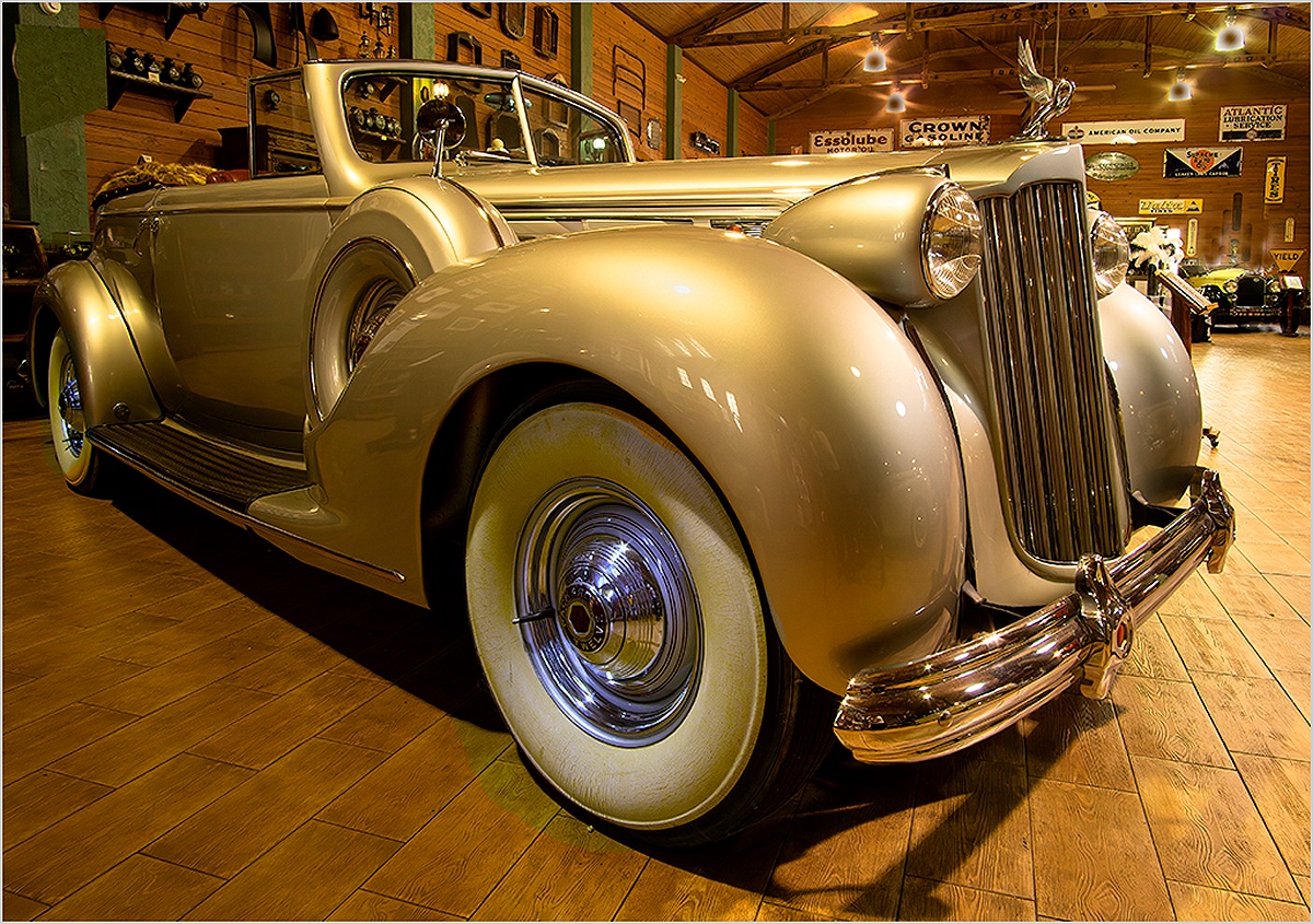
Like the others, I like the golden color of the car. I like the image more after correcting the white sidewall tires to be more white. |
Nov 22nd |
 |
| 30 |
Nov 22 |
Reply |
The program that I use for editing images is Picture Window Pro. It seems to be comparable in power to PS, but is more straightforward to use. It, and most likely PS, contains a transformation called lens distortion that can be used to remove barrel and pincushion distortion. The cropping transformation in PWP allows cropping at a bias which makes it easy to correct for camera tilt. The Warp transformation and the Level transformations also allow correction of camera tilt. PS, and most likely ACR also must contain these transformations. PWP is free, but the most fun about it is that the guy who wrote it is continuously updating it and if you find a flaw in the program or make a good suggestion or have a question, he immediately responds on the program's web site, and he usually fixes the problem in a day and posts an updated version of the program. Downloading and installing an updated version takes about two minutes. |
Nov 22nd |
| 30 |
Nov 22 |
Comment |
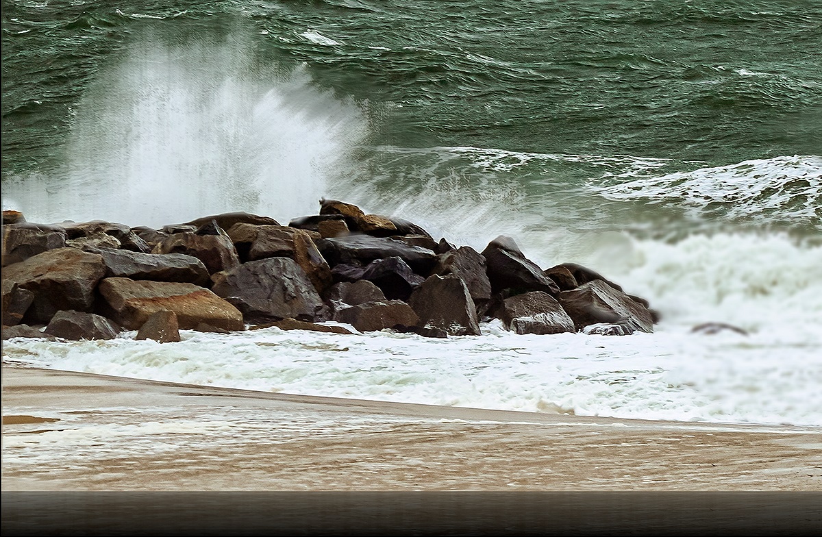
I thought that I would see how this image felt if the motion of the spray from the wave hitting the rocks were more apparent. I find the image to be a bit more interesting as a result. |
Nov 17th |
 |
| 30 |
Nov 22 |
Comment |
I like the sharpness of the waves and rocks and the overall color balance. I wonder if there is a shutter speed that will leave the waves nice and sharp, but show motion blur in the spray that is shot up by the waves hitting the rocks. |
Nov 7th |
| 30 |
Nov 22 |
Reply |
I also have the problem of getting used to one orientation and finding other orientations to be uncomfortable. |
Nov 1st |
| 30 |
Nov 22 |
Comment |
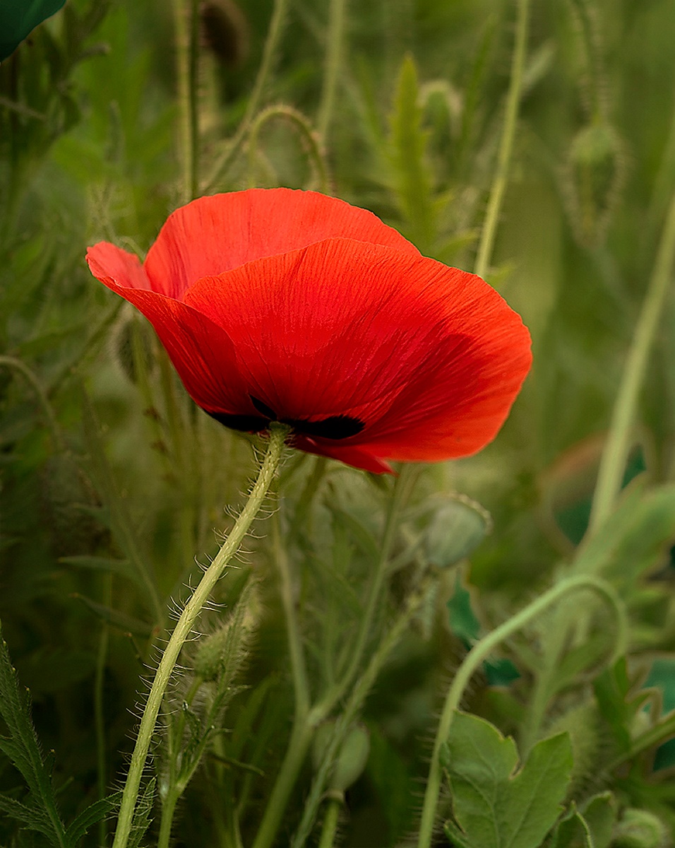
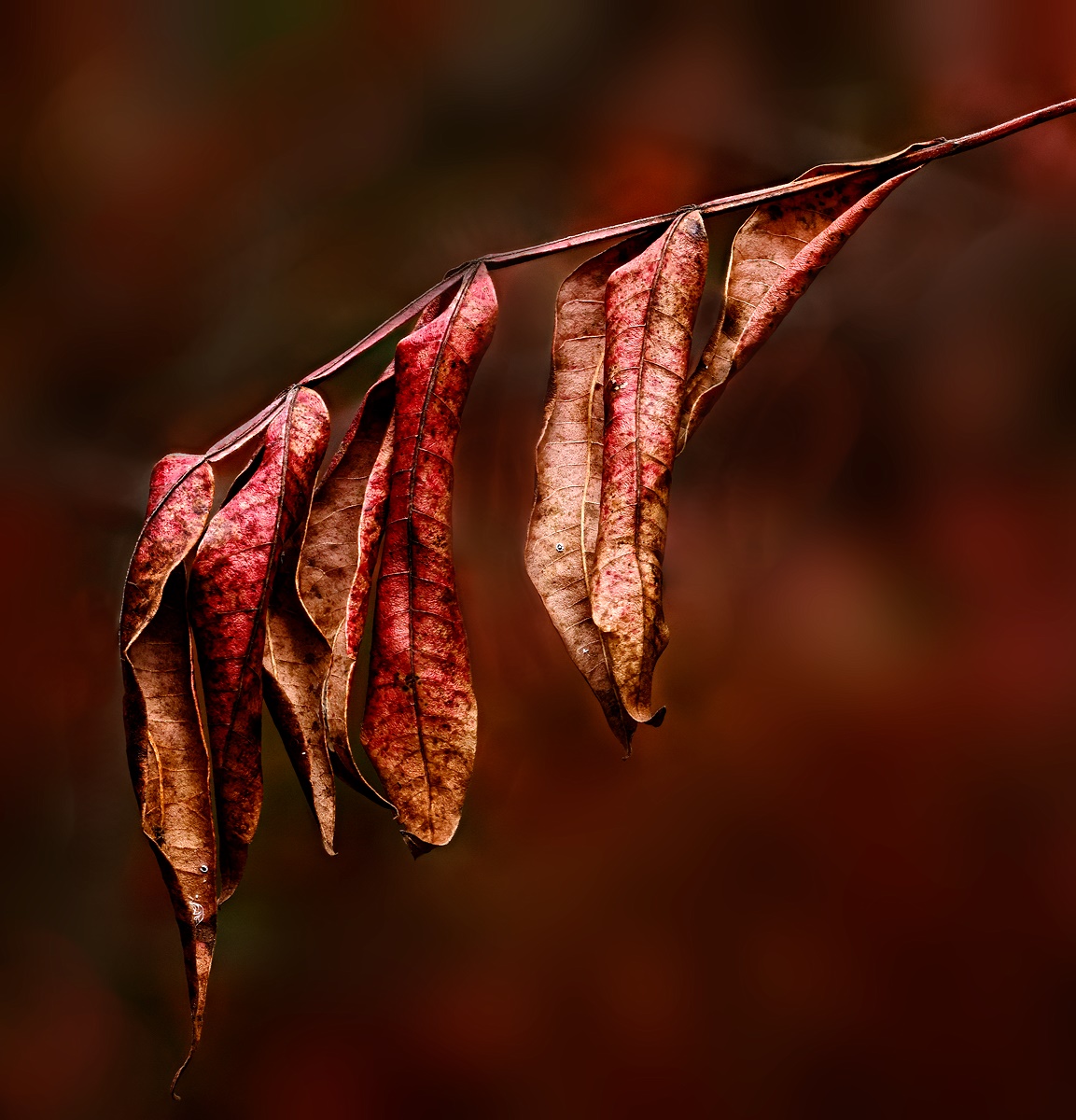
Very nice colors and shading and vignetting. I like how the stem and flower base have been handled. I wish that the stamens of both flowers contained more detail. |
Nov 1st |
| 30 |
Nov 22 |
Comment |
The processing really made this look nice. I agree that the seed pods provide context and also balance. I think I generally prefer that action be towards the right in an image, so I'd be tempted to reverse this left to right. |
Nov 1st |
| 30 |
Nov 22 |
Comment |
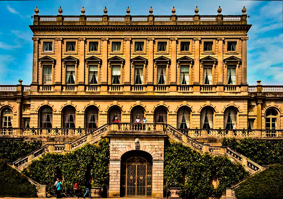
Yes, it does show the symmetry. It looks like there is a trade off between displaying the symmetry and shooting the building head on. Somewhat of an angled view might also have been interesting. Also, with respect to the shooting, you probably didn't have the freedom to wait until the sun was at a more oblique angle that would have emphasized depth differences.
With respect to processing: the image, particularly along the roof line, shows considerable pincushion distortion. Generally this is easy to remove. I reduced the feeling of flatness (although I don't know what is wrong with being flat) by increasing the contrast and saturation of the building. |
Nov 1st |
 |
6 comments - 2 replies for Group 30
|
| 42 |
Nov 22 |
Reply |
Thank you everybody for your most helpful comments. |
Nov 17th |
| 42 |
Nov 22 |
Reply |
I agree with Sarita that the poppies in the upper left and lower right nicely frame the main poppy. Initially I had viewed the image as just the main poppy, but it is also a very nice image which I like a lot when viewed in its entirety. |
Nov 17th |
| 42 |
Nov 22 |
Reply |
This is closer to what I had in mind. |
Nov 13th |
 |
| 42 |
Nov 22 |
Comment |
Here it is with a darker background, which I now prefer to my first post of this subject. |
Nov 12th |
 |
| 42 |
Nov 22 |
Reply |
OK. I've also wondered whether the background is too bright. |
Nov 10th |
| 42 |
Nov 22 |
Comment |
I like B&W, and I think it was wiser to use B&W on this one. Perhaps a different composition would have helped me better understand what you wanted me to see in this image. |
Nov 9th |
| 42 |
Nov 22 |
Comment |
This is amusing and fun to look at. I prefer this one when reversed left-to-right. Some of the background that lies on the borders could be toned down a little so my attention would be more concentrated on the subject. |
Nov 9th |
| 42 |
Nov 22 |
Reply |
Sarita's image has now replaced one of my old images. |
Nov 9th |
| 42 |
Nov 22 |
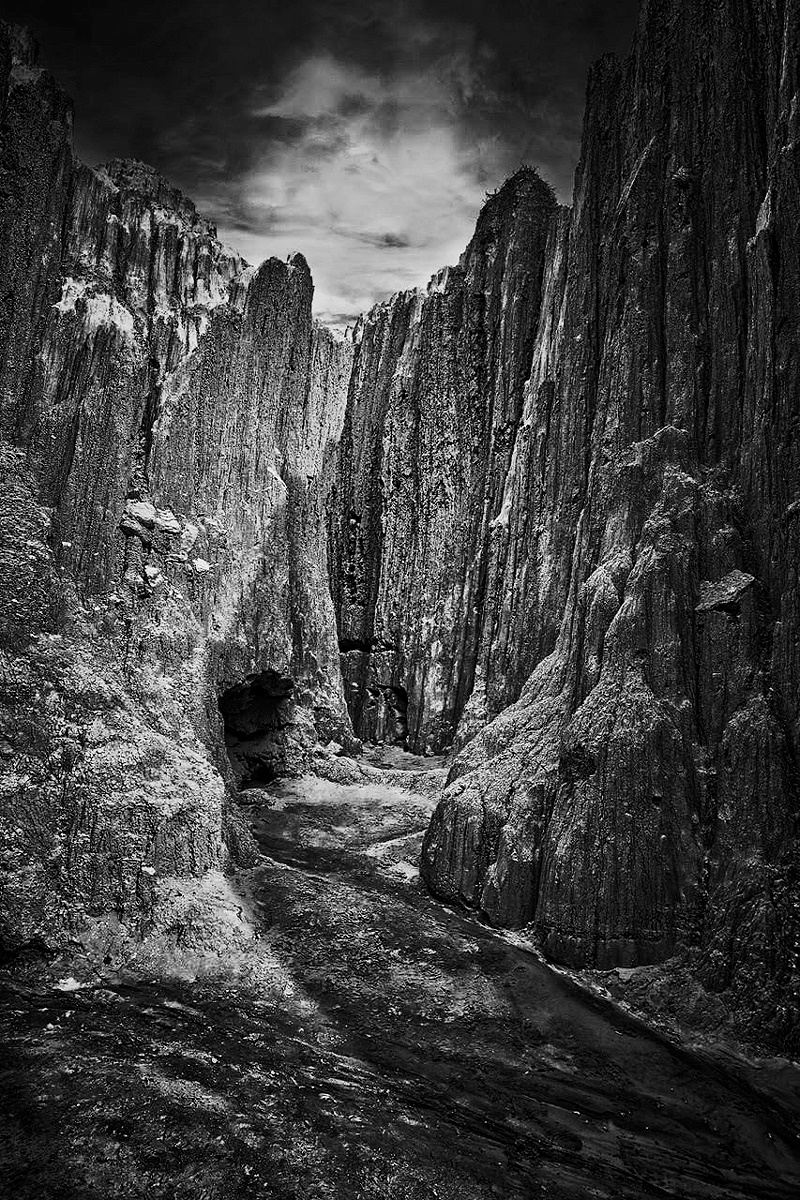
Comment |
It is a fascinating geologic feature. I like it more when I have substantially increased the contrast as shown. |
Nov 9th |
 |
| 42 |
Nov 22 |
Comment |
This looks somewhat familiar. |
Nov 8th |
| 42 |
Nov 22 |
Comment |
I like your capture of the red-orange of poppies, and I also like the light green background with stems all turning in the same direction. I'd like it still better if there the only red-orange visible were that of the main flower. |
Nov 8th |
| 42 |
Nov 22 |
Comment |
Twice now, somehow my comments have not made it to the web site. I'll try again. I like the color combination of the pink and green and I like the blurring of the background leaves. Possibly more texture would show in the petals if they were a little less bright. |
Nov 2nd |
7 comments - 5 replies for Group 42
|
13 comments - 7 replies Total
|


