|
| Group |
Round |
C/R |
Comment |
Date |
Image |
| 30 |
Jun 22 |
Reply |
In think Dorinda's little flaw may be some debris on the petal. There seems to be some more on the very far left. I don't mind Dorinda's debris, but the debris touching the left border seems out of place. I agree with Dorinda on the chromatic noise in background. Some slight blurring of those leaves or application of a denoise transformation removes the noise. |
Jun 8th |
| 30 |
Jun 22 |
Comment |
I love that despite the fact that all the petals are white, they are all clearly defined by their slightly different brightness or color. I wish the bees had been more cooperative and all posed in profile for you. Ordinarily, I would look for some texture in the petals, but here seeing texture would have reduced my liking of the image. |
Jun 7th |
| 30 |
Jun 22 |
Reply |
Because the dragonfly might have been gone in an instant, my first shot would have been whatever the camera was set for. If I had time to adjust a setting, I, too, might have used f/8. Now, in retrospect, it looks like f/16 or f/24 might have been better. |
Jun 7th |
| 30 |
Jun 22 |
Comment |
I agree with Dorinda on the colors and brush placement. What is happening at the tips of the bristles? It almost looks like a double exposure. |
Jun 6th |
| 30 |
Jun 22 |
Comment |
Very nice orientation of the dragonfly, and of course, its colors are interesting and unusual. Is there any explanation of why it evolved this color scheme? Does it hunt in vegetation of about this color? You certainly needed the short exposure. I think I would have preferred to have some greater depth of field, even at the expense of some noise. |
Jun 6th |
| 30 |
Jun 22 |
Comment |
Great angle! Wonderful colors and perfect depth of field. I guess that there are two extremes in historical reconstructions--natural as it was, or cleaned, polished, and sanitized. As could be guessed from the tenor of my comments over the years, I prefer natural. That doesn't detract however from this marvelous shot. |
Jun 3rd |
| 30 |
Jun 22 |
Comment |
Great idea. I also like the controlled depth of focus and the blurred background. I think I would like it more if the branch were closer to vertical than horizontal. I'd also like that little spot of light somewhat below the branch to be removed. |
Jun 3rd |
5 comments - 2 replies for Group 30
|
| 42 |
Jun 22 |
Reply |
Thank you. With respect to feeling harsh, I agree with you, but to me they seem less harsh in a print 24 x 19, so this may be one of those images whose impression is size dependent. |
Jun 15th |
| 42 |
Jun 22 |
Reply |
Yes, I have tried removing the dark greens, see above, but since a couple of you think that this would improve the image, I should try it again and perhaps adjust my esthetics accordingly. |
Jun 13th |
| 42 |
Jun 22 |
Reply |
The fact that a bit of the bird's neck and a bit of the fish are blown doesn't bother me as expect them to be pure white. On my monitor I see sufficient detail in all the black so that overall, the appeal of the luminosities in this image seems to be a matter of personal taste. |
Jun 11th |
| 42 |
Jun 22 |
Reply |
I have tried it with and without the stem on the right. Without it, the shadow on the upper left looks to me to be a little weird. Without both, it feels to me like there is too much dead space. I don't see how to crop more tightly on the left or right, and the image feels unbalanced if I crop more from the bottom. Could you please show me what you have in mind. |
Jun 11th |
| 42 |
Jun 22 |
Comment |
I agree with Holly. In addition, while normally I am loathe to suggest increasing saturation because things quickly become unnatural, in this case, I find that some increase in saturation makes me like the image even more. |
Jun 10th |
| 42 |
Jun 22 |
Comment |
Very nice colors and color combinations. It probably wasn't possible, but with the sun closer to the horizon, the shapes of the sandstone would be even more interesting. I would have liked something in the image to give an idea of the sizes of things. |
Jun 10th |
| 42 |
Jun 22 |
Comment |
Very nice. It might feel a little more natural if you flipped it left-right. |
Jun 10th |
| 42 |
Jun 22 |
Comment |
Another title possibility is "Busy Bee". I like the way the radial lines draw my eye to the bee. I think though, that I would like it better if those lines were somewhat less prominent. |
Jun 3rd |
| 42 |
Jun 22 |
Comment |
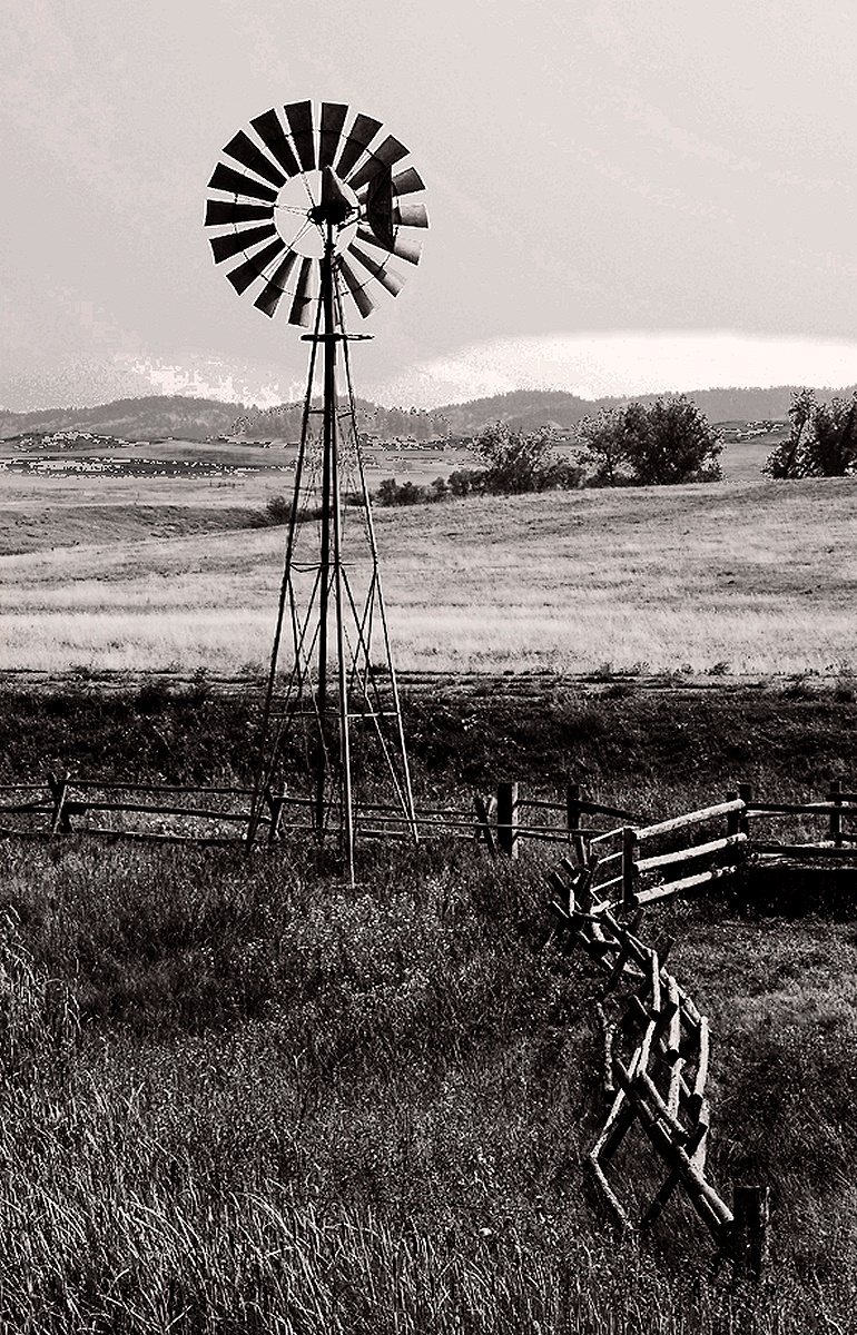
It's a really interesting photo. I like the idea of combining the fence and the windmill in the same shot. I am a little bothered by the fence coming straight at me in the center of the image and I wonder if the shot could have been taken from a slightly different vantage point to circumvent this problem. In general, I like B&W images to be considerably more contrasty than color images. For the fun of it, I tried cropping your image a bit, increasing the contrast, and darkening the sky plus cloud and the distant hills. |
Jun 3rd |
 |
| 42 |
Jun 22 |
Comment |
It is a most peaceful and interesting scene. It might appeal still more to me if it were cropped so that the focal point were not right in the middle of the image.
To me, the greens are much too intense. It seems like I make this point every month for your images, but I never hear a response or explanation or see a correction in the following month. Since other's images don't look this way, I'm tentatively concluding that the issue lies at your end. One thing that could produce this effect would be if the green channel on your monitor or screen were too weak or low. When you then adjusted images to your liking, the greens would appear normal on your monitor but too intense on everyone else's. I think the same thing might also occur if your visual system were somewhat insensitive to the green part of the spectrum. |
Jun 3rd |
6 comments - 4 replies for Group 42
|
11 comments - 6 replies Total
|


