|
| Group |
Round |
C/R |
Comment |
Date |
Image |
| 30 |
May 22 |
Reply |
Thank you for the explanation. |
May 8th |
| 30 |
May 22 |
Comment |
I like how the background colors match the colors of the flower. To me, the texture further enhances this image. The entire flower feels surprisingly sharp for a single image. I'm guessing that although you used an f/2.8 lens, it was not wide open for this shot. Your blurred flower background seems to contain only colors of the flower. To make it was what you blurred just a selection of the flower on top of a white background? The selection of the flower seems particularly accurate. How was the selection made? |
May 6th |
| 30 |
May 22 |
Comment |
The bird, the angles, and the wind (plus the photographer) have together produced a lovely picture. I wondered how it would look with greater contrast between the Egret and the grey of the background. Here is the result. |
May 4th |
 |
| 30 |
May 22 |
Comment |
You certainly succeeded in making it gloomy. To me, the tangle of vines competes too much with the iron fence and the gravestones. |
May 4th |
| 30 |
May 22 |
Comment |
Could you explain the title? I think you had a somewhat similar shot of a Magnolia last spring. This one is quite a lot nicer as nowhwere does it feel blown and the active bees give a sense of the urgency of Spring. |
May 4th |
| 30 |
May 22 |
Comment |
I like how texture is retained in the rose despite its brightness and how the image makes me think as I try to figure out what it is. For me there is a little too much brightness contrast between the spotlit area and the rest. |
May 4th |
5 comments - 1 reply for Group 30
|
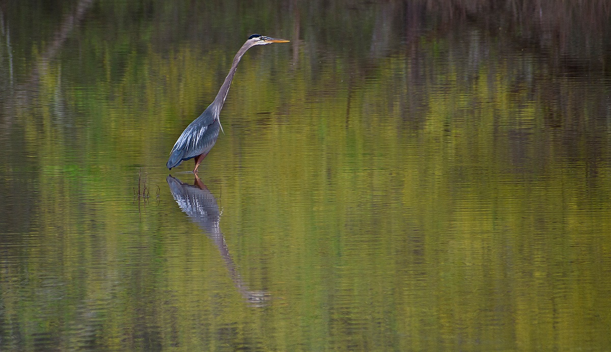
| 42 |
May 22 |
Comment |
What lovely colors, and such a peaceful scene. Possibly try a little more contrast of the bird, and perhaps some vignetting of the image as a whole? I tried increasing the contrast of just the Heron to make it stand out a little more. |
May 10th |
 |
| 42 |
May 22 |
Comment |
On the Group 42 home page, the sky in Holly's image with the bus looks normal, but side-by-side with Keith's image, Keith's sky seems to have too much green. I think I've commented the last couple months on Keith's skies, and the appearance of the previous images and comparing the images on the group home page seems to suggest that there is something in Keith's work flow that is introducing too much green when he replaces the real sky using the Neo plug-in. |
May 6th |
| 42 |
May 22 |
Reply |
Framing does enhance the image. Thank you for raising this possibility. Lately when I make a large print, I'm using the hangers described at https://posterhanger.com/pages/posterhanger-by-jorgen-moller
as these are quick and easy to use and look quite good. |
May 6th |
| 42 |
May 22 |
Comment |
What a lovely shot. The only thing I can think of to improve it would be a human somewhere in the image to give a sense of size to the radio telescope. |
May 4th |
| 42 |
May 22 |
Comment |
The house is interesting in itself, and the photograph was taken from a position that produces very pleasing perspective. I'd like it more if the sun's position in the sky were consistent between the shot of the house and the shot of the substituted sky. |
May 4th |
| 42 |
May 22 |
Comment |
The picture could well win image contests, but the bird won't win any beauty contests. It is an interesting pose of the bird. I also like the feeling of depth created by the unusual shape of the branch. I'd like it more if the background provided some context to the shot. |
May 3rd |
| 42 |
May 22 |
Comment |
Stuart's changes do give the bus more punch, but at the cost of the wide open Texas sky. I think that I prefer the sky. Maybe try all that Stuart did but omit the cropping? With respect to the composition, it looks like the engine might be missing from the bus. If so, having shot from a little higher vantage point might have made its absence more obvious and have added a little poignancy to the image. |
May 3rd |
| 42 |
May 22 |
Comment |
As in the previous comments, nice and sharp with nice colors. I would prefer that the upper left corner retain the texture that is present elsewhere in the background. I think I am bothered a bit by the faint hints of green here and there in the background textile. |
May 3rd |
7 comments - 1 reply for Group 42
|
12 comments - 2 replies Total
|


