|
| Group |
Round |
C/R |
Comment |
Date |
Image |
| 30 |
Aug 21 |
Reply |
Yes, of course, as the aperture decreases in size, diffraction increases and images become less sharp. The skill and experience of the photographer help in deciding the optimum settings of aperture, ISO, and f value for any particular situation. I have been pleasantly surprised at the sharpness of shots taken at f/16 or f/24 as well as the low noise level in shots taken with my new Canon R5. I'd probably start at 1/500 to 1/1000 at f/16 or f/24 and see what ISO would be required. You can also substantially underexpose and bring up the brightness in post. |
Aug 18th |
| 30 |
Aug 21 |
Reply |
I like the direction that Jody's change is going. I'd like to see that large bottom leaf also darkened. I think that doing that will necessitate reducing the saturation a bit more. |
Aug 12th |
| 30 |
Aug 21 |
Reply |
I agree, it seems like a different and less reflective surface on the lower half of the wall. |
Aug 12th |
| 30 |
Aug 21 |
Comment |
Very interesting. The jazzed up color looks good in this image. I tried cropping as you mentioned, but in the end, I prefer your present crop. Possibly a tighter croup would work if you upsize enough the eliminate the pixilation. |
Aug 10th |
| 30 |
Aug 21 |
Reply |
Could you explain more fully why the light bands between the people and above the table should be brighter than the light bands below the table. |
Aug 10th |
| 30 |
Aug 21 |
Comment |
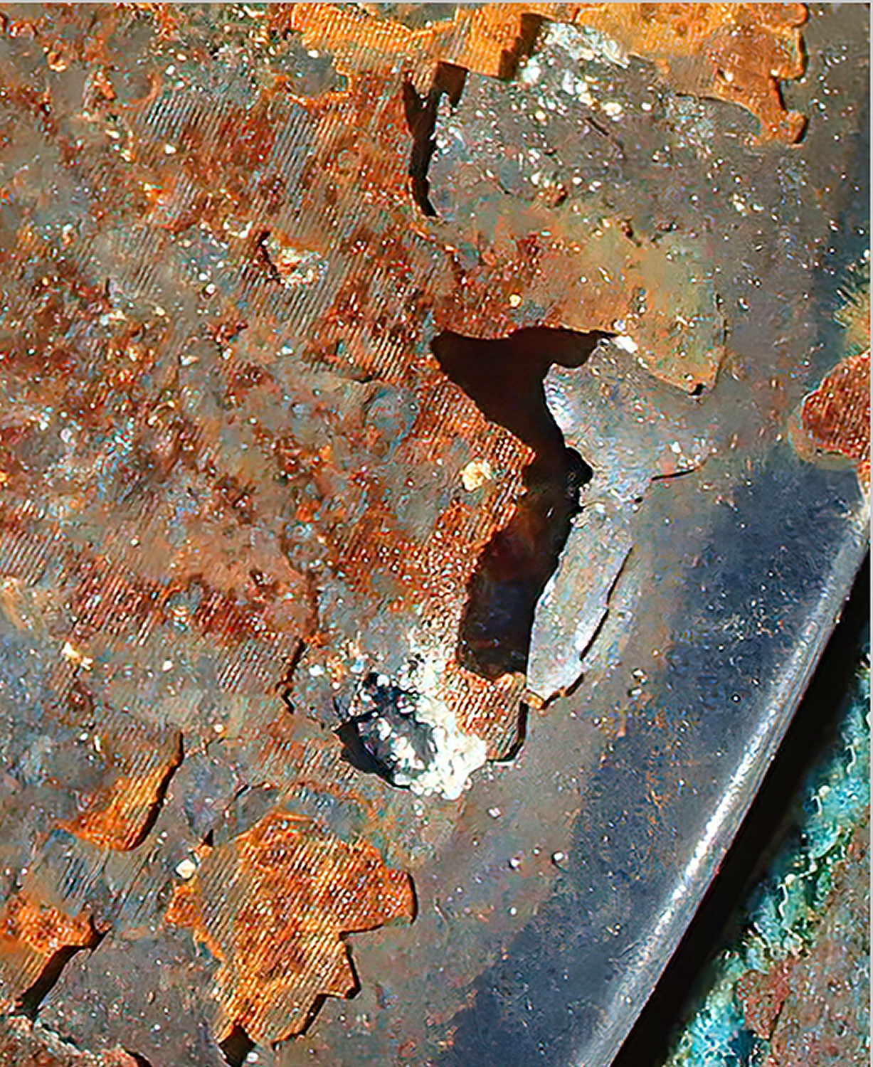
The diagonal lines in Judy's original and the first two crops seem more in keeping with the random nature of the corosion than a vertical line separating the corosion from the green.
|
Aug 5th |
| 30 |
Aug 21 |
Comment |
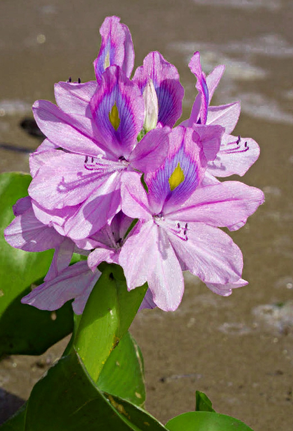
I like this view, which is somewhat like flying into the flower itself. The red portion is great, particularly with the surrounding white. I'd like it more if the bees could have been in focus. As it is really difficult to do a focus stack including live insects, your alternative is to live with some noise, turn the ISO way up, and shoot at something like f/24 or f/32 to get as much depth of field as possible. |
Aug 5th |
| 30 |
Aug 21 |
Comment |
The different crops all help emphasize the interesting expression on the woman's face. I prefer that prominent objects like the pictures on the wall and the blinds not be right on the edges, and also that the origin of the bands of light be explained by showing part of the blinds. In the end then, I prefer Dorinda's crop, but to retain the woman's face, I hope that the final print is pretty large. |
Aug 3rd |
| 30 |
Aug 21 |
Comment |
It is a nice (looking) flower and I also like the choice of crop. Dorinda's reversal increases my comfort with the image. I liked it a bit more after darkening the greens and increasing local contrast. |
Aug 1st |
 |
| 30 |
Aug 21 |
Comment |
It is an interesting image. I think I like it better if it has been cropped, but my preference is for a slightly different crop so that more of the blue-green shows and the hole is less centered and some increase in the saturation. |
Aug 1st |
 |
| 30 |
Aug 21 |
Comment |
Yes, a wonderful B&W. I agree with Jody on those light beams. The beams above and below the table ought to be of similar brightness. |
Aug 1st |
7 comments - 4 replies for Group 30
|
| 42 |
Aug 21 |
Reply |
I think that the white spots are granules of sand. Originally I felt that they were just part of the scene. Knowing that they are sand, do you (and others) still think the image would be improved by their removal? |
Aug 18th |
| 42 |
Aug 21 |
Comment |
What lens was this taken with? |
Aug 12th |
| 42 |
Aug 21 |
Comment |
After looking at this for a week and a half, I think that I'd like it more if there were something like a bush, rock, or stump in the foreground. For me, this would remove the image's current feeling of flatness. |
Aug 12th |
| 42 |
Aug 21 |
Comment |
Before lightening I had no problems with the location of the horizon, but after lightening, I agree with Michael. Also before lightening I had no problems with the water-beach line intersecting the horizon line just a bit outside the image. After lightening, I do. Therefore, I'd like the image more after lightening and cropping from the top and right. This would magnify the figure somewhat. I'm neutral on the buoy. |
Aug 12th |
| 42 |
Aug 21 |
Comment |
I like the clouds and the composition of the person on the beach and the line of the beach upwards to the right. I agree with Stuart in that I too, would like it more if it were a little lighter. To make it brighter without artifacts, it might be necessary to go back to the original raw file. |
Aug 8th |
| 42 |
Aug 21 |
Comment |
Very interesting. It hardly seems possible to fly that fast straight up. If it had been moving that fast, it would have been very close to generating a sonic boom. Thus, I also found Wikipedia's article on sonic booms to be interesting as well. |
Aug 6th |
| 42 |
Aug 21 |
Comment |
Very nice subject. I like the colors, and for me the subject is the hillside in autumn colors. Consequently, I prefer your cropping. |
Aug 5th |
| 42 |
Aug 21 |
Comment |
Because there were no charred areas, I think the wood has not been through a fire. Of course, they could have been washed and abraded off. |
Aug 3rd |
| 42 |
Aug 21 |
Comment |
It is an interesting subject. I like the fact that there is both sky and rock behind the rams. Since it seems like there was a bright sun at your back, was the fill flash necessary? Was it perhaps taken with a 24-100 mm lens? |
Aug 3rd |
| 42 |
Aug 21 |
Comment |
It surely makes me look twice. It reminds me of anamorphic images in fine art. |
Aug 1st |
| 42 |
Aug 21 |
Comment |
This is really nice. I particularly like the range of luminosities and the sharpness. |
Aug 1st |
10 comments - 1 reply for Group 42
|
17 comments - 5 replies Total
|


