|
| Group |
Round |
C/R |
Comment |
Date |
Image |
| 30 |
Jan 21 |
Comment |
I thought I'd try emphasizing the dark center of your image. |
Jan 17th |
 |
| 30 |
Jan 21 |
Comment |
Your comments and suggestions have improved the image. Thank you all. |
Jan 12th |
| 30 |
Jan 21 |
Reply |
Thank you. I'll see what I can do about the white line and those white spots. |
Jan 11th |
| 30 |
Jan 21 |
Comment |
Thanks folks for informing me on coffee and tea pots. I stand corrected on this issue. |
Jan 10th |
| 30 |
Jan 21 |
Comment |
It's an interesting abstract. I agree that the color is necessary. Acting on that, I tinted, making the medium grey slightly blue. It felt even more like ice as a result. I particularly like the result of removing the left and the bottom thirds of the image. |
Jan 4th |
| 30 |
Jan 21 |
Reply |
I clone from part of the image immediately adjacent to what I'm removing. In this case, since there is horizontal detail in the background, for each bird I would clone from right beside that bird. When it is sky like this, I clean up minor imperfections by slightly blurring. In this case, it would be in a stripe across the top. |
Jan 4th |
| 30 |
Jan 21 |
Reply |
Maybe I should mention that my new camera automatically makes a focus stack. Initially you set the focus either on the nearest part of your subject or in front of that point. You also set the number of shots you want taken. The camera takes a shot, adjusts the focus somewhat further away and shoots again, repeating the process until either your preset number of shots has been taken or focus has reached infinity. For safety, I've been over generous on the number of shots to be taken, but 40 is currently my standard for subjects like this flower. Before using the focus stack images, I now go through it to find the range of shots for which some part of the subject is in focus, and I discard the rest. Thus, I should have reported that my image was from a focus stack of 13 shots. |
Jan 4th |
| 30 |
Jan 21 |
Reply |
Your response to the 40 shots in the focus stack prompted me to go back and look at the shots. Only 13 of them had a portion of the flower in focus. Thus, 27 were essentially ignored and were unnecessary. |
Jan 4th |
| 30 |
Jan 21 |
Reply |
I like the birds in general. It is just the eight that touch the top edge that I'd prefer not to be present. |
Jan 3rd |
| 30 |
Jan 21 |
Comment |
That is a fun technique.
It looks to me like the lights are overexposed. Red, in particular, when it is somewhat overexposed becomes orange, and when more overexposed yellow, and then white.
|
Jan 3rd |
| 30 |
Jan 21 |
Reply |
Looking at it a day later, I now do like the change in hue. |
Jan 3rd |
| 30 |
Jan 21 |
Reply |
To me it would look more correct if the shadow of the pot's spout and shadow of the pot's handle were interchanged. It seems to me that the locations of the light sources illuminating the top inside of the coffee cup and the teapot are different. Also, in my experience liquid flowing out of a spout falls in a curved arc. I completely agree that it is a fantasy piece, and a very creative one. I like seeing the objects floating in space and the shards from something being broken, but the little deviations that I've mentioned subtract from my enjoyment of the creation. |
Jan 2nd |
| 30 |
Jan 21 |
Comment |
This made me look twice. The idea is fun. I'd like it more if it weren't coffee coming from a teapot, if the coffee-tea followed a realistic trajectory, if the light source were in the same place for the pot and the cup, and if the shadows were more consistent with what was casting them. Maybe all of these discrepancies are intentional, and the artistic intent is to build an image with many internal contradictions and make the viewer think?
|
Jan 2nd |
| 30 |
Jan 21 |
Comment |
The light box technique gives great results. The red spheres and the green leaves appeal to me. Our own holly is a bit annoying as I had to look for a long time to find a branch with berries closer to the tip so that I didn't need to include so many leaves. That is, I'd like this better if there were fewer leaves. For the fun of it, try converting the white to black. My image of holly became nicer against a black background. |
Jan 2nd |
| 30 |
Jan 21 |
Comment |
I very much like the oranges in the sky and clouds. For me, the multiple birds right at the top edge is a negative. I'd also like it more if the sun and its reflection on the water could be toned down a bit. |
Jan 2nd |
| 30 |
Jan 21 |
Comment |
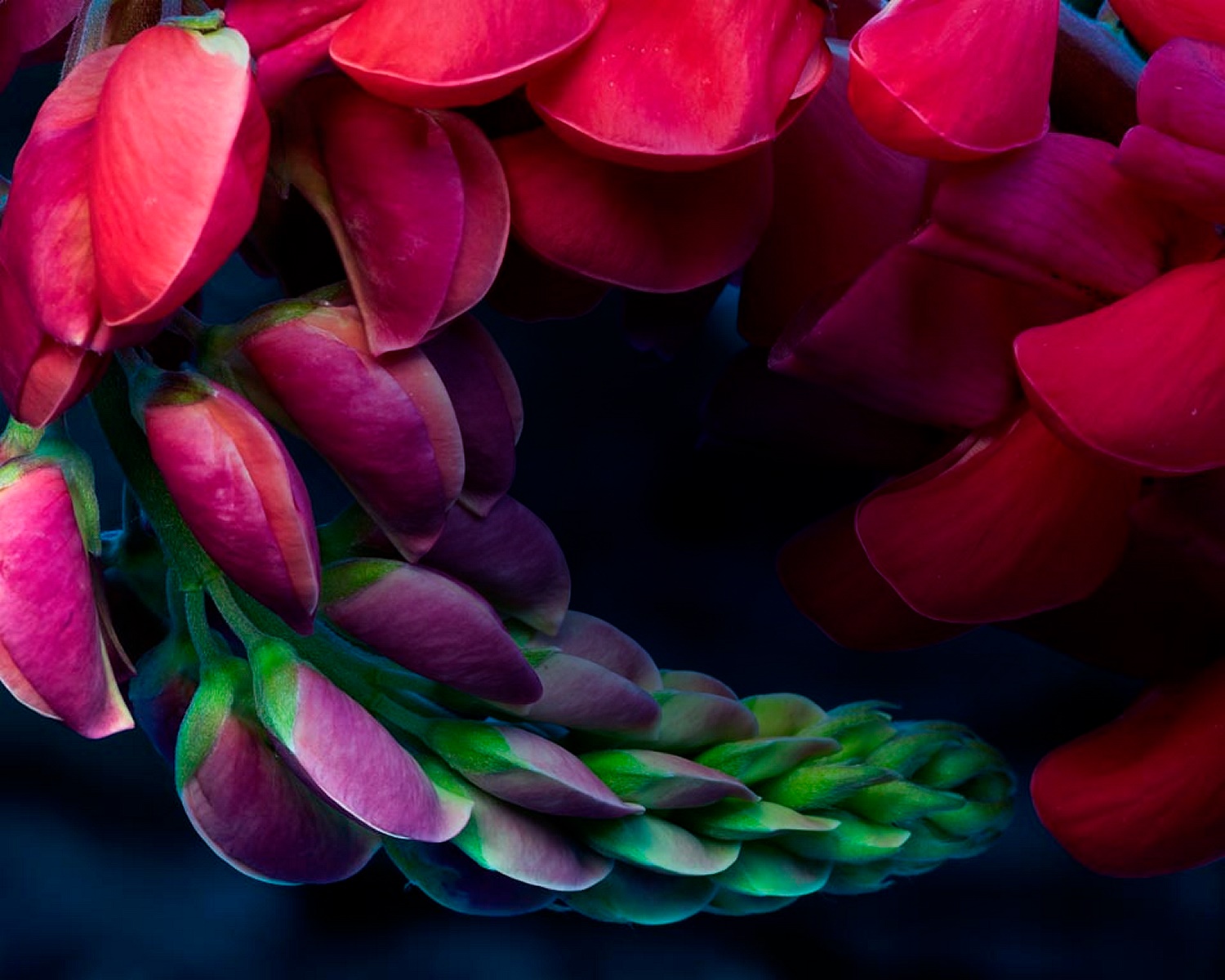
I like the cropping idea. It makes all the difference. I think that I would like it still more if the hues of the reds didn't change so much from the tip around to the portion of the lupin that is close to the tip. |
Jan 2nd |
9 comments - 7 replies for Group 30
|
9 comments - 7 replies Total
|


