|
| Group |
Round |
C/R |
Comment |
Date |
Image |
| 30 |
Feb 20 |
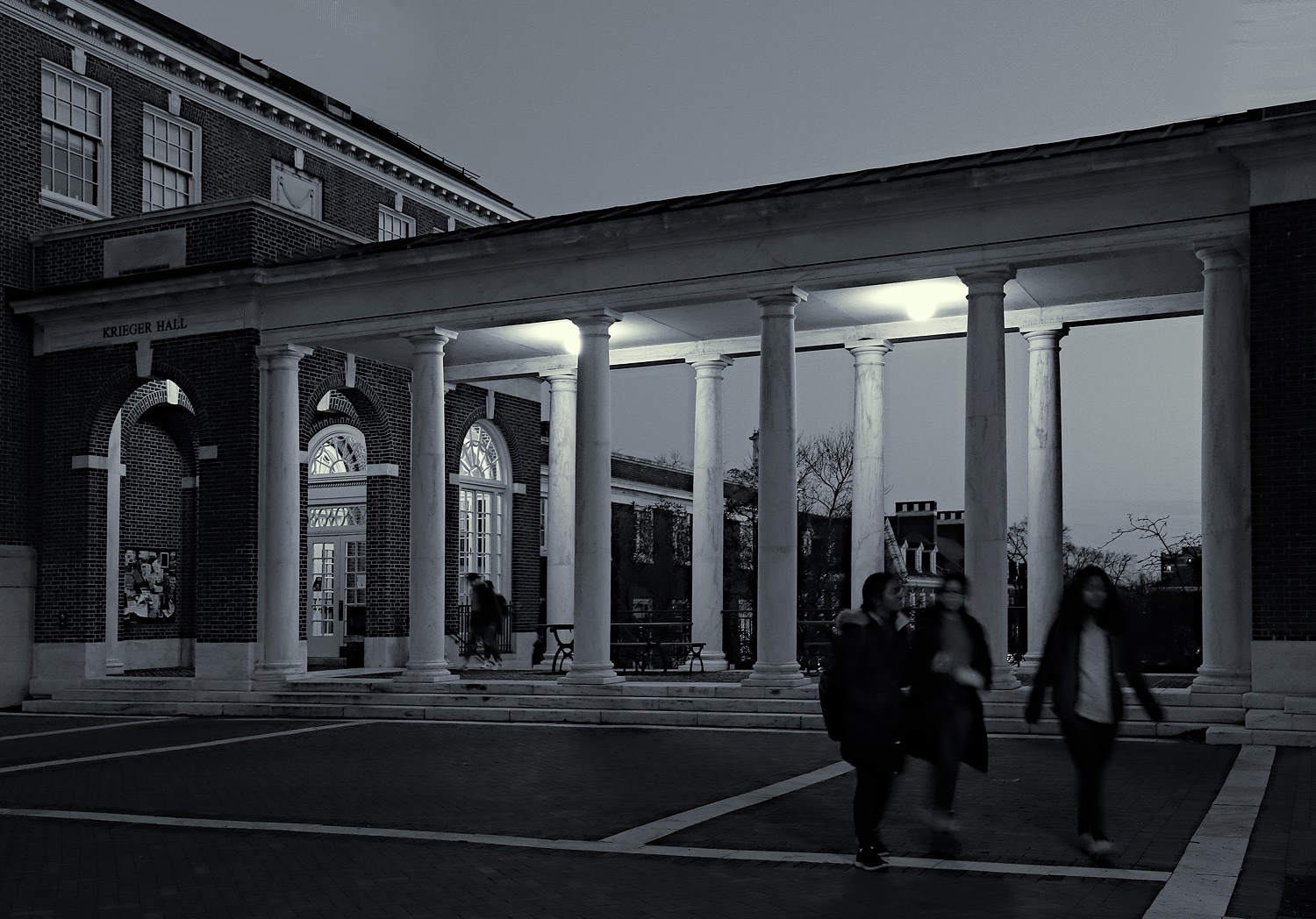
Reply |
I think this is what you have in mind, and I think I like this better than the others. Thank you. |
Feb 24th |
 |
| 30 |
Feb 20 |
Comment |
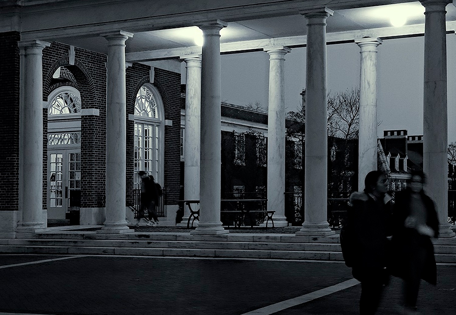
After looking at my revised version for a few days, I've come to feel that the sky is too dark. This is particularly apparent in the thumbnail. Looking at the building in daylight, I see that in the one and a half years since I took the original shot, construction has eliminated the dormers that I liked. Here is another of my 77 images processed to show most of what I think is important. I think that the roof on the left is needed to balance the lines of the colonnade leading out of the image. I don't mind the blurred people, as it shows some motion whereas the architecture is static. |
Feb 21st |
 |
| 30 |
Feb 20 |
Comment |
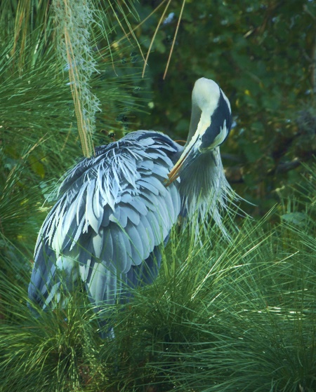
I agree with Judy that it helps to crop a bit. I like the colors a lot, but the bird and its surroundings are pretty similar so I also brightened the bird and removed some of the spots of light. |
Feb 21st |
 |
| 30 |
Feb 20 |
Comment |
For me, the previous two images are a little too simple. My eye zooms out of the image top and bottom and I miss that shadow that is nearly perpendicular to the cables. The windows and the shadow in the original provide a size scale that is important to my understanding. |
Feb 18th |
| 30 |
Feb 20 |
Comment |
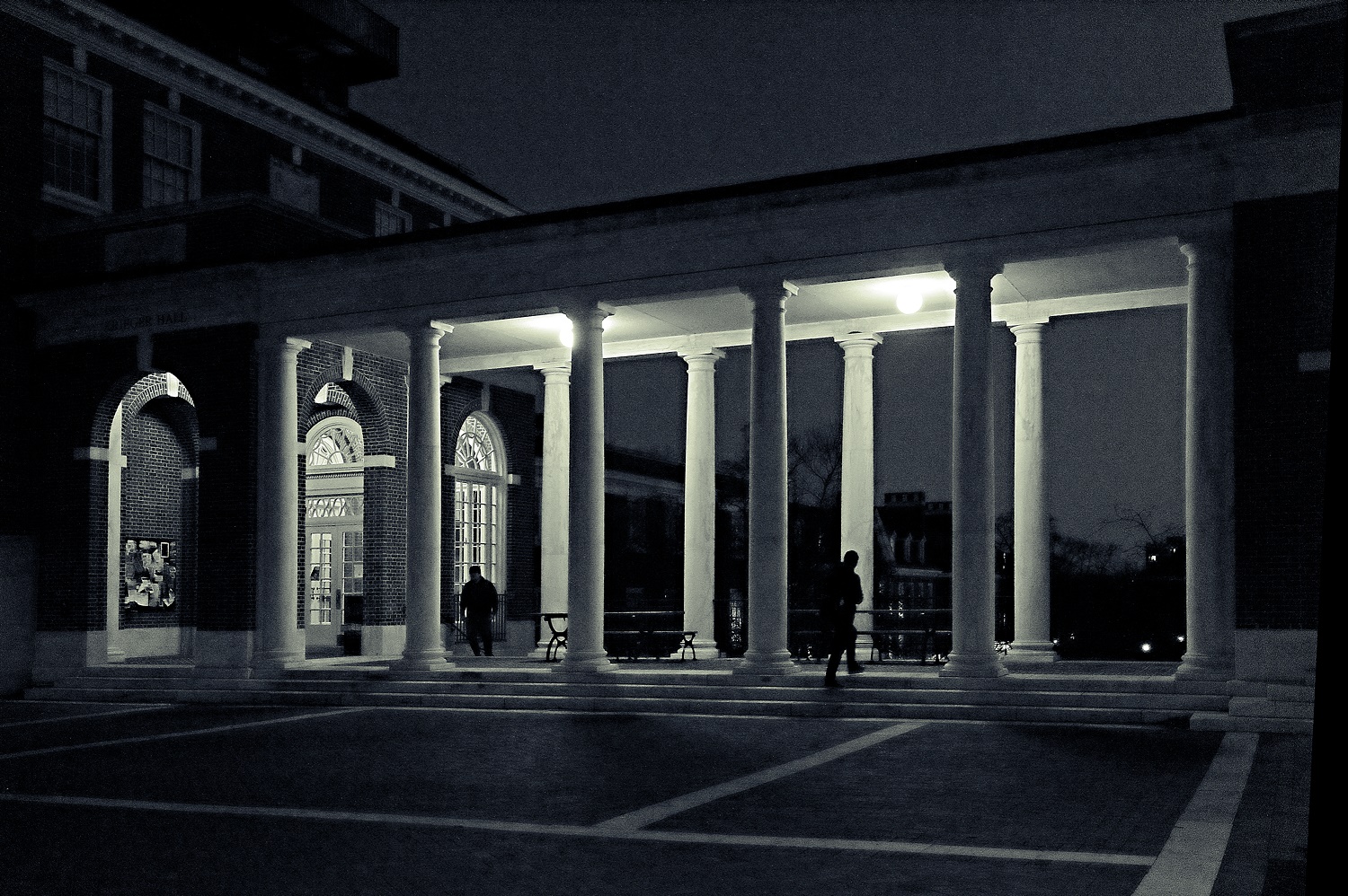
Here is my first retry. In this I tried to preserve the white border that Dorinda mentioned. I took 77 shots over a 30 minute period while twilight faded to near darkness (It was darn cold.) In trying to capture the walking pedestrians, I had to shoot with an ISO of 1600 or 3200 and dramatically underexpose, which produces a lot of noise. (Newer cameras supposedly are better in low light than mine.) I think I've gotten the feeling of people passing through this colonnade, but at the loss of the interesting roof profile of the building on the left. Should I sacrifice the size of the columns and people to regain that roof profile? |
Feb 17th |
 |
| 30 |
Feb 20 |
Comment |
Until you mentioned it, I hadn't realized the value of that white line in the foreground. It is a marble border to the brick walkway.
Before posing people in the shot, I'll see if I can catch random passers-by in good places. |
Feb 15th |
| 30 |
Feb 20 |
Comment |
I like the sharp, crisp lines, the composition, and the high contrast. |
Feb 15th |
| 30 |
Feb 20 |
Reply |
I agree. The blurred person definitely detracts from the image. Now that I look more critically, the other one isn't so good either because it overlaps one of the columns. For a long time I've tried to avoid having people in such shots. Now my thoughts are beginning to change as, to me, such images seem less cold and hard if they have a person in them. I'll see if I can record this with one or two persons in good locations. |
Feb 13th |
| 30 |
Feb 20 |
Comment |
After looking at this from time to time over the past week, I see that I would like the image better if the vignetting were not obvious, and if it could be detected, if it were symmetrical, as would be the case if it were a consequence of the camera's optics. |
Feb 7th |
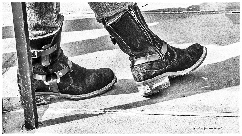
| 30 |
Feb 20 |
Comment |
Very interesting boot design. The image captured my attention for a while as I tried to figure out which was the right and which was the left foot. As a black and white image, this needs more contrast. An S-shaped brightness curve produced this. |
Feb 4th |
 |
| 30 |
Feb 20 |
Comment |
Shooting live insects with a macro and without a bright flash is really difficult. To have a decent depth of field, you need to use a small aperture (since you can't do focus stacking), and to prevent motion blur, you need to use a short exposure. Together these requirements translate into needing a lot of light in order to produce a sharp image. |
Feb 3rd |
| 30 |
Feb 20 |
Comment |
Very nice colors and depth of field. I think it might have been better without the windmill. |
Feb 3rd |
| 30 |
Feb 20 |
Comment |
What a wonderful image. The fog and the bridge design really make this picture. What about traffic in the other direction? Is there a second deck? I like the effect of the fog in softening the background so that the bridge stands out. The trees also nicely frame the bridge, the near absence of color matches the season as shown by the leafless trees. |
Feb 3rd |
11 comments - 2 replies for Group 30
|
11 comments - 2 replies Total
|


