|
| Group |
Round |
C/R |
Comment |
Date |
Image |
| 30 |
Jul 19 |
Comment |
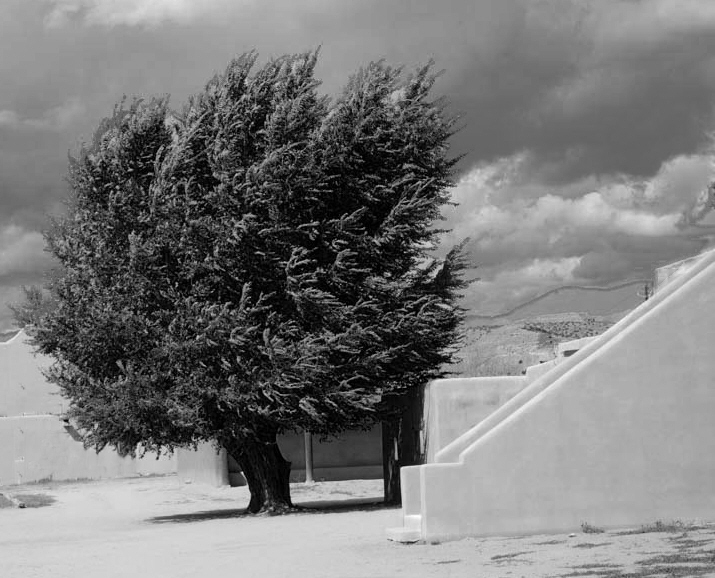
After looking at this for a week and playing a little with it, I like the image better with somewhat less contrast in the sky and clouds. Here it is also with the evidence of modern civilization removed. |
Jul 15th |
 |
| 30 |
Jul 19 |
Reply |
I like the effect of Dorinda's crop, and in addition, I also find that cropping some from the right enhances the image still more. |
Jul 15th |
| 30 |
Jul 19 |
Comment |
I'm still waiting for the groans. |
Jul 12th |
| 30 |
Jul 19 |
Comment |
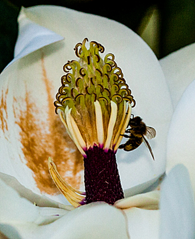
Stunning. I too love the colors, composition, and the out of focus background. To my mind, it would be a little nicer if the entire dragonfly were in focus--head + eyes to tip of tail. I suspect that if the dragonfly was just perched there, that you could have gone with a higher f number and longer exposure so as to increase the depth of field a bit. I believe it will not be hard to paint in the blown edge of the leaf. I played with some sharpening and found that I felt the image was nicer if I pretty aggressively sharpened the leaf and dragonfly and did not sharpen the background. |
Jul 12th |
| 30 |
Jul 19 |
Comment |
As a photo documenting pollination this nicely covers all the bases. As an art photo, this is a little too complicated for my taste and I would prefer that more of the shot be in focus. You hinted at a crop centered around the upper bee. I agree, this forms a nicer image. |
Jul 12th |
 |
| 30 |
Jul 19 |
Comment |
I like the perspective generated by the use of a wide angle lens from relatively close to the car. I think the background adds a lot to the image and ought to be visible. As it is in the submission, it is somewhat distracting. Perhaps it would be nicer if the background were somewhat darkened. |
Jul 2nd |
| 30 |
Jul 19 |
Comment |
Strange, my original comments have vanished. Anyway, I like the cropping and the conversion to B&W. I think the image would look better if the electrical conduits and the perfectly rectangular openings in the structures in the lower left were removed. |
Jul 2nd |
| 30 |
Jul 19 |
Comment |
The basic idea is most creative. I would never have thought to take a standard Western scene like this and add this kind of interest. I'd like the image better if the sun beams emanated from the location of the sun as indicated by the shadows from the rock outcroppings. In my opinion it would also increase the realism of the image, and hence, my enjoyment of it, if the sun beams ended before coming in front of the hills. |
Jul 2nd |
| 30 |
Jul 19 |
Comment |
Because I have such a vivid memory of the fern, I can't easily tell how well the feeling of depth is conveyed by your modifications of my submission. It seems to me that lightening the center reduces the feeling of depth that I sought. Your comments on this are making me rethink the issue.
I adjusted tonality primarily using a brush-type tool that I used to darken the center and slightly lighten the ends of the fronds.
In some of the images that I have previously submitted, comments have suggested eliminating the background as Dorinda suggests here. I can see the value of this suggestion, but I still haven't adjusted to this view. To me removing the background removes the context of the shot and leaves it feeling a bit like an object in a museum (pressed leaves or a pressed flower?). Perhaps I care too much that an image look natural and not like it has been artificially modified. |
Jul 2nd |
| 30 |
Jul 19 |
Comment |
Nice punography. I agree with Dorinda on the brightening and cropping. |
Jul 2nd |
9 comments - 1 reply for Group 30
|
9 comments - 1 reply Total
|


