|
| Group |
Round |
C/R |
Comment |
Date |
Image |
| 30 |
May 19 |
Comment |
My image editing program does not, but I think that PS allows blurring in a direction, much like what you would get if you were panning your camera. |
May 16th |
| 30 |
May 19 |
Reply |
There are three people on the bridge. |
May 12th |
| 30 |
May 19 |
Comment |
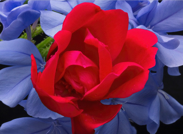
I like Judy's modification of the red of the rose, but less so covering the green patch at 11 o'clock with respect to the rose. I was interested in what Viveza 2 and Camer Raw Filter actually did to the image and I found that merely increasing the contrast of the rose produce an image that looks very similar to what her programs had done. Interestingly, for me, this increase in contrast overcomes the minor problem of the rose not looking sharp. |
May 8th |
 |
| 30 |
May 19 |
Comment |
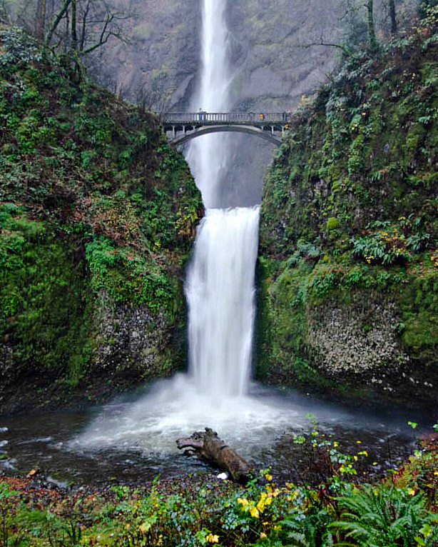
This should allow us to judge the image's impact with the drain removed. I feel it is a bit of an improvement.
|
May 8th |
 |
| 30 |
May 19 |
Comment |
It just occurred to me that it was probably not possible to have taken this from five feet to the left or right, as either would have altered the offset between the upper and lower falls. Taken from the left, the upper falls would lie partially behind the bridge's lower support, and taken from the right, the upper and lower falls would have aligned yielding a confusing image. |
May 7th |
| 30 |
May 19 |
Comment |
That is really lovely. What makes it for me is the difference in color saturation, with the less saturated blue forming the background. (I don't think it would work at all to have the background highly saturated and the flower in front being unsaturated.) I agree with Dorinda that it would likely improve the image if the rose were obviously sharper, and perhaps it would also improve the image if the background blue were blurred just a tad. I wonder if the image would look even more real if the top edge of the rose were just a little less crisp as that top edge is sharper than the interior edges of the petals. I tried blurring the edge, and it seemed to help for me. |
May 6th |
| 30 |
May 19 |
Comment |
Judy commented on the crop factor and f stop. At first this statement is somewhat paradoxical as f values affect image brightness and have nothing to do with the size of the sensor. That is, until you adjust image size. If an image just fills the frame on a full frame camera, then, if you switch to a crop frame camera at the same distance and with the same zoom lens and you adjust focal length so that the image again just fills the frame, the focal length needed for the crop frame camera will be smaller, and hence the background blur will be less than it was with the full frame camera. Thus, with respect to background blur, a crop frame camera can appear to have a greater depth of field. |
May 5th |
| 30 |
May 19 |
Comment |
I think this is a more interesting execution than your similar image of several months ago. I understand your "artist's prerogative" in making whatever image you like, but possibly you would like to hear others' reactions to your ideas. While I like the basic idea and execution, I would like the end result more if the out of focus mesh and the illumination from the upper right were not present, and if the grain in the wood floor looked like it was a natural size. |
May 3rd |
| 30 |
May 19 |
Comment |
Judy's crop would be the standard one for flowers like this, but I, like Dorinda, like the curve of the stem. |
May 3rd |
| 30 |
May 19 |
Comment |
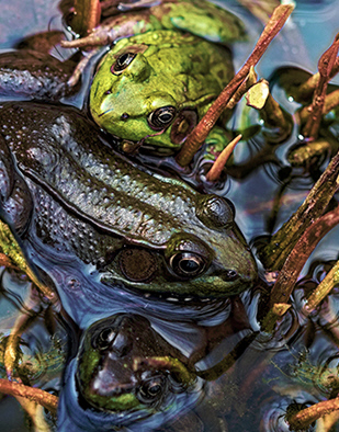
Dorinda's crop helped me a lot with this image. Now the frogs are prominent and I really like it. I think Dorinda also reduced the brightness of Jessica's image, but I prefer the image resulting from reducing the color saturation by about 20%. |
May 3rd |
| 30 |
May 19 |
Comment |
I love these great colors and the nice overall composition. Reversing the direction of the rider makes the image conform to the natural movement of our eyes from left to right, and this is also very nice. Unfortunately, the change marks the image as having been manipulated because there are no left-handed polo players--too dangerous. The image could have been improved if the shutter speed had been quite a lot faster so the horse and rider could have been sharp. This could have been done either by using a larger ISO and/or brightening an underexposed image. I think it would help this image if the demarcation between green and white of the picket of the fence just at the rider's waist were blurred like everything else at this distance from the camera. |
May 2nd |
| 30 |
May 19 |
Comment |
That's really interesting. I didn't know that some birds fish like this. At least, it looks to me like the bird doesn't have a particular fish in sight, but instead is dragging its beak through the water in hopes of encountering a fish. It is nice that you got the entire bird in the frame. I can't help feeling that either the original or the inset alone would appeal to me more than your composite. |
May 2nd |
| 30 |
May 19 |
Comment |
What a fantastic waterfall. A rainy day was the right time for this shot. The colors are more saturated on such days. I also like the slight blurring of the water in the waterfall--just right. The cropping fits the shape of the falls. Initially, I thought the brightened green near the lower falls was appealing, but after a while it began to feel artificial and overemphasized. Here is a version that I've brightened and sharpened a bit that I'm a little more comfortable with. I wonder how this would look if it had been shot from five feet to the left or right so that the log wouldn't be right in the middle. Maybe clone it out? |
May 1st |
 |
12 comments - 1 reply for Group 30
|
12 comments - 1 reply Total
|


