|
| Group |
Round |
C/R |
Comment |
Date |
Image |
| 30 |
Mar 19 |
Reply |
Thanks for the information. |
Mar 19th |
| 30 |
Mar 19 |
Reply |
With respect to the horizontal line--I have no where near the ability to take a picture in which all, or even most elements all work together to produce a holistically consistent image. That horizontal line was present, and I could not avoid it. |
Mar 15th |
| 30 |
Mar 19 |
Comment |
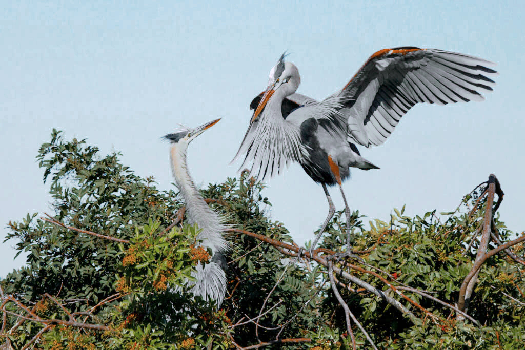
Initially I misinterpreted my color correction. Color balance in this image seems to be corrected by increasing the strength of blue by about 20%. This makes the sky even more dominant than before. Lightening the birds a little and dramatically desaturating the sky seems to me to improve the image, but I'm still not satisfied with the brightness of the birds or with what seems like a mock eyespot in the bird on the right. |
Mar 15th |
 |
| 30 |
Mar 19 |
Comment |
Judy's thoughts parallel my own. In addition, the beautiful pink color probably would have been visible on more of the petals if the exposure had been a little less. |
Mar 11th |
| 30 |
Mar 19 |
Comment |
I like the sharpness and the detail as well as the plumbing itself. You don't often see large pipes in any orientation other than horizontal or vertical.
I'm still learning how to like grunge shots.
Not having heard of On1 before, I looked it up. I like their attitude towards costs--no monthly rental. I find it very disappointing however, that their web site gives so little important technical information. For example, does it work with 8 or 16 bit depth, what color spaces does it work in, can it convert between color spaces? Does it utilize multiple processors and threads if present? |
Mar 7th |
| 30 |
Mar 19 |
Comment |
I like the pose, with the birds looking at one another. I also like the birds in and on the vegetation as well as the feeling of sharpness of the shot. I like the cropping as it is, but I also like it cropped on the left as Judy suggests, with a little cropping on the right and top. I think the picture would be improved if the color were balanced. At present green is too strong. |
Mar 7th |
| 30 |
Mar 19 |
Comment |
I see that the gold grass in the original is a negative, but that cropping it off leaves the image unbalanced. Judy's modification seems to leave a hole that I'm uncomfortable with. Here is yet another variation in which I converted the submitted image to B&W, then lightly cloned back onto it color from the original. |
Mar 6th |
 |
| 30 |
Mar 19 |
Reply |
Wait until you see next month's submission. Winter doldrums have me doing unusual things. |
Mar 6th |
| 30 |
Mar 19 |
Comment |
Is this any better? |
Mar 5th |
 |
| 30 |
Mar 19 |
Comment |
It think it is a nice street photograph and I wonder what the girl is thinking amidst the other people. I like the green wall of vegetation too, but what must be mist for watering that separates the green and the right half makes it hard to include both the vegetation and the people. It would have been great if the picture could have been taken when the mist was off. |
Mar 5th |
| 30 |
Mar 19 |
Comment |
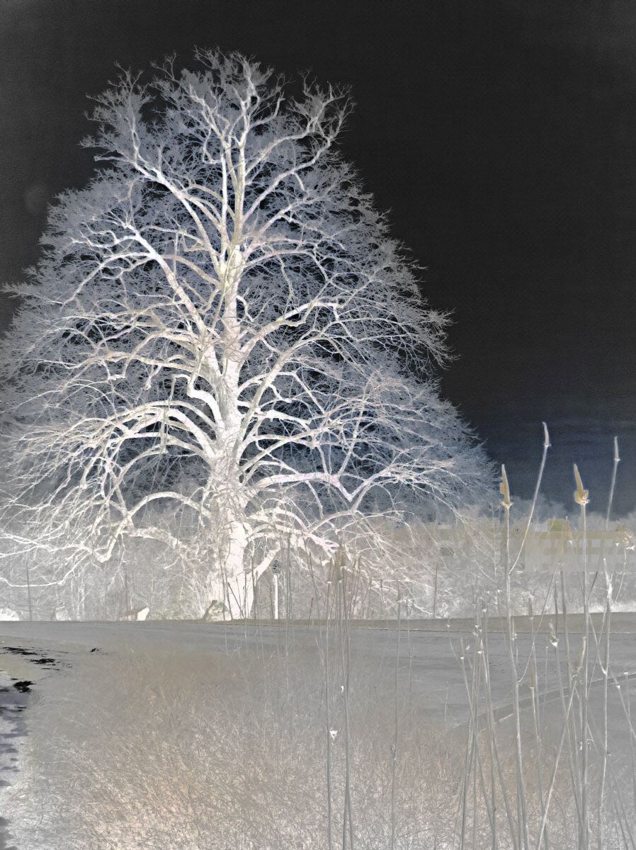
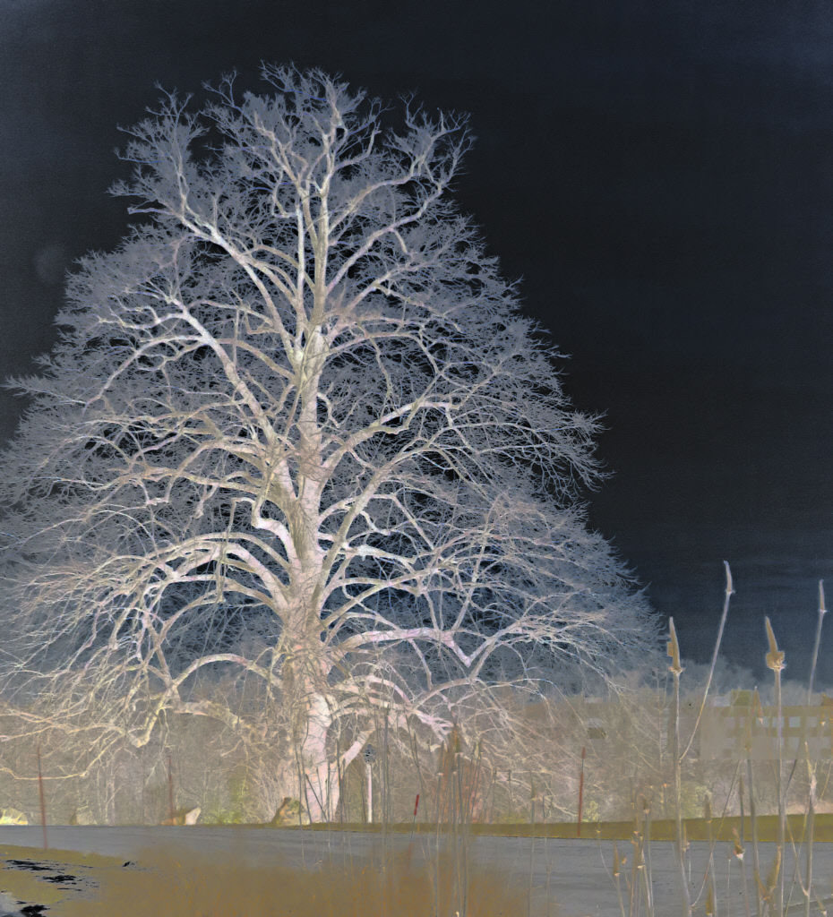
I reversed the brightness with a tone curve. Normally a tone curve runs from the lower left corner to the upper right corner
of a brightness histogram with some deviations along with way to increase or decrease contrast of areas of different brightness. Two reverse the brightness, I used a tone curve that ran from the upper left to the lower right. |
Mar 4th |
| 30 |
Mar 19 |
Comment |
I like the idea and its execution. The birds are nice and sharp. I think it would have been still nicer if the birds had been coming towards us and/or we could clearly see their eyes and heads. |
Mar 4th |
| 30 |
Mar 19 |
Comment |
I like the pose, crop, sharpness of the fur, and the color and bokeh of the background. |
Mar 4th |
10 comments - 3 replies for Group 30
|
10 comments - 3 replies Total
|


