|
| Group |
Round |
C/R |
Comment |
Date |
Image |
| 30 |
Jun 18 |
Comment |
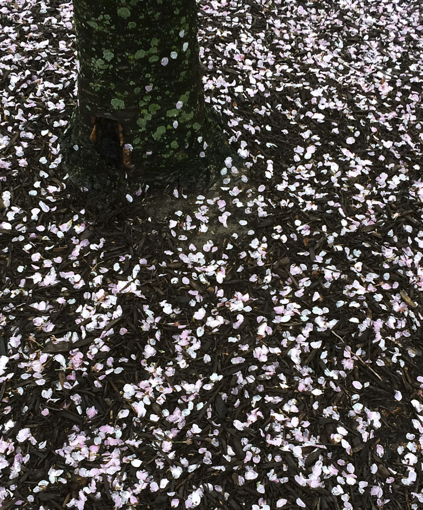
I intended the blossoms on the ground to be the primary subject. To reduce the importance of the tree, here I've darkened the moss. Rectilinear sometimes is too rigid and boring. In this case I can't tell how somewhat straightening the tree has altered the feeling. It wasn't possible to make it perfectly vertical without it ending uncomfortably close to the left edge. |
Jun 16th |
 |
| 30 |
Jun 18 |
Comment |
As for the color of the puddles, possibly the puddles are sufficiently shallow and their bottoms are a yellowish color so that, when added to a blue sky, it shifts the apparent color to something more cyan.
Initially I was so taken with the ancient style of house that I overlooked the modern houses in the background. Now, after a couple weeks of looking, they intrude a bit, and Judy's crop and blurring helps.
Judy's comment about using a telephoto to blur backgrounds prompted me to look into the suggestion. It looks like a most valuable technique to be aware of |
Jun 15th |
| 30 |
Jun 18 |
Comment |
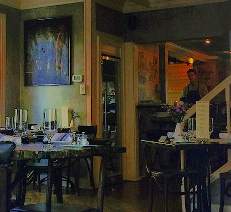
To me, part of the plant partly in front of the window is not soothing, it feels a little like a poke in the eye. I'll still advocate for the sinister feeling generated by the bartender in the background. |
Jun 11th |
| 30 |
Jun 18 |
Comment |
Getting "Two" into the title was my first idea, pas de deux is a ballet term that means steps or dance for two dancers. In terms of the image, brightening the legs so that all four are easily visible might help. |
Jun 11th |
| 30 |
Jun 18 |
Comment |
How about a title of "Pas de Deux" to make it clear from the beginning that there are two birds here. (Initially I missed the second bird.) |
Jun 10th |
| 30 |
Jun 18 |
Comment |
Judy's crop makes this more interesting to me. |
Jun 10th |
| 30 |
Jun 18 |
Comment |
My wife really liked this image. |
Jun 10th |
| 30 |
Jun 18 |
Comment |
For me there are too many different things going on in this image.
I kind of like the lurking bartender if the window is cropped out and the dark areas are lightened. The modern thermostat on the wall and the electrical outlet don't fit the mood, but can easily be removed.
|
Jun 6th |
 |
| 30 |
Jun 18 |
Comment |
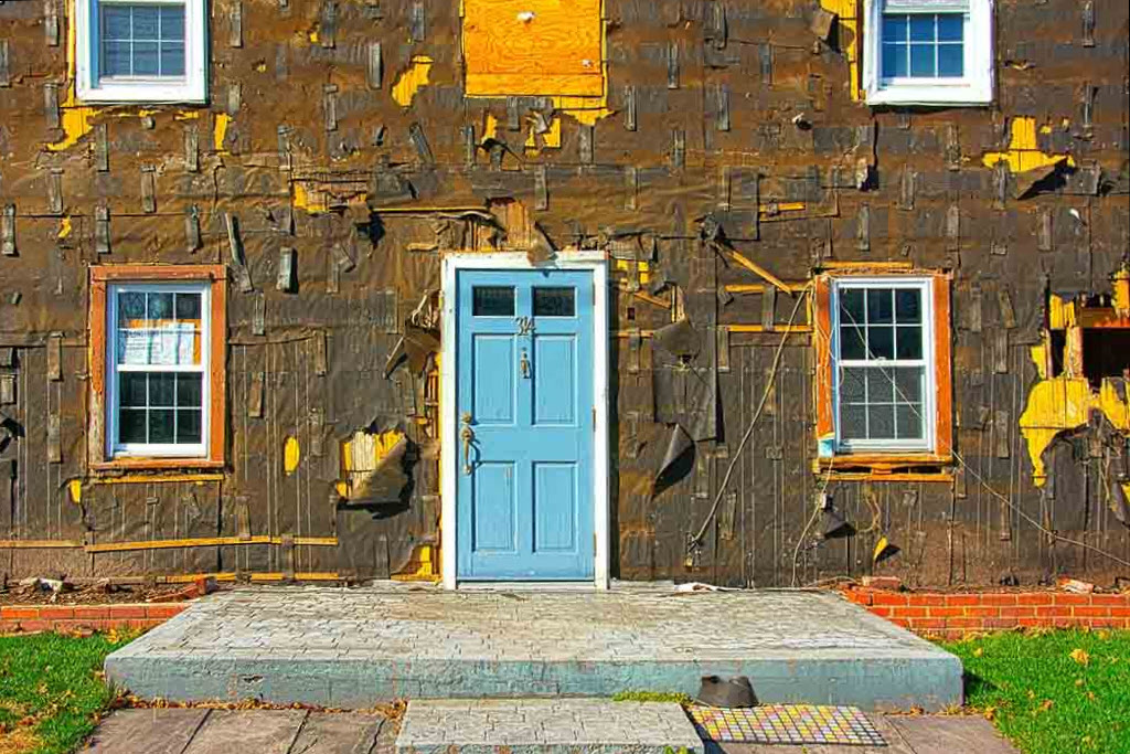
It is an interesting juxtaposition. This head-on view makes me want horizontals and verticals to be perfectly horizontal and vertical. Their slight departures is a little discomforting to me. Here I've trued it up a bit. |
Jun 4th |
 |
| 30 |
Jun 18 |
Comment |
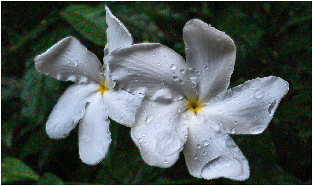
It is possible to brighten the whites while leaving the background dark and to sharpen this a little. The large water drop in the lower right and the folded petal of the left flower are somewhat inconsistent with the delicate perfection I associate with flowers. |
Jun 2nd |
 |
| 30 |
Jun 18 |
Comment |
This is nice documentation of a most interesting house. The sky and clouds are a little too contrasty for my taste. Parts of most clouds are blown, and the bottom of the cloud on the right has acquired an unnatural purple color, probably because one of the three color channels oversaturated. I am a little perplexed as to why the reflections of the sky from the puddles on the right are not the same shade of blue as the sky. |
Jun 1st |
| 30 |
Jun 18 |
Comment |
It is an arresting image. What kind of bird is it? I like it with the bird brightened a little and with a slight increase in local contrast. |
Jun 1st |
 |
| 30 |
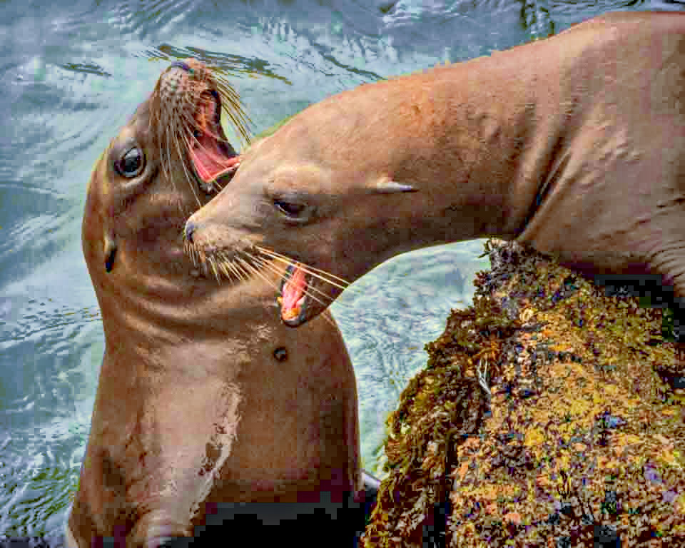
Jun 18 |
Comment |
It is very nice concentrated activity. I found the image to be a little dark. On lightening it, it seemed that the vignetting did not fit the subject and its cropping. On reversing that, it seemed that the color of the water wasn't as appealing as it might be. There is nothing really wrong with the submitted image, it is just that one little change led to another. Here is the product of my changes. |
Jun 1st |
 |
13 comments - 0 replies for Group 30
|
13 comments - 0 replies Total
|


