|
| Group |
Round |
C/R |
Comment |
Date |
Image |
| 30 |
May 18 |
Comment |
Judy's crop brings out the beautiful curves in the red "leaf". I'm a little uneasy with the colors though, but I don't know what I would like more. |
May 12th |
| 30 |
May 18 |
Comment |
I agree with the comments above.
Jeff Cable has produced an entertaining and informative video on sports photography that could be of interest, https://www.youtube.com/watch?v=LLjZTqKISIs
His suggestion on how to deal with distracting backgrounds like you had here is to shoot from very low.
|
May 12th |
| 30 |
May 18 |
Comment |
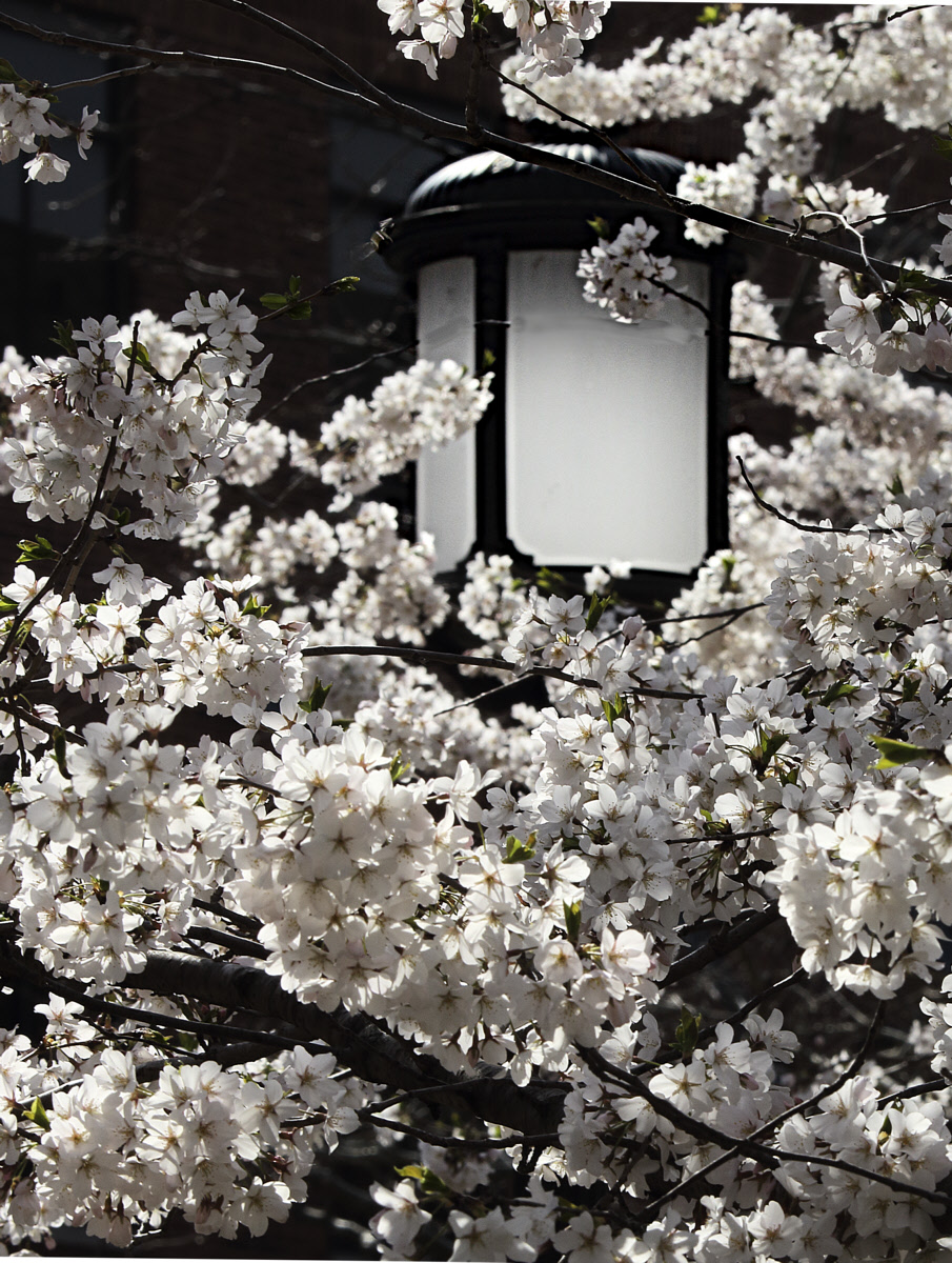
Well, maybe all of you are right, more tightly cropped, and with more of the blossoms in focus, this does seem a little nicer, even if it doesn't have the lamp quite as sharp as it should be. |
May 12th |
 |
| 30 |
May 18 |
Comment |
Yes, it is a red brick wall.
I'll take another look at the shots where I focused on the closest blossoms.
To me, a closer crop changes the subject from the blossoms to the lamp, and then, it would have to be in focus. Thus, I will also take another look at cropping some where I did have the lamp in focus. |
May 2nd |
| 30 |
May 18 |
Reply |
I'd be interested in seeing Dorinda's idea executed without the light beams. Vignetting may be the answer here. |
May 1st |
| 30 |
May 18 |
Comment |
At first I didn't take to the lime green, but as I looked at the image, I came to like the combination of the red and green. The plants themselves are a bit of a jumble for me. |
May 1st |
| 30 |
May 18 |
Comment |
Initially I had trouble appreciating the fluorescent lights, but then, after I had processed the stone walls and ceiling, the image became really interesting as a contrast with modern inventions and classical, old construction methods. To my mind the rays coming in from the upper left detract from the image as they are just too much, sort of a photographic cliche, and architecturally, it seems unlikely that an opening exists in the area from which they emanate |
May 1st |
| 30 |
May 18 |
Comment |
I really like the neck feathers. The water spout is amazing, but it draws my eyes away from the Egret. The more I look at the spout, the more I wonder how the Egret made it, for in my limited experience in making splashes, the volume of water splashed is roughly equal to the volume of whatever smashed into the water, and usually a splash surrounds whatever smashed into the water. Neither looks to be the case here. Thus, this image has me thinking about splashing rather than about birds. |
May 1st |
| 30 |
May 18 |
Reply |
Yes, you've got it. |
May 1st |
| 30 |
May 18 |
Comment |
I really like this. I like B&W images to be pretty contrasty, and although this image nicely spans the range from pure black to pure white, but it was possible to give this a little more punch by increasing the steepness of the tone curve over the middle brightness region. I'm posting this modification, but seeing the change from the original may depend on your viewing conditions. |
May 1st |
 |
| 30 |
May 18 |
Comment |
To me, the B&W is much more interesting than the color version (which seems to be a different shot). I liked it a little more when I increased the contrast in the brighter portion of the tone curve but did not change either the black or the white points, that is, I increased the steepness of the upper middle of the tone curve. I wanted the image to be a little sharper, but applying any sharpening to this image seems to degrade it. Perhaps this was a subject suitable for focus stacking or a very small aperture. |
May 1st |
9 comments - 2 replies for Group 30
|
9 comments - 2 replies Total
|


