|
| Group |
Round |
C/R |
Comment |
Date |
Image |
| 30 |
Apr 18 |
Reply |
In thinking about the various comments to this image I realize that whether or not I feel an image is too cluttered sometimes depends on the ultimate size of the print (or what I imagine that it will be). I wonder if other folks find this to be the case. Perhaps take Dorinda's crop and my corrected version and look at them at different sizes on your monitors. I'll be interested to hear if size alters other people's feelings about clutter. I picture this image to be printed at about 10 x 18.
Part of my size-dependent evaluation of clutter comes from my experiences in providing high resolution images six feet across that are displayed in the Biology Department building. Images that look good when printed at six inches across often don't look good at six feet across and vice versa. |
Apr 18th |
| 30 |
Apr 18 |
Comment |
I agree with Jon on the focusing. We can view this as focus vignetting. |
Apr 17th |
| 30 |
Apr 18 |
Reply |
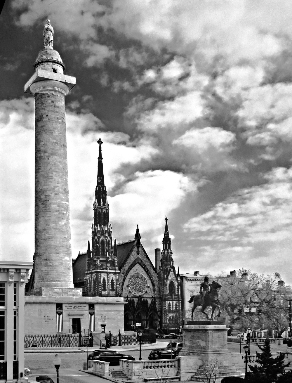
Yes, those tilted columns do look pretty silly. Here I've corrected them (not that easy). I've increased the contrast and brightness of George on the column, and the column itself, reducing the need for a cloud. I also increased contrast of the church spires and George on the horse. Each time I process, larger and larger portions of the clouds get blown even though they are not being explicitly modified--a side effect of jpg file compression. |
Apr 15th |
 |
| 30 |
Apr 18 |
Comment |
The grass background really does make this a more appealing image, but is this a representative context for this young woman?
This comment (apology) is addressed to all the group members. As you can infer from a number of my past comments, I am not an enthusiast of significant editorial or artistic changes to a photograph. There are two reasons for this. First, in the predigital era, significant manipulation of photographs was very difficult, and photographs were documentary evidence of events and scenes. This made artistic photography dependent on the photographer's creativity in identifying and photographing something beautiful, and not dependent on his creativity in gross manipulation of an image's content after recording the image. I still like the idea that a photograph represents reality at the time the image was recorded. My second reason for disfavoring wholesale manipulations of an image like replacing one sky for another is that as a research scientist, my progress in understanding nature is absolutely dependent upon seeing and interpreting the data exactly as it is. Seeing through rose-colored glasses interferes with progress, even if data from a particular experiment looks prettier that way. (Unfortunately?), this striving seems to have expanded beyond my professional work to my photography. I understand that my position is not universally held (although it is close to that of National Geographic) and many very fine images are generated by the combination of a good starting image and artistic and skillful postprocessing. |
Apr 12th |
| 30 |
Apr 18 |
Comment |
Judy's crop leaves the image more balanced, and more to my liking. |
Apr 10th |
| 30 |
Apr 18 |
Comment |
I love the blue sky above. It makes the image special. The shadows of the mullions and transoms also add to the uniqueness of this image. Is there any way to emphasize them? |
Apr 10th |
| 30 |
Apr 18 |
Comment |
I'm with Leonid on this one. It is true that the crop provides a variation from a standard flower shot, but on the other hand, there seems to be no reason within the image to crop like this, and I find it slightly disquieting to have the flower chopped up. In my mind, the chopping outweighs the virtue of variation, and thus, I prefer the original. |
Apr 10th |
| 30 |
Apr 18 |
Comment |
The fact that the background is concrete doesn't bother me much, (although I'm no fan of such wholesale substitutions) but it certainly helps to crop enough off the top to remove that dark horizontal line. Because the clothing and jewelry are as important to me as the face, I prefer leaving them as in the original. |
Apr 5th |
| 30 |
Apr 18 |
Reply |
Artistically, your crop produces a more harmonious image. Furthermore, the new center of attention has a bright cloud behind it. In this crop, there is no apparent reason why the photographer didn't shoot from a lower position and put a cloud behind George on the horse and each of the church spires, whereas with the pedestal in the picture one can see that such a shot is not possible. Psychologically, I have a minor problem with this crop that makes the church spire the center of attention, and that is that the spire contains a lot of interesting detail, and I sort of hate not displaying more of that detail. In both versions I rather like the diagonal line formed by the tops of the four (my crop) or three (your crop) points of interest |
Apr 5th |
| 30 |
Apr 18 |
Comment |
It is interesting action, and nice angle for the sunlight. Pity that there wasn't a way to catch the foursome looking towards the camera instead of away. Because the course mark isn't visible, I don't automatically know that they must just have made a turn. Consequently, it seems a little strange that they seem to have significant speed, and yet the sails are not taut. |
Apr 5th |
| 30 |
Apr 18 |
Comment |
Having looked at this image for a week, I can now see that a good photographer would have waited (if his wife had been patient) until a bright, sunlit cloud was behind George on the pedestal |
Apr 3rd |
| 30 |
Apr 18 |
Comment |
As with Jon's submission, I can't really comment. |
Apr 3rd |
| 30 |
Apr 18 |
Comment |
I can sympathize with your discomfort at doing street photography. I have the same problem. Therefore, I don't look at much work from street photographers and don't do much myself--thus leaving me in a poor position even to say whether or not I like something. |
Apr 3rd |
| 30 |
Apr 18 |
Comment |
The colors are stunning, and the swirl of the petals is intriguing. Although such a departure from reality is not something that I favor, for the fun of it, I tried to convert your original into something resembling your submission. I guess that both the decreased bit depth and the lower spatial resolution of the original as posted on the web compared to your original raw file prevented me. Primarily, I was thwarted by posterization. I just couldn't produce a smooth yellow to purple gradient. |
Apr 3rd |
11 comments - 3 replies for Group 30
|
11 comments - 3 replies Total
|


