|
| Group |
Round |
C/R |
Comment |
Date |
Image |
| 30 |
Feb 18 |
Reply |
Yes, I did adjust the color. The image of 2/10 is straight from the raw file without any color adjustment. |
Feb 14th |
| 30 |
Feb 18 |
Reply |
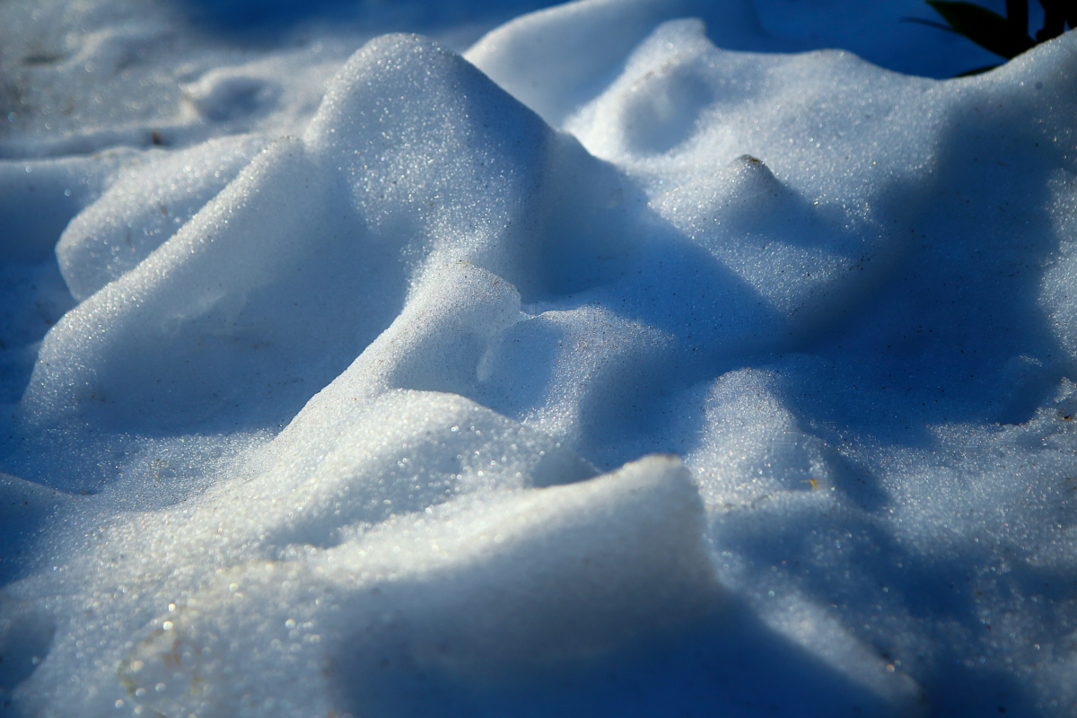
I found it hard to compare the over sharpened original and the less sharpened until I eliminated some of the annoying color differences. Here is the less sharpened version made more similar to the 2/08 version. I am coming to like this better than the over sharpened version. |
Feb 14th |
 |
| 30 |
Feb 18 |
Comment |
With the dearth of interesting outdoor subjects in this almost snowless winter, I've turned towards macro thinking and subjects. Therefore, I wonder if this interesting latch itself might be a good subject. By the way, a double loop latch like this is a way to put two locks on a chest and thus require the simultaneous presence of two people to open the chest. In essence, I'm with Dorinda, but with even more cropping or closer shooting than the original. |
Feb 14th |
| 30 |
Feb 18 |
Reply |
The substitution of black for the blue and the green and the gradient that takes out a lot of the red seems to me to deaden the image and make it feel somewhat contrived. I agree with Judy that the white spot in the upper left is a distraction that could be fixed. I think that my mind really needs the blue and green as their presence seems to accent and enhance the beautiful golds and reds. |
Feb 13th |
| 30 |
Feb 18 |
Reply |
Judy's crop almost magically ameliorates my earlier concerns. The ridge is no longer messy and I don't have the conflict between center and right. Now I really like this image. |
Feb 13th |
| 30 |
Feb 18 |
Reply |
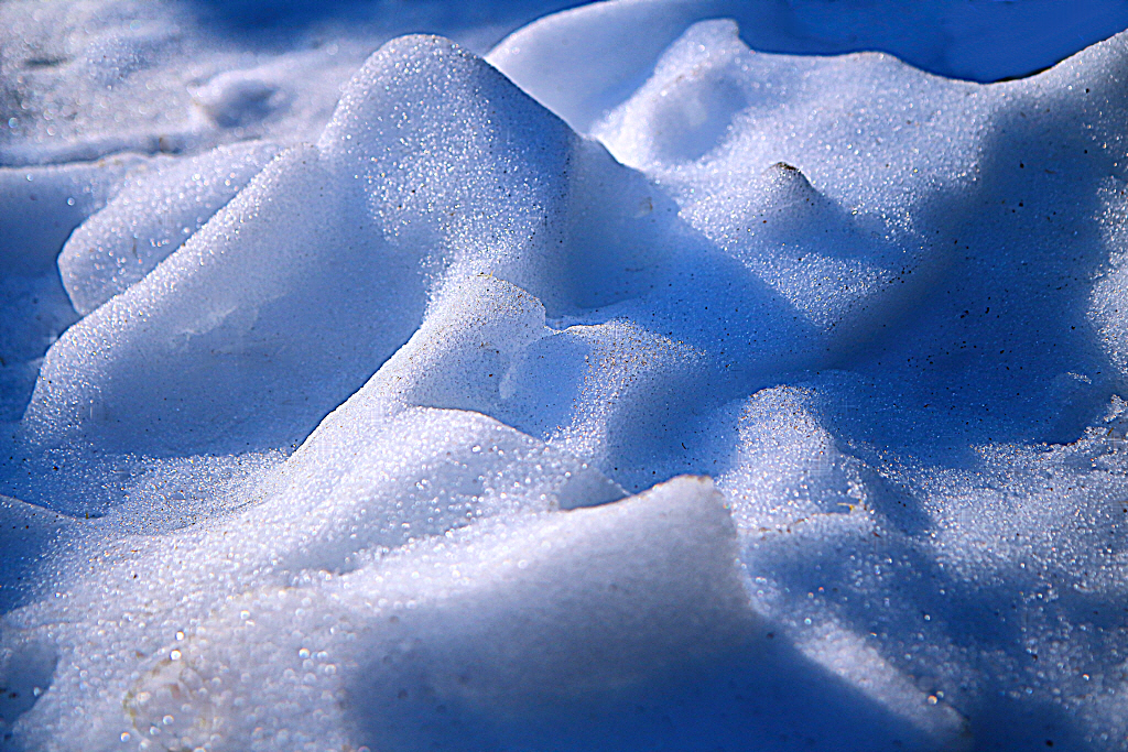
OK. Here is the image out of the raw processor with only the processor's moderate sharpening applied. I manually removed specks of dirt. I'd like to adjust some of the yellow-brown stain to light blue, but I've not done it in this version so you can see something close to the original. |
Feb 10th |
 |
| 30 |
Feb 18 |
Reply |
I tend to agree with Dorinda and Jon that the picture seems a little more interesting when cropped. Their crop provides the equivalent of "something" in my comment of wait for something to happen. Catching him with his mouth open adds a lot, and the buffalo in the background adds nice context. Jon is a little more willing than I am to add something to an image that wasn't there in the first place. |
Feb 9th |
| 30 |
Feb 18 |
Reply |
Yes, that orientation feels a little more natural. |
Feb 9th |
| 30 |
Feb 18 |
Reply |
It might not be correct to count my opinion as a vote for slightly blurred. In this case it is that I'm less bothered than usual by no sharpness. After thinking about this for a week, I think two factors contribute to this. First, the warm, bright colors, and second, there is little in the image with fine detail or that naturally has a sharp edge and which would make the slight blurriness very obvious. |
Feb 9th |
| 30 |
Feb 18 |
Reply |
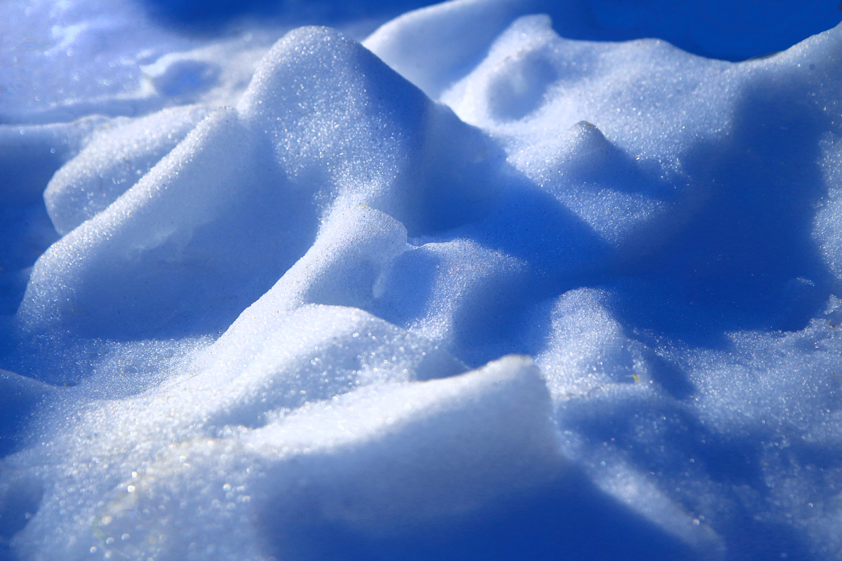
It could well be over sharpened. I didn't know where to stop as I tried to bring out the ice crystals. The more I sharpened it, the better I liked it, even though I knew it was being over sharpened by normal standards. Try some slight blurring of the image. I'd be interested to know if that increases or decreases your evaluation of the image. |
Feb 8th |
| 30 |
Feb 18 |
Comment |
The corners do seem to be in need of some improvement. How's this? |
Feb 8th |
 |
| 30 |
Feb 18 |
Comment |
Why not entitle it "Bath Time"? This seems like one of those situations when the sage writers of photography books say "Find the basic picture, and then wait for something to happen." |
Feb 3rd |
| 30 |
Feb 18 |
Comment |
If only I had the patience like you did, to wait for the opportune moment to shoot. It certainly was important to wait for the sun on the face. In spite of that, what I like most about this is the molten metal appearance of the water in front of the duck. |
Feb 3rd |
| 30 |
Feb 18 |
Comment |
I agree with Jon. The colors are great, and although I usually look for sharpness in the area my eyes are drawn to, in this case such sharpness seems less important. I don't know why. Perhaps it is the colors. |
Feb 2nd |
| 30 |
Feb 18 |
Comment |
Lightening the foreground makes a big improvement, as otherwise, the image would contain a large dead area. My eye immediately goes to the sun, but because there isn't much detail there, then it quickly goes to the first range and the silhouettes there. Psychologically, I'd like to see sharp detail there, subconsciously to reassure me that it isn't just that the entire image is blurred. Next, after seeing what is shown in silhouette, I find it a little messy. Perhaps I'm looking for a an interesting tree, a horse, a human, or some other distinct shape. The sun is centered, but the silhouettes are on the right. This sets up a slight conflict in my mind--center or right? Perhaps someone with some artistic training can weigh in on this and my next point. My inclination for balancing the image would be to increase the contrast on the left so as to make the ranges a little more prominent and balance the image. |
Feb 1st |
6 comments - 9 replies for Group 30
|
6 comments - 9 replies Total
|


