|
| Group |
Round |
C/R |
Comment |
Date |
Image |
| 30 |
Jan 18 |
Reply |
I agree that a tighter crop increases the impact of this image. On playing around I was surprised to discover that I like it even more after cropping still more than Jessica did. Losing the lower part of the bottom flower and the left part of the top flower makes this still more appealing to me. I wonder if others also find this to be so. |
Jan 22nd |
 |
| 30 |
Jan 18 |
Reply |
Could you post the image with the second bench cropped out? Aside from the difficulty of removing that bench, I'm having trouble visualizing the outcome. |
Jan 22nd |
| 30 |
Jan 18 |
Reply |
I very much like it already, so it will be interesting to see if you like it when you have rotated it a bit. Maybe the camera was tipped as you shot? It doesn't matter, the pattern of trails looks so much more dynamic like this when it is not symmetric about a vertical axis. |
Jan 20th |
| 30 |
Jan 18 |
Reply |
Is this at all what you had in mind? |
Jan 16th |
 |
| 30 |
Jan 18 |
Reply |
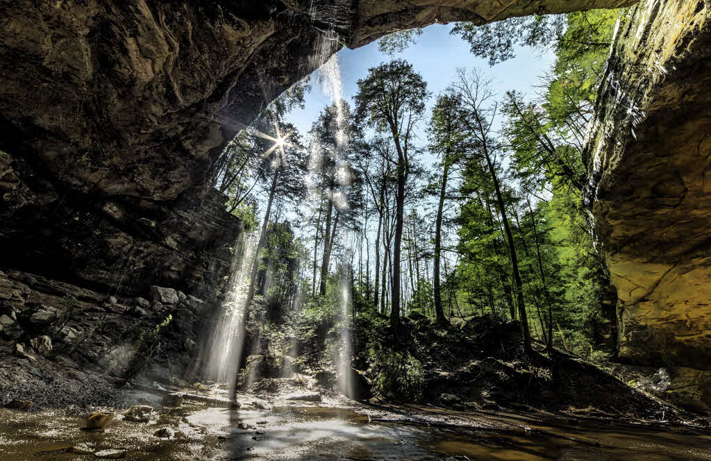
Some image editing programs allow masking areas of an image so that transformations can be confined to specific, desired areas of an image. In my modified image above, I used such masking to restrict my tone curve to just the brightest parts of the image. If you have a raw file of the image, you could try saving it as a 16 bit tif and then using such masking to help bring out some detail in the dark shadow area on the left, and then another mask to facilitate generating some tonal differences between the sun-facing walls and the cliff. |
Jan 14th |
| 30 |
Jan 18 |
Comment |
I certainly do like this. If only I had known how to photograph fireworks the last time I was near fireworks with a camera. By profession, I'm always looking into how things work. Therefore, I couldn't stop myself from seeing that it looks like you improved the artistic interest of the original image by rotating it about 20 degrees clockwise. Maybe a little more might even be better. Your pink frame delightfully enhances the image. |
Jan 14th |
| 30 |
Jan 18 |
Comment |
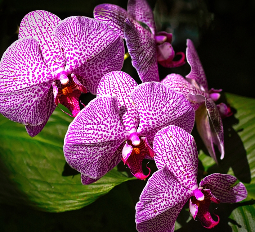
I thought I commented on this a few days ago, but I guess I forgot to push the button. These are wonderfully photogenic flowers and they are lined up just right. Also, the lighting naturally directs our attention to the flowers. |
Jan 13th |
| 30 |
Jan 18 |
Comment |
I'm highly sympathetic to the subject in this picture as currently it is COLD outside (and inside). By itself, this is a nice picture, but I can also see it as an effective part of a pictorial essay on public transportation or life in the city or something similar. |
Jan 2nd |
| 30 |
Jan 18 |
Comment |
I agree with Dorinda, nice subject and details. It is a bit too gritty for me as well, and it feels like too much of the wood is too bright. I agree that usually in b&w you want to go from full white to full black, but in this case, as a result, the wood on the right feels somewhat unnatural. Is it possible to make the nail and chains bright and slightly tone down the contrast in the wood? |
Jan 2nd |
| 30 |
Jan 18 |
Comment |
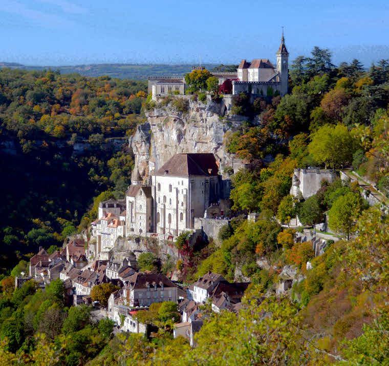
What a fantastic scene. If the original is a raw file, possibly some detail could be found in the dark shadow on the left. I tried cropping some of it out, but I wonder if the major building is now too centered in the image. Since most of the east facing walls are nearly blown, they plus the cliff all look very similar. It was possible however, to generate some differences in the tones of these walls and the cliff. |
Jan 1st |
 |
| 30 |
Jan 18 |
Comment |
Interesting subject, but I like it with more contrast. |
Jan 1st |
 |
6 comments - 5 replies for Group 30
|
6 comments - 5 replies Total
|


