|
| Group |
Round |
C/R |
Comment |
Date |
Image |
| 30 |
Nov 17 |
Comment |
I agree that the red superstructure should have been removed. To me the story of the picture is the curvature of the hull and the weathering of the wood. The anchor was meant to be the spice on the dish, not the main ingredient. Therefore, while some cropping can help this image, too much and the story changes. |
Nov 9th |
| 30 |
Nov 17 |
Comment |
I can imagine judges in a competition going berserk over this, with some giving it very high marks and some very low. Judy's crop is logical, but it removes features that I like, the contrast between the yellow and green, the unusual vertical feeling generated by the tall and narrow glass panes, and the stone around the edges. On the other hand, retaining these features probably violates several "rules" of composition. The more I look at the possibilities, the more I feel that the image needs a little more color than Judy's crop gives it. I'd probably throw caution to the winds and see what happens with an image that is pretty much like what you submitted, but with the little distractions on the edges removed. |
Nov 9th |
| 30 |
Nov 17 |
Reply |
Polarization of (the blue) skylight is maximal at 90 degrees from the direction toward or away from the sun. Thus, in a wide angle shot where the sky covers a wide angle, it is possible for the luminosity of the sky to go through a maximum or minimum and and then back up or down again. Hence, for wide angle shots including the sky, it is risky to use a polarizer. I worry about polarization of the sky only when I am generating wide angle composites, typically three to five vertically oriented (portrait orientation) shots taken with my 15-55 mm lens with an APS-C camera sensor.
I filed two notches in my filter (while at home, no file in my camera bag). I oriented the filter so as to minimize glare from light reflected off our varnished floor and then filed a notch in the top and bottom. In the field, if I'm in a hurry, I orient a notch to be perpendicular to whatever surface is producing glare. If I'm being more careful, I take the filter off, carefully determine the optimum angle of rotation, noting the position of a notch, then replace the filter and properly orient it. |
Nov 9th |
| 30 |
Nov 17 |
Comment |
It's a lovely picture. Nice composition. It looks like the sky has been edited a little too much. |
Nov 4th |
| 30 |
Nov 17 |
Reply |
Leonid's clouds are beautiful, and Jon's marsh is beautiful. The combination feels unnatural to me however, because the sky says "sunny day", but no direct sunlight or shadows are visible anywhere in the marsh. |
Nov 4th |
| 30 |
Nov 17 |
Comment |
Indeed, they do look like flowers. It is fun when a photograph captures such a "double image". Parts of some of the boats in full sunlight are dangerously close to being blown. My Canon T5i consistently overexposes so I set it to underexpose by 2/3 of a stop and I exposure bracket every shot. A shot like this certainly needs the polarizing filter. When I have to use one, I find it a whole lot easier to when rotating to find the optimum orientation, to do so with the filter off the camera. When I've found it, I put the filter back on. I've filed a small notch into the filter frame to keep track of the correct angle when replacing the filter. |
Nov 3rd |
| 30 |
Nov 17 |
Comment |
It has got the pure blacks and pure whites that B&W often seems to need, and it has interesting angles, but it seems that everything is directing my eye to the plain white wall, rather than to something more exciting or interesting. The architect should have put something up there. |
Nov 3rd |
| 30 |
Nov 17 |
Comment |
I think the cropping is brilliant. I would never have thought to, or had the courage to--cut off the back of her head. And yet, to my mind, this makes the picture. It makes me look and think, and focuses my attention on the question of "What is going in in there that is so absorbing?" |
Nov 3rd |
| 30 |
Nov 17 |
Comment |
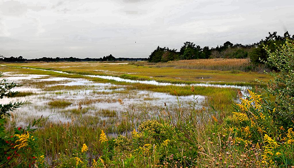
To reduce the large area of almost featureless sky, I increased the contrast of just the sky and then cropped to reduce its area and move the horizon out of the middle. I also increased local contrast of the marsh to make it brighter and then I had to do a little diddling with a mask and tone curve to minimize a halo at the horizon on the left half of the image. The foliage on the bottom and right nicely frame the image, but the fragment of an evergreen on the left feels a little incidental to me. I'd love to visit a marsh like this as the image feels so much like Fall. |
Nov 2nd |
 |
7 comments - 2 replies for Group 30
|
7 comments - 2 replies Total
|


