|
| Group |
Round |
C/R |
Comment |
Date |
Image |
| 30 |
Oct 17 |
Reply |
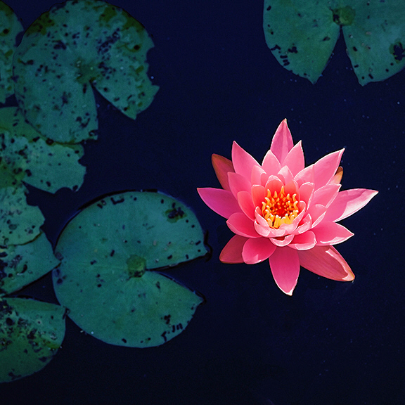
I like Judy's idea of fixing the bright portions of the petals, but Viveza 2 seems to have overdone it, leaving the colors less natural than I would like. Here I have used her idea, but merely remapped one shade of pink-white. I also lightened the leaves, which, as I commented earlier, I find a little too dark.
Another title possibility, which became apparent after lightening the leaves, is "Pac-Man". |
Oct 24th |
 |
| 30 |
Oct 17 |
Comment |
Perhaps the poles heighten the feeling of a leftward slant, but the beach itself has to be slanted to the left. The horizon on the ocean is a reliable level. |
Oct 19th |
| 30 |
Oct 17 |
Reply |
There was something about this that made me pause, but I couldn't identify it until Dorinda mentioned the woman being directly behind the dog. On the other hand, the fact that the dog and the woman are pretty much looking in opposite directions, but their heads are close together, adds to the interest. |
Oct 19th |
| 30 |
Oct 17 |
Comment |
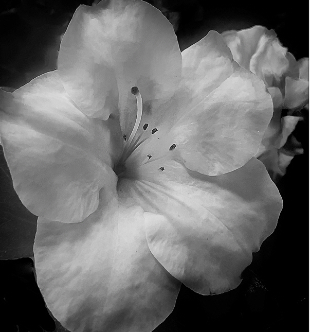
After looking at this a few times, the blank space on the left and the orientation of the flower out of the image to the right felt a little unnatural. An easy "fix" of this was to crop the other edges to match the right edge. In doing this however with my brightened image I could see that it was somewhat oversharpened. I have found that sometimes aggressive sharpening of flowers brings out nice texture in the petals, but then it is necessary to limit the sharpening to the interiors of the petals to avoid halo generation at high contrast edges. |
Oct 17th |
 |
| 30 |
Oct 17 |
Comment |
It really does pop, and the colors are great as well. Possibly the tips of a few of the petals are blown. To my mind, the contrast between the leaves-water and the flower is a little more than optimum, but this is undoubtedly much better than if you hadn't darkened them at all. |
Oct 8th |
| 30 |
Oct 17 |
Comment |
For several days I have been perplexed by the directions of the shadows of stones in the roadway. I've finally convinced myself that shadows of stones on the far right ought to point directly at the apex of the rainbow. They don't however, they point much to the right of the apex. Does anyone know why? |
Oct 6th |
| 30 |
Oct 17 |
Reply |
Oh, that sounds more logical. I misinterpreted your phrase "manual shutter" to mean manual release of the shutter. |
Oct 6th |
| 30 |
Oct 17 |
Comment |
Pretty nifty. Pretty impressive timing as well. Is there a reason you weren't using continuous shooting? For anything with movement, including grandchildren, continuous shooting gives me more keepers than otherwise. Since freezing the action seems more important in this image than depth of field or bohkeh, I'm also curious why you didn't specify the exposure time rather than aperture and then let the camera choose aperture or ISO. |
Oct 5th |
| 30 |
Oct 17 |
Comment |
Very nice. The large single rod and reel on the left and the three smaller rods on the right nicely frame the fisherman. There is quite a bit of noise in the sky that probably can be removed quite easily. |
Oct 5th |
| 30 |
Oct 17 |
Comment |
This is a most striking and unusual image. I've never seen a rainbow this bright, and it is unusual to have a rainbow without evidence of the source of the necessary water drops also being visible.
After looking at this for a while, I began to feel that the road was a little too dominant.
To place the rainbow as it is shown certainly would have had to make use of the full wide angle properties of the 18-200 lens. |
Oct 5th |
| 30 |
Oct 17 |
Comment |
There is a very nice feel to this. However, it also seems a bit dark. When I tried to lighten it, I found that parts are deceptively bright. I therefore made a tone curve that mimicked a saturation curve of film. It brightened the image but retained the feel that I cannot find words to describe. (To see the effect of the brightening, it helps to look at the full sized image.) |
Oct 1st |
 |
| 30 |
Oct 17 |
Comment |
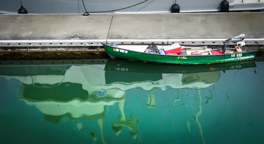
The second time I looked at this I laughed and appreciated the contrast between the little boat and the reflection of the big boat. Possibly this didn't do well in your camera club because the humor is subtle. In the camera club I used to go to, people were too serious to look twice at an image like this. It might help people to appreciate the reflection if its contrast were increased a little like this. |
Oct 1st |
 |
9 comments - 3 replies for Group 30
|
9 comments - 3 replies Total
|


