|
| Group |
Round |
C/R |
Comment |
Date |
Image |
| 30 |
Jun 17 |
Reply |
Optimism--pessimism. You are right, the two images convey different feelings. As a color image, I don't think the original has sufficient impact. I certainly agree that the brightness sky of the original would need to be reduced. |
Jun 26th |
| 30 |
Jun 17 |
Comment |
Here is the original of "Not Yet Spring". In addition to the steps I mentioned above, I did selectively increase contrast in the middle of the tonal range (clarity). I also increased local contrast by applying about 30% unsharp mask sharpening using a blurring radius of about 40 pixels. To bring up some tonal variations in the sky, I further increased contrast in just this portion of the image. |
Jun 15th |
 |
| 30 |
Jun 17 |
Comment |
Dorinda's crop directed my attention to the heads of the antelope which then prompted a different title--"Tasty?" |
Jun 9th |
| 30 |
Jun 17 |
Reply |
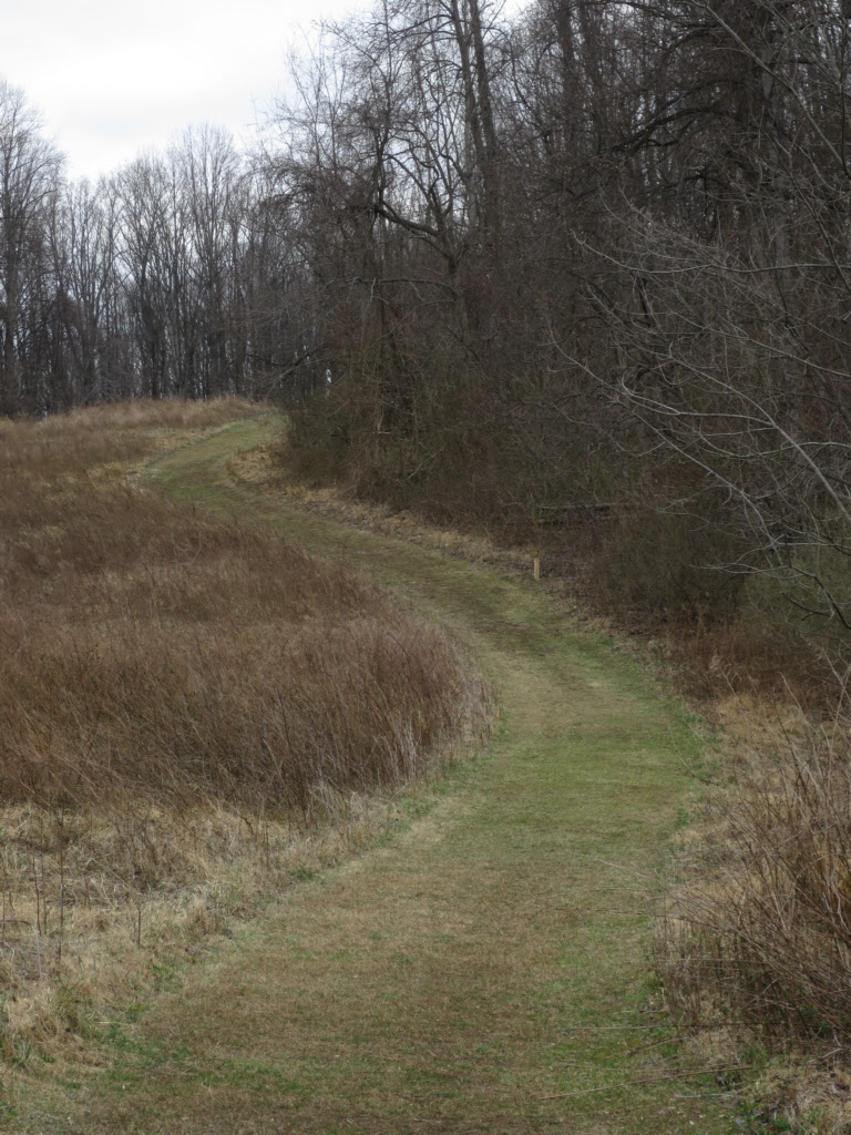
Interestingly, your small change directs my attention to the curved road whereas the uncropped version seems to involve me in more of the scene as a whole. I don't think one is better than the other, just different.
Generally, I'm somewhat leery of chopping just a little bit off some object near the edge of an image (the tree in the upper left), but maybe I should get over this inhibition. |
Jun 9th |
| 30 |
Jun 17 |
Comment |
Great colors and contrast. Perhaps remove the small white flowers in the upper right corner? |
Jun 7th |
| 30 |
Jun 17 |
Comment |
It looks like you were pretty close all right. It is an interesting shot, and I wonder if it becomes more interesting if those three or four birds behind the flying bird were not there. |
Jun 7th |
| 30 |
Jun 17 |
Reply |
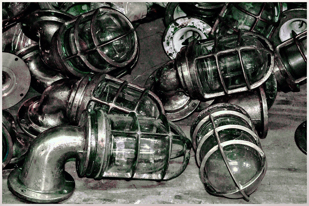
Yes, you are right about the green. My removal of the yellow was specific for yellow, and I overlooked the fact that some of the glass is green in the original. By the time that is corrected, the image is a B&W, which can be achieved more easily than by correcting individual colors. |
Jun 5th |
| 30 |
Jun 17 |
Reply |
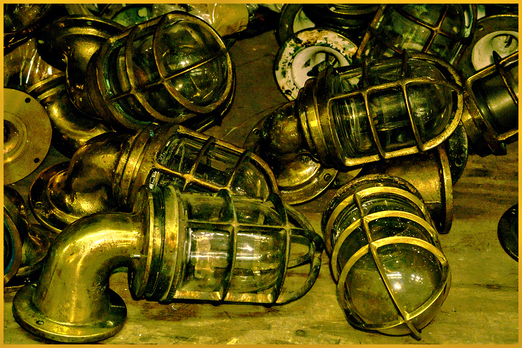
I, too, questioned the white balance, and adjusting it as Dorinda has does make the image feel better. I wonder if this is the way it really was though because now the reflections off the glass are blue, and I expect reflections to be white. If they actually are blue in this case, but our eyes see white, I guess colors can be blown in our eyes as well as in our cameras.
Here is a version in which the yellow (brass?) has been shifted to silver and the reflections have not been shifted to blue. |
Jun 4th |
 |
| 30 |
Jun 17 |
Comment |
Really interesting and fun to look at. |
Jun 3rd |
| 30 |
Jun 17 |
Comment |
It is a little dark and flat for me. Try this. |
Jun 3rd |
 |
| 30 |
Jun 17 |
Comment |
The colors are great, but overall, this is a bit too bright for me to enjoy. This is a bit unusual in that part is nice and sharp, and the rest is very blurred, but there is nothing in between, which seems incompatible with the structures of most flowers. |
Jun 3rd |
| 30 |
Jun 17 |
Comment |
I think it may be better without the white log.
I like the intertwined tree trunks, but it looks as though the two tree trunks have been selectively lightened, which to me reduces the feeling of naturalness. Perhaps it would be more appealing to me if the lighting looked more natural.
On the other hand, possibly this is the way it really was, which then would seem like a little bad luck. |
Jun 3rd |
8 comments - 4 replies for Group 30
|
8 comments - 4 replies Total
|


