|
| Group |
Round |
C/R |
Comment |
Date |
Image |
| 30 |
May 17 |
Reply |
After thinking about the different comments, I've begun to think that this might be the best shot of the lot. |
May 19th |
 |
| 30 |
May 17 |
Reply |
I hadn't realized how important that log or rock is until Dorinda mentioned it. It would be a pretty humdrum image without it. I have got to become more active in putting something in the foreground of my landscapes. |
May 14th |
| 30 |
May 17 |
Reply |
I agree that it is too busy, but I think it wouldn't feel that way if the subject were romance. To my mind, a couple on the bridge embracing changes the whole topic and seems natural in this garden. |
May 14th |
| 30 |
May 17 |
Reply |
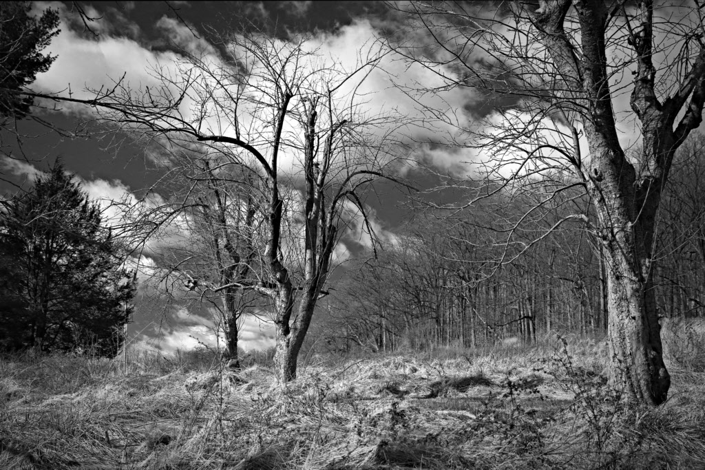
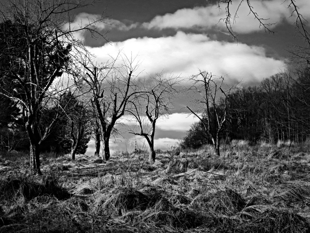
I guess that my submission this month should be classified as a hybrid. On my first outing my objective was to practice identifying scenes suitable for B&W, and I stumbled upon this old orchard against the sky. Later, at home, this shot seemed to be the best of the series, but it was obvious that it could be substantially improved by putting a single tree against the sky. Hence, I returned a week later with this image in mind and took a series with only one barren tree against the sky. So, random chance followed by a preconceived shot. |
May 14th |
 |
| 30 |
May 17 |
Comment |
It looks like a lovely spot, and certainly inviting to photograph. It is quite a bit of the picture that is on the verge of being blown. My initial reaction was the thought that the fountain and the bridge are competing for my attention, but they are nicely framed, and each would be a little weak on its own. Now I feel that the image might be strengthened if there were some people on the bridge. I generally set my Canon to bracket the exposure + and - about 2/3 of a stop and center the exposure at 1/2 to 2/3 stop underexposed. Generally, one of the underexposed images allows a suitable tone curve to brighten the darks and not blow the highlights. Once in a while I need to use HDR processing. |
May 9th |
| 30 |
May 17 |
Comment |
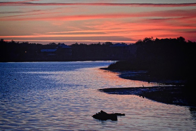
The cloud strata say that your camera was level, but the distant lake shore says it wasn't. Isn't it frustrating when the real object falsely makes it appear that something obvious is wrong with a shot? I warped this to remove the "slope" of the distant shore, but this may not be the way it looked in reality. At least it is more comfortable for me to look at. |
May 3rd |
 |
| 30 |
May 17 |
Comment |
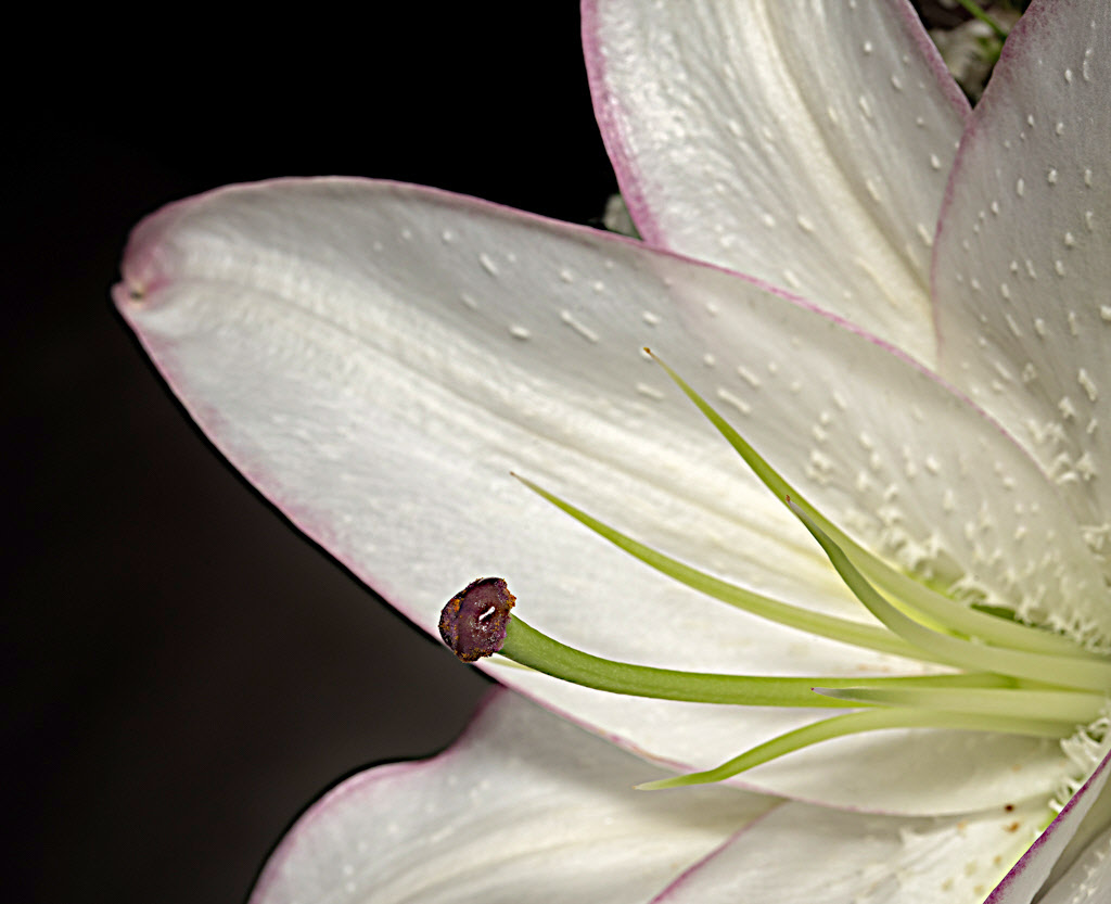
The high contrast of the petals gives them a waxy appearance, emphasizes the little ridges, and suggests that the flower is insufficiently pigmented. I found that moving the yellow-green more green and darkening it slightly also made the flower look more appealing to me.
An online depth of field calculator, http://www.dofmaster.com/dofjs.html indicates that you have less than a quarter of an inch of field depth in focus when your lens is at f22 and you are a foot from the object. If this is correct, it is not surprising that the petals are not sharp. It looks like you needed to be 30 to 36 inches from the flower. |
May 3rd |
| 30 |
May 17 |
Comment |
Sometimes I like B&W to be more contrasty than this, and for the asymmetry, if present, be be more pronounced. |
May 2nd |
 |
| 30 |
May 17 |
Comment |
I wonder how this would look if the petals were in focus rather than the anther, but I don't see why the petals look out of focus since you shot at f/22. How far away from the flower were you, very close? The halo around the anther suggests rather strong sharpening. Oddly, when I look at this, I suspect that the light source was harsh, but you used a diffuser, so I don't understand why the petals look they way they do. Technically, I'm a little perplexed by this shot. Esthetically, all I can say is that I liked your image of last month better. In playing with the image, I found that reducing contrast and increasing the brightness increased my liking of this image. |
May 2nd |
 |
| 30 |
May 17 |
Comment |
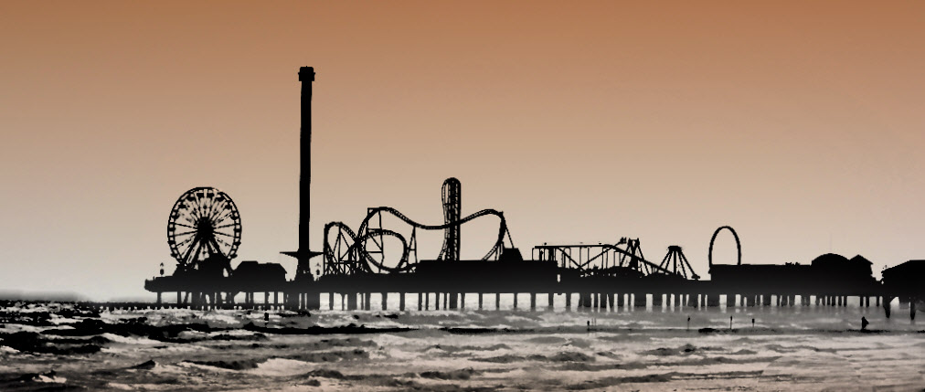
I like fog because it provides a nice depth indicator and helps images feel three dimensional. It can also minimize or eliminate distracting backgrounds. To start with, this image is pretty much two dimensional and there is no obvious background to eliminate. Consequently, to me, the fog doesn't seem to help much. The image is still fun, as the silhouette is most interesting. Therefore, I went in the other direction, increasing contrast and adding some color. I also leveled the horizon. |
May 2nd |
 |
| 30 |
May 17 |
Comment |
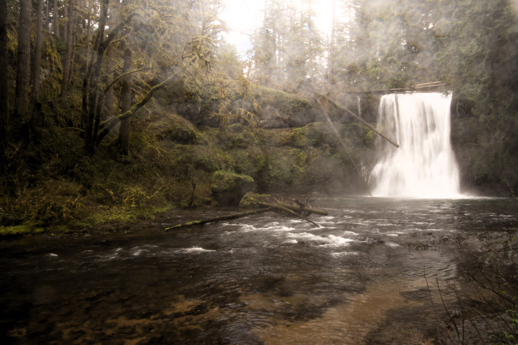
What a fantastic scene. It seems like you got the exposure time just right to make the falls look feathery but still keep the nearby ripples in the water sharp. I guess a lens hood for your 16-300 wouldn't provide much rain protection, but hoods for longer focal length lenses do protect against rain. Instead, you needed you needed an umbrella and a helper. Because there are quite a few raindrops, they almost feel like part of the scene, and they don't bother me. Taking out one or two is feasible, but not this number. Removing the log was fine, but I find your increase in saturation to be too much for my taste. Here is a version I like better in which contrast only has been increased. |
May 1st |
 |
7 comments - 4 replies for Group 30
|
7 comments - 4 replies Total
|


