|
| Group |
Round |
C/R |
Comment |
Date |
Image |
| 36 |
Sep 20 |
Comment |
Nice image of Paris from the tower. A few comments though. The image seems to be somewhat flat to me. There is a Texture adjustment in Adobe Lightroom which would bring out more detail in the city without affecting the overall contrast too much. There is a Clarity adjustment also but that would be a more drastic adjustment than Texture. I think the building on the left is somewhat of a distraction. However, I don't think that cropping it out would be very good because then you would have the road or railroad as a distraction. I would suggest opening the cropping on the left so that two buildings can be seen and make sure that the buildings are vertical and the horizon is horizontal. Please remember that this is just my opinion and I am in this group to also improve my photography. |
Sep 8th |
| 36 |
Sep 20 |
Comment |
Your B/W conversion is very good. The only notes I had before looking at your notes and every ones comments were that it needed to be cropped a bit at the top and the tree trunks at the bottom are too bright and distracting. You brought out the details in the trees in the bottom right very well and I like the layering of the image. Well done. Have you considered working on the color version? It could be great also. |
Sep 8th |
| 36 |
Sep 20 |
Comment |
Great image of a simple scene! A bit more contrast would be better as Larry has shown. I like that there are no footprints or anything in the snow, that makes it a pristine scene. Great job. |
Sep 8th |
| 36 |
Sep 20 |
Comment |
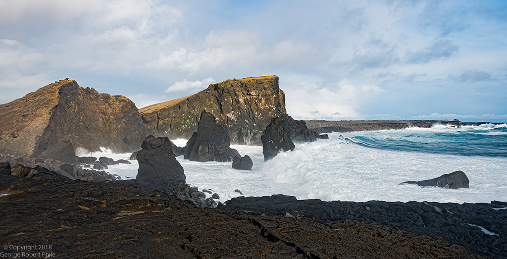
A nice nighttime image. I look at the images and make my comments before I look at what the image is about. After reading about what you were trying to do, I threw out almost all of my comments! I think you accomplished your objective. The only thing I would do would be to crop out the person at the right of the image and, if you do that, maybe crop a bit more from the bottom of the image also. Nice image. |
Sep 8th |
| 36 |
Sep 20 |
Comment |
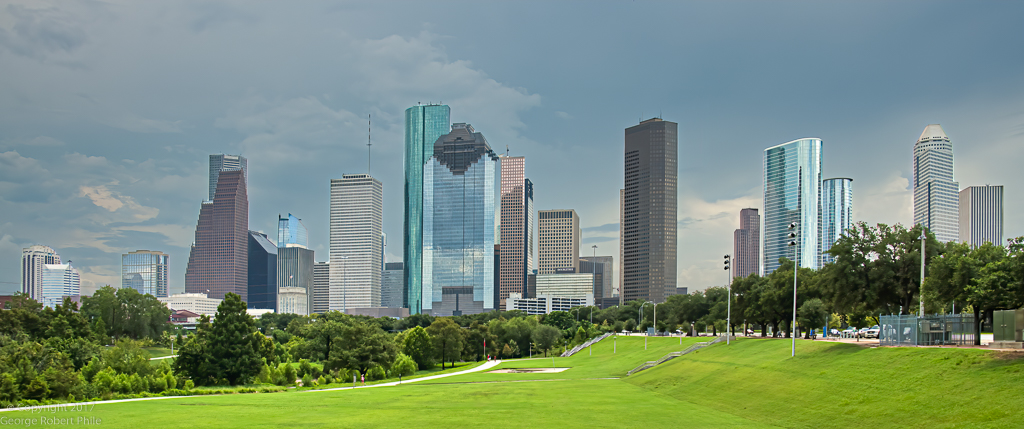
A really good image of the city skyline and making it a panorama was right choice. I would, crop out the green hillside at the right of the image, crop the left side of the image so only a small part of the island shows, and add a bit more detail in the city buildings. I think increasing the white point would help also. This is a really nice image of the city skyline. |
Sep 8th |
| 36 |
Sep 20 |
Comment |
This is a really great image of Half Dome. I agree with the comments about the upper right part of the image. I do think a bit more detail (perhaps contrast) in the valley and sides of the valley would give it a bit more oomph. This is an excellent image for a museum and/or wall somewhere. Great job |
Sep 8th |
6 comments - 0 replies for Group 36
|
6 comments - 0 replies Total
|