|
| Group |
Round |
C/R |
Comment |
Date |
Image |
| 36 |
Aug 20 |
Comment |
Nice image and composition Richard. I especially like the colors in the sky and the layering from the front bushes to the hills in the back. The overall color seems to me to be a bit to over saturated. The snow being white or pink is a personal preference I think. The detail in the image is really good. Nice image! |
Aug 11th |
| 36 |
Aug 20 |
Comment |
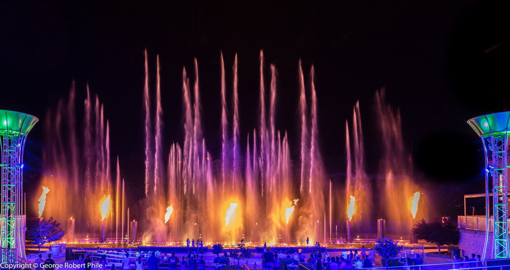
This is a great shot of the bridge! I am from SF but left in 1962 and never lived there again. This image makes more sense to me having seen your original so with that said, here are my comments. I like the nebulous clouds which was done well but you should get rid of the bird. The cropping you have done seems to me to be correct given the distractions in the lower left of the original image. The substructure of the bridge at the lower left should be corrected so that it is parallel to the edge of the frame and that can be done in LR. The orange color in the sky behind the cables just past the 1st tower is probably a function of the cables themselves and I don't think I would do anything with that. The color in the nearest tower seems to me to be a bit hot but that might be my personal preference. This is a great shot and let us know what happens in the travel contest. |
Aug 11th |
| 36 |
Aug 20 |
Comment |
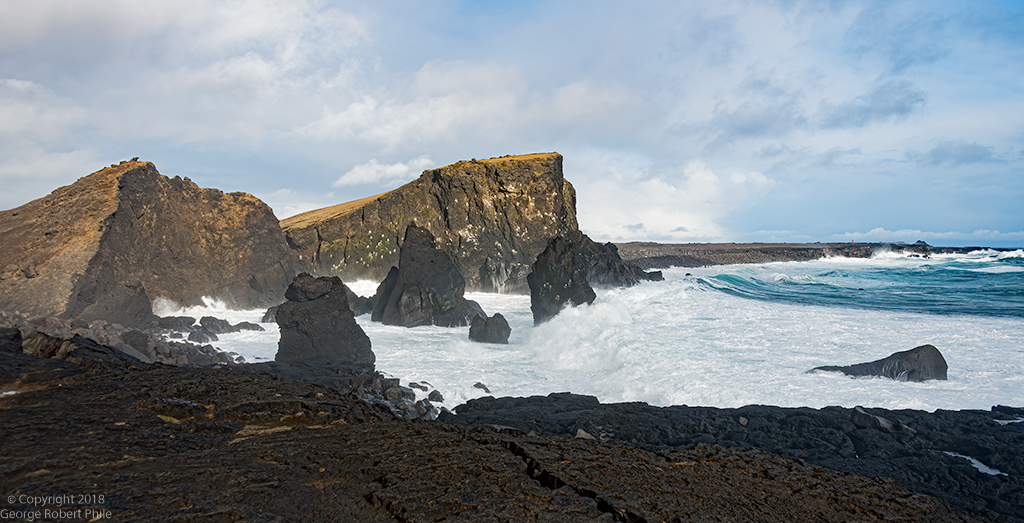
Arne, Very good shot and I agree it is best in B&W. Nice detail in the rocks. The sun is a bit of a distraction for me. My eye kept going from the rocks to it and back. Good mood shot. |
Aug 11th |
| 36 |
Aug 20 |
Comment |
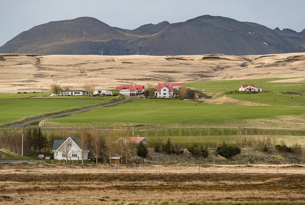
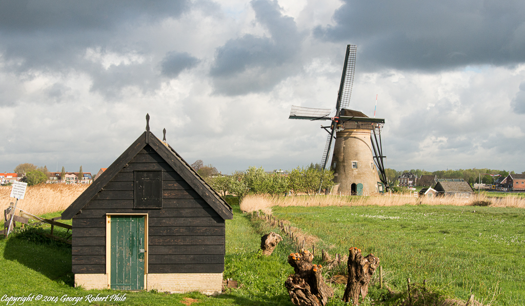
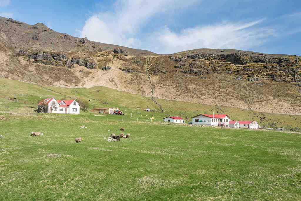
Nice image. Everything leads to the farm and the panorama is really nice. I would like to see a bit more detail in the gray to the right of the farmhouse. Nice image. |
Aug 11th |
| 36 |
Aug 20 |
Comment |
This is a really nice image Larry. I wrote down a number of things about your image and then read your shooting scenario and erased them all. The only minor issue I see is that the horizon is a bit off and the image is a little dark for me.
Maybe the trees in the upper left would be a bit better if they were lighter. I like the flowing water lines which lead right to the waterfall and the texture in the structure seems fine to me.
Great image. |
Aug 11th |
| 36 |
Aug 20 |
Comment |
Debbie, we are glad to have you in the group. I like to look at the images and list my comments before I read the others comments. Here is my take on your image. It is somewhat subdued except that the sun is too bright for the scene. The horizon doesn't appear to me to be level and there is a bit too much sky at the top and sand at the bottom. I think there needs to be more detail in the waves also. I like the mist in front of the land at the center left of the image and the wave touching the horizon in the center. Having said all that, Larry, Richard and Bill have suggested ways to improve your image which are all valid and I will not add to that. I will look forward to hearing your comments on all of our images and to seeing more of your work. |
Aug 11th |
| 36 |
Aug 20 |
Reply |
No polarizer was used. See my comments to Michael Jack. I agree that backing out to 28mm would have been better. I continue to learn. |
Aug 3rd |
| 36 |
Aug 20 |
Reply |
I went back to the original image and found the specs for shooting were not as I listed. The lens is the same but the focal length was 44mm, shutter speed 1/180, f/8, ISO 400. Sorry for the bad info. |
Aug 3rd |
6 comments - 2 replies for Group 36
|
6 comments - 2 replies Total
|