|
| Group |
Round |
C/R |
Comment |
Date |
Image |
| 36 |
Jul 20 |
Reply |
Please see my note to Larry above. |
Jul 13th |
| 36 |
Jul 20 |
Reply |
Please see my note to Larry above. |
Jul 13th |
| 36 |
Jul 20 |
Reply |
Please see my note to Larry above. |
Jul 13th |
| 36 |
Jul 20 |
Reply |
Please see my note to Larry above. |
Jul 13th |
| 36 |
Jul 20 |
Reply |
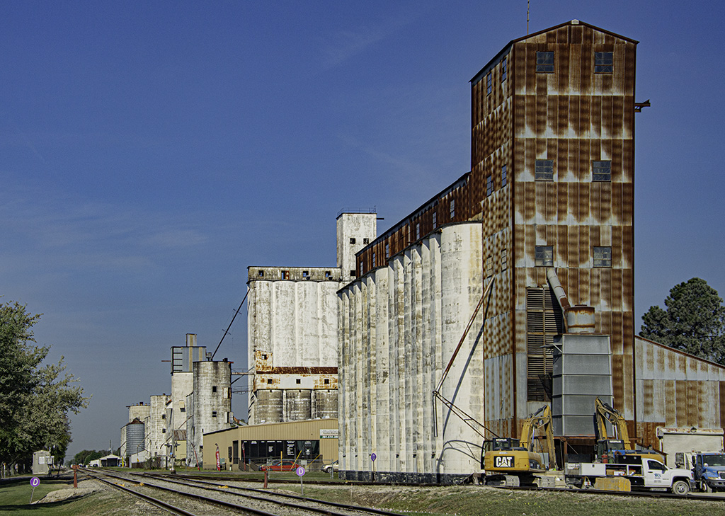
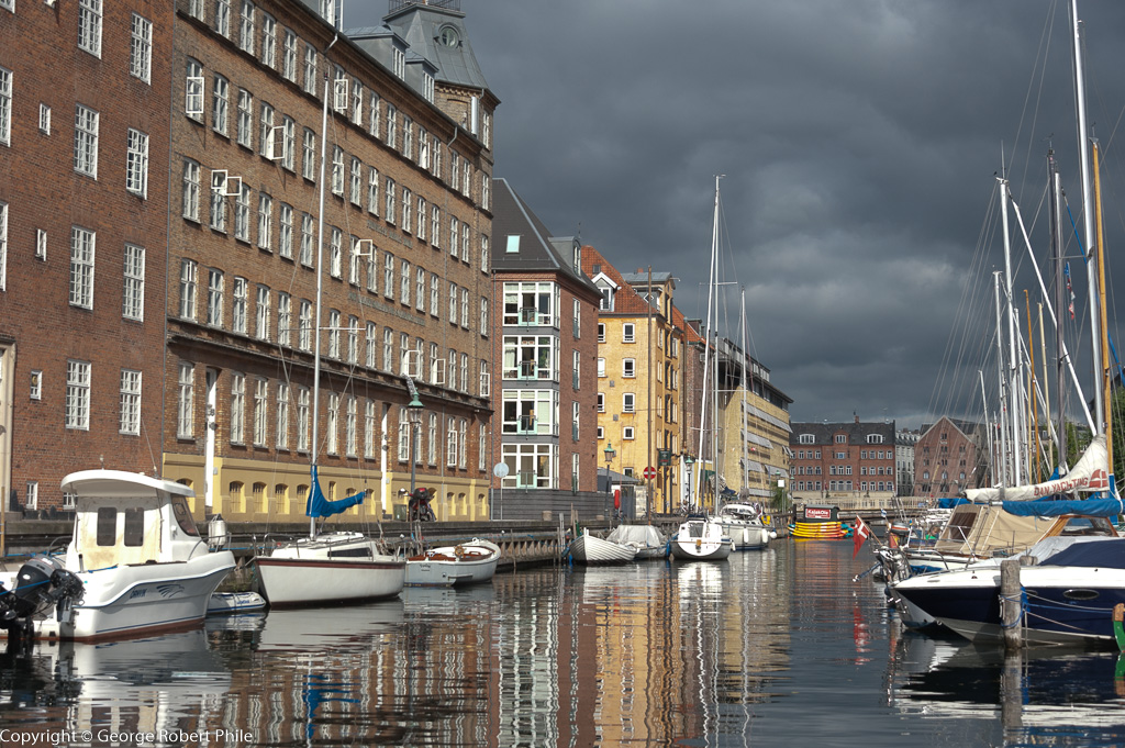
Just a quick note about this entry. I have been having computer problems for the past 6 months and it got particularly bad the last two. Somewhere during the preparation for this image I got the information file mixed up with the previous month. I just installed a new computer this past Saturday so things should be better now. I shot this in June 2019 in New York on a 5 day stay. I agree with all your comments about the image. |
Jul 13th |
| 36 |
Jul 20 |
Comment |
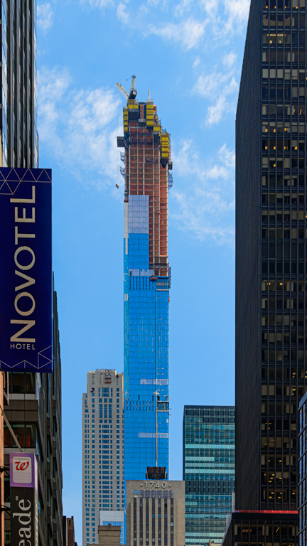
This is a really nice image Richard. I like the leading lines you have and that you took the time to straighten the buildings. There is lots of sky and I would like to see a bit more detail in it which would give it more character. The lamp post doesn't bother me although it is a minor distraction. I think the image you submitted is much better than the cropped version you posted on 7/6. The colors in this image are really pleasing to me. |
Jul 13th |
| 36 |
Jul 20 |
Comment |
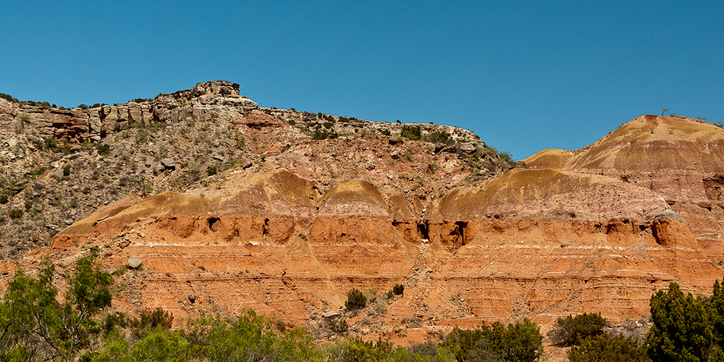
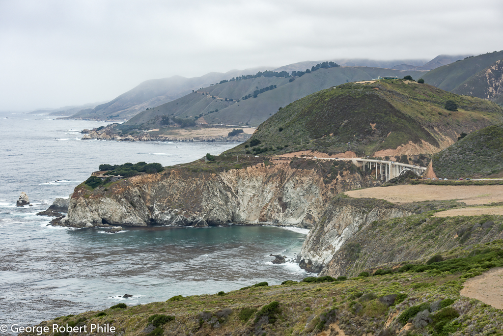
Good shot of part of the Grand Canyon Bill. I like the leading lines, the detail in both the clouds and canyon and the amount of clouds in the image. The only problem is the amount of pink in the image, it is way too much. The second image you posted on 7/8 is really much better. My wife and I had plans to be at the Grand Canyon this past April! Didn't happen with the corona virus. We hope to get there next year or in 2022. Nice second image! |
Jul 13th |
| 36 |
Jul 20 |
Comment |
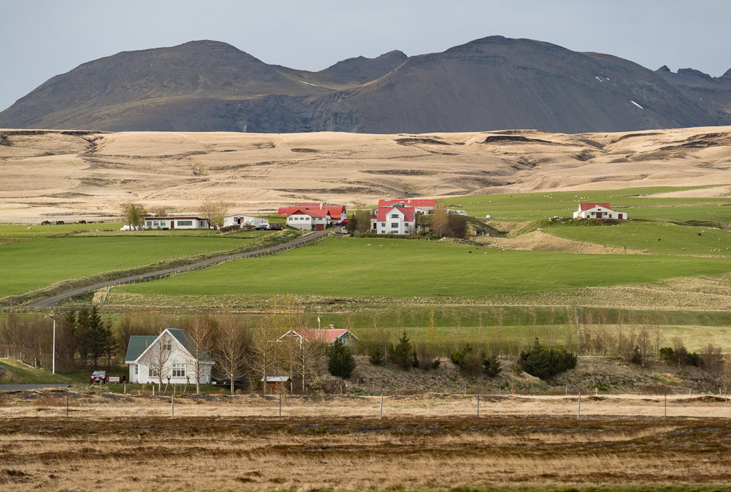
Great image Arne. B/W is much better that what would be the color version. I agree that a square image would be a better crop for it. That would eliminate some of the clouds in the left part of the image. This is probably just me but I would like to see a bit more detail in the mountains in the background. I was there two years ago but I think when I was there there were too many people to get a decent image. I might need to go back and look at those images again. |
Jul 13th |
| 36 |
Jul 20 |
Comment |
Beautiful image Michael. I agree that I wish the two bright spots on the door to the right were not there. The left corner of the lower stair doesn't bother me at all, it's part of what was there. I like the way that the brick in the upper left corner of the image is dark. To me that forces your eye to the right to follow the stairs. Great image. |
Jul 13th |
| 36 |
Jul 20 |
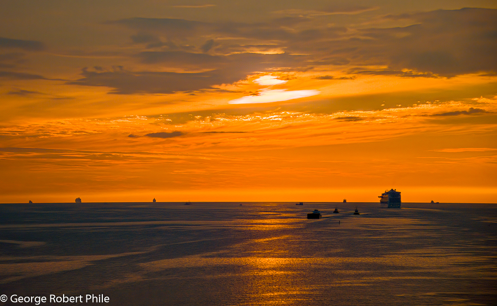
Comment |
Larry, This is really a great image. I like the way the cloud boundary leads into the posts, the posts to the waterline and the waterline to the rock which anchors the image at the bottom. I like the way the posts are not black but very dark and it doesn't bother me at all that the posts are not vertical. This image portrays a very calm, peaceful and tranquil scene. I like the ethereal quality of the water in the foreground. Very nice image! |
Jul 13th |
5 comments - 5 replies for Group 36
|
5 comments - 5 replies Total
|