|
| Group |
Round |
C/R |
Comment |
Date |
Image |
| 36 |
Jun 20 |
Reply |
Bill, I separated this image into two parts, one the sky and one the rest of the image. I got a lot of edge effects around the buildings when I did that and took lots of time eliminating them in Photoshop so you don't see them in this image.
|
Jun 13th |
| 36 |
Jun 20 |
Comment |
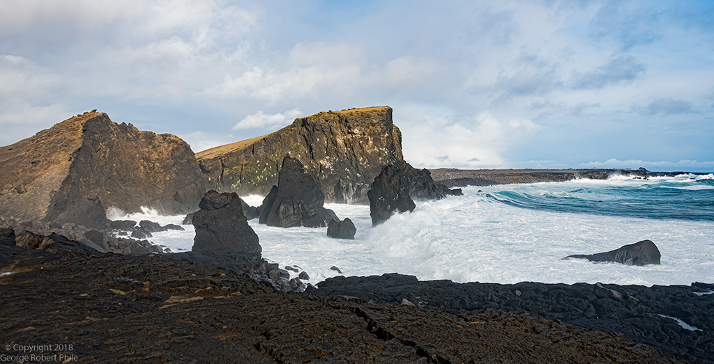
Great monochrome image. Much better than color would be, in my opinion. I like the pano a lot, that really helps to make this such a good image. I think a bit more detail in the sky would make this image better along with a bit more detail in the boulders in the left part of the image along with the lower part of the two big boulders on the right. The waves in the center of the image seem to be washed out with no detail in them at all. I am in a photo group in Houston which has a print competition every month and all my work has been in color so far. Seeing the images in this group is making me think that I really need to start submitting images in monochrome and not just color. |
Jun 13th |
| 36 |
Jun 20 |
Comment |
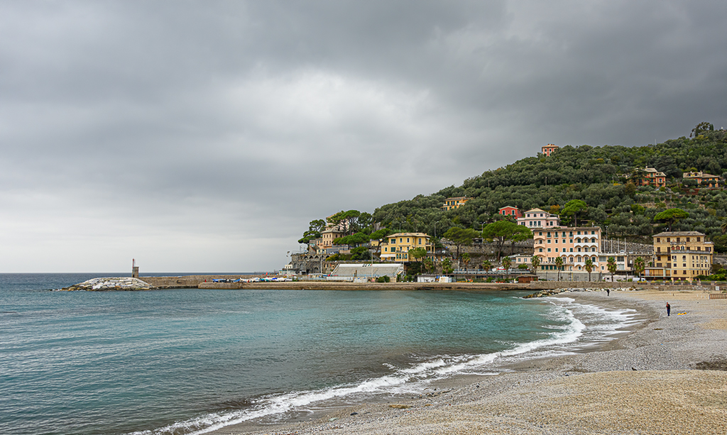
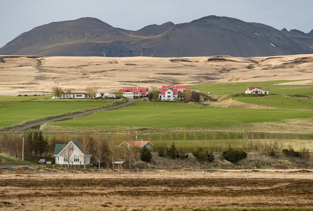
Nice image Bill from the top of the plate boundary. I was there in May 2018 with my grandson on his day off work but we didn't have time to go to the top. I think cropping out half of the sky would make this image more dramatic. The water in the lower left is a bit distracting but if half of the sky was cropped out the water would become more of the image and lead past the cliffs on the left to the mountains in the background. A little more detail in the distant mountains would be nice. Good image. |
Jun 13th |
| 36 |
Jun 20 |
Comment |
I like this image and think you did a very good job by converting it to monochrome. I don't think a color version would be better that this. I don't see any problem with the clouds being as bright as they are. My eye traveled from the solar panels to the clouds and back. The power lines are a distraction to me but, having read your reasons for leaving them in, I understand why they are there. I like the vignetting you did...good job of drawing attention to the center of the image. Nice image. |
Jun 13th |
| 36 |
Jun 20 |
Comment |
This is a really nice image. My eye went from the bottom the top of the image. The lady standing in front and her shadow really adds context to this image. I think the black & white surrounding the image on the waterfall really makes this image stand out. Great job. |
Jun 13th |
| 36 |
Jun 20 |
Comment |
Larry, This is a really great image. The only minor comment is about the horizon which has been discussed by others earlier. You have successfully captured a really ethereal image here. Great job! |
Jun 13th |
| 36 |
Jun 20 |
Comment |
Le, I am really late in reviewing the groups images this month. My computer was down and at the shop the last week and not running well before that. I still don't have it back. The things I would comment on have already been discussed so re-hashing them would add anything. Dust spots, Cropping on the left and working on the sky and increase the contrast of the mountain so it pops more. Good job and I am sorry to see you leave the group. |
Jun 13th |
| 36 |
Jun 20 |
Reply |
Larry, More of my comments to come late next week. |
Jun 6th |
| 36 |
Jun 20 |
Reply |
In retrospect, I agree that the image is a bit flat. I do think that your image has too much contrast. It looks unreal to me. I will try some more things with it and let you know what happens. |
Jun 2nd |
| 36 |
Jun 20 |
Reply |
I'll try curves on it and see what happens. I'll let you know next week. |
Jun 2nd |
6 comments - 4 replies for Group 36
|
6 comments - 4 replies Total
|