|
| Group |
Round |
C/R |
Comment |
Date |
Image |
| 36 |
Nov 19 |
Comment |
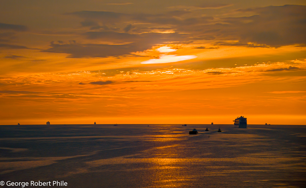
Richard, I like the amount of detail you have in the foreground and then the lines in the mountain lead you down the mountain to the water and then to the sky. I know it is sunrise but lightning up the mountain shadow might make it a little better. The puddle in the lower right doesn't bother me. Great picture. |
Nov 13th |
| 36 |
Nov 19 |
Comment |
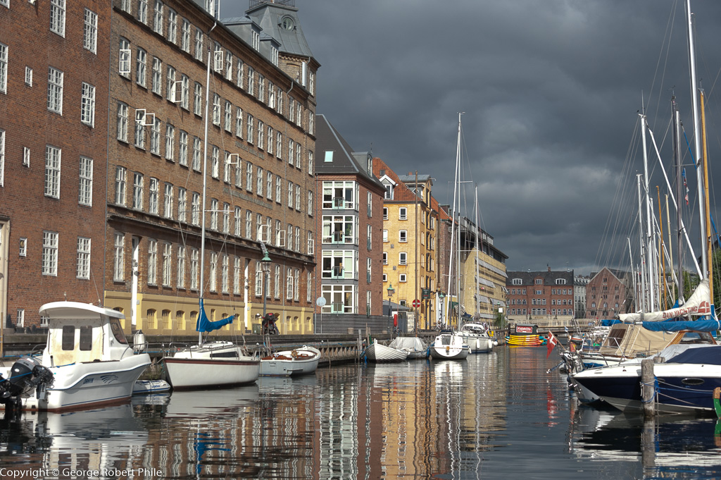
Bill, I think the rule of thirds DOES NOT apply in this image. It is a great image with lots of color. I really don't have any suggestions about making it better. |
Nov 13th |
| 36 |
Nov 19 |
Reply |
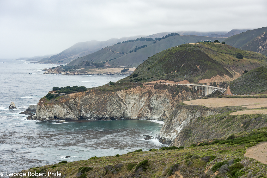
Michael, I thought about getting rid of the parking area in the lower right but decided that it would leave little room for the bridge. I actually like the hills in the background blurred some which,to me, accentuates the foreground hills. |
Nov 13th |
| 36 |
Nov 19 |
Comment |
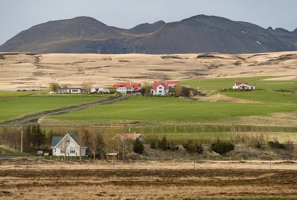
Good choice to make this b/w. I would lighten up the roof on the barn/garage but the house is really the center of attention. A little more detail or contrast on the hillside might make the image pop some. I really like the sky in the b/w verses the color image. |
Nov 13th |
| 36 |
Nov 19 |
Comment |
This is a great image. I like the horizontal aspect of it and, from my perspective, the sky is great. Maybe a tad bit lighter would be better (1/4 or 1/3 stop) but that just my preference. Just a little more space on the left and right of the image would be great but there are probably things there which distract from the image. Really nice image! |
Nov 13th |
| 36 |
Nov 19 |
Comment |
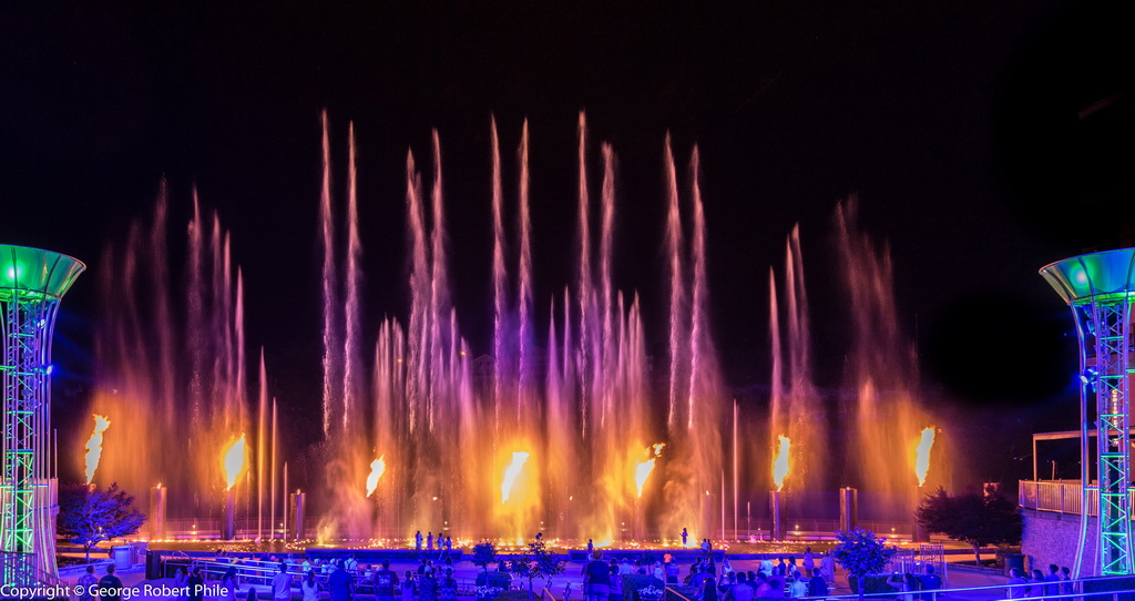
I like the image, especially the colors in the sky. I like the way the mountain leads you right to the top of the Dome. The image is a little dark for me, maybe 1/2 to 1 stop lighter which would bring out some more detail in the valley but then you might need to adjust the sky some also. Good shot. |
Nov 13th |
5 comments - 1 reply for Group 36
|
5 comments - 1 reply Total
|