|
| Group |
Round |
C/R |
Comment |
Date |
Image |
| 36 |
May 19 |
Reply |
Michael, Thanks, I am a novice of PS and I will try your suggestion sometime next week on this image. |
May 16th |
| 36 |
May 19 |
Reply |
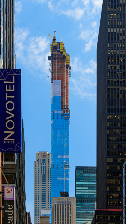
Richard, I straightened the image in Lightroom and cropped a very small amount on the left and right. I did crop about 10-15% off the top of the image because there was too much dark sky there. If I had to do it again, I would zoom out more so that I could get all of the towers on the left and right and not just half of them. |
May 15th |
| 36 |
May 19 |
Comment |
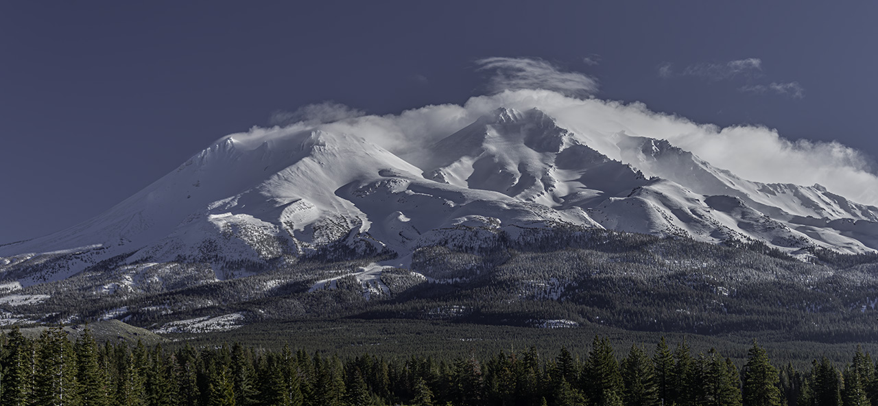
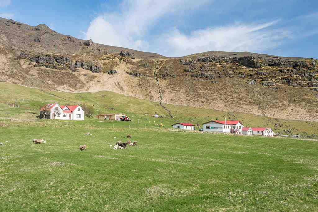
I like the lines of the mountains on the sides of the image which force your eye to the glacier itself and that the fog at the top limits where your eye may go. Good framing of the image! |
May 15th |
| 36 |
May 19 |
Comment |
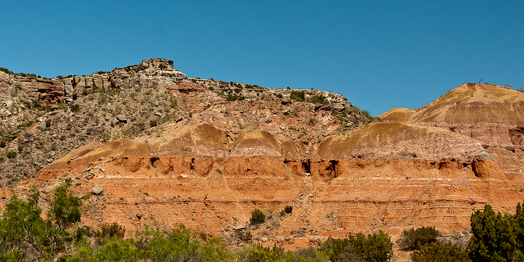
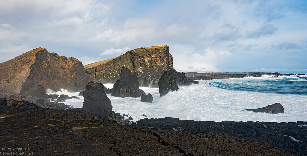
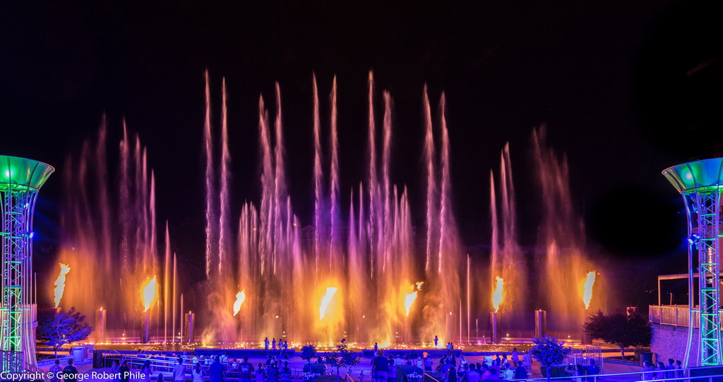
I like this image a lot. It has a bit too much sky. The breaking water in the lower and mid center of the image leads right to the cliffs in the distance. I would like to see all of the cliffs lightened up so I can see more detail. |
May 15th |
| 36 |
May 19 |
Comment |
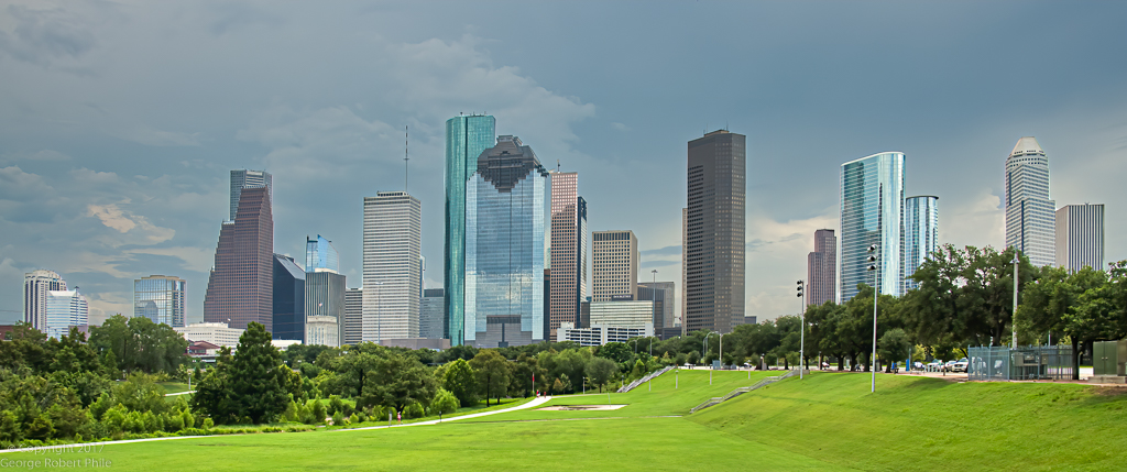
I like the conversion you did to create the soft lighting instead of using the original color. It makes a much better image. I agree with the cropping which Richard suggested because the lower right part of the image is pretty empty. That part of the image would be really good if this were an image used for advertising. |
May 15th |
| 36 |
May 19 |
Comment |
This is a really nice image. There is only one subject of interest and your eye is drawn right to it! The trees surround the tractor and your eyes are led right to it. I agree with Le's comment about the opening in the fence. Good job. |
May 15th |
| 36 |
May 19 |
Comment |
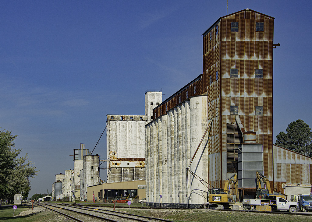
Bill, this is an excellent image. I agree that the fence on the left would be better edited out. The bird on the chimney is really a good extra touch to the image. The whites in the buildings appear to be somewhat muted. Was that due to clouds passing over? |
May 15th |
| 36 |
May 19 |
Comment |
I agree with Michael about cropping the sky at the top a bit but I wouldn't darken it. I also agree that darkening the sign would be a little better. The image seems a little dark to me below the sky and I would lighten that part of the image a bit. |
May 15th |
6 comments - 2 replies for Group 36
|
6 comments - 2 replies Total
|