|
| Group |
Round |
C/R |
Comment |
Date |
Image |
| 39 |
Jun 20 |
Comment |
The horse looks great, but the blown out background is distracting. The lower legs virtually disappear in the bright foreground. Maybe cropping where the head and body of the horse is more prominent eliminating the bright foreground? I don't know, that's a tough lighting situation to work with. |
Jun 12th |
| 39 |
Jun 20 |
Comment |
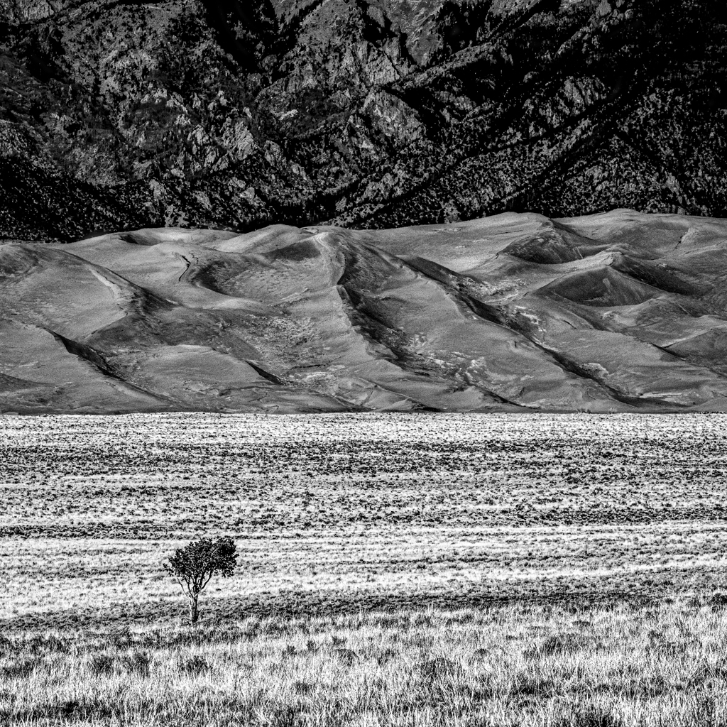
The striations in the sand give the impression of a raked Zen garden and the slight compression of the 200mm bring the grass clumps right to you yet still feel slightly out of reach. I would love to see this printed and framed where the sharp details of the sand and grass stand out. |
Jun 12th |
| 39 |
Jun 20 |
Comment |
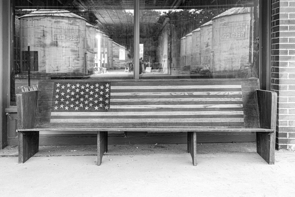
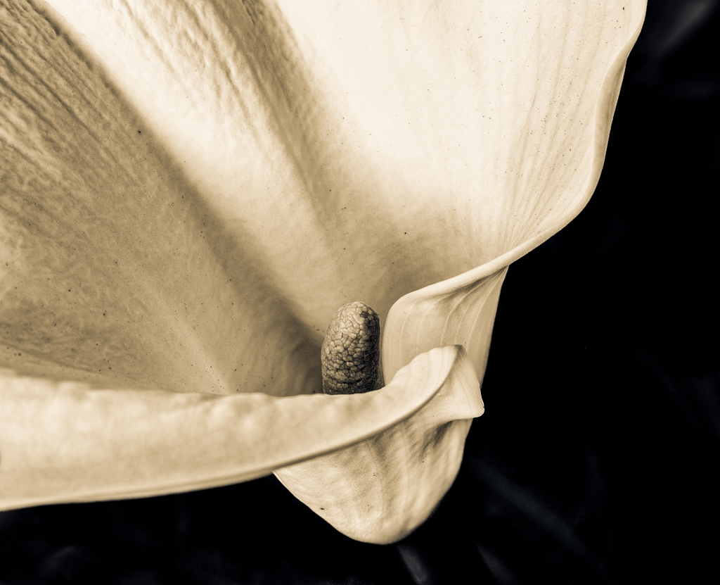
I'll have to agree with Arfan and both Jerry's on this one. I would go with the color one cropping into a square shot. This is the perfect shot for a square image with the stalk coming from the bottom left and moving across the frame. |
Jun 12th |
| 39 |
Jun 20 |
Comment |
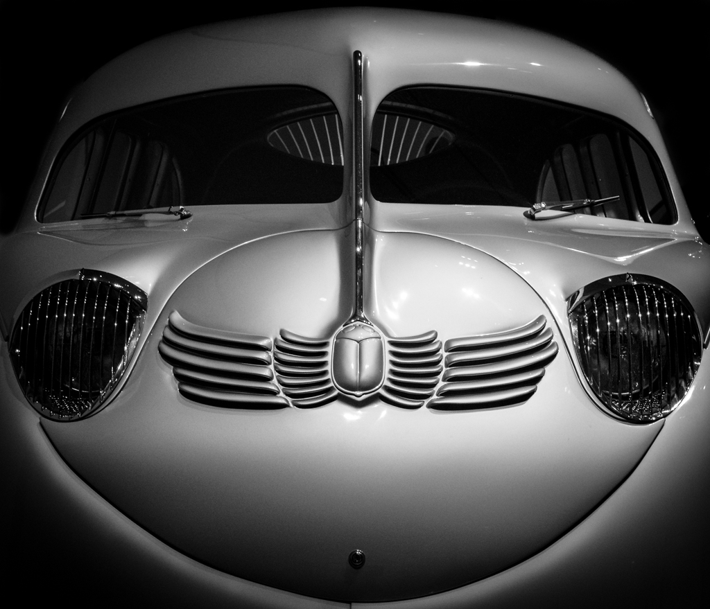
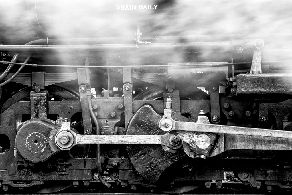
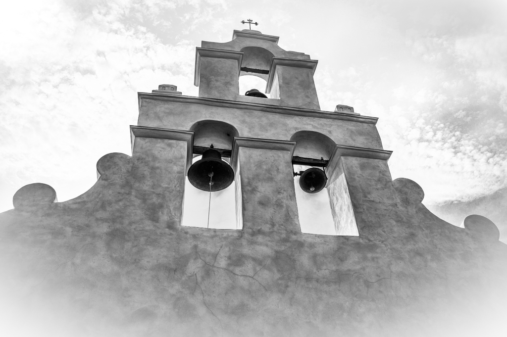
You've captured the lines beautifully. I'm tipping toward the color version. Though I really like the B&W, the color shot has a vibrancy that is, for me, missing in the B&W. In the color version you've also removed the floodlight that is growing out of the cab in the B&W. The bright spots presented by those lamps in the center of the photo keep drawing my eye away from the train. |
Jun 12th |
| 39 |
Jun 20 |
Reply |
This was shot with a Leica M9. |
Jun 5th |
| 39 |
Jun 20 |
Comment |
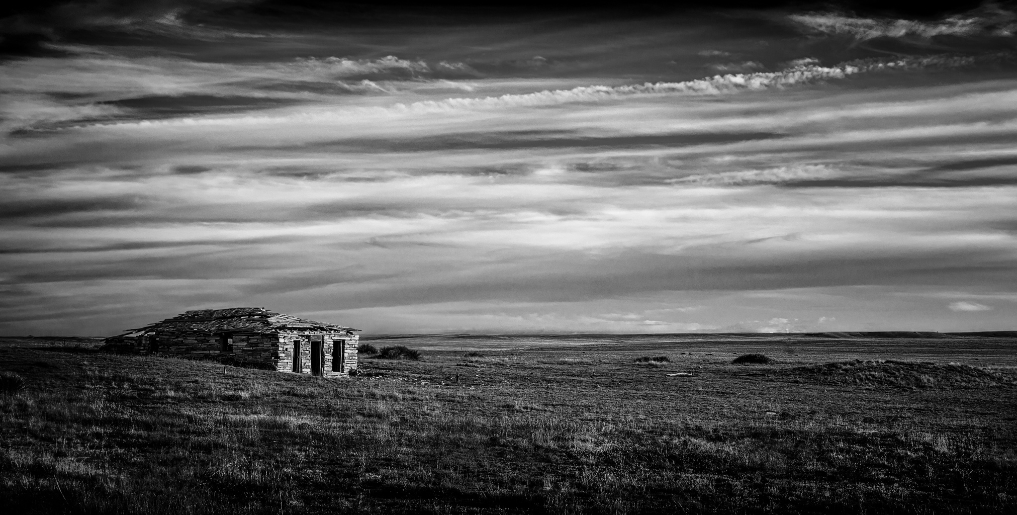
I'm in agreement with David. The pano crop is perfect, removing the boring bottom section and keeping the angled sky. It really adds depth to the photo. If it were mine, it would already be on the wall. |
Jun 3rd |
5 comments - 1 reply for Group 39
|
5 comments - 1 reply Total
|