|
| Group |
Round |
C/R |
Comment |
Date |
Image |
| 14 |
Mar 26 |
Reply |
Hi Karen - It's always helpful to get the feedback! |
Mar 30th |
| 14 |
Mar 26 |
Reply |
Hi Ingrid - Thanks for demonstrating your suggested changes. I appreciate the ideas - |
Mar 30th |
| 14 |
Mar 26 |
Reply |
Hi Tom - I appreciate your observations and suggestions! |
Mar 30th |
| 14 |
Mar 26 |
Comment |
Hi Kamal - A beautifully textured temple you've captured. The architecture, texture and color variations are lovely and well captured. I think you've captured the best version of the unusual shape and detail of the arches in your composition. It feels a bit tilted backward and a slight vertical adjustment might be helpful although the building's shape might be creating that illusion? I agree that addressing the unusual artifacts in the right hand portion of the sky. A vignette may help highlight the building and tone down that lower right corner too. Thanks for sharing - |
Mar 14th |
| 14 |
Mar 26 |
Comment |
Hi Jackie - Devil's Tower creates a dramatic B&W image that stands out nicely against the clouds. I like the standing bison as it adds interest to the foreground. The two bison lying to the left side get lost in the tree line - there is just not enough contrast. I like Tom's changes, especially to that sky, although it didn't change my thinking about those two left side bison. Your image inspires me to take a look in my archives for our trip to that area several years back. A lovely capture! |
Mar 14th |
| 14 |
Mar 26 |
Comment |
Hi Tom - What a eye - bringing the roof line together against that unusual sky in order to create this interesting abstract. Your choices in creating this strong composition and converting to B&W make for an appealing image. I suspect this would do well in a juried show. Well seen and nicely executed! |
Mar 14th |
| 14 |
Mar 26 |
Comment |
Hi Greg - I think you did quite well with the technique of creating the texture overlay. I find the overall image a bit flat though - perhaps retaining the larger of shadow as shown in the original would have added some depth. While purely a personal preference, the background matte texture against the gloss of the paint on the vehicle doesn't do much to elevate the image to my eye. Good on you for trying a new challenge! |
Mar 14th |
| 14 |
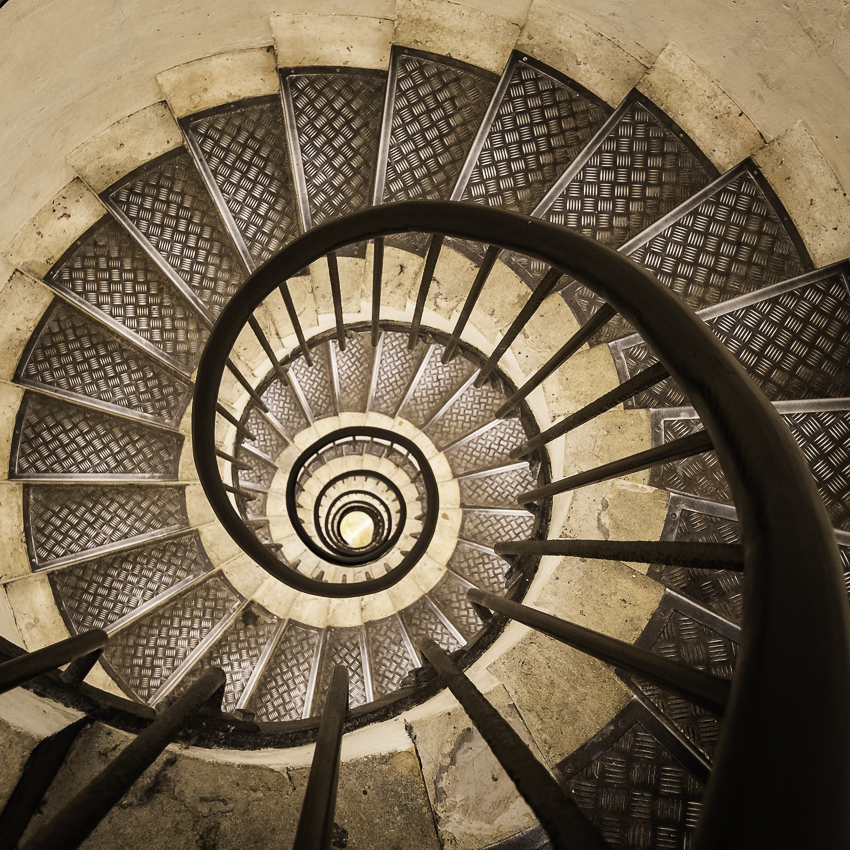
Mar 26 |
Comment |
Hi Karen - I love this image; it's hard to find a good stairwell that has character and decent lighting. Your lighthouse stairwell has both. The contrast created in your B&W image is lovely and the composition is excellent. Well seen and captured! |
Mar 14th |
| 14 |
Mar 26 |
Reply |
Thanks Greg - I like your idea for selective sharpening in the core. Your perspective is always enlightening. Thinking everyone could read my mind was my mistake :) |
Mar 7th |
| 14 |
Mar 26 |
Comment |
Hi Ingrid - The lighting makes this image. The colors and textures are lovely. Bringing the birds closer in post was a good choice and tells a cute story. If you hadn't mentioned that you brought the birds a tad closer, I probably would not have looked close enough to see where that was done. Great expression on the bird to the left and a nice catch of the bird on the right in flight! |
Mar 7th |
| 14 |
Mar 26 |
Reply |
Hi Jackie - Thanks for the input. An added something would definitely add a bit more interest. |
Mar 7th |
| 14 |
Mar 26 |
Comment |
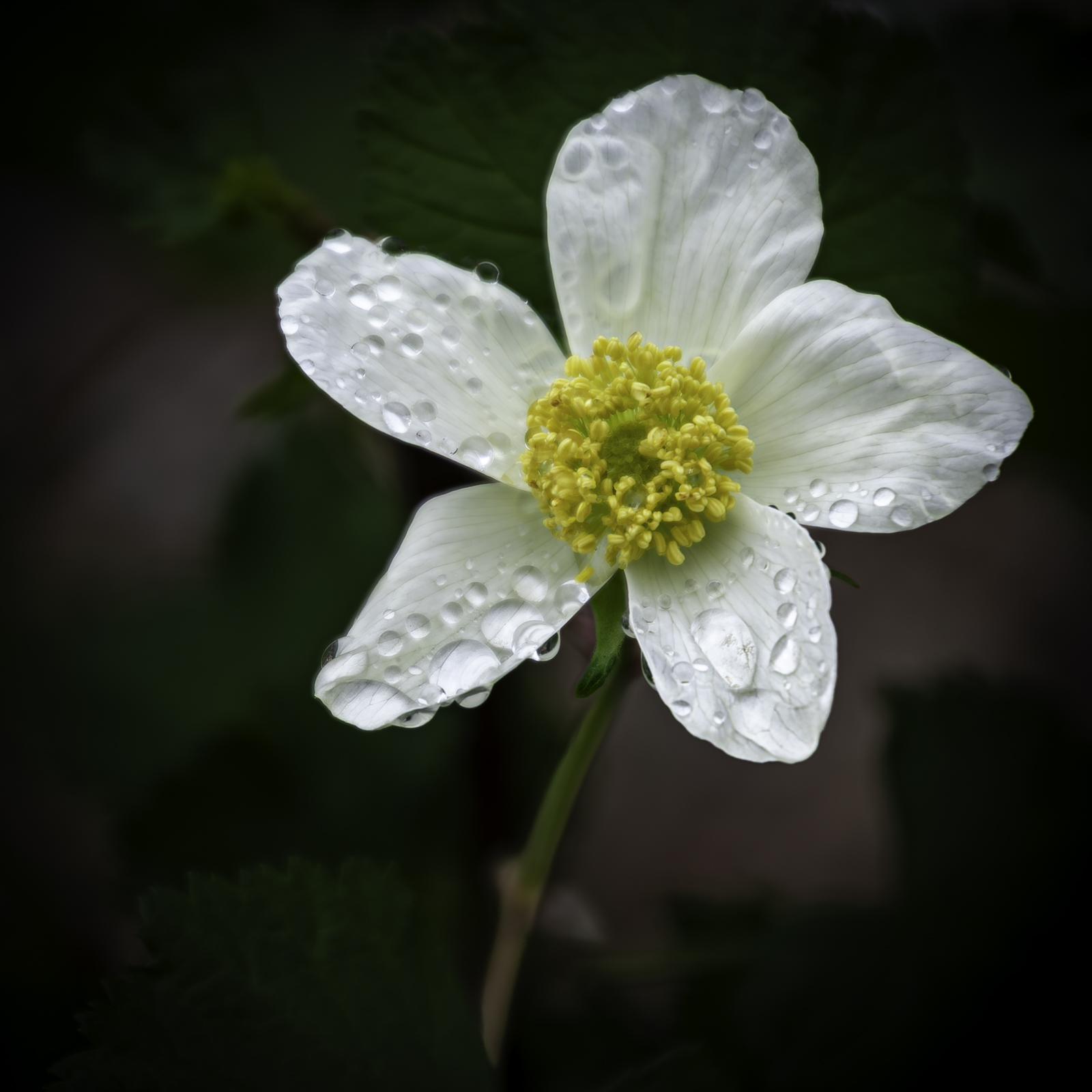
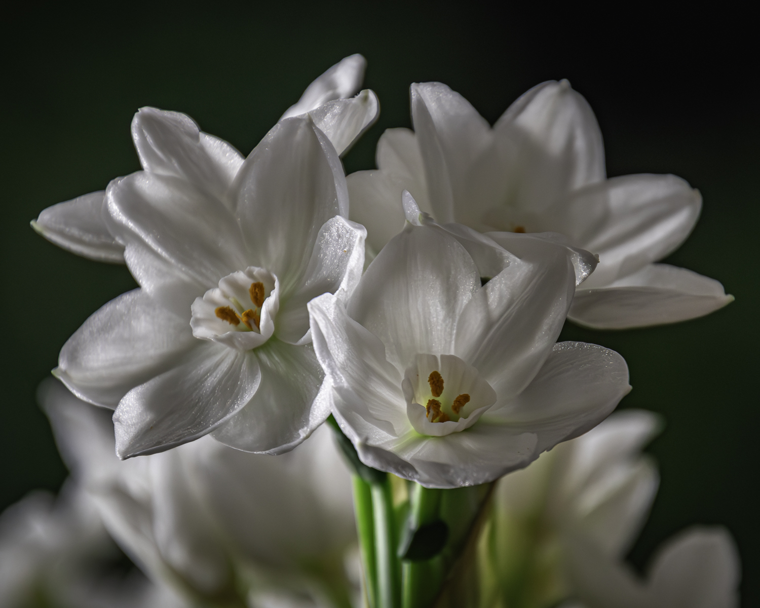
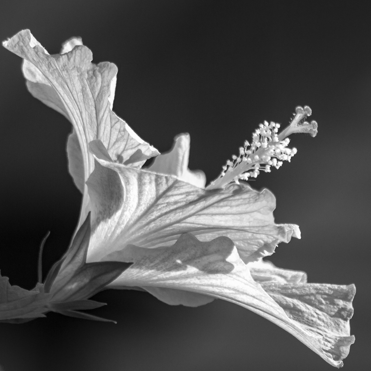
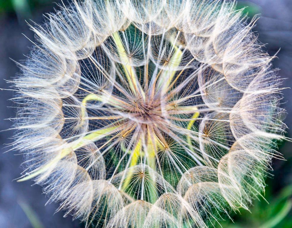
Hi Kamal and Greg - You are both right - The image is soft especially on the back two petals. In this case, I don't really mind. While I realize that many photographers aim for maximum sharpness, in this case it was more of an artistic choice. I felt there were a lot of droplets on this flower making the image quite busy. By using the softness in the image, I was hoping the viewer would focus more on those patterns and heavy droplets that are about to succumb to gravity. I have noticed that soft edges in close-up or macro photography in juried national photography shows has become more and more common and with nice affect. I do realize that there are times where it could be a technical limitation. If this was for a scientific or nature journal and even in many competitions, this wouldn't work either. In this case, perhaps I needed to reduce or enhance the softness to make the image more effective? . . . or maybe just toss this image in the bin? I do appreciate your input and suggestions. I probably should have explained this in my narrative . . . Thanks! |
Mar 7th |
7 comments - 5 replies for Group 14
|
7 comments - 5 replies Total
|