|
| Group |
Round |
C/R |
Comment |
Date |
Image |
| 14 |
Sep 24 |
Comment |
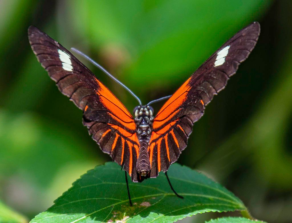
Hi Kamal ~ Love the title, Dry Fish Boy. The rest of the Group 14 team has already done a good job of input and suggestions. If it were mine, I probably would go for a slightly tighter crop, perhaps to an aspect ratio of 4:3. This would still show the scope of the dry fish operation, place the boy nicely in the frame and bring your focal point a bit closer. It would also eliminate the referenced pink area and the table behind the boy which are not contributing much value to the story. Those small pops of color throughout are quite nice. That said, I do believe Ingrid's idea for a B&W presentation would be lovely. Nice capture! |
Sep 25th |
| 14 |
Sep 24 |
Comment |
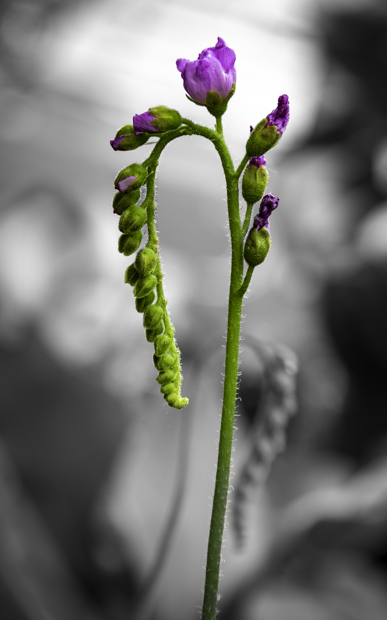
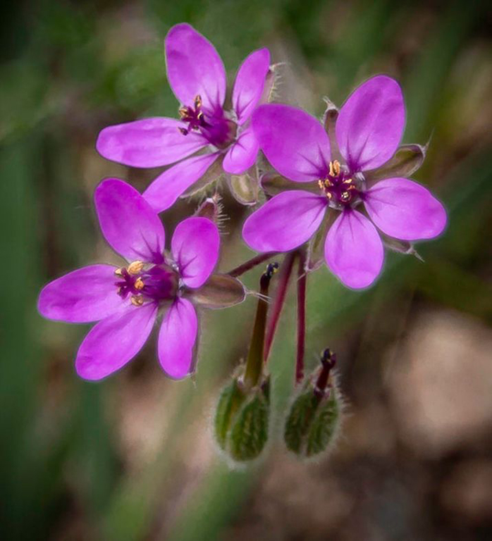
H Erin - What a lovely garden shot! The composition works beautifully - excellent focus where it's needed, good depth in the image, effective lighting, striking colors and that Monarch posed quite nicely for you in just the right spot. I agree with Karen and Ingrid regarding the remaining blue flower in the background. Nice capture; well done! |
Sep 25th |
| 14 |
Sep 24 |
Comment |
Hi Tom - I much prefer your final product over the original. I appreciate the amount of effort into this month's experiment with pretty nice results - thanks for sharing how you got from A to B! I agree with Ingrid about eliminating the monochromatic element in the back as it's a bit of a distraction and it would create the more minimalist effect you are after. The square format works well as does the lighting. It's unanimous so far on taking those hot spots down a notch. So, a few tweaks and you're there! |
Sep 25th |
| 14 |
Sep 24 |
Comment |
Hi Greg - Shooting through water never produces the image quality and vivid colors as remembered. How fortunate that you are quite proficient at post processing as evidenced by the difference between the original and your final image. I like how clear and crisp the foreground of the image is highlighting your focal point and how you brought out the colors in the landscape. Your choice and placement of the fish was an excellent decision completing the story and drawing the viewer's eye further into the image. Thanks for sharing - |
Sep 25th |
| 14 |
Sep 24 |
Comment |
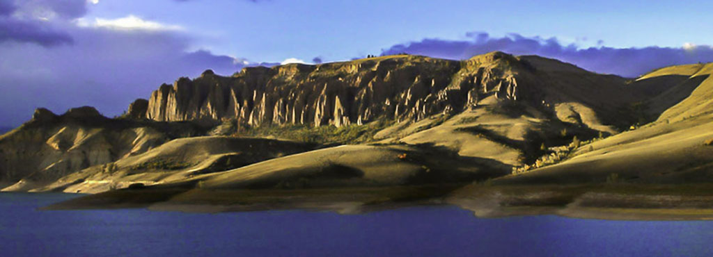
Hi Karen - What an extraordinary landscape that leads the viewer through it nicely. I too agree with Leslie's and Tom's comments/suggestions. The photograph has good impact and was nicely handled in post, especially the textures. If Tom hadn't mentioned the bright element, I would have missed it entirely. Good job! |
Sep 21st |
| 14 |
Sep 24 |
Comment |
Hi Ingrid - No question, an abstract it is! I like the reflective nature of the composition and the balance of colors, shapes and textures. The lighting works well too. Perhaps it is just me - I find that the silhouetted object(s) creates a barrier that works against the rest of the image ... it brings in an altogether different structural design element that I'm not sure works entirely. If you hadn't told us what we are looking at, I would never have guessed! Well seen at 75 mph! |
Sep 21st |
6 comments - 0 replies for Group 14
|
6 comments - 0 replies Total
|