|
| Group |
Round |
C/R |
Comment |
Date |
Image |
| 1 |
Jun 24 |
Comment |
Hi Joey - This is a gorgeous image of Antelope Canyon. Beautiful light and an interesting capture with all sorts of leading lines taking the viewer into the image. My only suggestion would be to flip the image horizontally so that your strongest leading line is coming up at a diagonal from the bottom left instead of the right. Just a thought. Well done!
Darcy - DD Group 14
|
Jun 30th |
1 comment - 0 replies for Group 1
|
| 14 |
Jun 24 |
Reply |
Thanks Karen - I understand what you mean . . . I'll see what I can do and keep it close to a decent aspect ratio. It shouldn't be a big deal on the left; I'm less sure about the crop from the bottom . . . just have to give it a go :) Thanks - |
Jun 19th |
| 14 |
Jun 24 |
Comment |
Hi Kamal - I always enjoy stumbling across weddings in visited spaces . . . the celebration just adds something special to the moment even as an observer! Better yet, you've captured a spontaneous portrait of that moment. As a suggestion, I believe you have some wonderful light that could be exploited further. Also, the young girl's face is in some shadow and perhaps brightening/lightening that area a tad may be helpful to draw further attention to your subject. Valencia, Spain . . . you do get around to some wonderful places! |
Jun 18th |
| 14 |
Jun 24 |
Comment |
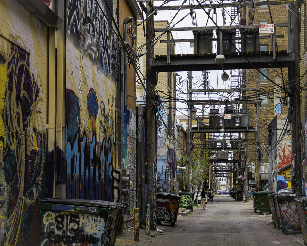
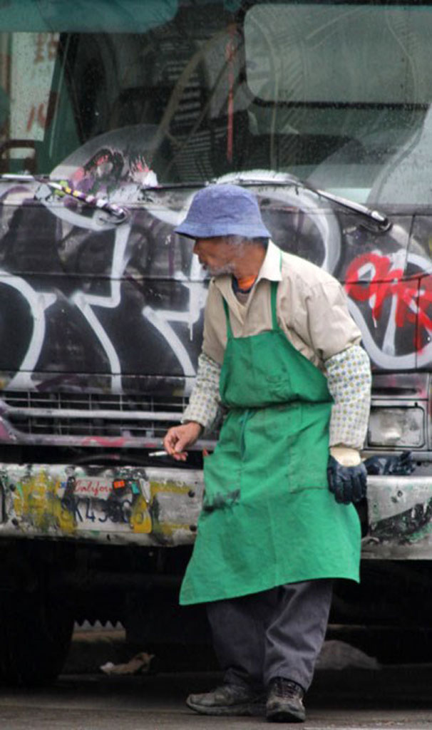
Hi Tom - In my experience, there are really some good artists doing some incredible graffiti these days . . . despite a whole lot negative aspects. I like the idea of highlighting the "messy" section prominently to tone down the level of distraction. I also agree with the idea that balancing the lighting a bit better in the remainder of the image may work well without sacrificing your focal point. If it were mine, I might set the highlighted graffiti wall off center, to the right slightly, which would also serve to diminish and reshape the shadow. Graffiti alley's are such a photographic challenge and I think you've found a way to make it work! |
Jun 17th |
| 14 |
Jun 24 |
Reply |
Hi Ingrid - Thank you for the incredibly kind feedback. |
Jun 16th |
| 14 |
Jun 24 |
Reply |
Hi Kamal - I did add a light vignette, so perhaps I'll try upping it a bit and see if that helps. Thanks for the suggestion and the observations. |
Jun 16th |
| 14 |
Jun 24 |
Comment |
Hi Erin - What a genuine and spontaneous portrait of your daughter. I can't imagine anyone not smiling when they see this image. I like the monochrome conversion and the closer crop as well. Well done! |
Jun 16th |
| 14 |
Jun 24 |
Comment |
Hi Greg - Do I detect a bit of a sly grin on this fellow? I'm hoping you were in the comfort of your car doing a slow drive by when you captured this guy, especially since his many alligator friends are often spotted along the road. That said, I don't believe I have anything to add beyond the comments others have already made. Nicely executed nature image! |
Jun 16th |
| 14 |
Jun 24 |
Reply |
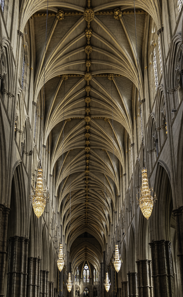
Hi Erin - The lighting is definitely darker on one side than the other and it shows in the windows and in some of the vaulted areas. I considered trying to even out the lighting, played a bit with it but thought I was doing more harm than good. Good eye - I appreciate your insights. |
Jun 14th |
| 14 |
Jun 24 |
Reply |
Hi Greg - Thanks for your thoughts. |
Jun 14th |
| 14 |
Jun 24 |
Reply |
Thanks Leslie - I appreciate your commenting. |
Jun 14th |
| 14 |
Jun 24 |
Reply |
Thanks Tom - Interesting that you mention sharpening. My thinking when processing was that I would love to have a bit more focus overall, that the image just isn't as sharp as it needs to be for an architectural image. So expected that as a critique - so I'm glad it appears otherwise to your eye. I did try lightening the lantern some but felt it began to look flat - perhaps I need to play with that more? Thanks for your insights. |
Jun 14th |
| 14 |
Jun 24 |
Comment |
Hi Karen - This was a good candidate for B&W. I like the suggestion of upping the contrast to better see the pond and brightening the whites to catch the snow. I think changing to a panoramic aspect ratio was a good idea as well. The fence is a head scratcher . . . Thanks for sharing! |
Jun 14th |
| 14 |
Jun 24 |
Comment |
Hi Ingrid - I like the simplicity of the image. As bright as it was out, you were still able to get the massive rock in shadow which is nicely contrasted by the tree lit directly by the sun creating interest. I agree that the dots have to go. Good job with the texture. Nice capture. |
Jun 14th |
6 comments - 7 replies for Group 14
|
7 comments - 7 replies Total
|