|
| Group |
Round |
C/R |
Comment |
Date |
Image |
| 14 |
Sep 21 |
Reply |
Hi Ingrid - You certainly were able to bring out more detail . . . now things have gone a bit too much the other way. Having to pick, your first presentation was better. Thanks for giving it a try. |
Sep 16th |
| 14 |
Sep 21 |
Reply |
Thanks Xiao - I'll see if I can improve the image using the techniques you suggest. I appreciate your input. |
Sep 16th |
| 14 |
Sep 21 |
Reply |
Hi Ingrid - I'll play with the LR sliders and darken the corner as you suggest to see how that improves the image. I appreciate your suggestions. Thanks - |
Sep 11th |
| 14 |
Sep 21 |
Reply |
Thanks for you insights Greg - I'll give it another go when the next opportunity presents itself. Best - |
Sep 10th |
| 14 |
Sep 21 |
Reply |
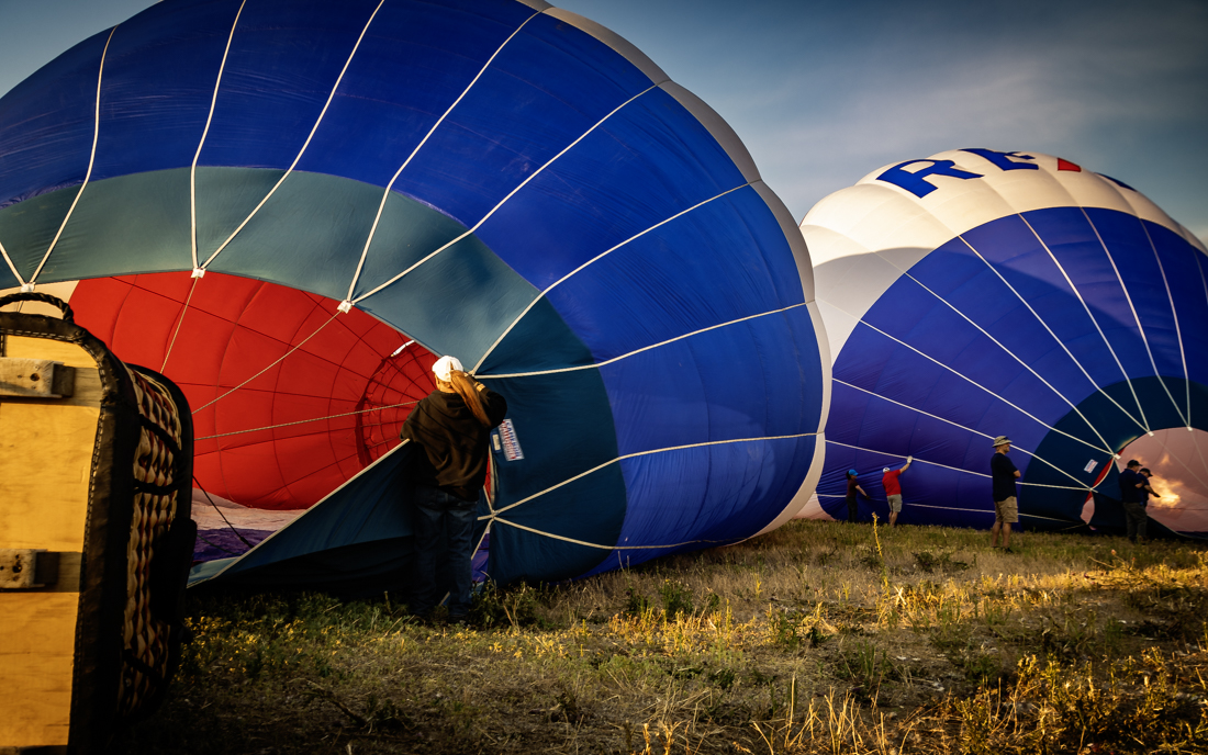
Thanks for the tip on PhotoPill and for checking the contrast Tom - need to work on that generally. I think that this is a good example of not having quite the right equipment for the job at hand as I seemed to have run out of focal length and my f-stop range. |
Sep 10th |
| 14 |
Sep 21 |
Comment |
Hi Syed - Your flights certainly take you over some interesting sights. This is a great story and I like that the jute workers continue with business and are not all that distracted by your low flying up the bank. I wish there was a little more detail in the blacks. I like the time of day you captured this image as it adds a level of depth and interest we would not see otherwise. The composition is well done and there is nice action captured by the water's movement and in the posture of some of the workers. Overall, a very lovely image. |
Sep 10th |
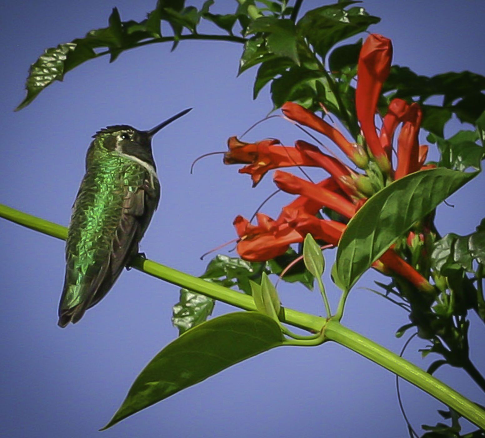
| 14 |
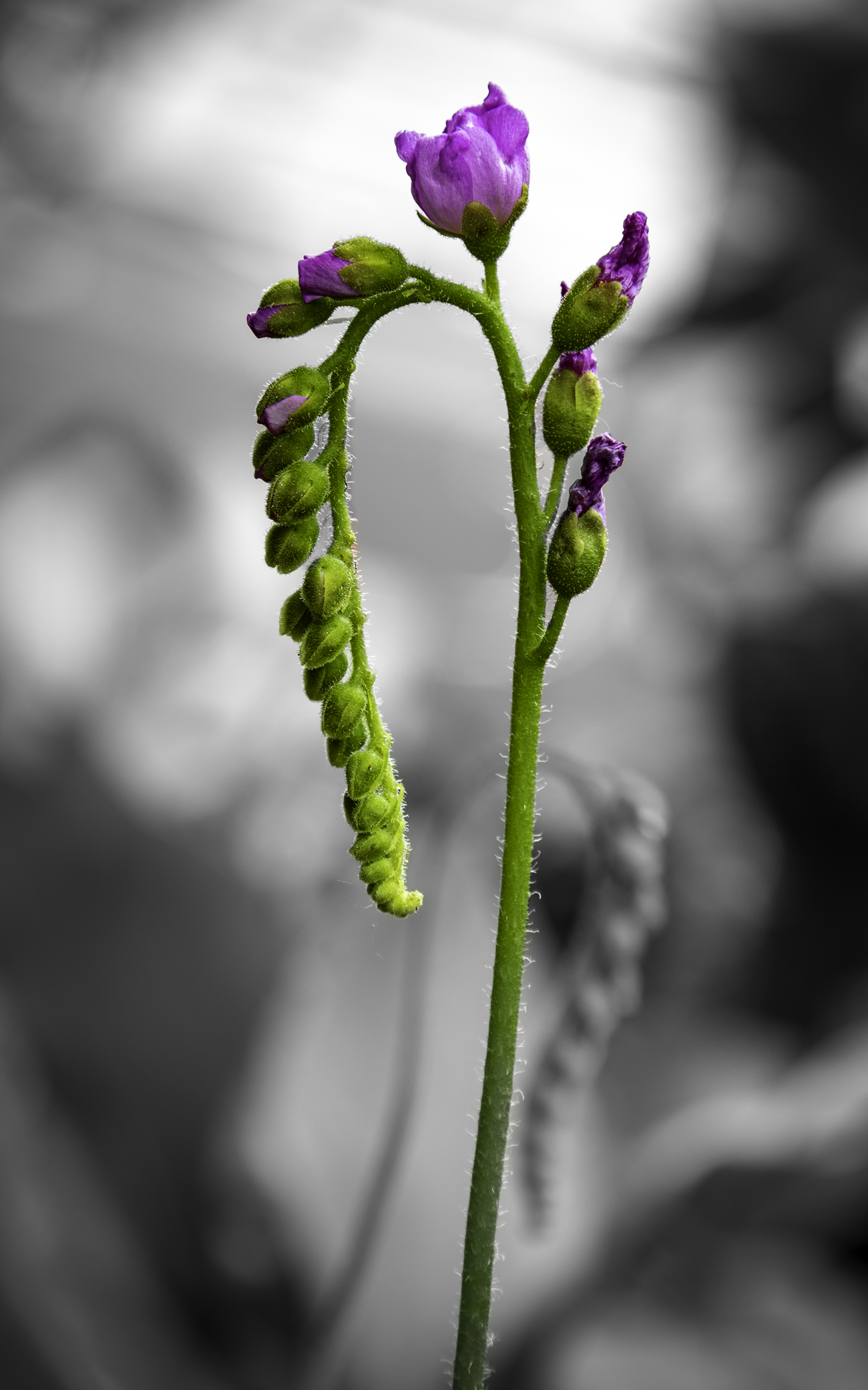
Sep 21 |
Comment |
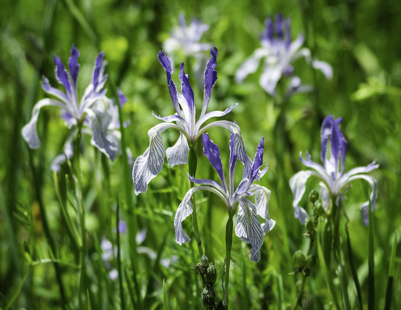
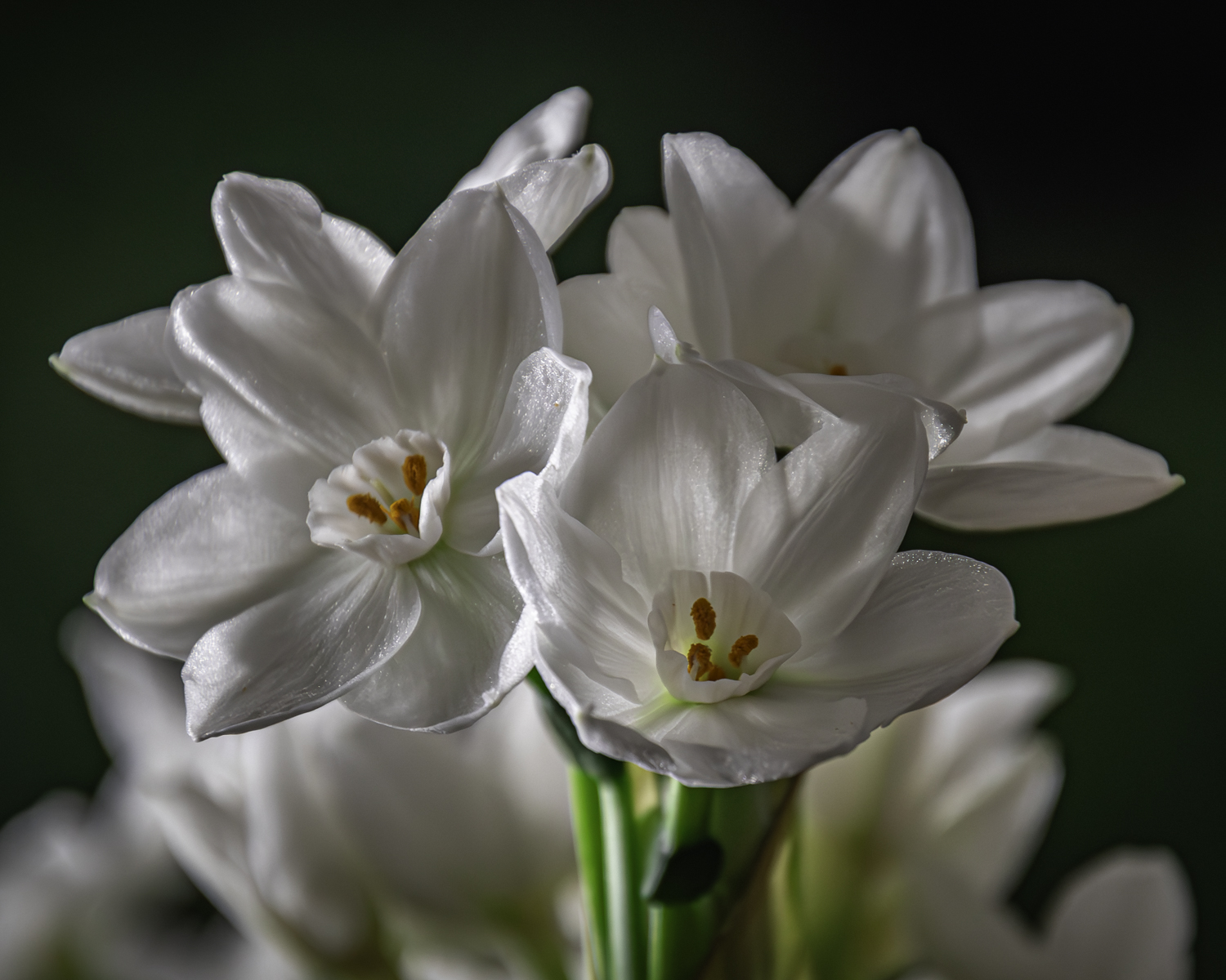
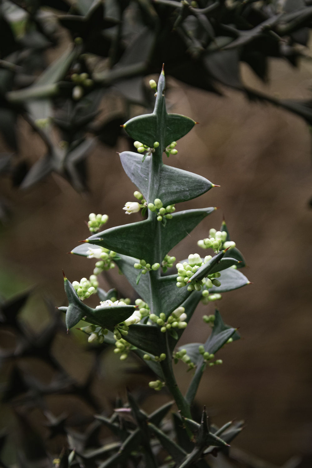
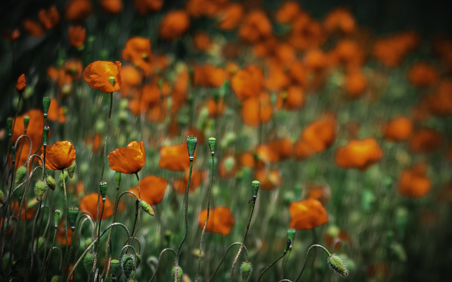
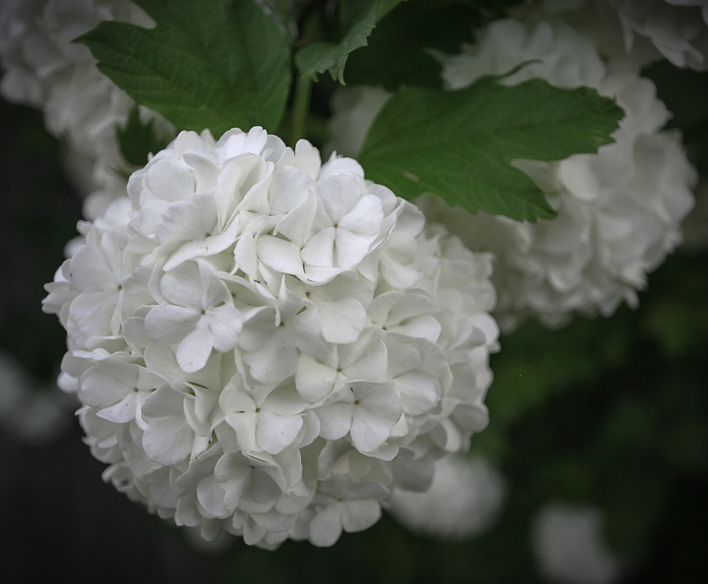
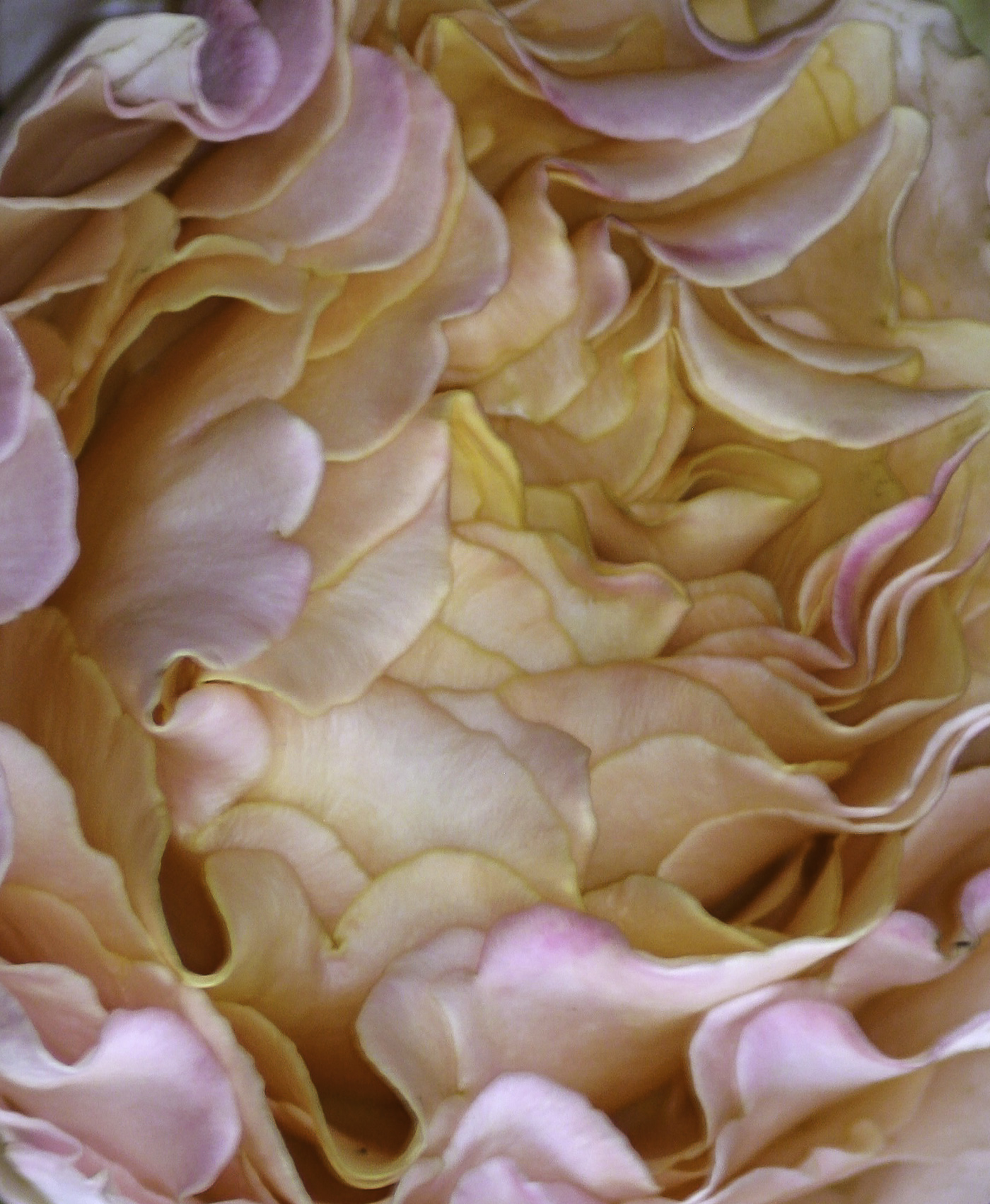
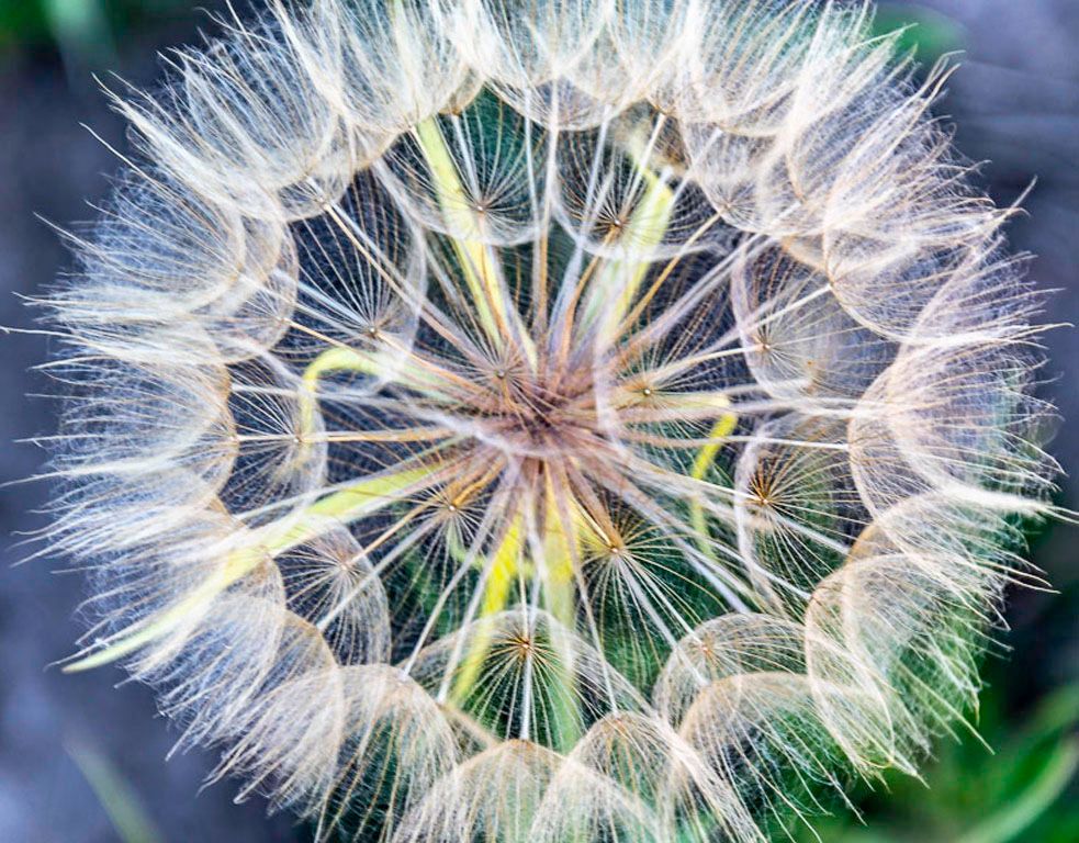
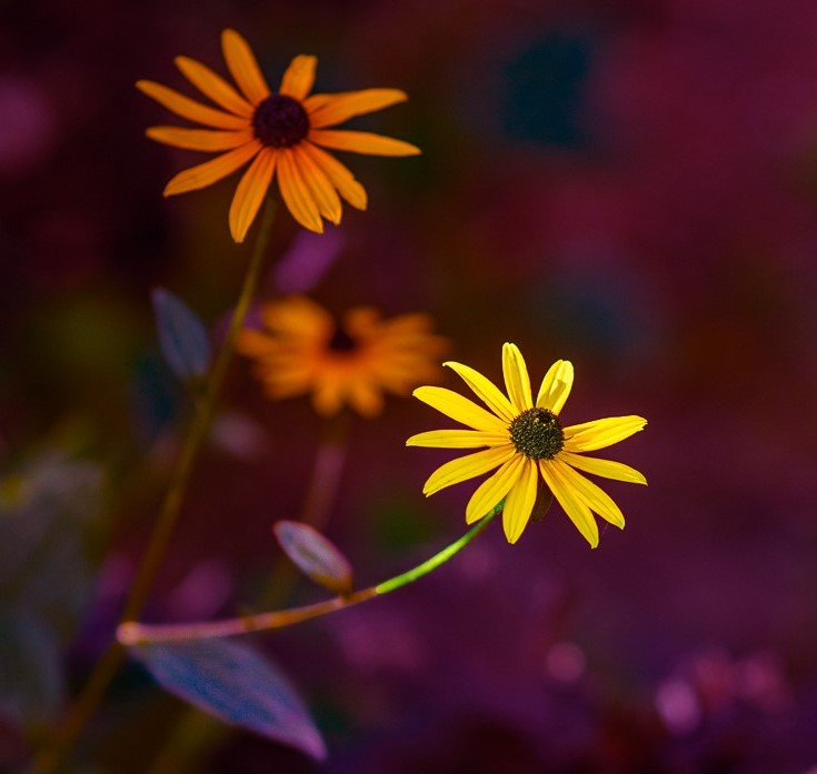
Hi Xiao - Your image does a good job of capturing your artistic intent of flowers within the environment. To strengthen the composition, I might suggest cropping horizontally right above the bottom right flower and vertically just to the left of the recessed flower of the far right flower. I would then flip the image horizontally. The leading lines created by the stem along with the lighting will help focus on the main subject I particularly like the beautiful colors that are nicely balanced. |
Sep 10th |
 |
| 14 |
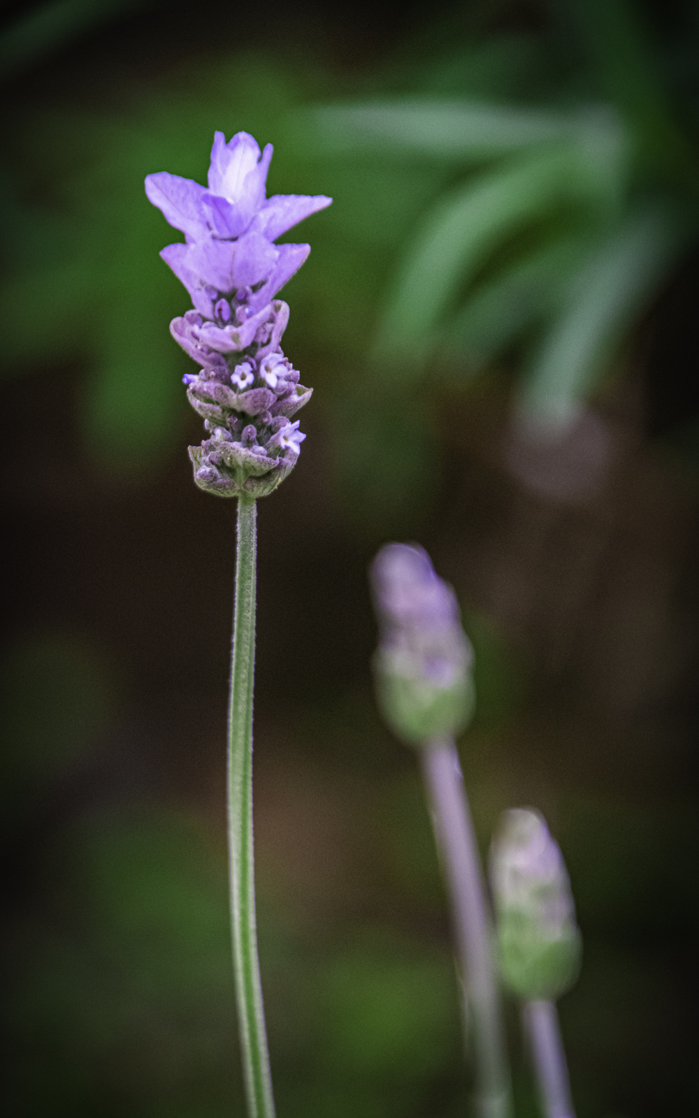
Sep 21 |
Comment |
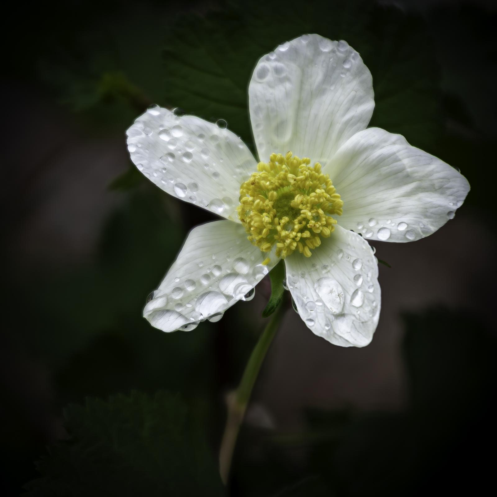
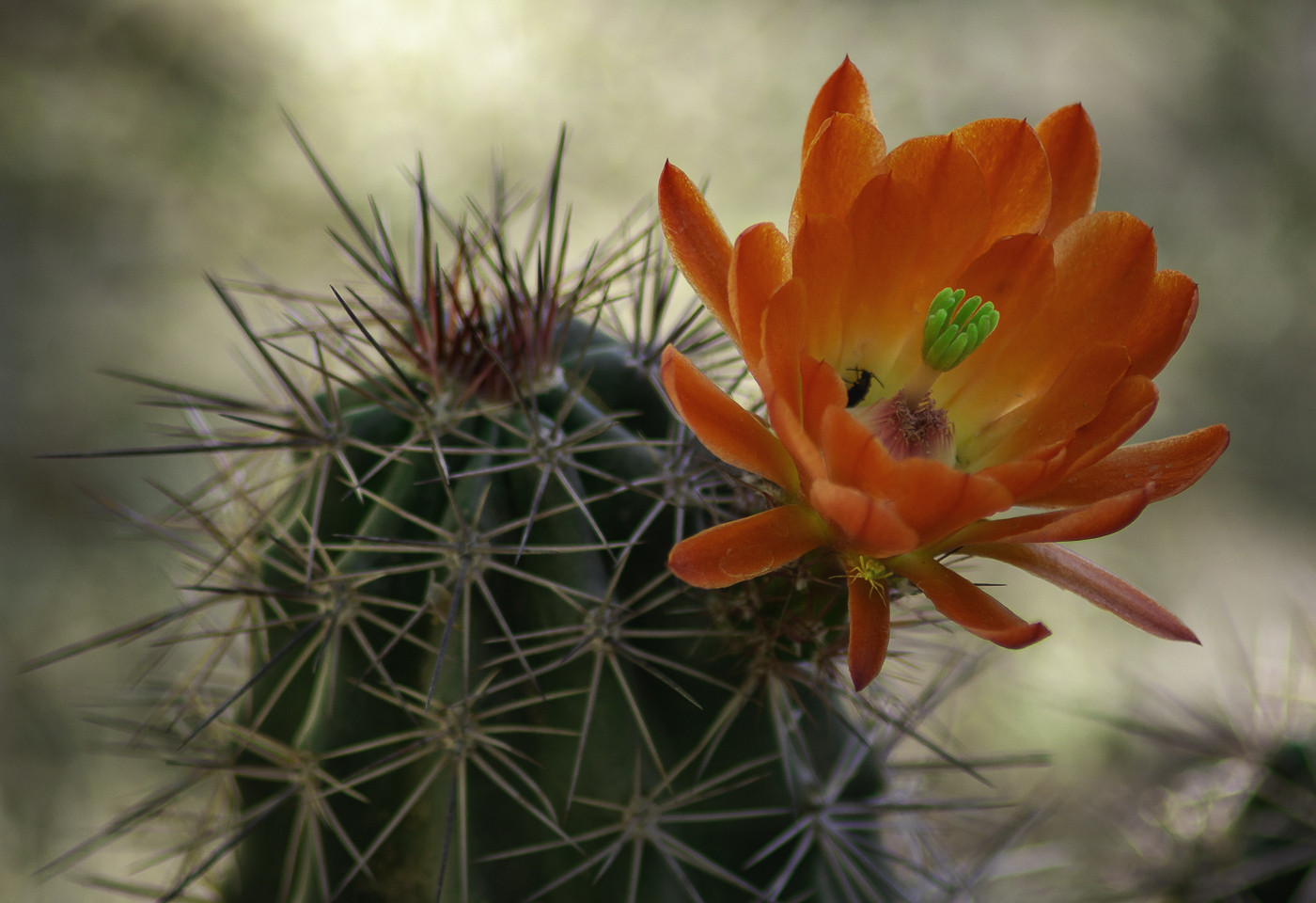
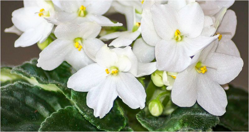
Hi Tom - I know this flower more commonly as Bird of Paradise. Where I live, it is a more rare, exotic flower only grown in greenhouses. I don't recall ever seeing the plant; just the flower - I'm quite jealous really! I think you are on the right track with your experimentation efforts (lighting - which is the hardest part to get right in my mind; use of orange gel, etc.) although I believe you went too far with the saturation. Otherwise, keep trying, that glow is there and you chose a beautiful flower with a long shelf life . . . so a few more tries? P.S. Clearly, your wife knows you well :D |
Sep 10th |
| 14 |
Sep 21 |
Comment |
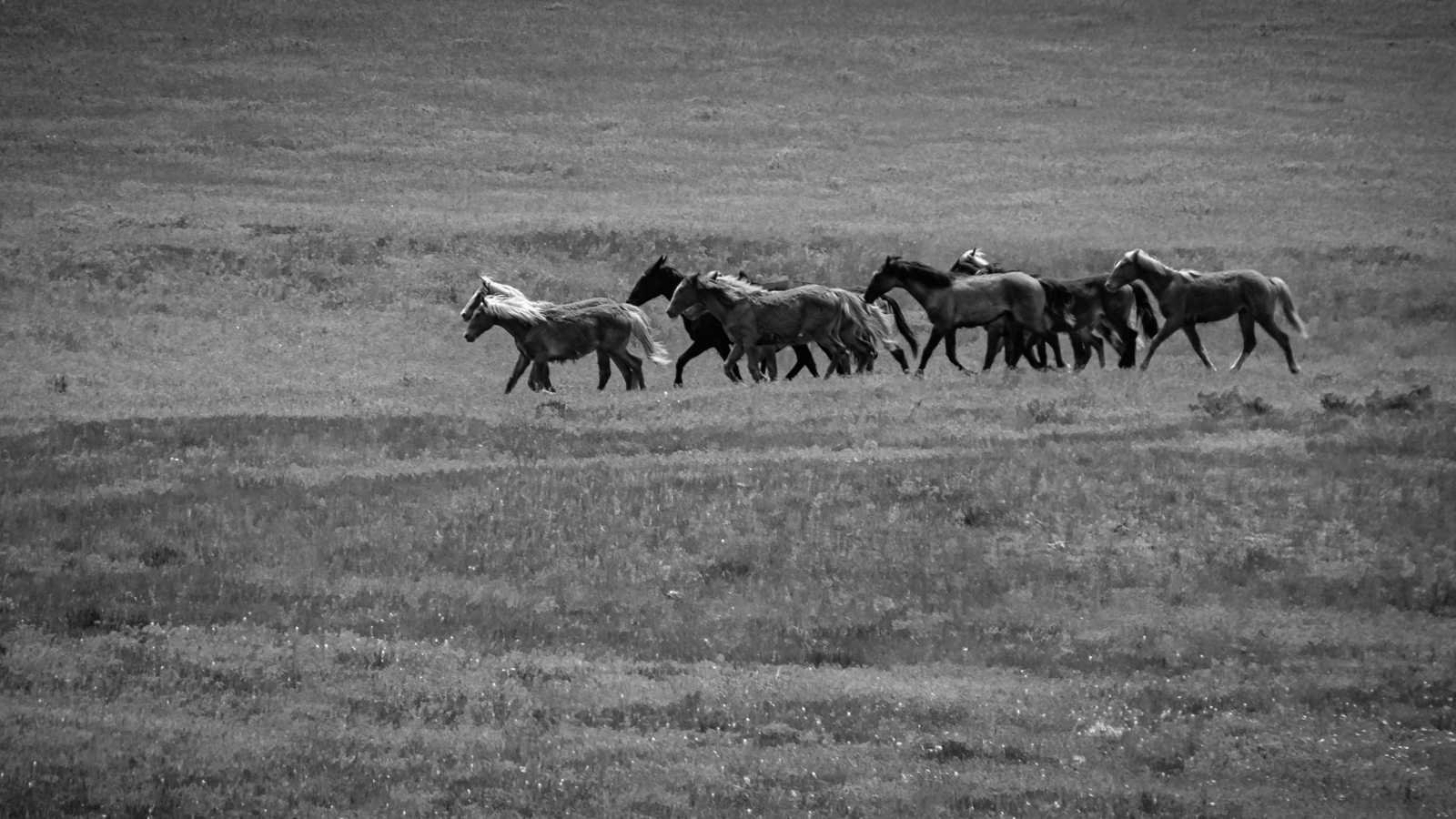
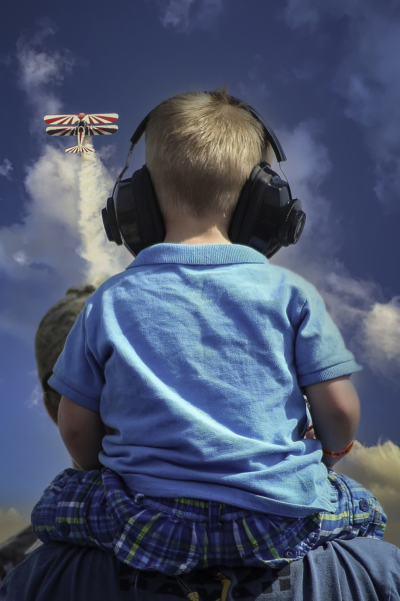
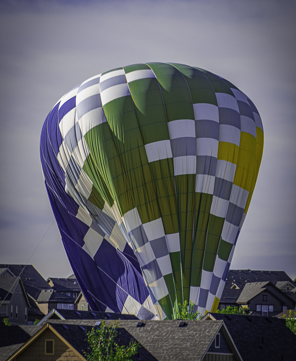
Hi Greg - Although hard to choose, probably my favorite shot to date from your recent Colorado shoot. The silhouette is very nicely done, great use of color and filters, good impact and tells a nice story. A small distraction for me, is that I wish it wasn't left to the imagination that two of the three horses appear to have less than four legs. Otherwise a great shot. You came to Colorado at a perfect time this year! |
Sep 10th |
| 14 |
Sep 21 |
Comment |
Hi Karen - I'm with Greg . . . forget the tripod and give those horses a little room to run on the right side. This is best done when composing the shot out of the camera - better to crop some in post if need be (don't get me wrong - Greg's idea works too:) One very, very small nit is that it would be nice if the center horse looked like it had four legs. All that said, lovely colors, angle of the shot and great action shown from the flying dirt to just how deep the horses hooves have to dig in to keep moving forward. I also like that the background is blurred just enough to keep the focus on the jockeys/horses. Nice capture! |
Sep 10th |
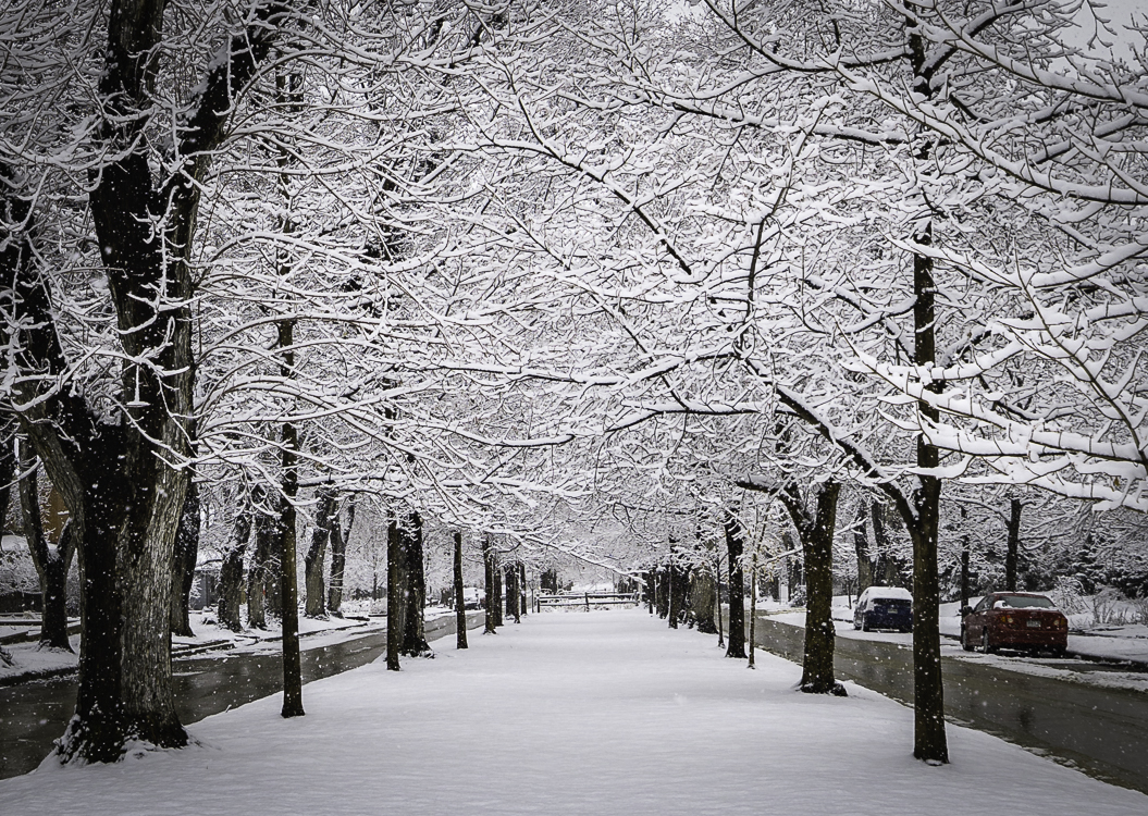
| 14 |
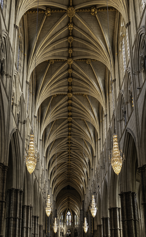
Sep 21 |
Comment |
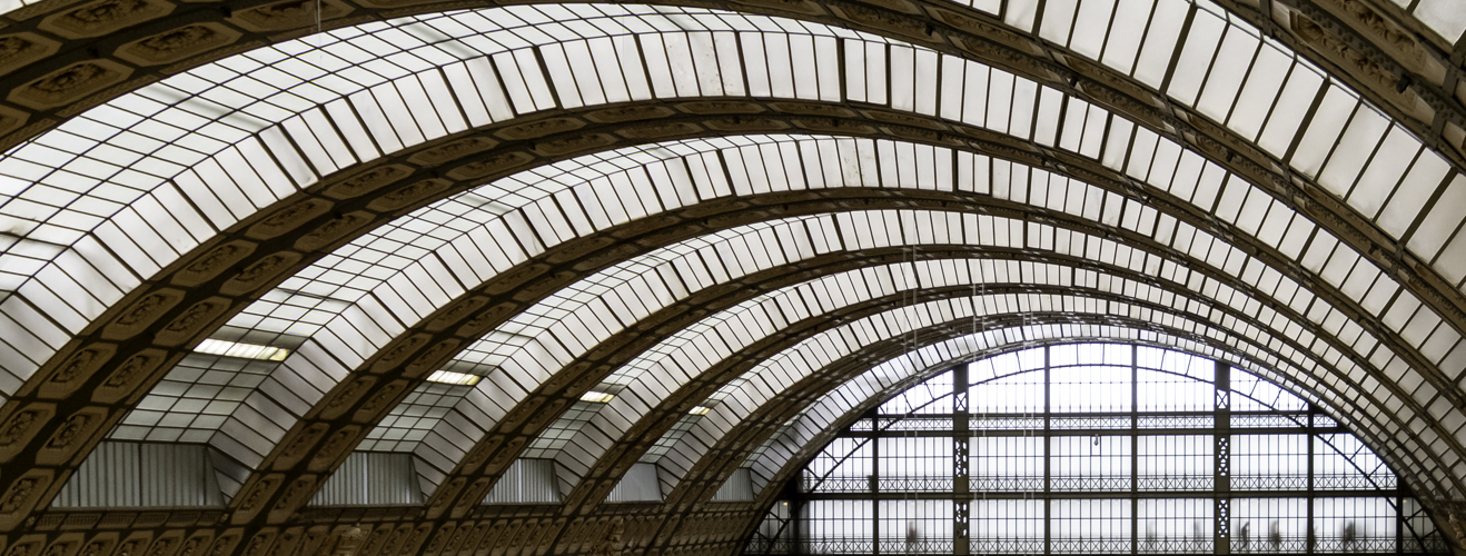
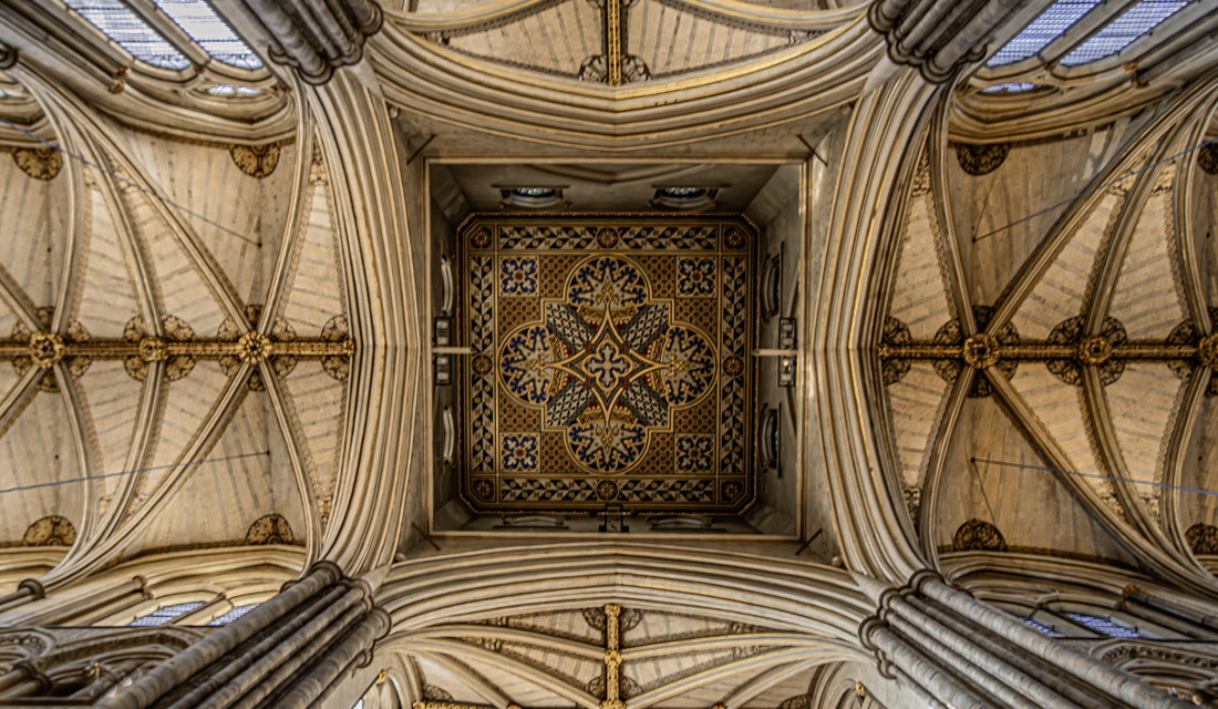
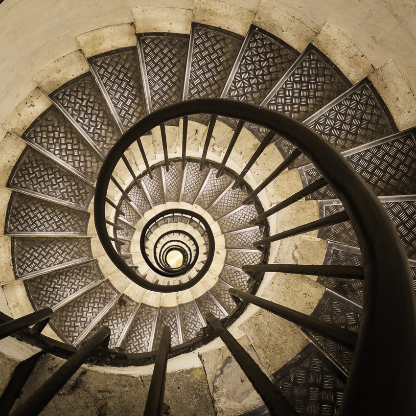
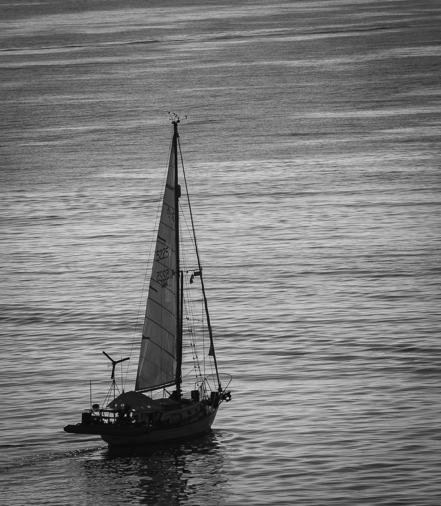
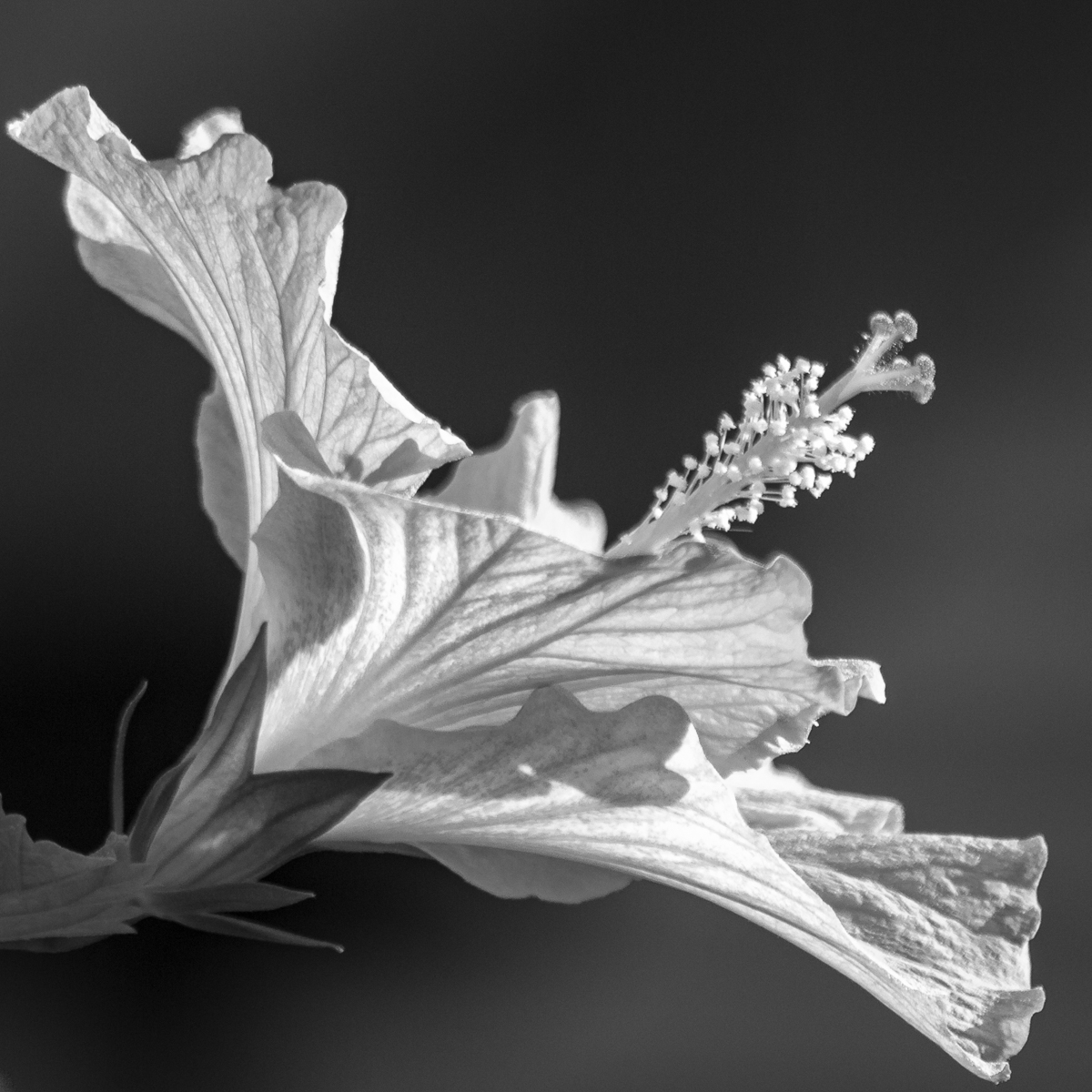
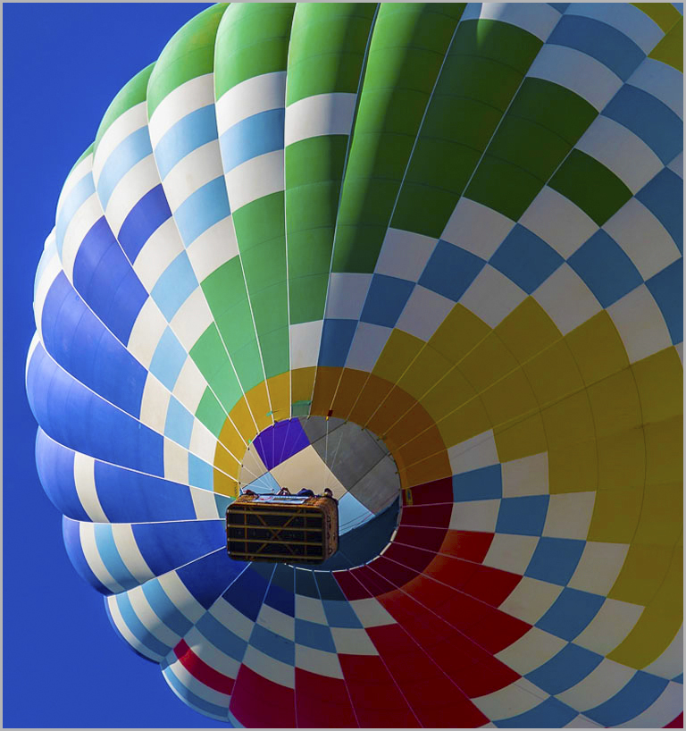
Hi Ingrid - This is a beautifully simple and well executed black & white composition. For my part, I think it works that the suspension elements are not symmetrical as it may make the image less interesting. It's sharp with really nice contrast. If anything I might suggest trying to bring out just a bit more of the detail in the main structure. Otherwise, well-done! |
Sep 10th |
6 comments - 5 replies for Group 14
|
6 comments - 5 replies Total
|