|
| Group |
Round |
C/R |
Comment |
Date |
Image |
| 87 |
Apr 25 |
Reply |
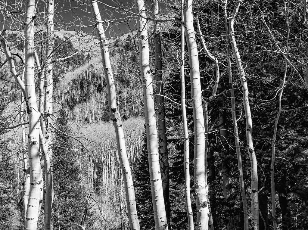
Hi Chun,
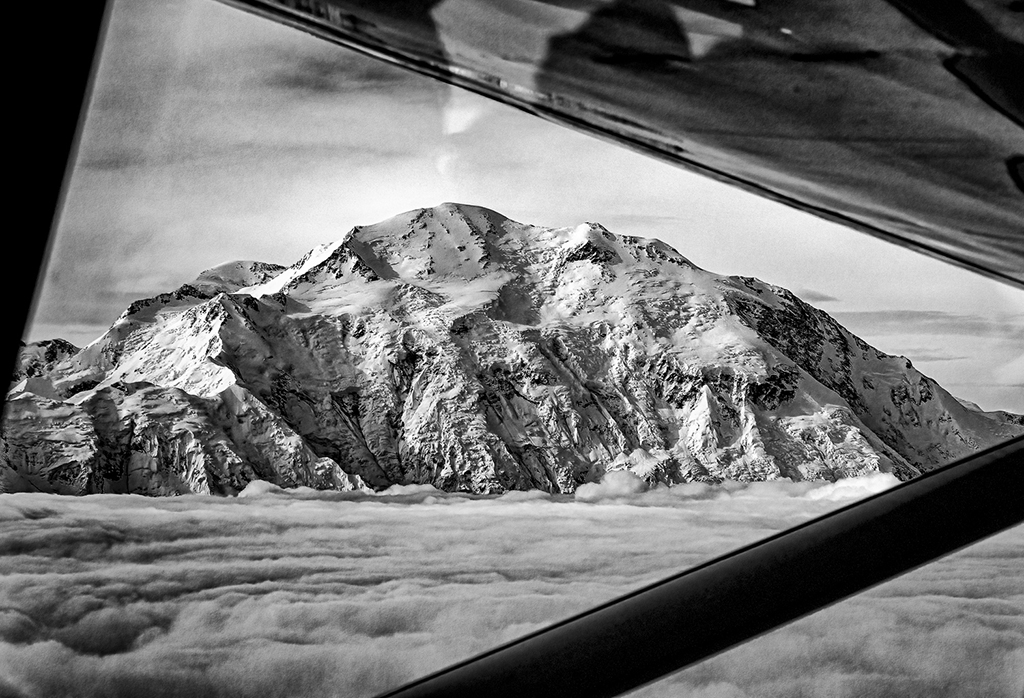
Thank you for taking the time to do a B&W version! The increased contrast does make it more dramatic, but the white line above the mountains on the right is sometimes a result of too much contrast, so I try to be easy on things like contrast and clarity. The light over the mountains to the left is interesting - how did you do that? And did you add the grain in the sky? You are a great addition to group 87! |
Apr 12th |
| 87 |
Apr 25 |
Reply |
Thanks Will! I used a sepia tone on it because it kept the look of the playa surface, but wondered if it should have been true B&W. I'm glad you like it the sepia way!
|
Apr 12th |
| 87 |
Apr 25 |
Reply |
Thanks Dale! This is one of my favorite images from my trip - I'm glad you enjoyed it. |
Apr 12th |
| 87 |
Apr 25 |
Reply |
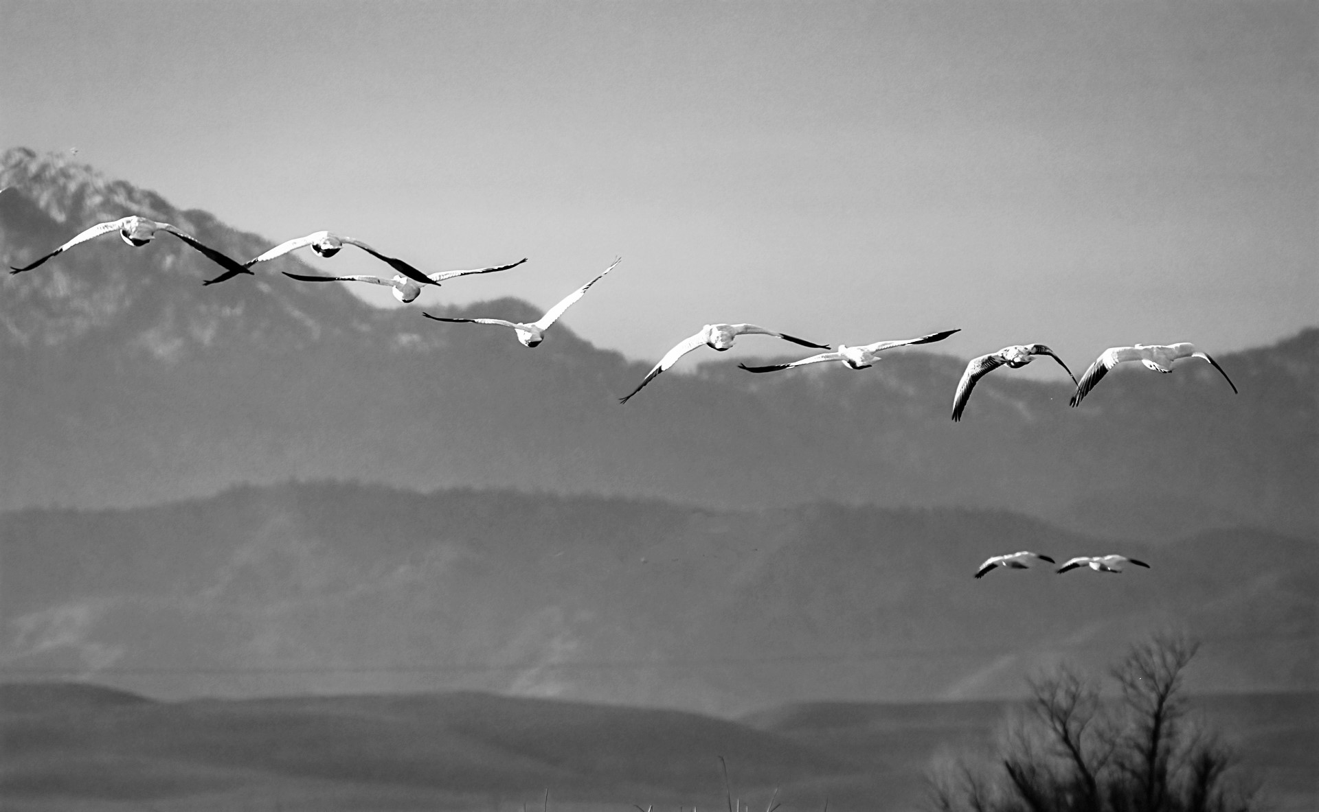
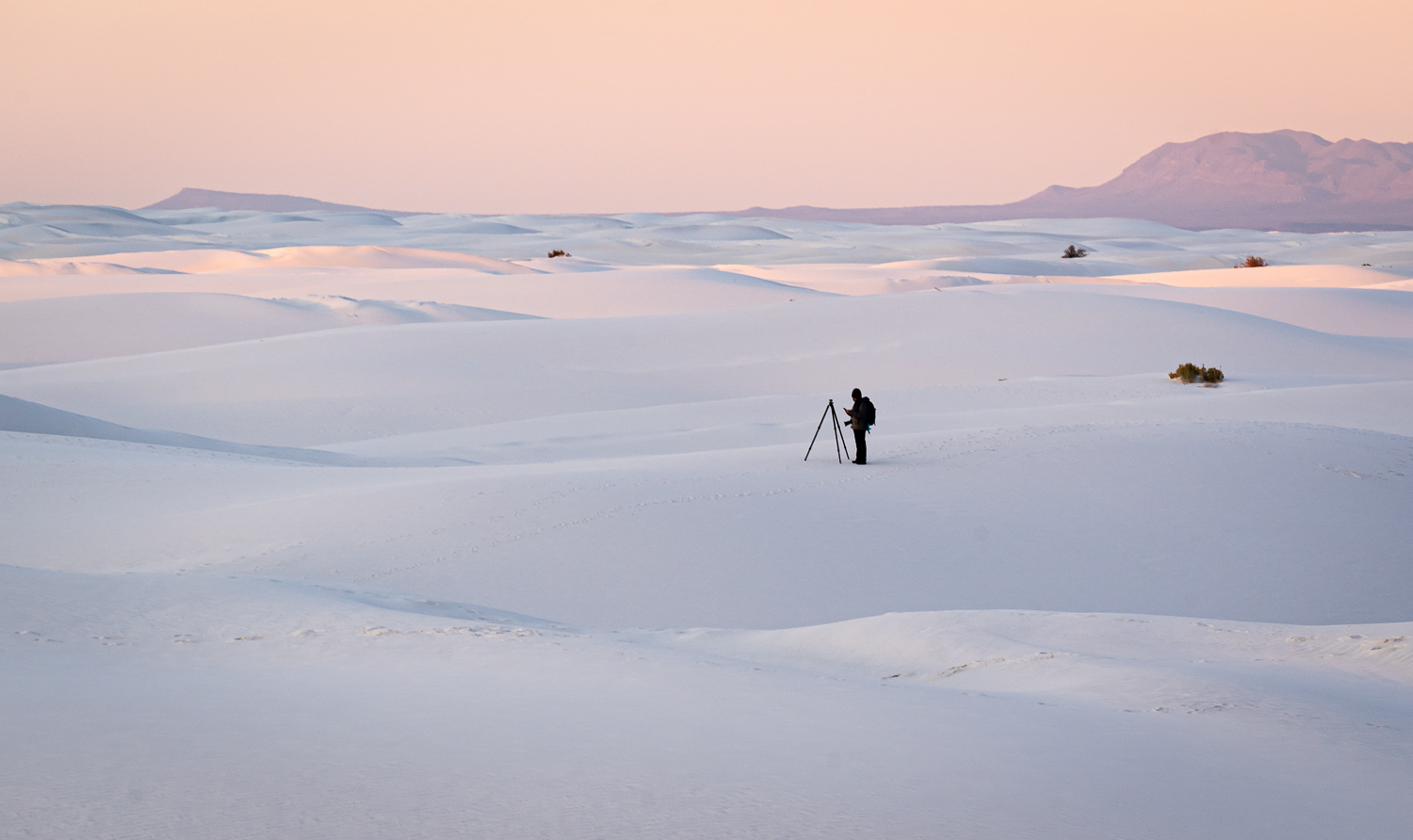
Thanks for your comments, Steven. Yes, it would be almost impossible to figure it out without explanation - probably the kind of confusion early discoverers of this phenomenon felt! The dawn light was full of shadows due to all the mountains surrounding the playa, so lighting was uneven. Perhaps I should tone down the bright sunlight in the distance or brighten the foreground. Thanks for the suggestion about Auto-ISO - it would probably have done a better job here. As for texture, I struggle to find the right amount and often I hear comments like "crunchy" about my images. Photography is such a balancing act and I appreciate getting feedback from you and the rest of the group! |
Apr 8th |
| 87 |
Apr 25 |
Comment |
Hi Cindy,
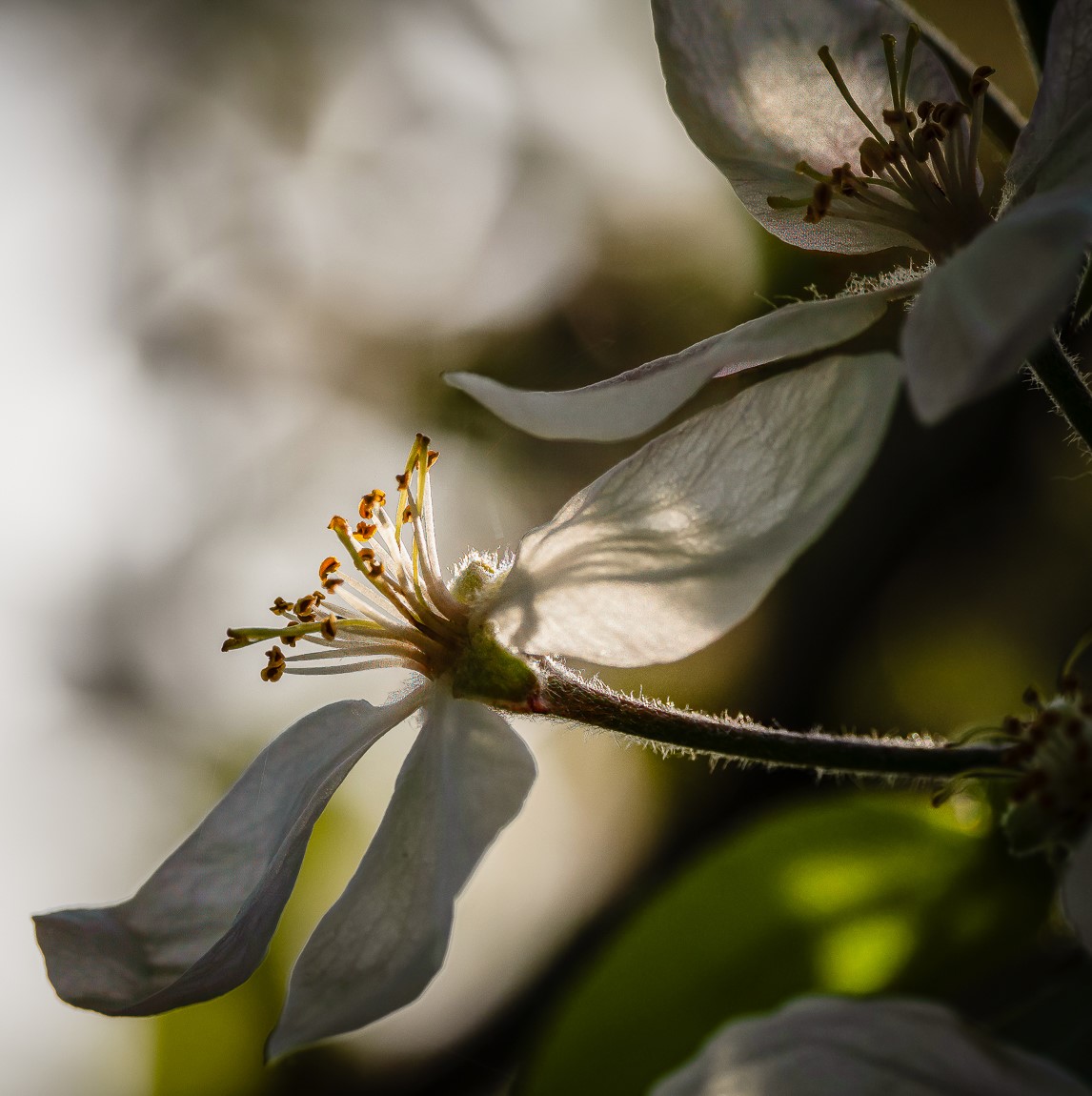
I can really see what you were going for with the focus. I didn't notice the tree until I read Steven's comment. I learn so much from seeing these images and then reading the comments of the rest of the group. Inevitably, people notice things that I don't, or have ideas for improvement that didn't occur to me. One thing that struck me is the inclusion of the pink tulip. There is only one, so it stands out, but it is out of focus. Perhaps it would have been better to exclude it? |
Apr 8th |
| 87 |
Apr 25 |
Comment |
Hi Will,
I really like that this image has both repetition and variety! The sharpness of the window frames and the distorted reflections of light, with curves and circles, make an interesting juxtaposition. And the very faint view of the inside of the building keeps me engaged even more! Good job and I can see why it sold! |
Apr 8th |
| 87 |
Apr 25 |
Comment |
Hi Dale,
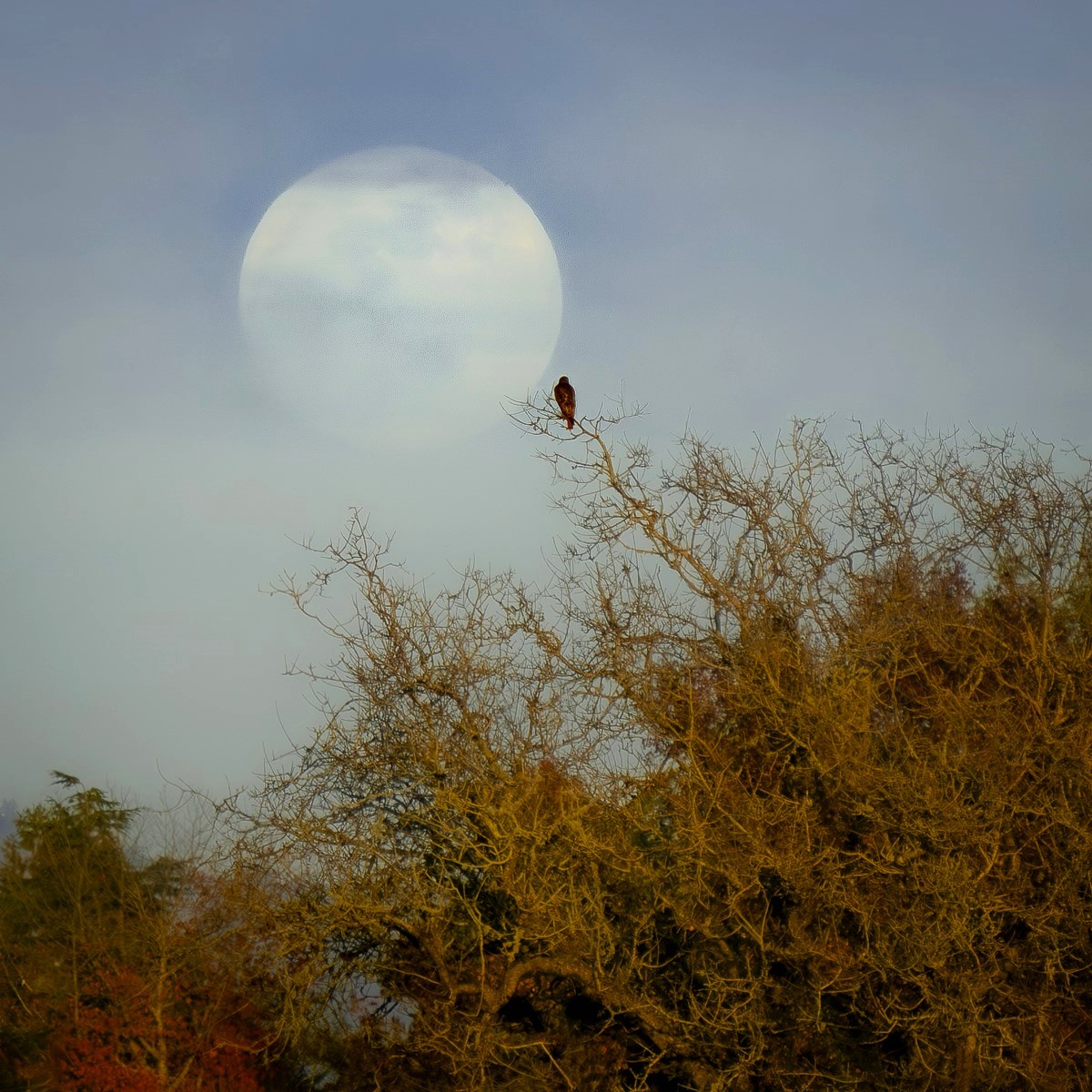
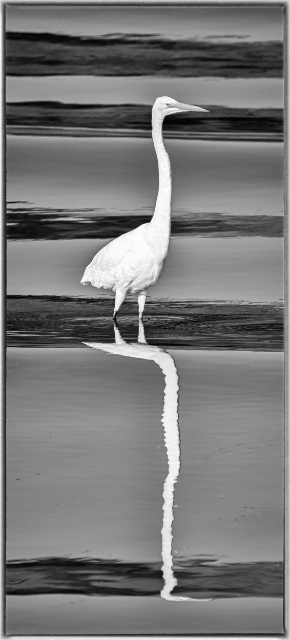
Very nice silhouette - the heron or egret looks like a prehistoric creature! I like the tint of the sky, which gives me the feeling of dawn, and the stick is a good example of spring nest building behavior, especially as the nest is included in the image. A very evocative image! |
Apr 8th |
| 87 |
Apr 25 |
Comment |
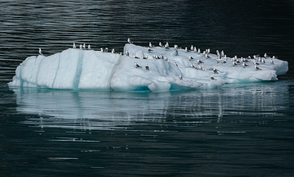
Hi Steven,
Your bird (cormorant?) is beautifully captured and positioned in the frame. The blurring of the water behind it gives a good sense of motion. Perhaps the water beneath the bird could be blurred just a bit to enhance that sense of movement. |
Apr 8th |
| 87 |
Apr 25 |
Comment |
Hi Chan! I love how you cand find photo opportunities anywhere you go. Your cropping and Photoshop transformations are excellent and well done. Your choice of color for the walls works very well. I see the line that Steven mentioned and it looks like a dark shadow, perfectly normal, but I agree it is a little distracting. |
Apr 8th |
| 87 |
Apr 25 |
Comment |
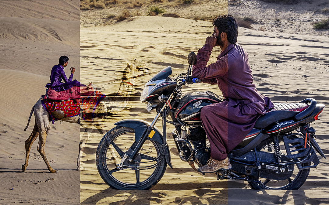
A very thought-provoking image! The young woman looks happy and loving, but I found myself wondering if the man was unhappy or sad or just distracted. I like the way you isolated the couple and separated them from whatever is going on - it reminds me that there can be many stories in a single field of view, and the photographer gets to decide what to point out to the viewer. |
Apr 8th |
| 87 |
Apr 25 |
Comment |
Thank you Stephen! And thanks for stopping by group 87. |
Apr 3rd |
7 comments - 4 replies for Group 87
|
7 comments - 4 replies Total
|