|
| Group |
Round |
C/R |
Comment |
Date |
Image |
| 32 |
Oct 24 |
Comment |
Hi Stephen!
So, I must agree, the flower is seemingly lost within the surrounding foliage in the B&W version. To try and remedy this, go back and attempt a different tonal gamut that allows the flower to stand more on its own: perhaps a color (green) filter will brighten up the flower to spotlight its beauty ...
Also, go to DD-83 and see my comments about a similar issue with Elsie's leaf. I often refer to this type of issue as "visual confusion" ... where subject/s become lost in their immediate surroundings. |
Oct 23rd |
1 comment - 0 replies for Group 32
|
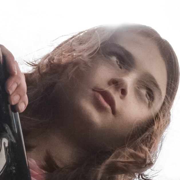
| 83 |
Oct 24 |
Comment |
Adi, I like what is suppose to be going on here ... as it relates to tension, but my feelings echo Michael's: I find the Trash Bin too close to the edge of the frame and also not clear enough to distinguish it clearly enough, in my opinion.
I also feel if the Trash Bin was (more) inside the main frame it would still act as a point (or reference) for Tension ...
Overall, I do believe you have secured the tension you are looking for, but the point of Tension really flirts with going outside the frame and thus, many viewers may actually interpret this as a mistake, not so much part of the "compositional structure" you intended. It's a close call for sure! Well done for presenting this intriguing piece. |
Oct 26th |
| 83 |
Oct 24 |
Comment |
Another fine Street Photography (or street scene) from you ... the focus, B&W tonal gamut and overall compositional structure is devine!!
"Points to Ponder"
However, not so sure I connect with the scene ... as the surrounding space/artifacts/people do not reflect any particular location or culture. In this respect, then the viewer will try and find a connection of some sort (comic, like Gary Winogrand's work, for example) for narrative options. I can not find any connection to hold my attention ... and frankly, not apparently connected to some comic event (or health related Doc) I am put-off seeing the women's mouth open.
|
Oct 22nd |
| 83 |
Oct 24 |
Comment |
Hello, Don!
So, off the bat, Adi's remark about the column is, in my opinion, not accurate as the structure is NOT directly coming through the subjects head. (The comment is more appropriate when, say for example, smaller tree or light post seemingly protrudes from the head) ... in this case, and in my opinion, your work is free from this criticism.
Otherwise, the scene is most attractive ... addition thinking echos those above regarding expected perspective from this lens and format. Nicely, done! |
Oct 22nd |
| 83 |
Oct 24 |
Comment |
Simply, a very lovely and most beautiful portrait composition!
Blown up on the screen the overall softness is quite pleasing and illuminates how the dark shadow on the subjects face is soft, as well. |
Oct 22nd |
| 83 |
Oct 24 |
Comment |
Elsie, I applaud your attempt in trying to create a narrative, or feeling, or emotion about life and eventual departure: and the knowledge of becoming one with the Earth once more.
Exposure: as mentioned above, re-edit to allow the main subject more prominence within the composition. Currently, one could argue the surrounding grass is too overwhelming in the B&W version and is seemingly swallowing up the main subject. |
Oct 20th |
| 83 |
Oct 24 |
Reply |
Happy I waited to comment later ... after seeing the original (full-crop) color version, I think a slight crop (on the right-side edge), but still keeping the End-plates on the wing, may actually provide for a more contemplative abstraction. What do you think?
As it relates to Michael's question ... a quick refresher on why/how we choose or enjoy color vs B&W, see my new Bulletin Board post! Thank you, everyone!
|
Oct 20th |
| 83 |
Oct 24 |
Reply |
It is always nice to have you visit, Stephen! I too, like the highlights in the composition ... we can say, perhaps, are key components in making the scene feel authentic! |
Oct 18th |
| 83 |
Oct 24 |
Reply |
Another interesting observation, and if we dwell on those circles of light for very long I can see where it (may) disrupt the natural progression I hope each viewer takes in enjoying the scene.
But even after reading your warning, I still do not feel this artifact (the two or three light spots) on the floor interfere with the images Gestalt.
Again, they are natural artifacts seen in real-time and outside of slightly Burning them, I intend to leave them relaxing where they lay. |
Oct 18th |
| 83 |
Oct 24 |
Reply |
... then the composition is doing what I hoped it would!
Thank you, Don! |
Oct 18th |
| 83 |
Oct 24 |
Reply |
I look forward to seeing your like-image in the near future!
Cheers! |
Oct 18th |
| 83 |
Oct 24 |
Reply |
Hi Adi! An interesting observation, indeed, but not accurate as it relates to where I hope the viewer looks: I hope the viewer eventually looks everywhere, but need them to contemplate the foreground before continuing to infinity. As in real-time, the scene is bold and led my eyes in such a path. In the end, after experiencing the images Gestalt, I would hope the viewer can trace back over all areas and look for details ...
... but the images initial power is in its Gestalt.
|
Oct 18th |
| 83 |
Oct 24 |
Comment |
Yes, Elsie, the tantalizing highlights are a favorite aesthetic ... or perhaps, visual anomaly(?) ... offered through film. Trying to squelch the highlights will effectively take away a key component that invites the viewer to peer longer into this part of the Rickhouse.
I want the viewer to squint, when looking at this scene.
Yes, indeed, duck or you will smack your head on that beam: the the beam framing is key in inviting depth, and both the foreground barrel and the beam balance each other.
Thank you for the thought-provoking question. |
Oct 2nd |
6 comments - 6 replies for Group 83
|
| 87 |
Oct 24 |
Comment |
Great timing!!
"Points to Ponder"
Allow me to also note, this vernacular image is another example where a group of like-images presented within a Series would be more powerful: in this respect, this is another fabulous subject to go back out and begin/continue a long-term project within a focused narrative. |
Oct 18th |
| 87 |
Oct 24 |
Comment |
A very well executed Timed Exposure.
Would a 16:9 ratio serve the subject/space better? Either bias to the top, or biased to the bottom edge ... either version may actually help spark more attention ... what do you think? |
Oct 18th |
| 87 |
Oct 24 |
Comment |
A very well balanced landscape composition, Dale!!
Perhaps take the Dodge Tool (LOW mid-tone setting) and carefully lighten every light-colored tree and / or bush to bring some depth ... overall, beautiful composition! |
Oct 18th |
| 87 |
Oct 24 |
Comment |
Kudos!! A very appealing portrait!! Color, lighting, texture ... well done!! |
Oct 18th |
| 87 |
Oct 24 |
Comment |
Well done, Chan!!
As Steve mentioned ... a good eye to be able to "see" beauty most would past by ...
"Points to Ponder" I like the horizontal plane of the foreground Bushes ... they may act to frame the bottom part if re-cropped carefully ... see my test crop ... In the end, both compositions are valid entries ... but wanted to see if the foreground Bushes would add depth ... |
Oct 18th |
 |
| 87 |
Oct 24 |
Comment |
Thank you, everyone! |
Oct 18th |
| 87 |
Oct 24 |
Reply |
A good idea, indeed, but perhaps in this example a bit too much; see area slightly to the left ... there, a noticeable Dark Blob. |
Oct 18th |
| 87 |
Oct 24 |
Reply |
Really appreciate your positive comments ... here, a portrait from a couple of years ago ... need to find more recent one's. |
Oct 18th |
 |
6 comments - 2 replies for Group 87
|
13 comments - 8 replies Total
|


