|
| Group |
Round |
C/R |
Comment |
Date |
Image |
| 6 |
Sep 24 |
Comment |
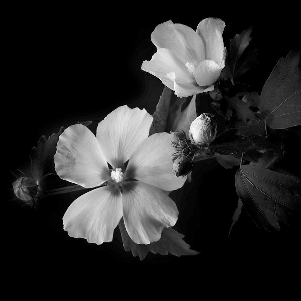
Hi Lori! As I was passing through many of the DD rooms your featured work grabbed my attention. Initially, the B&W rendering feels so right with this particular composition. Lovely work, indeed!
But allow me to point out a few caveats worth reviewing before your next outing: my words echo some of Karen's thinking, but allow me to dig a bit deeper.
"Points to Ponder"
First, the overall, what I refer to as a works "compositional structure" is pretty well balanced (including the left-side bud) which (will) anchor as a balance to the right-side details ... (if) we Open the Exposure to reveal more left-side detail.
Yes, this is an alternative visual narrative, but perhaps imbue traits for longer viewer contemplation. On a technical note, the "point of focus" is not clearly defined: this in virtue of the main flower being out of focus, and other parts in and out of focus ... that does not look to be a result of lens bokeh (and with F/8 opening on a 40mm lens seems correct) ... that is, less bokeh for deeper depth of Field (Dof).
Technical questions to help define how/where focus was completed: manual or autofocus? If manual focus, where? Lastly, I posted a quick edit to offer the alternative described in the aforementioned details that maintains your original crop (though I did crop left-side ever so slightly).
Lance A. Lewin
PSA Global B&W Photography Mentor
PSA South Atlantic Area Membership Director
lance.visualizingart@gmail.com |
Sep 8th |
 |
1 comment - 0 replies for Group 6
|
| 18 |
Sep 24 |
Reply |
The essay is posted. Thank you. |
Sep 19th |
| 18 |
Sep 24 |
Reply |
Gunter, these are wonderful questions, but I see your group does not have a Bulletin Board ... can you email your Admin and ask to have this installed ... it will take little time for Tom to do this. Then I will post my response there ... hopefully inspiring others to join the conversation. Thank you. (You can visit DD-83 and see the one there for reference). |
Sep 18th |
| 18 |
Sep 24 |
Comment |
Of course, for all intent and purposes, this very engaging art is purely within the realm of Graphic Art: here, you used a photograph as a base model for digitally replicating it (the photo)to create digital art or a graphic art illustration.
In any case, beautifully done, Gunter!
"Points to Ponder"
However, this is not within the realm of true "creative" photography .... but techniques/aesthetics learned in Graphic Arts. Work by László Moholy-Nagy known to many as the most avant-garde photographer of the 20th century is a better example of "Creative" photography. So is a lot of "Conceptual" Photography born in the 21st century.
Indeed, we have expanded the boundaries under "Creative" ... a process that was incubated after the birth of the so called Digital Photography Revolution ... and now includes/shares many aesthetics seen and enjoyed in Commercial and Video Game Photographic Illustrations. But, the PSA definition is vague and lends itself to a wider interpretation, as well.
Regardless, the scope of work in these DD-Creative groups inspires many different ideas and sparks imaginations, but also makes constructive comments harder to make; this is especially true when a subgenre has too broad a definition.
Lance A. Lewin
PSA Global B&W Photography Mentor
PSA South Atlantic Area Membership Director
lance.visualizingart@gmail.com |
Sep 17th |
| 18 |
Sep 24 |
Comment |
Very interesting, while also being, well, a bit like science fiction in the way the subjects are "frantically" separated from their otherwise natural perch.
I will suggest, the added "shadow" would look stellar in the DD-87 version of this composition.
"Points to Ponder" ... along with the added Shadow, convert the composition into a B&W rendering, while losing the Black Outline. Thoughts?? |
Sep 3rd |
2 comments - 2 replies for Group 18
|
| 83 |
Sep 24 |
Reply |
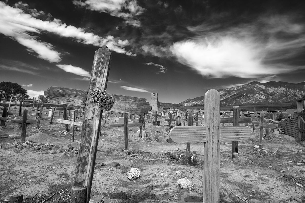
Hi Adi!
Indeed, composing the scene with a larger aperture (like one of Bob's examples) is viable, but then we lose identification of the space, which in this case is pivotal in the works documentary narrative: that is, letting the viewer know this is the sacred/spiritual grounds of Taos Pueblo, a well known and often studied community by both 20th century artist painters and photographers.
As mentioned above, cropping or diminishing the background will often leave many types of photography seemingly austere in virtue of only highlighting a particular subject with no regard to the space it sits in: this is perfectly fine, but the resulting composition will look like hundreds other like impressions. Thank you, Adi. |
Sep 23rd |
| 83 |
Sep 24 |
Reply |
LOL!!!! : ) |
Sep 19th |
| 83 |
Sep 24 |
Reply |
Thank you for stopping by!!
In all my classes and in the PSA mentoring space participants (both intermediate and advanced artist photographers) come to me to learn methodologies for breaking away from Competition Rules ... as I teach, untethering from rules sparks and generates creativity from behind the viewfinder. (Some ideas can be reviewed in my article in the March 2023 issue of the PSA Journal). |
Sep 19th |
| 83 |
Sep 24 |
Reply |
No. This is an entirely different narrative and takes out the surrounding space that helps define a sense of "place" and thus a specific narrative. In your image, though lovely, and a very viable option, is too narrow and one that is more common, in my opinion. |
Sep 19th |
| 83 |
Sep 24 |
Reply |
So we are clear ... I did not offer an alternative presentation. Thank you. |
Sep 17th |
| 83 |
Sep 24 |
Reply |
"Points to Ponder"
... or more relevant, "interpretation", (as opposed to Style) especially when critiquing photographic art compared to evaluating a painting, for example. (However, Lewin's photographic "style" is mostly in presenting B&W photographic imagery, regardless on how the picture is composed and the resulting visual narrative).
This compared to Vincent van Gogh use of heavy, thick, brush strokes in identifying his "Style" (or process) of painting ... which defined visual narratives in unique and, at the time, an original style of marking the canvas. |
Sep 17th |
| 83 |
Sep 24 |
Reply |
Interesting reflection, as I actually cropped the original "finished" scene to present this alternative one, which, I too, feel, is not as revealing or defining: see the posted original which clearly illustrates (in some instances) more space around the subject/s helps define a sense of "place".
I hope you feel this original version is less distracting.
Thank you for jarring me to stick with my original thinking/composition which was completed through the viewfinder at the time of exposure.
|
Sep 16th |
 |
| 83 |
Sep 24 |
Reply |
Elsie, for this particular scene/subject ... the square crop actually, we can say, constricts the space: in which case the Tree is left in limbo. Such a view can often restrict engagement in virtue of depleting a "sense of place".
Adi's work reveals a sense of isolation, even mystery, the square crop diminishes these narrative options. |
Sep 16th |
| 83 |
Sep 24 |
Reply |
See my reply above: not sure we want to remove the sign and stand its connected to. |
Sep 16th |
| 83 |
Sep 24 |
Reply |
Hi Elsie.
It is often hard to "engage" with many different types of "street photography" (SP) compositions: see Gary Winogrand's black and white work, specifically, the series of images registered at airports. In a few of these images many would assume the scene should have been cropped, or even be more level, but in fact, SP narratives are either clear, or defined by spectators'. In any case, they are often created with spontaneity and / or designed as candid reflections of the everyday or otherwise depicting local vernacular.
In Michael's image, the "whole" scene "is" the picture, and is designed to help instigate a narrative ... eliminating the surrounding artifacts may actually "dull" our contemplative impulse to study the work longer. This being said, I also suggest, this is another example of a scene better appreciated within a series of like-pictures ... and thus, perhaps provoke better narrative options, or actually define a definitive one.
In a final thought, "street photography" is not for everyone, and for many, have little desire to try and contemplate their value to fine art, commentary or documentary.
I look forward to your feedback/questions on Winogrand's work. Thank you.
|
Sep 15th |
| 83 |
Sep 24 |
Comment |
A very delightful scene!
Also, a very pleasing B&W tonal gamut. You clearly enjoyed a successful Post-production workflow. Well done!
|
Sep 9th |
| 83 |
Sep 24 |
Reply |
Michael, the scene was digitally registered, and then converted in Efex Pro to B&W: yes, I also used the Red Filter in Efex Pro. Good catch!! |
Sep 6th |
| 83 |
Sep 24 |
Reply |
It is my pleasure, Don ... and what I hope all PSA Critique Groups offer their participants - transparent, honest critiques towards supporting and teaching photographers at all levels. (It is the theme of the Bulletin Board piece I posted). |
Sep 6th |
| 83 |
Sep 24 |
Comment |
First, you have a great eye, Don! We have seen this talent from you in the past, and hear another very contemplative image.
First, if I never saw the Original version I would have enjoyed the Featured "cropped" view with interest, though after spending some time viewing it the scene feels claustrophobic: in this sense, my eye and mind want "closure" in some of the shapes, or perhaps, processed as a whole, some closure to either the beginning or end is needed to satisfy my nerves, as it were.
And the Original provides this "closure": within the Gestalt theory the human eye-mind collaboration enjoys, and feels less stress when it can contemplate a start and / or end, such as a series of lines; and why we often tell people ...'wish you included the top portion of the tree' ... in an otherwise engaging landscape photograph, for one example.
I did however make a very, very, very slight crop to the Original: your original scene through the viewfinder, or your original (larger) crop includes the left-side shape/curve and shadow that compliments the entire right-side of the scene. This small area I describe "completes" the composition ... it gives us more information in completing the shapes and textures and helping to define the object we are looking at, in my opinion, at the very least, it simply Balances the composition.
Bravo!!! |
Sep 5th |
 |
| 83 |
Sep 24 |
Comment |
First, this B&W rendering is beautiful ... as it relates to a wide and complete tonal gamut.
Subject, for me, comical! Yup,I sense an abrupt attitude (Diver) dragging along this inorganic shark as if it was just caught on land ... and now the Diver is bringing it back where it belongs! Yes, I have quite the imagination! |
Sep 3rd |
| 83 |
Sep 24 |
Comment |
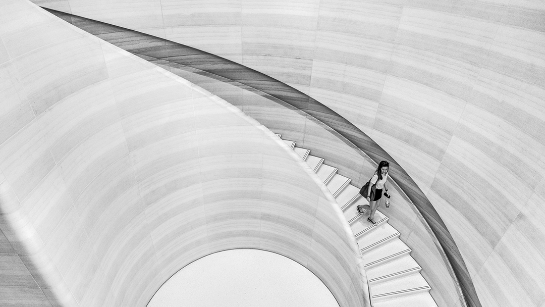
Impressionism ... minimalism. I like this a lot!
Makes one wait, stand and contemplate where this is and what they (the spectator) are doing there. Its mysterious. Very much imbues what I enjoy within Japanese and Chinese aesthetics. Paying tribute to the common place and austere, and engendering mystery.
|
Sep 3rd |
4 comments - 12 replies for Group 83
|
| 87 |
Sep 24 |
Reply |
Similarly, 20th century photographer László Moholy-Nagy saw himself as an Artist, who happens to use photography in his process. Many see him as the quintessential 20th century Avant-garde photographer. |
Sep 17th |
| 87 |
Sep 24 |
Reply |
Really appreciate your detailed critique, Dale!
Yes, as I often speak about ... B&W images tend to allow viewers' to gulp-down the whole scene ... that is, enjoy the images Gestalt, as opposed to the sometimes interference color can have on contemplating visual narratives. |
Sep 17th |
| 87 |
Sep 24 |
Reply |
Chan, yes, though this image enjoys attributes that elicits one to study it longer, agreed, this is a good example where a series of like images would do very well.
I will add this image and others like it for the Talk I am giving your Photography Group in January on ... Photography: Creating A Series |
Sep 10th |
| 87 |
Sep 24 |
Reply |
Cool!! : ) |
Sep 6th |
| 87 |
Sep 24 |
Reply |
My pleasure! |
Sep 3rd |
| 87 |
Sep 24 |
Reply |
Very interesting version you posted in DD-18 ... go see my comments. : ) |
Sep 3rd |
| 87 |
Sep 24 |
Comment |
Though I appreciate your ability to use a few post-production tools to bring us this image, the overall, what I often refer to "compositional structure", is weak.
One of the main issues ... the subjects occupy the middle line separating the rocks and the water. This in itself normally is not stimulating to human gaze.
I suggest, to help bring a bit more engagement, re-crop using 16:9 ratio. Alternatively, a Square Crop of the two right-side Puffin's, for another example. Note, the surrounding space does not speak to a specific location, so making it less prominent will likely be OK. |
Sep 3rd |
| 87 |
Sep 24 |
Comment |
The Subject (the thing or things creating the abstract) seem secondary to what you have created: that is, the visual presentation may be all the spectator needs to appreciate the work ... as one line of thought.
The next line of thought, I suggest this type of Abstract (very much like the variety of abstract paintings we gaze at in museums) needs to be seen on a large substrate: wood, metal or most familiar, a large gallery matte and framed piece. As a small projected photographic composition, in my opinion, it is too weak. The work needs to be experienced, well illuminated, and as a large photograph. In your face!
A 20"x20" Test print will reveal if additional editing needs to be completed before the final super large print is made: I am hinting, the colors needs to be bold enough under a strong spotlight to engage viewers'. Next, in a series of like-images will be most powerful, but a a large solitary photograph in the right atmosphere will (may) be just as engaging.
Thank you for presenting this most engaging piece!! |
Sep 3rd |
| 87 |
Sep 24 |
Reply |
In other words, sometimes it is very hard to reveal what we see and feel in real-time through the magic of photography, that is, without implementing advanced post-production manipulation to help reveal such visualizations.
Again, careful choice of lenses, position, and other criteria help develop critical "compositional structure" ... most vital for photographic work in the "classic tradition" of photography. |
Sep 3rd |
 |
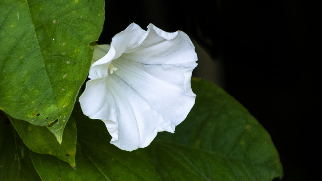
| 87 |
Sep 24 |
Comment |
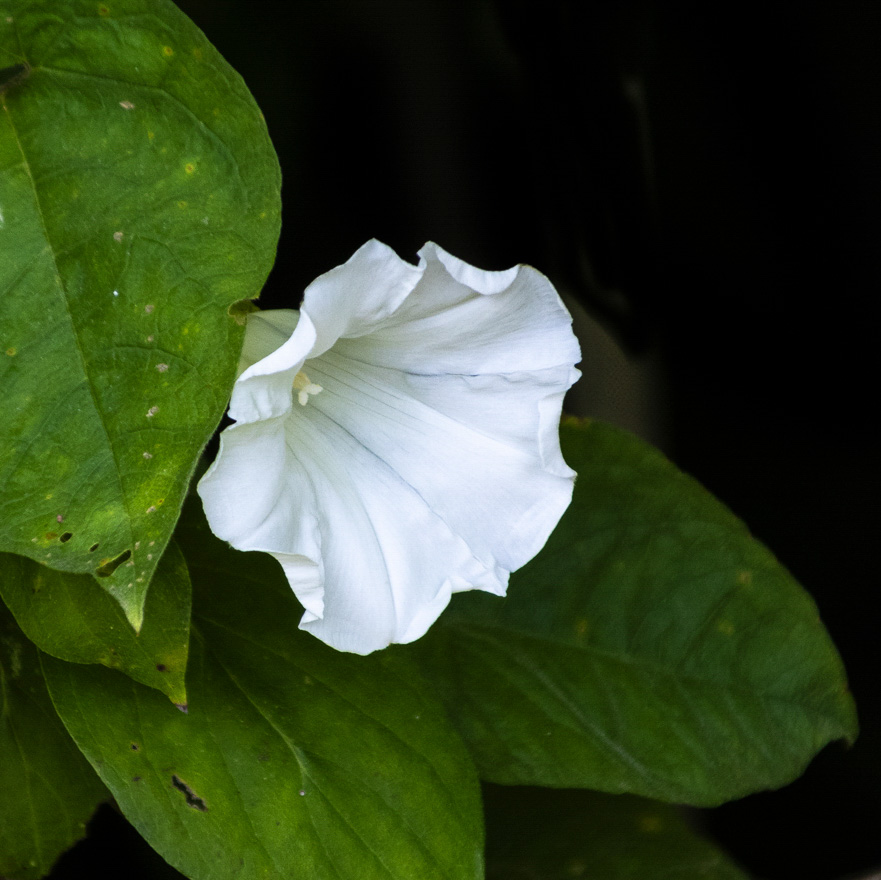
Indeed, the stark white flower impacts the green and black surroundings that single out the flower as, seemingly, alone ... a solitary subject: simplicity often reveals much beauty.
However, I must critique the fact the overall composition may be "awkward" (or unbalanced) to some extent from the placement of the branches: they interfere with the whole scene.
You can still impart the notion of simplicity and solitary with two other "crop" options: as examples seen here. Of course, in the future, and from behind the viewfinder, a bit more patience could have solved this issue while on location. Thank you, Dale. |
Sep 3rd |
 |
| 87 |
Sep 24 |
Comment |
The silhouette best compliments this most beautiful sunrise!
I wish I was there! And indeed, the image very effectively allows me to rekindle deep (or lost) memories walking (or sitting) on ocean shorelines ...
Thank you for getting up early to "register" this most lush visualization! |
Sep 3rd |
| 87 |
Sep 24 |
Comment |
Very interesting how the subjects "float".
Though you, again, reveal your strength in using post-production skills, and thus offer this examination (in a fine art documentary way), I suggest the main subjects (and the composition as a whole) may have a stronger impact if the subjects were crystal clear ... at least the very front-facing portion of them, in my opinion.
This and some of your past (recent) work show quite a bit of contemplation in how photography (and its many digital tools) can expand artists visualizations. Thank you, Chan. |
Sep 3rd |
5 comments - 7 replies for Group 87
|
12 comments - 21 replies Total
|


